Ggplot2 简明教程
ggplot2 - Bubble Plots & Count Charts
气泡图实际上是气泡图,它基本上是散点图,第三个数值变量用于圆的大小。在这一章中,我们将重点关注条形数量图和直方图数量图的创建。它们被视为气泡图的复制品。
Bubble plots are nothing but bubble charts which is basically a scatter plot with a third numeric variable used for circle size. In this chapter, we will focus on creation of bar count plot and histogram count plots which is considered as replica of bubble plots.
以下步骤用于使用上述软件包创建气泡图和数量图 −
Following steps are used to create bubble plots and count charts with mentioned package −
Understanding Dataset
加载相关软件包和所需的数据集,以创建气泡图和数量图。
Load the respective package and the required dataset to create the bubble plots and count charts.
> # Load ggplot
> library(ggplot2)
>
> # Read in dataset
> data(mpg)
> head(mpg)
# A tibble: 6 x 11
manufacturer  model  displ  year  cyl  trans      drv   cty  hwy  fl  class
<chr> <chr> <dbl> <int> <int> <chr> <chr> <int> <int> <chr> <chr>
1 audi        a4     1.8    1999  4    auto(l5)   f     18   29   p   compa~
2 audi        a4     1.8    1999  4    manual(m5) f     21   29   p   compa~
3 audi        a4     2      2008  4    manual(m6) f     20   31   p   compa~
4 audi        a4     2      2008  4    auto(av)   f     21   30   p   compa~
5 audi        a4     2.8    1999  6    auto(l5)   f     16   26   p   compa~
6 audi        a4     2.8    1999  6    manual(m5) f     18   26   p   compa~
可以使用以下命令创建条形数量图 −
The bar count plot can be created using the following command −
> # A bar count plot
> p <- ggplot(mpg, aes(x=factor(cyl)))+
+ geom_bar(stat="count")
> p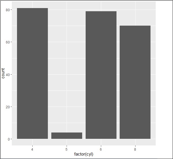
Analysis with Histograms
可以使用以下命令创建直方图数量图 −
The histogram count plot can be created using the following command −
> # A historgram count plot
> ggplot(data=mpg, aes(x=hwy)) +
+    geom_histogram( col="red",
+       fill="green",
+       alpha = .2,
+       binwidth = 5)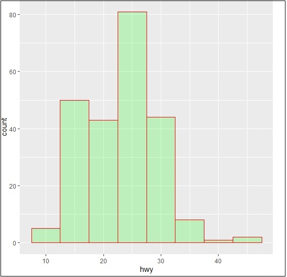
Bubble Charts
现在让我们创建最基本的点图,并增加散点图中所述点的维度。
Now let us create the most basic bubble plot with the required attributes of increasing the dimension of points mentioned in scattered plot.
ggplot(mpg, aes(x=cty, y=hwy, size = pop)) +geom_point(alpha=0.7)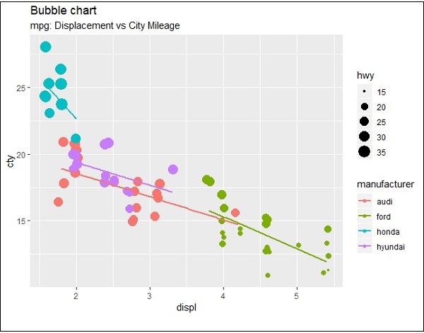
该图描述了制造商的特性,其包含在图例格式中。所表示的值包括“hwy”属性的不同维度。
The plot describes the nature of manufacturers which is included in legend format. The values represented include various dimensions of “hwy” attribute.