Kivy 简明教程
Kivy - Getting Started
Kivy 是一个开源 Python 库。它允许您构建具有自然用户界面(NUI)的多点触控应用程序。利用 Kivy,您可以开发跨平台应用程序。撰写完毕的相同代码能部署在不同的各种操作系统平台上,比如 Windows、macOS、Linux、Android 和 iOS。
Popular GUI Frameworks in Python
Kivy 是 Python 生态系统中可用的大量 GUI 框架之一。一些用于构建桌面 GUI 应用程序的流行 Python 库包括−
-
Tkinter − Tkinter 包与 Python 的标准库捆绑在一起。它是 Tcl/Tk GUI 工具包的标准 Python 接口。
-
PyQt5 − 此库是 Qt GUI 工具包的 Python 端口。我们的 PyQt5 扩展教程可通过 here. 访问
-
WxPython − WxPython 库允许 Python 程序员访问 WxWidgets,一个用 C++ 编写的开源 GUI 工具包。要了解 WxPython 的更多信息,请单击 here.
-
Kivy − Kivy 是一个 Python 库,帮助您为 Windows、Linux、iOS 及 Android 构建跨平台 GUI 应用程序。Kivy 支持触控输入。Kivy GUI 框架中的所有小部件都能处理多点触控手势。
Kivy 配备强大的图形和多媒体功能。Kivy 应用程序可支持音频、视频、动画、2D 及 3D 图形。
Key Features of Python Kivy
以下是一些 Python Kivy 的主要特征−
-
Kivy 支持触控输入。Kivy GUI 框架中的所有小部件都有能力处理多点触控手势。
-
Kivy 综合的 GUI 小部件和强大的布局管理可轻松设计出迷人的界面。
-
Kivy 配备强大的图形和多媒体功能。这让它能在应用程序中纳入 2D 及 3D 图形、动画、音频和视频组件。
-
Kivy 支持各种输入设备。它包括触控、鼠标和手势。
-
Kivy API 可访问移动设备硬件组件,比如摄像头、GPS 等。
-
Kivy 使用 OpenGL ES 2 图形库,基于顶点缓冲对象和着色器。
-
Kivy 依靠 Cython 实现其核心,并依靠 SDL2(简单直接媒体层)进行低级多媒体和输入处理。
要将 Kivy 应用程序部署到具有 Windows、Linux 或 iOS 操作系统的桌面设备,可使用 PyInstaller 构建可分发应用程序。要构建 Android 的 APK,您需要使用 Android 开发环境和 Buildozer 实用程序。
Kivy - Installation
若要构建 Kivy 应用,您需要在电脑上安装 Python。Kivy 2.2.0(最新稳定版本)正式支持 Python 3.7 至 3.11。如果尚未安装 Python,请从 Python 官方网站下载最新 Python 版本的安装程序,以供您的操作系统和架构使用 - https://www.python.org/downloads/
Python Virtual Environment
Python 建议使用虚拟环境,以避免与其他 Python 版本和软件包发生冲突。
虚拟环境使我们能够为特定项目创建一个 Python 的隔离工作副本,而不会影响外部设置。我们将使用 Python 标准库中的“venv”模块来创建虚拟环境。默认情况下,PIP 包含在 Python 3.4 或更高版本中。
Creating a Virtual Environment
在 Windows 中使用以下命令创建虚拟环境 -
C:\users\user\>python -m venv c:\kivyenv在 Ubuntu Linux 中,在创建虚拟环境之前,请根据需要更新 APT 存储库并安装“venv”。
mvl@GNVBGL3:~ $ sudo apt update && sudo apt upgrade -y
mvl@GNVBGL3:~ $ sudo apt install python3-venv
然后,使用以下命令创建虚拟环境 -
mvl@GNVBGL3:~ $ sudo python3 -m venv kivyenvInstalling Kivy Using the pip Utility
安装任何 Python 软件包的最简单方法是使用“pip”实用程序。Python 3 安装附带“pip”安装程序。激活虚拟环境后,从 Windows 中的 CMD 终端或 Linux 终端中使用以下命令 -
pip3 install "kivy[base]" kivy_examples这将安装 Kivy 包,且依赖项最少。“kivy_examples”软件包是可选的。除了“base”之外,“full”选项启用音频/视频支持。
Installing the Dependency Libraries for Kivy
SDL2(Simple DirectMedia Layer)是 Kivy 的主要依赖项。在 Windows 操作系统上,当您使用“pip”实用程序时,SDL2 会自动安装。但是,对于 Linux 和 macOS,您需要单独安装 SDL2。
在 macOS 上,您可以通过在终端中运行以下命令,使用 Homebrew 安装 SDL2 -
brew install sdl2如果在 Linux 操作系统上,请使用相应的软件包管理器安装 SDL2。例如,在 Ubuntu Linux 机器上使用以下命令即可完成此操作 -
sudo apt-get install libsdl2-dev此外,您可能需要安装其他依赖项,如“gstreamer”和“Pillow”,以获得 Kivy 的某些特定功能。
Verifying the Kivy Installation
要验证 Kivy 是否已正确安装,请启动 Python 交互式 shell 并导入该软件包。控制台显示 Kivy 依赖项也已导入。
>>> import kivy
[INFO] [Logger] Record log in C:\Users\mlath\.kivy\logs\kivy_23-05-26_0.txt
[INFO] [deps] Successfully imported "kivy_deps.gstreamer" 0.3.3
[INFO] [deps] Successfully imported "kivy_deps.angle" 0.3.3
[INFO] [deps] Successfully imported "kivy_deps.glew" 0.3.1
[INFO] [deps] Successfully imported "kivy_deps.sdl2" 0.6.0
[INFO] [Kivy] v2.2.0
[INFO] [Kivy] Installed at "c:\kivyenv\Lib\site-packages\kivy\__init__.py"
[INFO] [Python] v3.11.2 (tags/v3.11.2:878ead1, Feb 7 2023, 16:38:35) [MSC v.1934 64 bit (AMD64)]
[INFO] [Python] Interpreter at "c:\kivyenv\Scripts\python.exe"
[INFO] [Logger] Purge log fired. Processing...
[INFO] [Logger] Purge finished!
您还可以使用“pip freeze”命令获取已安装的所有软件包的列表 -
(kivyenv) C:\kivyenv>pip3 freeze
certifi==2023.5.7
charset-normalizer==3.1.0
docutils==0.20.1
idna==3.4
Kivy==2.2.0
kivy-deps.angle==0.3.3
kivy-deps.glew==0.3.1
kivy-deps.gstreamer==0.3.3
kivy-deps.sdl2==0.6.0
Kivy-examples==2.2.0
Kivy-Garden==0.1.5
Pillow==9.5.0
Pygments==2.15.1
pypiwin32==223
pywin32==306
requests==2.31.0
urllib3==2.0.2
Kivy - Architecture
阅读本章以了解 Kivy 框架的设计架构。一方面,Kivy 提供各种微件,让用户可以与应用程序交互;另一方面,它与各种硬件设备(例如鼠标 TUIO、音频和视频流等)交互。中间层包含用于处理触摸输入、音频和视频、图形指令和文本输入的驱动程序或提供程序。
这是 Kivy 框架的官方架构图 -

Core Providers
Kivy 架构的一个重要功能是“模块化”和“抽象”。打开窗口、读取音频和视频流、加载图像等操作是在任何图形应用程序中的核心任务。Kivy 通过将易于实现的 API 提供给控制硬件的驱动程序,抽象了这些核心任务。
Kivy 会对运行您应用程序的操作系统使用特定的提供商。每个操作系统(Windows、Linux、MacOS 等等)都有其自己的原生 API 来运行不同的核心任务。这些原生 API 作为操作系统一侧和 Kivy 另一侧之间的中介通信层。因此,Kivy 完全利用操作系统提供的功能来提高效率。
使用平台特定的库可以减少 Kivy 发行版的大小并简化打包。这也使 Kivy 更容易移植到其他平台。Android 移植版本受益匪浅。
Input Providers
输入提供程序是一段代码,它增加了对特定输入设备的支持。在 Kivy 中具有内置支持的不同输入设备包括:
-
Android Joystick Input Provider
-
Apple’s trackpads
-
* TUIO(有形用户界面对象)
-
mouse emulator
-
HIDInput
要增加对新输入设备的支持,请提供一个新的类,该类可从您的设备读取输入数据并将它们转换为 Kivy 基本事件。
Graphics
OpenGL是Kivy框架的整个图形API的基础。Kivy使用OpenGL指令来发出硬件加速的绘图命令。Kivy通过定义易于使用的功能摆脱了编写OpenGL命令的困难部分。
Kivy使用OpenGL版本2.0 ES(GLES或嵌入式系统的OpenGL),您可以使用它进行跨平台开发。
Core Library
Kivy框架的以下组成部分提供了高级抽象:
-
* Clock - Clock API 帮助您计划计时器事件。它同时支持一次性计时器和周期性计时器。
-
* Gesture Detection - 多点触控界面的重要要求。手势识别器检测各种类型的笔触,例如圆形或矩形。您甚至可以对其进行训练以检测您自己的笔触。
-
* Kivy Language - kivy 语言用于轻松高效地描述用户界面。这样有助于将应用程序设计与开发应用程序逻辑分离。
-
* Properties - Kivy 的属性类(它们不同于 Python 类中的属性)这一独特的概念将您的构件代码与用户界面描述关联起来。
UIX
Kivy 的用户界面由构件和布局构建。
-
构件是您添加到应用程序中以提供某种功能的 UI 元素。构件的示例包括按钮、滑动条、列表等。构件接收 MotionEvents。
-
将多个构件放在合适的布局中。Kivy 提供的布局类可以满足为各个用途放置构件的要求。网格布局或盒子布局就是示例。您还可以嵌套布局。
Event Dispatch
术语“构件”几乎用于所有图形工具包中的 UI 元素。任何接收输入事件的对象都是一个构件。一个或多个构件被安排在树形结构中。
Kivy 应用程序窗口只能容纳一个根构件,但该根构件可以在树形结构中包含其他构件。因此,构件之间存在“父-子-兄弟”关系。
每当发生新的输入事件时,构件树的根构件会首先收到该事件。根据触碰状态,该事件会沿着构件树向下传播。
树中的每个构件都可以处理该事件或将其传递给层次结构中的下一个构件。如果一个构件吸收并处理了该事件,它应该返回 True,这样,事件在树中向下传播就会停止,并且该事件不会有进一步的处理。
def on_touch_down(self, touch):
   for child in self.children[:]:
      if child.dispatch('on_touch_down', touch):
         return True
由于该事件通过窗口小部件树传播,因此通常需要验证该事件是否发生在期望处理该事件的某个窗口小部件的区域内。collide_point() 方法有助于确定这一事实。此方法检查触摸位置是否落在某个窗口小部件的“监视区域”内,否则返回 True 或 False。默认情况下,这将检查窗口小部件的 pos (对于位置;x 和 y)和 size (宽和高)描述的屏幕上的矩形区域。
Kivy - File Syntax
Kivy 框架提供了一种简洁且声明式的方法来定义窗口小部件结构和外观,方法是使用 Kivy 语言(也称为 Kv language )。它是声明性语言,专门用于在 Kivy 应用程序中构建用户界面。其主要优点是您可以将用户界面设计与 Python 中编写的应用程序逻辑分开。
用户界面设计在具有“.kv”扩展名的文本文件中定义。它包含应用程序窗口中窗口小部件的分层序列。该文件采用类似树的结构,显示了窗口小部件之间的父子关系。在每个窗口小部件下方,指定其属性、事件和事件处理程序。
kv 设计语言在创建“.kv”文件时规定了以下约定,以便 Python 和 Kivy 框架可以识别并加载相应窗口小部件结构 −
-
文件名必须是小写
-
它必须与应用程序中的主类匹配。此类继承自 App 类。
-
如果类名以“app”或“App”结尾(例如, HelloApp ),则“.kv”文件必须从其名称中排除“app”。这意味着,对于 HelloApp 类,“.kv”文件的名字必须是“hello.kv”。
-
“.kv”文件必须与 Python 应用程序文件(.py)所在的同一文件夹中。
在使用“.kv”文件时,App 类不会覆盖 build() 方法。只需使用 pass 语句声明一个类就足够了。当调用 run() 方法时,Kivy 会自动从相应的“.kv”文件中加载用户界面。
让我们首先从 HelloApp 类中删除 build() 方法 −
Example
from kivy.app import App
class HelloApp(App):
   pass
app = HelloApp()
app.run()
用户界面在同一文件夹中的“hello.kv”文件中定义。我们有一个垂直方向的顶级 BoxLayout,其下放置了两个标签。将以下脚本另存为“hello.kv”文件
BoxLayout:
   orientation: 'vertical'
   Label:
      text: 'Python Kivy Tutorial'
      font_size: '30pt'
   Label:
      text: 'From TutorialsPoint'
      font_size: '50'
      color: (1,0,0,1)
现在,如果您运行“hello.py”程序,它将产生以下输出 −

Kivy - Applications
使用 Kivy 框架编写的应用程序由继承“kivy.app.App”类的类的对象表示。调用此对象的 run() 方法将启动应用程序,并进入无限事件循环。
应用程序 GUI 通过覆盖 App 类中的 build() 方法或提供相应的“.kv”文件来设置。
Application Configuration
如果您想提供一个或多个参数的自定义配置,则当调用 App 类的 build_config() 方法时,将创建一个 config.ini 文件。
以下是 build_config() 方法的一个示例。它将值存储在“ini”文件的“section1”中。“ini”文件的名字将与应用程序类相同(如果没有“App”后缀)。因此,如果您的应用程序类是“HelloApp”,那么“ini”文件将被创建为“hello.ini”。当调用 build() 方法时,将加载此文件中的参数。
def build_config(self, config):
   config.setdefaults('section1', {
      'Company': 'TutorialsPoint',
      'year': '2023'
   })
一旦添加了一个节,就会在包含“hello.py”文件的同一目录中创建“hello.ini”文件。
在 build() 方法中加载和使用配置设置,如下所示 −
def build(self):
   config = self.config
   l1 = Label(text="© {} Year {}".format(
      config.get('section1', 'company'),
      config.getint('section1', 'year')),
      font_size=40)
   return l1
运行应用程序后,便会通过读取“config”文件来填充标签。
Example
以下为完整程序 −
from kivy.app import App
from kivy.uix.label import Label
from kivy.core.window import Window

class HelloApp(App):
   Window.size = (720, 300)

   def build_config(self, config):
      config.setdefaults('section1', {
         'Company': 'TutorialsPoint',
         'year': '2023'
      })

   def build(self):
      config = self.config
      l1 = Label(text="© {} Year {}".format(
         config.get('section1', 'company'),
         config.getint('section1', 'year')),
         font_size=40)
      return l1

app = HelloApp()
app.run()
Instance Methods in the App Class
App 类定义了以下实例方法 −
-
build() − 此方法初始化应用程序,并且仅调用一次。如果此方法返回一个控件(树),则它将用作根控件,并添加到窗口中。
-
build_config() − 此方法在应用程序初始化之前构建 ConfigParser 对象。根据您在此处放置的 config 的任何默认部分/键/值,“ini”文件将在本地目录中创建。
-
load_config() − 此函数返回包含应用程序配置的 ConfigParser。
-
load_kv() − 如果先前尚未为此应用程序构建控件树,则首次运行应用程序时会调用此方法。然后,此方法将在与包含应用程序类的文件相同的目录中查找匹配的“kv”文件。
-
pause() − 此方法会导致应用程序暂停。
-
run() − 调用时,此方法以独立模式启动应用程序。
-
stop() − 此方法停止应用程序。
-
on_pause() − 这是一个事件处理程序方法,在请求暂停模式时调用。如果它返回 True,则应用程序可以进入暂停模式,否则应用程序将被停止。
-
on_resume() − 一个事件处理程序方法,该方法从暂停模式恢复应用程序。
-
on_start() − 此方法是“on_start”事件的事件处理程序。它在初始化之后(在 build() 已被调用之后)立即触发,但在应用程序开始运行之前。
-
on_stop() − “on_stop”事件在应用程序运行完毕后(即窗口即将关闭)触发。此方法处理 on_stop 事件。
Kivy - Hello World
让我们从使用 Kivy 构建一个简单的“Hello World”应用程序开始。请按照以下步骤操作 −
要开发 Kivy 应用程序,您需要从“kivy.app”模块导入 App 类。
from kivy.app import App以 App 为其基类的类的对象表示应用程序。要设计界面,请重写返回根控件的 build() 方法。现在,让我们在 build() 方法中放入 pass 语句。
class HelloApp(App):
   def build(self):
      pass
接下来,实例化上述“HelloApp”类 -
app = HelloApp()App 类中的 run() 方法启动一个无限事件循环。它显示一个空白应用程序窗口,该窗口当前没有任何控件。
app.run()现在,让我们向根控件添加一个带有“Hello World”标题的不可编辑标签。为此,我们必须从“kivy.uix.label”模块导入 Label 类。如下所示更改 build() 方法。
Hello World in Python Kivy
以下是使用 Kivy 打印“Hello World”的完整代码 -
Example
from kivy.app import App
from kivy.uix.label import Label

class HelloApp(App):
   def build(self):
   l1 = Label(text="Hello World", font_size=50)
   return l1

app = HelloApp()
app.run()
Label 对象可以用许多属性进行配置。此处,我们仅设置了 text 和 font_size 属性。
从命令行运行上述代码 (hello.py) -
python hello.pyKivy 在终端中生成更多日志文本
[INFO ] [Factory] 190 symbols loaded
[INFO ] [Image ] Providers: img_tex, img_dds, img_sdl2, img_pil (img_ffpyplayer ignored)
[INFO ] [Text ] Provider: sdl2
[INFO ] [Window ] Provider: sdl2
[INFO ] [GL ] Using the "OpenGL" graphics system
[INFO ] [GL ] GLEW initialization succeeded
[INFO ] [GL ] Backend used <glew>
[INFO ] [GL ] OpenGL version <b'4.6.0 - Build 31.0.101.3959'>
[INFO ] [GL ] OpenGL vendor <b'Intel'>
[INFO ] [GL ] OpenGL renderer <b'Intel(R) Iris(R) Xe Graphics'>
[INFO ] [GL ] OpenGL parsed version: 4, 6
[INFO ] [GL ] Shading version <b'4.60 - Build 31.0.101.3959'>
[INFO ] [GL ] Texture max size 16384
[INFO ] [GL ] Texture max units 32
[INFO ] [Window ] auto add sdl2 input provider
[INFO ] [Window ] virtual keyboard not allowed, single mode, not docked
[INFO ] [Base ] Start application main loop
[INFO ] [GL ] NPOT texture support is available
当您运行此应用程序时,您将获得带有标签并且上面显示有“Hello World”文本的默认 Kivy 应用程序窗口。

您可以按“X”按钮关闭窗口并停止正在运行的应用程序。
Layouts in Kivy
在上述程序中,我们仅在应用程序的根树中使用了一个控件,即 Label。如果我们要放置多个控件,则需要将它们添加到 Layout 中,然后从 build() 方法中返回 Layout 对象。Kivy 支持各种类型的布局,如 BoxLayout、FlowLayout、AnchorLayout 等。
让我们设计如下界面:在垂直 BoxLayout 对象中添加两个 Label。这些标签一个接一个地添加。HelloApp 类的 build() 方法将作相应更改。
Example
from kivy.app import App
from kivy.uix.label import Label
from kivy.uix.boxlayout import BoxLayout

class HelloApp(App):
   def build(self):
      lo = BoxLayout(orientation='vertical')
      l1 = Label(text="Hello World", font_size=50)
      l2 = Label(text = "From TutorialsPoint",
         font_size=30,
         color = (1,0,0,1))
      lo.add_widget(l1)
      lo.add_widget(l2)
      return lo

app = HelloApp()
app.run()
Kivy - App Life Cycle
一个 Kivy 应用程序从执行到停止会经历各个阶段。下图显示了不同阶段 −

现在,让我们详细讨论每个阶段 −
Initialize UI
Kivy 框架中的 App 类是表示 Kivy 应用程序的那一个类。创建 App 对象是应用程序生命周期中的第一步。
from kivy.app import App声明 App 类的子类,并覆盖 build() 方法。
from kivy.app import App

class MyApp(App):
   def build(self):
      #UI Design
它通过调用 build() 方法或在 ".kv" 文件的帮助下构建应用程序的 UI。如果需要,则从相应的 ".ini" 文件加载应用程序的配置。
Event Loop
一旦载入用户界面,App 对象进入一个无限事件循环。
if __name__ == '__main__':
   MyApp().run()
现在,界面中组装的各种小部件吸收用户交互(例如按钮单击或文本输入),并根据相应事件处理程序做出响应。响应用户交互,任何小部件或应用程序的状态可能会被修改。
要运行应用程序,请从操作系统终端执行以下命令 −
Python MyApp.py虽然你可以通过这种方式在 Windows 或 Linux 上运行你的 Kivy 应用程序,但你可能需要采取一些其他步骤才能在 Android 上运行它。对于 Android,你应该构建一个 APK(Android 软件包套件)。
你应该使用 Buildozer ,它是一个可以自动化整个构建过程的工具。它安装了 python-for-android 的所有前提条件,包括 Android SDK 和 NDK,然后构建一个可以自动推送到设备上的 APK。Buildozer 目前仅适用于 Linux 和 macOS(对于 Windows,在机器上激活 WSL,然后从 WSL 中使用 Buildozer)
Pause / Resume
应用程序正在运行时,可以使其暂停。例如,如果应用程序窗口最小化,或者设备本身进入睡眠模式,则暂停模式有助于节省资源。
Kivy 有一个 on_pause() 事件处理程序。在请求暂停模式时调用它。如果你的应用程序可以进入暂停模式,则你应返回 True,否则返回 False,你的应用程序将停止。你无法控制应用程序何时进入此模式。它由操作系统决定,而且主要用于移动设备(Android/iOS)和调整大小。
应用程序可以从暂停的位置恢复运行。
当你的应用程序从暂停模式恢复时,会调用 Kivy 的 on_resume() 事件处理程序。
恢复时,OpenGL 上下文可能已损坏/释放。在这里,你可以重建一些 OpenGL 状态。
Kivy - Events
Kivy 是一个 Python 库,它帮助您构建跨平台 GUI 应用程序。任何 GUI 应用程序都是事件驱动的,其中程序的流程不是按顺序进行的(从上到下),而是由用户与界面上的控件的交互决定的。用户操作,如单击按钮、“从列表中选择一个项目”或“从可用的单选按钮中选择一个选项”等,称为 events 。
基于 GUI 的程序会预见到其环境内和周围可能发生的事件,并在发生某个事件时(如果发生)将这些事件分派到相应的处理程序函数。

当调用 Kivy 的 App 对象的 run() 方法时,应用程序会启动“事件侦听”循环,并针对每种类型的事件触发适当的回调函数,每个函数对应一种事件。
Global Event Dispatcher
Kivy 框架包括 EventDispatcher 类。它将事件对象分派到控件树,并且该事件通过控件层次结构传播。当某个控件能够处理该事件时,其关联的回调处理程序就会被触发。 Widget, Animation 和 Clock 类是事件分发器的示例。
Clock 是一个全局事件分发器,可让您计划并在特定时间间隔触发事件。它定义了 'schedule_once()' 和 'schedule_interval()' 等方法,用于注册函数或方法以便在某个延迟时间后或以规则时间间隔调用。此机制对于处理定时事件、动画更新和应用程序中的其他重复任务很有用。
Example
在以下示例中,我们在控件树中放了一个标签和两个按钮。标题为“Start”的按钮计划每隔一秒定期发生一个事件。schedule_interval() 函数采用以下语法编写 -
Clock.schedule_interval(callback, timeout)另一方面,标题为“Stop”的第二个按钮调用 unscheduled() 方法,该方法会移除计划的事件。
from kivy.app import App
from kivy.uix.label import Label
from kivy.uix.button import Button
from kivy.uix.boxlayout import BoxLayout
from kivy.clock import Clock
from kivy.config import Config

# Configuration
Config.set('graphics', 'width', '720')
Config.set('graphics', 'height', '400')
Config.set('graphics', 'resizable', '1')

class DemoApp(App):
   def build(self):
      lo = BoxLayout(orientation='vertical')
      self.l1 = Label(text="0", font_size=100)
      self.b1 = Button(text="start", font_size=100, color=(0, 0, 1, 1))

      self.b1.bind(on_press=self.onstart)
      self.b2 = Button(text="Stop", font_size=100, color=(1, 0, 0, 1))
      self.b2.bind(on_press=self.onstop)
      lo.add_widget(self.l1)
      lo.add_widget(self.b1)
      lo.add_widget(self.b2)
      return lo

   def onstart(self, event):
      print("started")
      Clock.schedule_interval(self.update_label, 1)

   def onstop(self, event):
      Clock.unschedule(self.update_label)

   def update_label(self, event):
      self.l1.text = str(int(self.l1.text) + 1)

if __name__ == '__main__':
   DemoApp().run()
Widget Events
Kivy 构建的大多数小部件都具有内置的事件处理功能。事实上,每个小部件都被设计为处理特定类型的事件。例如,按钮小部件处理由单击它而引起的事件。您可以为小部件上发生的特定事件(例如,按钮单击、触摸事件或键盘事件)注册事件处理程序。
通常,在小部件的类或应用类中将事件处理程序定义为方法。它们通常以“on_”开头,后跟事件名称。例如,按钮按压事件的“on_press”。
当事件发生时,Kivy 会自动调用相应的事件处理程序方法,并将事件相关信息作为参数传递。在事件处理程序中,您可以定义要执行的所需行为或操作。
Events Associated with Widgets
下面列出了与一些最常用的部件相关联的事件列表 −
Button
-
on_press − 按钮按下时触发。
-
on_release − 按钮松开时触发。
-
on_touch_down − 触摸事件在按钮上开始时触发。
-
on_touch_up − 触摸事件在按钮上结束时触发。
Examples − Event Handling in Kivy
当我们在 Kivy 框架中解释每个微调器时,将讨论这些事件。然而,对于本章,下面给出了两个事件处理示例。
Example 1
第一个示例显示了按钮微调器的“on_press”事件。在下面的代码中,我们有一个标签和一个按钮微调器,按 BoxLayout 排列。为了处理 on_press 事件,我们将按钮与 DemoApp 类中定义的 onStart() 方法绑定
from kivy.app import App
from kivy.uix.label import Label
from kivy.uix.button import Button
from kivy.uix.boxlayout import BoxLayout
from kivy.config import Config

# Configuration
Config.set('graphics', 'width', '720')
Config.set('graphics', 'height', '400')
Config.set('graphics', 'resizable', '1')

class DemoApp(App):
   def build(self):
      lo = BoxLayout(orientation='vertical')
      self.l1 = Label(text="0", font_size=100)
      self.b1 = Button(text = "start", font_size = 100, color=(1,0,0,1))
      self.b1.bind(on_press=self.onstart)
      lo.add_widget(self.l1)
      lo.add_widget(self.b1)
      return lo

   def onstart(self, event):
      print ("started")
      self.l1.text = str(int(self.l1.text)+1)

if __name__ == '__main__':
   DemoApp().run()
Example 2
在此示例中,我们有一个 TextInput 微调器和一个标签。TextInput 绑定至 onkey() 方法。用户输入的每次击键都反映在标签上。
from kivy.app import App
from kivy.uix.label import Label
from kivy.uix.textinput import TextInput
from kivy.uix.boxlayout import BoxLayout

from kivy.clock import Clock
from kivy.core.window import Window

Window.size = (720,400)

class DemoApp(App):
   def build(self):
      lo = BoxLayout(orientation='vertical')
      self.t1 = TextInput(multiline=False)
      self.l1 = Label(font_size=50)
      self.t1.bind(text=self.onkey)

      lo.add_widget(self.t1)
      lo.add_widget(self.l1)
      return lo

   def onkey(self, event, value):
      print ("press")
      self.l1.text = value

if __name__ == '__main__':
   DemoApp().run()
Kivy - Properties
Property 是 Kivy 中的一个特殊类,允许您定义和管理微调器或对象的属性。Property 类在“kivy.properties”模块中定义。您可以跟踪对这些属性的更改,并且它们允许您绑定将在属性更改时执行的回调函数。
Kivy 的属性类支持以下特性−
Value Checking / Validation
每当将新值指定给某个属性时,系统会根据验证约束检查该值,以防止错误。例如,OptionProperty 的验证将确保该值位于预定义的可能性列表中。NumericProperty 的验证将检查您的值是否属于数字类型。
Observer Pattern
您可以指定某个属性值发生更改时应采取哪些措施。您可以将自己的函数作为回调绑定到某个 Property 的更改。例如,如果您希望在微调器的 pos 属性更改时调用一段代码,则可以向其绑定一个函数。
Better Memory Management
一个属性的同一实例在多个微调器实例中共享。
-
值得注意的是,Property 对象与 Python 中的 property() 内置函数不同。
-
必须在类级别声明一个属性对象,而不是在类中的任何方法中。
-
每个属性在默认情况下提供一个“on_<属性名>”事件,该事件在属性的状态/值更改时被调用。
Example
让我们通过以下示例研究 Kivy 中 Property 的行为。App 类具有 NumericProperty 属性。NumericProperty 对象(value)绑定到 on_value_change() 方法。
class NumPropApp(App):
   value = NumericProperty(0)

   def on_value_change(self, instance, value):
      print(f"Value changed: {value}")
      self.l1.text = str(value)
在 build() 方法中,应用程序在一个垂直 BoxLayout 中组装了一个标签和一个按钮。针对 on_press 事件,按钮调用 onstart() 方法,并将值增加 1。
   def onstart(self, event):
      print ("started")
      self.value = self.value+1

   def build(self):
      lo = BoxLayout(orientation='vertical')
      self.l1 = Label(text=str(self.value), font_size = 50)
      self.b1 = Button(text = "start", font_size = 50)
      self.b1.bind(on_press=self.onstart)
      self.bind(value=self.on_value_change)
      lo.add_widget(self.l1)
      lo.add_widget(self.b1)
      return lo
由于在每次更改值时都会调用“on_value_change()”方法,因此效果是,在每次按下按钮时,该标签标题都会从“0”开始显示增加的编号。
以下是本例的 complete code −
from kivy.app import App
from kivy.uix.label import Label
from kivy.uix.button import Button
from kivy.properties import NumericProperty
from kivy.uix.boxlayout import BoxLayout
from kivy.config import Config

# Configuration
Config.set('graphics', 'width', '720')
Config.set('graphics', 'height', '400')
Config.set('graphics', 'resizable', '1')

class NumPropApp(App):
   value = NumericProperty(0)
   def on_value_change(self, instance, value):
      print(f"Value changed: {value}")
      self.l1.text = str(value)
   def onstart(self, event):
      print ("started")
      self.value = self.value+1
   def build(self):
      lo = BoxLayout(orientation='vertical')
      self.l1 = Label(text=str(self.value), font_size = 50)
      self.b1 = Button(text = "start", font_size = 50)
      self.b1.bind(on_press=self.onstart)
      self.bind(value=self.on_value_change)
      lo.add_widget(self.l1)
      lo.add_widget(self.b1)
      return lo

if __name__ == '__main__':
   NumPropApp().run()
Property Types
Kivy 提供以下 Property 类型 −
NumericProperty − 处理数字值,例如整数和小数。它仅接受 int 或 float 数字数据类型或可转换为数字的字符串。
count = NumericProperty(0)StringProperty − 用于处理字符串值。可以使用“defaultvalue”参数对其进行初始化。
text = StringProperty("start")BoundedNumericProperty − 此属性与 NumericProperty 类似,但允许您为值定义最小值和最大值边界。它还支持 get_min() 和 get_max() 方法,它们分别返回最小和最大可接受值。
a = BoundedNumericProperty(1, min=0, max=100)BooleanProperty − 处理布尔值(True 或 False)。defaultvalue 参数可以设置为 True 或 False。
active = BooleanProperty(False)ListProperty − 此属性的值为 List 对象。当将列表分配给 ListProperty 时,存储在该属性中的列表是该列表的浅表副本,而不是原始列表。
colors = ListProperty([1, 0, 0, 1])ObjectProperty − 处理单个对象实例。如果 rebind 参数设置为 True,则当任何中间属性更改时,将重新评估关联的 kv 规则,并且所有属性将被重新绑定。
person = ObjectProperty(None)OptionProperty − 指定属性的默认值。它应该是 Options 参数中给出的列表中的一个。示例 −
state = OptionProperty("None", options=["On", "Off", "None"])ReferenceListProperty − 此属性用于引用其他类型的多个属性对象。
   x = NumericProperty(0)
   y = NumericProperty(0)
   z = ReferenceListProperty(x, y)
更改“z”的值会自动相应地更改“x”和“y”的值。如果您读取“z”的值,它将返回一个包含“x”和“y”值元组。
AliasProperty − 为现有属性提供别名或备用名称。
   def _get_width(self):
      return self.size
   def _set_width(self, value):
      self.size = value
   width = AliasProperty(_get_width, _set_width)
DictProperty − 用于定义具有多个参数的对象的初始值,因为这些参数是字典键。
   params = DictProperty({
      'xlog': False,
      'xmin': 0,
      'xmax': 100,
      'ylog': False,
      'ymin': 0,
      'ymax': 100,
      'size': (0, 0, 0, 0)
   })
VariableListProperty − 列出项,并将其扩展到所需列表大小。
obj = VariableListProperty(defaultvalue, length)defaultvalue 参数指定了列表的默认值。length 参数是一个 int,为 2 或 4。
ConfigParserProperty — ConfigParserProperty 可让你根据其他 kivy 属性自动侦听和更改指定键的值。
ConfigParserProperty(defaultvalue, section, key, config)ConfigParser 由节组成,每个节都有很多键和值与这些键关联。
username = ConfigParserProperty('', 'info', 'name', None)ColorProperty — 处理各种格式的颜色值,例如 RGB 或十六进制。可为该属性分配以下任何值:
-
一个在 0-1 之间包含 3 或 4 个浮点值的集合(kivy 默认值)
-
格式为 #rrggbb 或 #rrggbbaa 的字符串
-
一个表示颜色的字符串(例如,“red”、“yellow”,“green”)
Kivy - Inputs
Kivy 框架具备接收和处理鼠标、触摸屏、陀螺仪、加速计等不同类型的输入的能力。Kivy 很多时候可以自动检测可用硬件。但是,如果你想支持自定义硬件,则需要对 kivy 适当进行配置。
由不同输入源产生的所有事件均由对应的事件类表示。MotionEvent 是针对指向设备(包括触摸和非触摸事件)提供的事件使用的基类。
-
Touch events — 一个至少包含一个 X 和 Y 位置的运动事件。所有触摸事件均在 Widget 树中分派。
-
No-touch events — 非触摸事件的一个示例是加速计,因为它是一个连续事件,没有位置。它没有开始或停止。这些事件不会在 Widget 树中分派。
Kivy 对输入应用后处理并对它进行分析以形成有意义的解释,例如:
-
是否是双击/三击检测?(根据距离和时间阈值)
-
当硬件不准确时让事件更加准确
-
如果原生触摸硬件发送的位置几乎相同,则减少事件的生成数量
经过处理后,运动事件会分派到 Window。如果它只是运动事件,它将分派到 on_motion()。另一方面,如果它是触摸事件,则触摸的 (x,y) 位置(0-1 范围)将按比例扩大到 Window 大小(宽度/高度),并分派到:
-
on_touch_down()
-
on_touch_move()
-
on_touch_up()
Example
在以下示例中,我们定义了一个名为 widget 的新类,它继承自 Widget。我们需要用以下语句导入 Widget 类:
from kivy.uix.widget import Widgetwidget 类中有三个方法:
-
on_touch_down — 它是初始按压。
-
on_touch_move — 它是在按压后进行的移动。
-
on_touch_up - 这是媒体的“发布”。
class widget(Widget):
   def on_touch_down(self, touch):
      print("Down:",touch)
   def on_touch_move(self, touch):
      print("Move:",touch)
   def on_touch_up(self, touch):
      print("UP!",touch)
接下来,App 类的 build() 方法返回 widget() 对象。
class MotionApp(App):
   def build(self):
      return widget()
您可以通过点击和拖动屏幕来测试代码。您应该看到鼠标的所有移动和按压位置。
以下为 complete code ,可以保存并运行 -
from kivy.app import App
from kivy.uix.widget import Widget
from kivy.config import Config

# Configuration
Config.set('graphics', 'width', '720')
Config.set('graphics', 'height', '400')
Config.set('graphics', 'resizable', '1')

class widget(Widget):
   def on_touch_down(self, touch):
      print("Down:",touch)
   def on_touch_move(self, touch):
      print("Move:",touch)
   def on_touch_up(self, touch):
      print("UP!",touch)

class MotionApp(App):
   def build(self):
      return widget()

if __name__ == '__main__':
   MotionApp().run()
Output
output 是一个不包含任何 UI 组件的空应用程序窗口。
在窗口中的任意位置单击鼠标。将捕获“on_touch_down”和“on_touch_up”事件,并显示鼠标触摸的位置,如下所示 -
Down: <MouseMotionEvent spos=(0.4228094575799722, 0.38596491228070173) pos=(304.0, 154.0)>
UP! <MouseMotionEvent spos=(0.4228094575799722, 0.38596491228070173) pos=(304.0, 154.0)>
Down: <MouseMotionEvent spos=(0.5730180806675939, 0.5137844611528822) pos=(412.0, 205.0)>
UP! <MouseMotionEvent spos=(0.5730180806675939, 0.5137844611528822) pos=(412.0, 205.0)>
Down: <MouseMotionEvent spos=(0.2517385257301808, 0.5588972431077694) pos=(181.0, 223.0)>
UP! <MouseMotionEvent spos=(0.2517385257301808, 0.5588972431077694) pos=(181.0, 223.0)>
MouseMotionEvent 的 spos 属性提供 0-1 坐标系中的相对位置。应用程序窗口的左下角对应于 (0,0),右上角对应于 (1,1)
pos 属性显示鼠标单击的实际坐标。在上述示例中,它在 (0,0) 位置向右 378.85 像素,向上 281.39 像素。
按住鼠标并将其移动到窗口中,您将获得 spos 和 pos 属性的瞬时变化值。例如 -
Move: <MouseMotionEvent spos=(0.41863699582753827, 0.5338345864661654) pos=(376.3546592489569, 266.38345864661653)>
Move: <MouseMotionEvent spos=(0.4172461752433936, 0.531328320802005) pos=(375.1043115438108, 265.1328320802005)>
Move: <MouseMotionEvent spos=(0.41585535465924894, 0.5288220551378446) pos=(373.8539638386648, 263.88220551378447)>
Event Profiles
基于输入提供程序和所用硬件的类型,事件配置文件包含有关输入事件的更多信息。该配置文件是 MotionEvent 对象的设备特定属性。例如,触摸输入具有 (x,y) 位置,但也可能具有压力信息、光斑大小、加速度向量等。
通过在 touch_down 事件处理程序中添加以下语句,我们可以找出当前设备支持的功能。
def on_touch_down(self, touch):
   print(touch.profile)
output 将根据设备类型确定。它可以是 -
['pos', 'button']或者,
['pos', 'angle']Profile Values
以下是默认支持的一些配置文件值。
Sr.No |
Profile value & Description |
1 |
*Angle*2D 角度。通过“a”属性访问。 |
2 |
*Button*鼠标按钮('left'、'right'、'middle'、'scrollup' 或 'scrolldown')。通过按钮属性访问。 |
3 |
*Markerid*标记或定位标识符。通过 fid 属性访问。 |
4 |
*Pos*2D 位置。通过 x、y 或 pos 属性访问。 |
5 |
*pos3d*3D 位置。通过 x、y 或 z 属性访问。 |
6 |
*Pressure*接触压力。通过压力属性访问。 |
7 |
*形状*接触形状。可通过形状属性访问。 |
Touch Shape
在 Kivy 中,触摸事件期间的交互区域由“触摸形状”一词表示。它是指用于表示触摸或屏幕上触摸事件的几何形状。如果触摸具有形状,则会反映在“形状”属性中。
Kivy 支持的接触形状不同,有椭圆形、矩形、圆形和方形。
Double / Triple Tap
在多点触控设备中,双击是指在规定时间和距离内连续点击两次的操作。以类似的方式,设备可以识别“三击”操作。
事件对象具有“is_double_tap”属性和“is_triple_tap”属性,它们均会计算为 True 或 False。您可以测试当前触摸是否是双击:
def on_touch_down(self, touch):
   if touch.is_double_tap:
      print('Touch is a double tap!')
      print(' - interval is', touch.double_tap_time)
      print(' - distance between previous is', touch.double_tap_distance)
快速连续按鼠标按钮两次。您可获得类似于下面显示的结果:
Touch is a double tap!
- interval is 0.17462420463562012
- distance between previous is 0.0
Kivy - Behaviors
在 Kivy 中,“kivy.uix.behaviors”模块会定义行为混合,行为混合也被称作“可重复使用类”,可为小组件提供其他功能。它们包含通用功能,且可以与多个小组件混合以扩展其行为。
-
行为有助于保持代码的模块化、可重复使用和可维护。通过它们,您可以为可作为直接替代项的标准 kivy 小组件定义自己的实现。
-
行为混合的应用程序之一是可以将图像用作按钮。我们可以定义一个扩展 ButtonBehavior 的自定义类,以便对其做出诸如“on_press”或“on_touch”之类的事件的响应,从而使图像本身可以作为按钮。在本章后面,我们将了解如何将图像转换成按钮的示例。
“kivy.uix.behaviors”模块定义了多种混合。下面解释了其中一些最常用的类:
ButtonBehavior
此行为向小组件提供类按钮的功能。它添加了以下功能:按压/释放视觉反馈、“on_press”和“on_release”事件的自动触发,以及对触摸事件的处理。
它通常用于需要类按钮的行为的小组件,例如按钮、切换按钮或自定义小组件。
DragBehavior
此行为类允许小组件通过触摸输入进行拖动和移动。它处理触摸事件,例如 on_touch_down、on_touch_move 和 on_touch_up 以实施拖放功能。
它对在您的应用程序中创建可拖动小组件非常有用。
SelectableBehavior
此行为向小组件添加了选择功能。它允许用户从一组可选小组件中选择一项或多项。它处理选择状态、视觉反馈和与选择相关的事件的触发。
它通常用于需要选择功能的小组件,例如 ListView、RecycleView 或自定义小组件。
ButtonBehavior Example
我们现在将开发一个 Kivy 程序来实现 ButtonBehavior。我们在 Kivy 窗口上使用 Kivy 的 Image 对象来显示图像。但若要添加类按钮的行为,我们首先定义一个自定义类,该类既扩展 Image 类,又扩展 ButtonBehavior 类,并将其称作 imgbtn。
Image 类的 source 属性被赋值为一个字符串,该字符串为指向图像文件的路径。然后,我们重写 on_press() 方法,如下所示:
from kivy.uix.image import Image
from kivy.uix.behaviors import ButtonBehavior

class imgbtn(ButtonBehavior, Image):
   def __init__(self, **kwargs):
      super(imgbtn, self).__init__(**kwargs)
      self.source = 'Logo.jpg'

   def on_press(self):
      print("Button pressed")
这之后,定义了 imgbtn 类。让 App 类的 build() 方法返回它的对象。
以下是 ready-to-run code 。你可以保存并运行它:
from kivy.app import App
from kivy.uix.image import Image
from kivy.uix.behaviors import ButtonBehavior
from kivy.config import Config

# Configuration
Config.set('graphics', 'width', '720')
Config.set('graphics', 'height', '400')
Config.set('graphics', 'resizable', '1')

class imgbtn(ButtonBehavior, Image):
   def __init__(self, **kwargs):
      super(imgbtn, self).__init__(**kwargs)
      self.source = 'Logo.jpg'

   def on_press(self):
      print("Button pressed")

class ImageApp(App):
   def build(self):
      return imgbtn()

if __name__ == '__main__':
   ImageApp().run()
Kivy - Buttons
按钮是任何 GUI 库(包括 Kivy)中最重要元素之一。按钮对象包含一个标签,通常用来指示它的用途(例如一个带有“开始”标题的标签,或一个带有“文件夹”图标用来指示“打开文件操作”的标签),并且具有响应某些事件(例如触摸或鼠标点击)的能力。
Button 类在“kivy.uix.button”模块中定义。Button 对象的外观可以通过在 Label 类中定义的相同属性集进行配置。Button 类还继承自 ButtonBehavior 混入。
Button 对象使用以下语法实例化:
b1 = Button(**kwargs)为了配置按钮,你可以指定它的属性作为构造函数的关键字参数:
-
background_color − 在 (r, g, b, a) 格式中,按钮的背景色是一个 ColorProperty,其默认值为 [1,1,1,1]。
-
background_disabled_down − 按钮的背景图片是一个 StringProperty,包含指向图像文件的路径的字符串,当按钮被禁用并按下时用作默认图形表示。
-
background_disabled_normal − 按钮的背景图片也是一条图像路径,当按钮被禁用并且未按下时用作默认图形表示。
-
background_down − 在按下按钮时作为默认图形表示使用的按钮的背景图像。
-
background_normal − 在未按下按钮时作为默认图形表示使用的按钮的背景图像。
除了上面提到的内容,Button 还继承自 Label 类的属性,其中的部分属性如下:
-
bold − 表示使用粗体字的字体。它是一个 BooleanProperty,其默认值为 False。
-
underline − 在文本下添加下划线。此功能需要 SDL2 文本提供程序,它是一个 BooleanProperty,其默认值为 False。
-
strikethrough − 在文本中添加删除线。此功能需要 SDL2 文本提供程序。它是一个 BooleanProperty,其默认值为 False。
-
text − 标签的文本。例如:
widget = Button(text='Hello world')text 是一个 StringProperty,其默认值为 ''。
-
color − 文本颜色,格式为 (r, g, b, a)。它是一个 ColorProperty,其默认值为 [1, 1, 1, 1]。
-
font_size − 以像素为单位的文本字体大小。“font_size”是一个 NumericProperty,默认为 15sp。
Button 类还继承了 ButtonBehavior 类的 state 属性。
-
state − 按钮的状态,必须是 'normal' 或 'down' 之一。仅当按钮当前被触摸/单击时,其状态才为 'down',否则为 'normal'。它是一个 OptionProperty,默认为 'normal'。
Button 类还继承了诸如 disabled, height, width 和 pos 等来自 Widget 类中的属性。
如果你想在 Kivy 应用程序窗口上显示按钮,则可以通过在 build() 方法中声明一个 Button 对象或者使用“kv”语言脚本来实现。
Displaying a Button Using the build() Method
让我们使用上面解释的一些属性配置 Button −
Example
from kivy.app import App
from kivy.uix.button import Button
from kivy.config import Config

# Configuration
Config.set('graphics', 'width', '720')
Config.set('graphics', 'height', '300')
Config.set('graphics', 'resizable', '1')

class HelloApp(App):
   def build(self):
      b1 = Button(text = "A Kivy Button",
         font_size=50,
         color = [0.8, 0.2, 0.3, 1])
      return b1

app = HelloApp()
app.run()

Kivy - Button Events
在 Kivy 中,大多数 GUI 小部件的按钮都会被编程为响应特定类型的事件。按钮处理以下事件类型 −
-
on_press − 按钮按下时触发。
-
on_release − 按钮松开时触发。
-
on_touch_down − 触摸事件在按钮上开始时触发。
-
on_touch_up − 触摸事件在按钮上结束时触发。
Kivy 的 EventDispatcher 类提供了一个 bind() 方法,此方法负责将事件委托给某个回调函数以进行处理。
EventDispatcher.bind(self, **kwargs)Button(就像每个 Kivy 小组件一样)继承此方法。因此,我们可以将 Button 对象绑定到任何回调事件处理程序函数。您还可以将属性绑定到回调。
Binding Event
下面给出了一个典型的绑定 on_press 事件到按钮的方法 −
def callback(instance):
   print('The button is being pressed')

btn1 = Button(text='Hello world')
btn1.bind(on_press=callback)
Example
在以下示例中,我们在 FloatLayout 中放置了两个按钮。每个按钮的 "on_press" 事件都绑定到 callback() 方法。
触发 "on_press" 事件的按钮的引用会传递给 callback() 方法,这样我们就可以识别按下的按钮的说明。
from kivy.app import App
from kivy.uix.button import Button
from kivy.config import Config
from kivy.uix.floatlayout import FloatLayout

# Configuration
Config.set('graphics', 'width', '720')
Config.set('graphics', 'height', '400')
Config.set('graphics', 'resizable', '1')

class ButtonApp(App):
   def on_button_press(self, instance):
      print("{} Button pressed!".format(instance.text))

   def build(self):
      flo = FloatLayout()
      btn1 = Button(text= 'Hello World',
         background_color= [1,0,0,1],
         font_size= 20, underline= True,
         size_hint= (.4, .25),
         pos_hint= {'center_x':.5, 'center_y':.8})
      btn1.bind(on_press = self.on_button_press)

      btn2 = Button(text= 'Hello Python',
         color= [0,0,1,1], font_size= 20,
         size_hint= (.4, .25),
         pos_hint= {'center_x':.5, 'center_y':.2})
      flo.add_widget(btn1)
      btn2.bind(on_press = self.on_button_press)
      flo.add_widget(btn2)
      return flo

if __name__ == '__main__':
   ButtonApp().run()
Binding Property
如前所述,我们可以将回调绑定到小组件的属性。每当属性的值发生更改时,都会调用回调以通知更改。
btn1.bind(property=callback)让我们在 App 类中定义另一个方法 "on_textchanged()",并将其与 btn2 的文本属性进行绑定。btn1 上的 on_press 事件会更改 btn2 的说明,而更改会立即调用 on_textchanged() 方法。
Example
将 ButtonApp 类的代码更改为如下 −
from kivy.app import App
from kivy.uix.button import Button
from kivy.config import Config
from kivy.uix.floatlayout import FloatLayout

# Configuration
Config.set('graphics', 'width', '720')
Config.set('graphics', 'height', '400')
Config.set('graphics', 'resizable', '1')

class ButtonApp(App):
   def on_button_press(self, instance):
      print("{} Button pressed!".format(instance.text))
      self.btn2.text="Hello Tutorialspoint"

   def on_textchanged(self, instance, value):
      print ("Text property changed to", instance.text)

   def build(self):
      flo = FloatLayout()
      self.btn1 = Button(text= 'Hello World',
         background_color= [1,0,0,1],
         font_size= 20, underline= True,
         size_hint= (.4, .25),
         pos_hint= {'center_x':.5, 'center_y':.8})

      self.btn1.bind(on_press = self.on_button_press)
      self.btn2 = Button(text= 'Hello Python', color= [0,0,1,1],
         font_size= 20, size_hint= (.4, .25),
         pos_hint= {'center_x':.5, 'center_y':.2})
      flo.add_widget(self.btn1)
      self.btn2.bind(text = self.on_textchanged)
      flo.add_widget(self.btn2)
      return flo

if __name__ == '__main__':
   ButtonApp().run()
Binding using Lambda Function
另一种绑定方式是使用 lambda(或匿名)函数。其优点是您无需声明新函数,即它们提供了一种简洁的方式来 "重定向" 回调。
将 btn1 的 "on_press" 事件绑定的语句更改为 −
self.btn1.bind(on_press = lambda btn1: self.on_button_press(btn1))Using Partial Function
在 Python 中,Partial 函数允许我们将一个具有 x 个参数的函数转换为具有较少参数的函数,并为限制性更强的函数设置常数值。它让函数可以重复使用。 partial() 函数在 Python 标准库的 functools 模块中定义。
Example
我们可以在部分方法上绑定一个事件。在以下示例中,传递了 Button 对象 bt1 和 btn2 。该函数交换了两个文本属性。
from kivy.app import App
from kivy.uix.button import Button
from kivy.config import Config
from kivy.uix.floatlayout import FloatLayout
from functools import partial

# Configuration
Config.set('graphics', 'width', '720')
Config.set('graphics', 'height', '300')
Config.set('graphics', 'resizable', '1')

class ButtonApp(App):
   def on_textchanged(self, instance, value):
      print ("Text property changed to", instance.text)

   def a_function(self, *args):
      args[0].text, args[1].text = args[1].text, args[0].text

   def build(self):
      flo = FloatLayout()

      self.btn1 = Button(text= 'Hello World',
         background_color= [1,0,0,1],
         font_size= 20, underline= True,
         size_hint= (.4, .25),
         pos_hint= {'center_x':.5, 'center_y':.8})

      self.btn2 = Button(text= 'Hello Python',
         color= [0,0,1,1],
         font_size= 20,
         size_hint= (.4, .25),
         pos_hint= {'center_x':.5, 'center_y':.2})
      flo.add_widget(self.btn1)
      self.btn1.bind(on_press = partial(self.a_function, self.btn1, self.btn2))
      self.btn2.bind(text = self.on_textchanged)
      flo.add_widget(self.btn2)
      return flo

if __name__ == '__main__':
   ButtonApp().run()
Kivy - Button Colors
在任何 GUI 应用程序中,按钮都是一个重要的组件。它的主要功能是响应点击事件并调用回调。为了设计出美观的 GUI,应适当地选择按钮颜色。你可以通过指定其标题的颜色、正常状态的背景颜色以及禁用状态的背景颜色来配置按钮。
在 Kivy 中,Button 类定义了以下与颜色相关的属性 −
-
color
-
background_color
-
disabled_color
-
outline_color
-
disabled_outline_color
color Property
Button 类从 Label 类继承此属性,因为 Button 是一个响应点击相关事件的 Label。 color 属性定义按钮文本或按钮标题的颜色。
由于 color 的类型为 ColorProperty,因此必须指定为 (r,g,b,a) 格式。颜色取值范围为 “0” 到 “1”。“a” 组件用于透明度。对于一个按钮,颜色默认为 [1, 1, 1, 1]。
background_color Property
它用作纹理颜色的乘数。默认纹理为灰色,因此仅设置背景颜色将得到较暗的结果。按钮的背景颜色是 (r, g, b, a) 格式中的 ColorProperty,其默认值为 [1,1,1,1]。
outline_color Property
继承自 Label 类,此属性配置文本轮廓的颜色。请注意,这需要 SDL2 文本提供程序。此属性的类型为 ColorProperty,其默认值为 [0,0,0,1]
disabled_outline_color Property
此属性定义禁用小组件时文本轮廓的颜色,格式为 (r, g, b)。它从 Label 类继承而来。此功能需要 SDL2 文本提供程序。 disabled_outline_color 是一个 ColorProperty,默认为 [0, 0, 0]。
Example 1
让我们演示如何使用 color 和 disabled_color 属性。在以下示例中,我们在浮动布局中放置了两个按钮。它们使用不同的 color 和 disabled_color 属性实例化。单击后,文本颜色会改变。
from kivy.app import App
from kivy.uix.button import Button
from kivy.config import Config
from kivy.uix.floatlayout import FloatLayout

# Configuration
Config.set('graphics', 'width', '720')
Config.set('graphics', 'height', '300')
Config.set('graphics', 'resizable', '1')

class HelloApp(App):
   def on_button_press(self, instance):
      instance.disabled = True

   def build(self):
      flo = FloatLayout()

      btn1 = Button(text= 'Hello Python', color= [1,0,0,1],
         disabled_color = [0,0,1,1],
         font_size= 40, size_hint= (.4, .25),
         pos_hint= {'center_x':.5, 'center_y':.8})
      btn1.bind(on_press = self.on_button_press)
      btn2 = Button(text= 'Hello Kivy', color= [0,0,1,1],
         disabled_color = [1,0,0,1],
         font_size= 40, size_hint= (.4, .25),
         pos_hint= {'center_x':.5, 'center_y':.2})
      flo.add_widget(btn1)
      btn2.bind(on_press = self.on_button_press)
      flo.add_widget(btn2)
      return flo

if __name__ == '__main__':
   HelloApp().run()
Example 2
在以下程序中,当单击任意按钮时,它的文本颜色和背景颜色将互换。
from kivy.app import App
from kivy.uix.button import Button
from kivy.config import Config
from kivy.uix.floatlayout import FloatLayout

# Configuration
Config.set('graphics', 'width', '720')
Config.set('graphics', 'height', '300')
Config.set('graphics', 'resizable', '1')

class HelloApp(App):
   def on_button_press(self, instance):
      print("change color")
      instance.background_color, instance.color = instance.color, instance.background_color

   def build(self):
      flo = FloatLayout()

      self.btn1 = Button(text='Hello Python',
         color=[1, 0, 0, 1],
         background_color=[0, 0, 1, 1],
         font_size=40, size_hint=(.4, .25),
         pos_hint={'center_x': .5, 'center_y': .8})

      self.btn2 = Button(text='Hello Kivy',
         color=[0, 0, 1, 1],
         background_color=[1, 0, 0, 1],
         font_size=40, size_hint=(.4, .25),
         pos_hint={'center_x': .5, 'center_y': .2})
      flo.add_widget(self.btn1)
      self.btn1.bind(on_press=self.on_button_press)
      self.btn2.bind(on_press=self.on_button_press)
      flo.add_widget(self.btn2)
      return flo

if __name__ == '__main__':
   HelloApp().run()
Kivy - Button Size
按钮在 Kivy 应用程序的用户界面上的窗口小部件必须有合适的大小非常重要。和 position 属性一样,按钮(就这一点而言任何窗口小部件)的 size 属性受其所在布局的支配。
按钮大小可以通过两个属性“size”和“size_hint”来配置。“kivy.uix.button.Button”类从 Widget 类继承这些属性。
按钮的“size_hint”属性是由其父布局使用的值元组,用于决定大小。它定义相对于布局大小的大小,而非绝对大小。例如:
btn.size_hint = (w, h)参数“w”和“h”均在 0 到 1 范围内的浮点数中指定。例如,0.5 表示 50%,1 表示 100%。
# This button has width and height of the parent layout
btn.size_hint=(1,1)

# Width of this button will be half of the container's width
btn.size_hint=(0.5, 1)

# This button will be of width and height 20% of the layout
btn.size_hint=(.2,.2)
另一方面,“size”属性以绝对值形式分配按钮的宽度和高度,并以像素为单位表示。
btn.size=(200,100)但是,对于绝对大小的按钮,你必须要求 Kivy 布局忽略大小提示。如果你不想对宽度或高度使用 size_hint,请将值设置为 None。换句话说,你必须在按绝对测量单位分配大小时先设置“size_hint=(None, None)”。
你还可以使用“size_hint_x”和“size_hint_y”属性为宽度或高度单独设置大小提示。
假设你希望制作一个宽度为 250 像素且为父元素高度 30% 的按钮
btn.size_hint_x = None
btn.size_hint_y= 0.3
widget.width = 250
这些属性也可以在 Button 构造函数参数中设置:
btn = Button(text="Hi there!", size_hint=(None, 0.3), width=250)Example
以下程序将带有不同组合的 size_hint、size、pos_hint 和 pos 属性的各种按钮放置在应用程序窗口的 FloatLayout 中:
from kivy.app import App
from kivy.uix.floatlayout import FloatLayout
from kivy.uix.button import Button
from kivy.core.window import Window

Window.size = (720,400)

class DemoApp(App):
   def build(self):
      f = FloatLayout()

      b1 = Button(text="B1", size_hint=(None, None))
      f.add_widget(b1)

      b2 = Button(text="B2", size_hint=(1, None), height=20)
      f.add_widget(b2)

      b3 = Button(text="B3", size_hint=(None, None), pos=(0, 100), size=(400, 100))
      f.add_widget(b3)
      b4 = Button(text='B4', size_hint=(None,.3), width=50, pos_hint={'x':.6, 'y':.2} )
      f.add_widget(b4)

      b5 = Button(text='B5', size_hint=(None,.9), width=50, pos_hint={'x':.5, 'y':.5} )
      f.add_widget(b5)
      return f

if __name__ == '__main__':
   DemoApp().run()
Kivy - Button Position
将控件放置在适当的位置是设计符合人体工学用户界面的关键所在。在 Kivy 中,按钮的定位(以及其他控件的定位)主要受布局的控制。在本章节中,我们将学习如何在 Kivy 应用窗口的指定位置放置按钮。
第一个决定定位的因素是布局。在 Kivy 中,布局是用于以特定方式排列控件的容器。例如,
-
BoxLyout 顺序放置控件,垂直或水平顺序均可。
-
如果您使用 GridLayout ,则控件位置由 rows 和 cols 属性决定。
-
FloatLayout 没有对放置做出限制。您可以通过指定绝对坐标将按钮或任何其他控件放置在任何位置。
Window size
要将按钮放置在特定位置,我们首先定义应用程序窗口的大小。“size”属性的 Window 对象可帮助您设置所需的大小。
from kivy.core.window import Window
Window.size = (720,400)
Kivy 的窗口坐标系定义了控件的位置及其发送给他们的触摸事件。它在窗口的左下角放置 (0, 0)。窗口的右上角与 (1,1) 相对应,这很明显。
Button 类从 Widget 类继承了“pos”和“pos_hint”属性。它们有助于确定按钮在窗口表面上的位置。
Position properties
pos - 该属性是水平和垂直轴上的坐标值“x”和“y”的元组,基于窗口的左下角来衡量。例如,
button = Button(text ='Hello world', pos =(20, 20))pos_hint - 该属性为控件的位置提供提示。它允许您在父布局内设置控件的位置。该属性是一个最多包含 8 个键来确定位置的字典 -
-
x
-
y
-
left
-
right
-
top
-
bottom
-
center_x
-
center_y
键“x”、“right”和“center_x”将使用父宽度。键“y”、“top”和“center_y”将使用父高度。例如,如果您希望按钮的顶部位于其父布局的高度的 10%,则可以编写 -
button = Button(text ='Hello world', pos_hint={'top': 0.1})“pos_hint”是 ObjectProperty。并非所有布局都使用它。
Layouts supporting positioning
-
FloatLayout - 支持 “pos_hint”属性。这些值介于 0 和 1 之间的数字,表明与窗口大小的比例。
-
RelativeLayout - 定位属性(pos、x、center_x、right、y、center_y 和 top)相对于布局大小,而不是窗口大小。
-
BoxLayout - 仅“x”键(x、center_x 和 right)在垂直方向上起作用,而(y、center_y、top)在水平方向上起作用。固定的定位属性(pos、x、center_x、right、y、center_y 和 top)也适用相同的规则。
在以下代码中,我们在上方的垂直 BoxLayout 内放置了水平 BoxLayout 和 FloatLayout。水平的 BoxLayout 包含四个按钮:LEFT、RIGHT、TOP 和 BOTTOM。在 FloatLaout 内,我们有一个用“pos”属性放置的按钮。
App 类有一个名为 movebtn() 的方法,该方法可识别被按下按钮的标题,并更改按钮的“x”或“y”位置
def movebtn(self,instance):
   if instance.text =='RIGHT':
      self.btn.pos[0]=self.btn.pos[0]+10

   if instance.text == 'LEFT':
      self.btn.pos[0] = self.btn.pos[0]-10

   if instance.text == 'UP':
      self.btn.pos[1] = self.btn.pos[1]+10

   if instance.text == 'DOWN':
      self.btn.pos[1] = self.btn.pos[1]-10
按 RIGHT 和 LEFT 按钮会导致“x”位置增加或减少 10 个像素。类似地,TOP 和 BOTTOM 按钮将“y”值更改为 ±10。
Example 1
complete code 如下所示 -
from kivy.app import App
from kivy.uix.button import Button
from kivy.config import Config
from kivy.uix.floatlayout import FloatLayout
from kivy.uix.boxlayout import BoxLayout

Config.set('graphics', 'width', '720')
Config.set('graphics', 'height', '400')
Config.set('graphics', 'resizable', '1')

class MovableButtonApp(App):
   def movebtn(self,instance):
      if instance.text =='RIGHT':
         self.btn.pos[0]=self.btn.pos[0]+10

      if instance.text == 'LEFT':
         self.btn.pos[0] = self.btn.pos[0]-10

      if instance.text == 'UP':
         self.btn.pos[1] = self.btn.pos[1]+10

      if instance.text == 'DOWN':
         self.btn.pos[1] = self.btn.pos[1]-10

   def build(self):
      mblo = BoxLayout(orientation='vertical')
      blo = BoxLayout(orientation ='horizontal')
      b1 = Button(text='LEFT')
      b1.bind(on_press=self.movebtn)
      b2 = Button(text = 'RIGHT')
      b2.bind(on_press=self.movebtn)
      b3 = Button(text = 'UP')
      b3.bind(on_press=self.movebtn)
      b4 = Button(text = 'DOWN')
      b4.bind(on_press=self.movebtn)
      blo.add_widget(b1)
      blo.add_widget(b2)
      blo.add_widget(b3)
      blo.add_widget(b4)

      mblo.add_widget(blo)
      flo = FloatLayout()
      self.btn = Button(text='Movable Button', size_hint= (.350, .150))
      flo.add_widget(self.btn)
      mblo.add_widget(flo)
      return mblo
MovableButtonApp().run()
Output
运行程序时,顶部应显示四个按钮,左下角要有一个可移动按钮。单击按钮,即可查看可移动按钮如何改变其位置。

以下是演示按钮定位使用方法的另一个示例。让我们定义一个扩展了 Button 类别的 MovableButton 类别。我们定义了 on_touch_down()、on_touch_up() 和 on_touch_move() 方法来处理触摸事件。
on_touch_down() 方法检查触摸事件是否在按钮范围内发生,通过将小部件设置为当前触摸目标来处理触摸事件。
def on_touch_down(self, touch):
   if self.collide_point(*touch.pos):
      touch.grab(self)
      return True
   return super().on_touch_down(touch)
如果触摸事件正由我们的按钮处理,则使用 on_button_move() 方法更新其位置 -
def on_touch_move(self, touch):
   if touch.grab_current == self:
      self.pos = (self.pos[0] + touch.dx, self.pos[1] + touch.dy)
最后,释放作为当前触摸目标的按钮,并处理触摸事件。
def on_touch_up(self, touch):
   if touch.grab_current == self:
      touch.ungrab(self)
      return True
   return super().on_touch_up(touch)
build() 方法仅使用位于 left_bottom 位置的按钮构建窗口
def build(self):
   return MovableButton(text='Drag me', size_hint= (.250, .100))
Example 2
complete code 如下所示 -
from kivy.app import App
from kivy.uix.button import Button
from kivy.config import Config
from kivy.uix.floatlayout import FloatLayout

Config.set('graphics', 'width', '720')
Config.set('graphics', 'height', '300')
Config.set('graphics', 'resizable', '1')

class MovableButton(Button):
   def on_touch_down(self, touch):
      if self.collide_point(*touch.pos):
         touch.grab(self)
         return True
      return super().on_touch_down(touch)

   def on_touch_move(self, touch):
      if touch.grab_current == self:
         self.pos = (self.pos[0] + touch.dx, self.pos[1] + touch.dy)

   # Override the on_touch_up method to update
   # the widget's position when the touch event ends
   def on_touch_up(self, touch):
      if touch.grab_current == self:
         touch.ungrab(self)
         return True
      return super().on_touch_up(touch)

class TestApp(App):
   def build(self):
      return MovableButton(text='Drag me', size_hint=(.250, .100))

if __name__ == "__main__":
   TestApp().run()
Kivy - Round Buttons
Kivy 框架中的所有窗口小部件都呈矩形形状。按钮对象始终具有直角。因此,创建圆角按钮没有捷径可走,但我们可以通过一些技巧实现它。
Using Image as a Button
我们可以定义一个扩展 ButtonBehavior 混合和 Image 类的新类。使用任何照片编辑器创建一个类似圆形按钮的椭圆形,并将其用作 Image 对象的 source 属性。
你可以覆盖允许使用图像作为按钮的 ButtonBehavior 类中的 on_press() 方法。
from kivy.uix.behaviors import ButtonBehavior
from kivy.uix.image import Image
class imgbtn(ButtonBehavior, Image):
   def __init__(self, **kwargs):
      super(imgbtn, self).__init__(**kwargs)
      self.source = 'hello.png'
      self.pos_hint= {'center_x':.5, 'center_y':.6}

   def on_press(self):
      print("Button pressed")
我们现在可以在 Kivy 应用程序中使用 imgbtn 对象。
KivyMD Buttons
使用 KivyMD 扩展,我们可以设计更具吸引力的界面。KivyMD 是一个 Material Design 窗口小部件集合,可用于 Kivy 应用程序。KivyMD 库提供不同的圆角按钮对象。
-
MDRoundFlatButton
-
MDRoundFlatIconButton
-
MDFillRoundFlatButton
-
MDFillRoundFlatIconButton
首先,安装 KivyMD 扩展(确保先前已经安装 Kivy 框架)
pip3 install KivyMD应用程序类必须是 MDApp 类的子类,而不是 App 类的子类。在该示例中,我们将使用 MDRoundFlatButton 类。其大部分属性与 Kivy 按钮相同。
from kivymd.app import MDApp
from kivymd.uix.button import MDRoundFlatButton

btn = MDRoundFlatButton(
   text= 'Hello Python',
   font_size= 20,
   size_hint= (.3, .1),
   pos_hint= {'center_x':.5, 'center_y':.3},
   line_width=3
)
Example
在以下示例中,我们有一个 MDApp 类。build() 方法在应用程序窗口中放置一个图像按钮和一个 MDRoundButton 对象。
from kivymd.app import MDApp
from kivy.core.window import Window
from kivy.uix.floatlayout import FloatLayout
from kivy.uix.image import Image
from kivy.uix.behaviors import ButtonBehavior
from kivymd.uix.button import MDRoundFlatButton

Window.size = (720, 300)

class imgbtn(ButtonBehavior, Image):
   def __init__(self, **kwargs):
      super(imgbtn, self).__init__(**kwargs)
      self.source = 'btnnormal.png'
      self.pos_hint= {'center_x':.5, 'center_y':.6}

   def on_press(self):
      print("Button pressed")

class ButtonApp(MDApp):
   def build(self):
      flo = FloatLayout()
      self.btn1 = imgbtn()
      self.btn2 = MDRoundFlatButton(
         text= 'Hello Python',
         font_size= 20, size_hint= (.3, .1),
         pos_hint= {'center_x':.5, 'center_y':.3},
         line_width=3
      )
      flo.add_widget(self.btn1)
      flo.add_widget(self.btn2)
      return flo

if __name__ == '__main__':
   ButtonApp().run()
Using Canvas
在 Kivy 中,画布是控件绘图的根对象。为了模拟一个用作循环按钮的标签,我们定义一个类,它扩展了 ButtonBehavior 和一个标签。“kv”文件将此对象的结构定义为 -
<RoundCorneredButton>:
   canvas:
      Color:
         rgb: (1, 0, 0, 1) if self.state == 'normal' else (0, 0, 0, 1)
      RoundedRectangle:
         size: (self.size)
         pos: (self.pos)
         radius: [200, ]
   on_release:
      print("This is the button made up by the canvas")
类定义如下 -
class RoundCorneredButton(ButtonBehavior, Label):
   pass
Example
在以下应用程序代码中,我们将使用上述类和 kv 设计 -
from kivy.app import App
from kivy.uix.label import Label
from kivy.config import Config
from kivy.uix.button import ButtonBehavior
from kivy.graphics import Rectangle, Color

# Configuration
Config.set('graphics', 'width', '720')
Config.set('graphics', 'height', '300')
Config.set('graphics', 'resizable', '1')

from kivy.app import App
class RoundCorneredButton(ButtonBehavior, Label):
   pass

class HelloApp(App):
   def build(self):
      return RoundCorneredButton()

HelloApp().run()
Kivy - Disabled Buttons
Kivy API 拥有不同类型的按钮小组件。Button、ToggleButton 和 CheckBox 的对象都是按钮,具有不同的特性。它们有 一个共同的属性。它们可以在点击事件中接受并传播“触摸”事件。所有的按钮对象都可以引发按钮事件,因为这些 类继承了 ButtonBehavior 接口。
你可以通过将“disabled”属性设置为 True 来让按钮对按钮事件没有响应。(disabled 属性的默认值为 False。disabled 属性是从 Widget 类继承下来的。)
from kivy.uix.button import Button
b1 = Button(text="OK", disabled=True)
为了配置正常按钮或启用按钮的禁用按钮的外观,可以使用以下属性−
-
background_disabled_down − 按钮的背景图片是一个 StringProperty,包含指向图像文件的路径的字符串,当按钮被禁用并按下时用作默认图形表示。
-
background_disabled_normal − 按钮的背景图片也是一条图像路径,当按钮被禁用并且未按下时用作默认图形表示。
-
disabled_color − 此属性从 Label 类继承而来。它定义了按钮文本或标题在禁用时的颜色。它是一个 ColorProperty,默认为 [1,1,1,3]
-
disabled_outline_color − 此属性定义了小组件禁用时文本轮廓的颜色,格式为 (r, g, b)。它从 Label 类继承而来。此功能需要 SDL2 文本提供程序。disabled_outline_color 是一个 ColorProperty,默认为 [0, 0, 0]。
Example
下面给出的代码在一个垂直 BoxLayout 中排列了一个 ToggleButton 和一个正常的按钮。如果其状态为下降或正常,则切换按钮将另一个按钮的 disabled 属性更改为 True 或 False。
from kivy.app import App
from kivy.uix.button import Button
from kivy.uix.togglebutton import ToggleButton
from kivy.core.window import Window
from kivy.uix.boxlayout import BoxLayout

Window.size = (720, 350)

class HelloApp(App):
   def on_button_press(self, instance, value):
      if value == 'down':
         self.btn2.disabled = True
         self.btn2.text = 'Disabled'
         instance.text = 'Enable Btn 2'
      if value == 'normal':
         self.btn2.disabled = False
         self.btn2.text = 'Enabled'
         instance.text = 'Disable Btn 2'

   def build(self):
      flo = BoxLayout(orientation='vertical')

      btn1 = ToggleButton(
         text='Disable Btn 2', font_size=40,
         size_hint=(1, .25),
         pos_hint={'center_x': .5, 'center_y': .8}
      )
      btn1.bind(state=self.on_button_press)
      self.btn2 = Button(
         text='Enabled', color=[0, 0, 1, 1],
         disabled_color=[1, 0, 0, 1], font_size=40,
         size_hint=(1, .25),
         pos_hint={'center_x': .5, 'center_y': .2}
      )
      flo.add_widget(btn1)
      flo.add_widget(self.btn2)
      return flo

if __name__ == '__main__':
   HelloApp().run()
Kivy - Image Button
Kivy 库没有一个开箱即用的图像按钮控件。它有一个正常的按钮和一个切换按钮控件。您当然可以在正常状态或禁用状态下使用图像文件作为它们的背景 -
-
background_disabled_down − 按钮的背景图片是一个 StringProperty,包含指向图像文件的路径的字符串,当按钮被禁用并按下时用作默认图形表示。
-
background_disabled_normal − 按钮的背景图片也是一条图像路径,当按钮被禁用并且未按下时用作默认图形表示。
-
background_down − 在按下按钮时作为默认图形表示使用的按钮的背景图像。
-
background_normal − 在未按下按钮时作为默认图形表示使用的按钮的背景图像。
例如,您可以使用 -
B1 = Button(background_normal='images/play.png')但是,要使图像小工具用作可单击按钮,您需要使用 ButtonBehavior mixin 和 Image 类定义一个自定义类并重写 on_press() 方法。
ButtonBehavior
在 Kivy 中,“kivy.uix.behaviors”模块定义了行为 mixin,它也被称为“可重用类”,为控件提供了额外的功能。
要使用图像作为按钮,我们定义一个扩展 ButtonBehavior 的自定义类,使其可以响应诸如 on_press 或 on_touch 的事件,这样图像本身就可以表现得像一个按钮。
我们使用 Kivy 的图像对象在 Kivy 窗口上显示图像。但是,为了向其添加类似按钮的行为,我们首先定义一个名为“imgbtn”的自定义类,该类扩展了 Image 和 ButtonBehavior 类。
图像类的 source 属性分配了一个字符串,该字符串是图像文件的路径。然后,我们重写 on_press() 方法。
class imgbtn(ButtonBehavior, Image):
   def __init__(self, **kwargs):
      super(imgbtn, self).__init__(**kwargs)
   def on_press(self):
      print("Button pressed", self.source)
      ImgBtnApp.l1.text=self.source
Example
让我们实现这一概念,并在应用程序布局中放置四张图像,并将其绑定到一个回调。为图像提供类似按钮的功能的类首先定义如下 -
class imgbtn(ButtonBehavior, Image):
   def __init__(self, **kwargs):
      super(imgbtn, self).__init__(**kwargs)
   def on_press(self):
      ImgBtnApp.l1.text=self.source
我们现在将在应用程序布局上使用此类的对象来显示图像,它们将引发 on_press 事件。单击的图像的源属性将作为其文本显示在标签上。
from kivy.app import App
from kivy.graphics import *
from kivy.uix.floatlayout import FloatLayout
from kivy.uix.gridlayout import GridLayout
from kivy.uix.button import Button
from kivy.uix.label import Label
from kivy.uix.image import Image
from kivy.uix.behaviors import ButtonBehavior
from kivy.core.window import Window

Window.size = (720, 400)

class imgbtn(ButtonBehavior, Image):
   def __init__(self, **kwargs):
      super(imgbtn, self).__init__(**kwargs)

   def on_press(self):
      print("Button pressed", self.source)
      ImgBtnApp.l1.text = self.source

class ImgBtnApp(App):
   def build(self):
      main = GridLayout(cols=1)
      ImgBtnApp.l1 = Label(text='Hello', font_size=32)
      main.add_widget(ImgBtnApp.l1)
      root = FloatLayout(size=(Window.width, 100))
      with root.canvas:
         Color(.2, .7, .1, 1)
         Rectangle(pos=root.pos, size=root.size)

      self.btn1 = imgbtn(
         source='previous.png', size_hint=(None, None),
         pos_hint={'center_x': .2, 'center_y': .25}
      )
      self.btn2 = imgbtn(
         source='play.png', size_hint=(None, None),
         pos_hint={'center_x': .4, 'center_y': .25}
      )
      self.btn3 = imgbtn(
         source='pause.png', size_hint=(None, None),
         pos_hint={'center_x': .6, 'center_y': .25}
      )
      self.btn4 = imgbtn(
         source='stop.png', size_hint=(None, None),
         pos_hint={'center_x': .8, 'center_y': .25}
      )
      root.add_widget(self.btn1)
      root.add_widget(self.btn2)
      root.add_widget(self.btn3)
      root.add_widget(self.btn4)

      main.add_widget(root)
      return main

ImgBtnApp().run()
Kivy - Widgets
Kivy 应用程序的用户界面由 Kivy 库中的各种小工具设计。 “kivy.uix”模块包含与小工具名称相对应的类定义。这些类提供了相应的控件对象的属性和功能。
Kivy 库中的各种小工具可以分类为以下类别 -
General Purpose Widgets
这些小控件在某种意义上是经典的,因为它们被用于大多数应用程序的界面设计中。比如标签(Label)、不同类型的按钮(Button)、输入框、图片容器、滑块和进度指示器等 UX 小控件属于这个类别。
其中一些 UX 小控件如下所示 −

Layouts
Kivy 应用程序窗口只能包含一个作为其根对象的小控件。但是,如果你需要将应用程序界面与多个控件组合在一起,则必须使用布局小控件,并将多个 UX 小控件放在其中,然后将布局设置作为应用程序窗口上的根小控件。
需要注意的是,布局小控件本身没有可视化表示。Kivy 提供了各种布局,例如网格布局、框布局、浮动布局等。
Complex UX Widgets
此类型的控件是结合多个经典控件的结果。它们很复杂,因为它们的组装和用法不像经典控件那样通用。
复杂控件类别中的示例包括下拉列表、文件选择器、旋转器、视频播放器、虚拟键盘等。
Widget Class
在 kivy.uix.widget 模块中定义的 Widget 类是所有小控件类的基础。在此 Widget 类中定义的 size、width、height、pos、pos_hint 等公共属性由其他小控件继承。
任何 Widget 对象的交互性取决于两个方面:“事件处理程序”和“属性回调”。如果小控件在特定类型的事件发生时绑定到某个处理程序,则会调用相应的处理程序函数。
def callback(instance):
   print('Callback handler')

wid = Widget()
wid.bind(on_event=callback)
还会根据某个属性调用回调函数。如果某个属性发生更改,则小控件可以对“on_<propname>”回调中的更改做出响应。
def on_pos_change(instance, value):
   print('The widget position changed to ', value)

wid = Widget()
wid.bind(pos=on_pos_change)
基本 Widget 类和任何小控件都没有 draw() 方法。每个控件都有自己的 Canvas,你可以使用它来绘制。
widget = Widget()
with widget.canvas:
   Rectangle(pos=widget.pos, size=widget.size)
可以将颜色、矩形、线条、缩放和旋转等图形指令添加到任何小控件的 Canvas 中。
在 Kivy 中,事件会从第一个子级通过其他子级向上传播。如果小控件有子级,则事件会先传递给其子级,然后再传递给它后面的控件。
每个小控件都是通过 add_widget() 方法添加到其父对象的。每个添加项都由一个递增索引标识。
box = BoxLayout()
l1=Label(text="a")
l1=Label(text="b")
l1=Label(text="c")
box.add_widget(l1)
box.add_widget(l2)
box.add_widget(l3)
l1、l2、l3 的添加索引分别为 0、1 和 2。你可以将 index 参数显式地传递给 add_widget() 方法。
box.add_widget(l1, index=1)
box.add_widget(l2, index=0)
box.add_widget(l3, index=2)
如果控件安排是嵌套的,则最内部控件的事件将向上传播。假设一个按钮是一个子控件,添加到 Widget 对象本身。因此,将为两个对象调用 touch_down 回调。若要确认触摸事件仅发生在按钮上,请使用 collide_points() 方法。
def callback(self, touch):
   if instance.collide_point(touch.x, touch.y):
      #consume event
      return True
   else:
      #the upper level widget processes the event
Example
一个基本的 Kivy 应用程序在添加到 Widget 对象中标签上显示一个简单的单行消息,代码如下:
from kivy.app import App
from kivy.uix.label import Label
from kivy.uix.widget import Widget
from kivy.core.window import Window

Window.size = (720,300)

class HelloApp(App):
   def build(self):
      w = Widget()
      l1=Label(
         text='Fortune Favours the Brave!',
         font_size=50, size=(200,100),
         pos_hint={'center_x':.5, 'center_y':.5},
         pos=(250,200)
      )
      w.add_widget(l1)
      return w

app = HelloApp()
app.run()
Kivy - Label
在任何 GUI 工具包中,标签是使用最频繁的小组件之一。标签显示可直接编辑的任意文本内容。标签用于显示页面标题,作为输入控件(如文本框)的字段名称的占位符,或仅仅用作输出消息的呈现。
在 Kivy 中,标签小组件是 Label 类的一个对象,定义在“kivy.uix.label”模块中。
from kivy.uix.Label import Label
lbl = Label(**kwargs)
要定制标签对象,你可以使用以下属性作为构造函数的关键字参数:
-
bold − bold 是一个 BooleanProperty,默认为 False。将其设置为 True 可以使用字体的粗体版本。请注意,根据你的字体,粗体属性可能对你的文本呈现没有任何影响。
-
color − 文本颜色,格式为 (r, g, b, a)。它是一个 ColorProperty,默认为 [1, 1, 1, 1]。
-
disabled_color − 禁用标签时文本的颜色,格式为 (r, g, b, a)。它是一个 ColorProperty,默认为 [1, 1, 1, .3]。
-
font_name − 要使用的字体的文件名。font_name 是一个 StringProperty,默认为“Roboto”。此值取自 Config。
-
font_size − 文本的字体大小,以像素为单位。它是一个 NumericProperty,默认为 15sp。
-
halign − 文本的水平对齐方式。halign 是一个 OptionProperty,默认为“auto”。可用选项有:auto、left、center、right 和 justify。
-
italic − 表示使用字体斜体版本。italic 是一个 BooleanProperty,默认为 False。
-
markup − 如果为 True,则使用 MarkupLabel 呈现文本:可以使用标记更改文本样式。
-
outline_color − 文本轮廓的颜色,格式为 (r, g, b)。它是一个 ColorProperty,默认为 [0, 0, 0, 1]
-
padding − 以 [padding_left, padding_top, padding_right, padding_bottom] 格式设置文本的填充。padding 还接受 [padding_horizontal, padding_vertical] 和 [padding] 的两个参数形式和一个参数形式。
-
strikethrough − 向文本添加删除线。strikethrough 是一个 BooleanProperty,默认为 False。
-
text − 标签标题的文本。text 是一个 StringProperty,默认为“”。例如:
lbl = Label(text='Hello world')-
text_size − 默认情况下,标签不受任何边界框约束。你可以使用此属性设置标签的大小约束。文本将自动流入约束。因此,虽然字体大小不会减小,但文本将被安排,以尽可能最佳地适应文本框,任何仍然在文本框外的文本都会被剪切。
Label(text='long text . . . ', text_size=(200, None))text_size 是一个 ListProperty,默认为 (None, None),表示默认没有任何尺寸限制。
-
texture − 文本纹理对象。在属性更改时自动呈现文本。纹理是一个 ObjectProperty,默认为 None。
-
texture_size − 文本的纹理大小。大小由字体大小和文本决定。如果 text_size 为 [None, None],那么纹理将为适合文本所需的尺寸,否则它将被剪切以适合 text_size。
-
underline − 在文字下方添加下划线。
underline是一个 BooleanProperty 并且默认为False。 -
valign − 文字的垂直对齐方式。它是一个
OptionProperty并且默认为bottom。可用的选项有:bottom、middle(或center)和top。
Alignment
尽管 Label 类具有 halign 和 valign 属性,但文字图像(纹理)只大到足以使字符定位在 Label 的中心。
valign 属性没有效果而 halign 只有在文字有新行时才有效;即使 halign 设置为左(默认为左),单行文字仍将居中显示。
为了使对齐属性生效,需要设置 text_size,它是文字对齐所在边界框的大小。例如,以下代码将此大小绑定到 Label 的大小,因此文字将对齐在控件边界之内。
Label:
   text_size: self.size
   halign: 'left'
   valign: 'middle'
Markup
如果 Label 的 markup 属性为 True,则将使用 Text 标记渲染文字,用于多行文字设置样式。与 html 标记类似,Text 标记标记带有 [tag],并且应该有一个相应的 [/tag] 结束标记。例如 −
[b]Hello [color=ff0000]world[/color][/b]可以使用以下标记来构造标签文字 −
Sr.No |
标记 & 标签文字说明 |
1 |
*[b][/b]*Activate bold text |
2 |
*[i][/i]*Activate italic text |
3 |
*[u][/u]*Underlined text |
4 |
*[s][/s]*Strikethrough text |
5 |
[font=<str>][/font] 更改字体(注意 - 指的是 TTF 文件或注册别名) |
6 |
[size=<size>][/size] 更改字体大小。应该是一个整数,可选地带有单位(例如,16sp) |
7 |
*[color=#<color>][/color]*Change the text color |
8 |
[sub][/sub] 在它之前的文字相对于该文字显示在下标位置。 |
9 |
[sup][/sup] 在它之前的文字相对于该文字显示在上标位置。 |
例如,这创建了一个标签 hello world,其中的 world 为加粗
l = Label(text='Hello [b]World[/b]', markup=True)Sizing
Label 的大小不受文字内容影响,而文字也不受大小影响。为了控制大小,必须指定 text_size 以约束文字和/或将 size 绑定到 texture_size 以随着文字而增加。
例如,在 kv 语言脚本中,这个标签的大小将设置为文字内容(加上衬垫) −
Label:
   size: self.texture_size
Example
现在我们将在以下示例中演示如何使用一些 Label 属性。此处将三个标签放置在垂直框布局中。每个标签都是使用 Label 类的特定属性构造的。
from kivy.app import App
from kivy.uix.boxlayout import BoxLayout
from kivy.uix.label import Label
from kivy.graphics import Color, Rectangle
from kivy.core.window import Window

Window.size = (720, 350)

class LblApp(App):
   def build(self):
      layout = BoxLayout(orientation='vertical')
      self.l1 = Label(
         text='Hello World', color=[1, 0, 0, 1],
         font_size=40, bold=True
   )

   self.l2 = Label(
   text='Hello Python', color=[0, 1, 0, 1],
   font_size=40, italic=True
   )

   self.l3 = Label(
      text='Hello Kivy', color=[0, 0, 1, 1],
      font_size=40, font_name='Arial',
      underline=True
   )
   layout.add_widget(self.l1)
   layout.add_widget(self.l2)
   layout.add_widget(self.l3)
   return layout

if __name__ == '__main__':
   LblApp().run()
Example with kv file
现在将使用“kv”文件创建以上设计。除了以上 Python 代码中使用的属性以外,还会给每个标签应用背景颜色。
Label 类不支持背景颜色属性。为了克服这个问题,我们在按钮的画布上绘制一个以所需颜色作为填充色的矩形。例如 −
Label:
   canvas:
      Color :
         rgba: 0, 1, 0, 0.25
      Rectangle:
         pos:self.pos
         size : self.size
我们将使用此功能为三个标签应用不同的颜色作为背景。
BoxLayout:
   orientation:'vertical'
   Label:
      text:'Hello World'
      color : [1,0,0,1]
      font_size : 40
      bold : True
      canvas:
         Color :
            rgba: 0, 1, 0, 0.25
         Rectangle:
            pos:self.pos
            size : self.size

   Label:
      text:'Hello Python'
      color:[0,1,0,1]
      font_size:40
      italic:True
      canvas:
         Color :
            rgba: 1, 1, 0, 0.1
         Rectangle:
            pos:self.pos
            size : self.size
   Label:
      text:'Hello Kivy'
      color:[0,0,1,1]
      font_size:40
      font_name:'Arial'
      underline:True
Kivy - Text Input
您经常会看到在桌面和网络应用程序中使用矩形框,用于用户输入一些文本。文本框是任何 GUI 工具包中的一个基本小部件。在 Kivy 中,TextInput 提供了一个控件,用户可以在其中输入和编辑文本。
TextInput 控件可自定义,以接收单行或多行文本。可以使用鼠标选择文本的某个部分。用户还可以使用光标移动在其中执行全屏编辑。
TextInput 类定义在 kivy.uix.textinput 模块中。
from kivy.uix.textinput import TextInput
textbox = TextInput(**kwargs)
以下属性在 TextInput 类中定义 -
-
allow_copy − 决定是否允许复制文本。allow_copy 是一个 BooleanProperty,默认为 True。
-
background_color − 背景的当前颜色,格式为 (r, g, b, a)。它是一个 ColorProperty,默认为 [1, 1, 1, 1] (白色)。
-
border − 用于 BorderImage 图形指令的边框。与 background_normal 和 background_active 一起使用。可用于自定义背景。它必须是四个值的列表:(下,右,上,左)。border 是一个 ListProperty,默认为 (4, 4, 4, 4)。
-
cursor − 指示当前光标位置的 (col, row) 值的元组。您可以在需要移动光标时设置新的 (col, row)。滚动区域将自动更新,以确保光标在视口中可见。cursor 是一个 AliasProperty。
-
cursor_color − 光标的当前颜色,格式为 (r, g, b, a)。cursor_color 是一个 ColorProperty,默认为 [1, 0, 0, 1]。
-
cut() − 将当前选择复制到剪贴板,然后从 TextInput 中删除它。
-
delete_selection(from_undo=False) − 删除当前文本选择 (如果有)。
-
disabled_foreground_color − 禁用时前景色,格式为 (r, g, b, a)。disabled_foreground_color 是一个 ColorProperty,默认为 [0, 0, 0, 5] (50% 透明黑色)。
-
font_name − 要使用的字体的文件名。路径可以是绝对路径或相对路径。相对路径由 resource_find() 函数解析。
-
font_name − 是一个 StringProperty,默认为 “Roboto”。此值来自 Config。
-
font_size − 文本的字体大小,以像素为单位。font_size 是一个 NumericProperty,默认为 15 sp。
-
foreground_color − 前景色,格式为 (r, g, b, a)。foregorund_color 是一个 ColorProperty,默认为 [0, 0, 0, 1] (黑色)。
-
halign − 文本的水平对齐方式。halign 是一个 OptionProperty,默认为 “auto”。可用的选项为:auto、left、center 和 right。
-
hint_text - 如果文本是 '',则显示组件的提示文本。hint_text 是一个 AliasProperty,默认为 ''。
-
hint_text_color - hint_text 文本的当前颜色,格式为 (r, g, b, a),ColorProperty,默认为 [0.5, 0.5, 0.5, 1.0] (灰色)。
-
input_filter - 如果不为 None,则根据指定模式过滤输入内容。如果为 None,则不应用任何过滤条件。它是一个 ObjectProperty,默认为 None。可能之一为 None、'int'(字符串)、'float'(字符串)或一个可调用对象。
-
insert_text(substring, from_undo=False) - 在当前光标位置插入新文本。覆盖此函数,以预先处理要进行输入验证的文本。
-
line_height - 一行的高度。此属性根据 font_name 和 font_size 自动计算。更改 line_height 不会产生任何影响。line_height 是一个 NumericProperty,只读。
-
line_spacing - 各行之间占据的空间。line_spacing 是一个 NumericProperty,默认为 0。
-
minimum_height - TextInput 内内容的最小高度。minimum_height 是一个只读 AliasProperty。
-
multiline - 如果为 True,组件将能够显示多行文本。如果为 False,则“enter”按键按下后将取消 TextInput 的焦点,而不是添加一行新文本。
-
on_touch_down(touch) - 接收触摸按下事件。touch 参数是 MotionEvent 类的一个对象。如果为 True,则触摸事件的派发将停止。如果为 False,则事件将继续派发到组件树的其余部分。
-
on_touch_move(touch) - 接收触摸移动事件。touch 位于父坐标中。
-
on_touch_up(touch) - 接收触摸抬起事件。touch 位于父坐标中。
-
padding - 文本的填充:[padding_left, padding_top, padding_right, padding_bottom]。填充还接受一个双参数形式 [padding_horizontal, padding_vertical] 和一个单参数形式 [padding]。填充是一个 VariableListProperty,默认为 [6, 6, 6, 6]。
-
password - 如果为 True,组件将显示其字符为 password_mask 中的字符集。
-
password_mask - 当 password 为 True 时,设置用于屏蔽文本的字符。password_mask 是一个 StringProperty,默认为 '*'。
-
paste() - 将来自系统剪贴板的文本插入 TextInput 的当前光标位置。
-
readonly - 如果为 True,则用户将无法更改 TextInput 的内容。
-
select_all() - 选择此 TextInput 中显示的所有文本。
-
select_text(start, end) - 选择此 TextInput 中显示的部分文本。参数有:start - 要从那里开始选择 textinput.text 的索引,以及 end - 要显示选择内容的 textinput.text 的索引。
-
selection_color - 选择的当前颜色,格式为 (r, g, b, a)。
-
selection_from - 如果选择正在进行中或已完成,则此属性将表示选择开始的光标索引。
-
selection_text - 当前内容选择。selection_text 是一个 StringProperty 且默认为 '',只读。
-
tab_width - 默认情况下,每个制表符将在文本输入小组件上替换为四个空格。您可以设置较小或较大的值。tab_width 是一个 NumericProperty 且默认为 4。
-
text - 小组件的文本。它是一个 AliasProperty。
Usage
要创建一个简单的 hello world -
widget = TextInput(text='Hello world')如果您想使用 unicode 字符串创建小组件,请使用 -
widget = TextInput(text=u'My unicode string')当用户在 TextInput 小组件内输入数据时,它将变成 text 属性的值。
当 TextInput 对象的 text 属性更改时,您可以调用回调。
def callback(instance, value):
   print('The widget', instance, 'have:', value)

textinput = TextInput()
textinput.bind(text=callback)
当 multiline 属性为 False 时,TextInput 接受单行输入。当用户按下 Enter 键时,会生成 on_text_validate 事件 -
def callback(instance, value):
   print('The widget', instance, 'have:', value)

textinput = TextInput(multiline=False)
textinput.bind(on_text_validate=callback)
Example
让我们使用上述 TextInput 类的某些属性和方法。在以下示例中,我们在 BoxLayout 中布置了两个多行文本框和两个按钮。
“COPY”按钮调用 gettext() 方法,该方法会存储从上文本框中选择的文本。
def gettext(self, instance):
   mydemoapp.text = self.text1.selection_text
PASTE 按钮调用回调 insert(),它将选定的文本粘贴到光标位置。
def insert(self, instance):
   self.text2.insert_text(mydemoapp.text)
这两个函数绑定到两个按钮 −
self.b1=Button(text='COPY')
self.b1.bind(on_press=self.gettext)
self.b2=Button(text='PASTE')
self.b2.bind(on_press=self.insert)
build() 方法组装文本框和按钮。
这是 complete code −
from kivy.app import App
from kivy.uix.boxlayout import BoxLayout
from kivy.uix.textinput import TextInput
from kivy.uix.button import Button
from kivy.config import Config

Config.set('graphics', 'width', '720')
Config.set('graphics', 'height', '300')
Config.set('graphics', 'resizable', '1')

class mydemoapp(App):
   text=''
   def gettext(self, instance):
      mydemoapp.text = self.text1.selection_text
   def insert(self, instance):
      self.text2.insert_text(mydemoapp.text)

   def build(self):
      main= BoxLayout(orientation= 'vertical')
      self.text1 = TextInput(multiline=True, font_size=20)
      btns = BoxLayout(orientation='horizontal')

      self.b1=Button(text='COPY')
      self.b1.bind(on_press=self.gettext)
      self.b2=Button(text='PASTE')
      self.b2.bind(on_press=self.insert)
      self.text2 = TextInput(
         multiline=True, font_size=20,
         foreground_color=[0,0,1,1]
      )

      btns.add_widget(self.b1)
      btns.add_widget(self.b2)
      main.add_widget(self.text1)
      main.add_widget(btns)
      main.add_widget(self.text2)
      return main

mydemoapp().run()
Kivy - Canvas
与一些其他 GUI 工具包(例如 TKinter)不同,Kivy 没有独立的 Canvas 小组件。相反,您需要使用 Kivy 中每个 Widget 默认已有的画布。创建小组件时,您可以创建所有必要的指令以便绘制它的画布。
我们需要注意,所有小组件具有不同的画布,但所有画布都完全按照相同的绘图空间(即坐标空间)进行绘制。此外,绘图空间不受小组件的位置和大小的限制。绘图空间的 (0,0) 始终是左下角。
“canvas.before”属性在需要操作实例的颜色时特别有用。另一方面,canvas.after 用于在添加子项后执行任何指令。它在遍历所有子项后调用。
在 Kivy 中,Canvas 是绘图指令的集合。要进行绘制,您将需要一个 Canvas 对象和 Instruction 对象。例如,要在标签的画布上绘制一个矩形 -
from kivy.graphics import *
with label.canvas:
   Color(1., 0, 0)    # Add a red color

   # Add a rectangle
   Rectangle(pos=(10, 10), size=(500, 500))
如果您必须不使用 Python 的上下文管理器完成相同操作 -
label.canvas.add(Color(1., 0, 0))
label.canvas.add(Rectangle(size=(500, 500)))
您可以在任何小组件的画布上绘制形状,例如矩形、椭圆、线和贝塞尔曲线,包括 Widget 对象本身。(Widget 类是 Kivy 中所有其他可视化小组件的基础)
要在画布上绘制矩形,我们需要指定 pos 和 size 属性 -
from kivy.graphics import Rectangle
Rectangle(**kwargs)
Parameters
-
pos - X 和 Y 坐标值的列表,以 (x, y) 的格式指定矩形的位置。
-
size – 指定矩形的宽度和高度,格式为(宽度,高度)。
以下代码在 Widget 对象的画布上绘制一个矩形 –
widget=Widget()

with widget.canvas:
   Color(0,0,1,1)
   Rectangle(pos=(50,300), size_hint=(None, None), size=(300,200))
Color 和 Rectangle 指令自动添加到画布对象,并在绘制窗口时使用。
Syntax
您可能想使用“kv”语言语法 –
Widget:
   canvas:
      color:
         rgb: 0,0,1
      Rectangle:
         pos: self.pos
         size: self.size
Kivy 中的标签对象没有背景颜色属性。为了解决这个问题,您可以在其画布上绘制一个填充有所需颜色的矩形来提供背景。
lbl = Label(text='Hello World', font_size=24)
   with lbl.canvas.before:
      Color(1,1,0)
      Rectangle(pos=lbl.pos, size=lbl.size)
或者,使用“kv”脚本 –
Label:
   text:'Hello World'
   font_size:24
   canvas.before:
      Color:
         rgb: (1,1,0)
      Rectangle:
         pos:self.pos
size=:self.sizeParameters
-
segments – 定义绘制椭圆所需的线段数。线段越多,绘制出来的椭圆会更平滑,但如果您有许多线段,可能会减慢绘制速度。
-
angle_start – float,默认为 0.0,指定圆盘部分的起始角度(以度为单位)。
-
angle_end – float,默认为 360.0,指定圆盘部分的结束角度(以度为单位)。
-
angle_end – 椭圆的结束角度(以度为单位),默认为 360。
-
angle_start – 椭圆的起始角度(以度为单位),默认为 0。
-
pos – 画布坐标系中的位置
-
size – 椭圆的 X 和 Y 半径。如果两者相等,则变成一个圆。
您还可以在画布上直接绘制图像,方法是将图像文件指定为矩形或椭圆的源属性。
Example 1
以下代码实现了上面解释的所有绘制指令,以在小组件画布上显示矩形、椭圆和图像。它还放置了一个标签,标签包含一个在画布上绘制了背景色的矩形。
from kivy.app import App
from kivy.uix.image import Image
from kivy.uix.widget import Widget
from kivy.uix.label import Label
from kivy.uix.button import Button
from kivy.graphics import *
from kivy.core.window import Window

Window.size = (720,400)

class canvasdemoapp(App):
   def build(self):
      widget=Widget()

      # rectangle on canvas
      with widget.canvas:
         Color(0,0,1,1)
         Rectangle(
            pos=(50,300), size_hint=(None, None),
            size=(300,200)
         )
         Color(0.5, .2, 0.4, 1)
         d = 100

         # ellipse
         Ellipse(pos=(600,100), size=(d+75, d))
         Color(.5,.5,.5)

         # image
         Rectangle(source='kivy-logo.png', pos=(50,100))
         Color(1,1,1)
         Rectangle(source='TPlogo.png', pos=(300, 100))

         # label with background
         lbl = Label(
            text='Hello World', font_size=24,
            pos=(Window.width/2, 300), size =(200,200),
            color=(0,0,1,1)
         )
         with lbl.canvas.before:
            Color(1,1,0)
            Rectangle(pos=lbl.pos, size=lbl.size)
         widget.add_widget(lbl)
         btn=Button(
            text='Button', font_size=24,
            background_color= (.8, .4, .3, 1),
            pos=(500,10)
         )
         widget.add_widget(btn)
      return widget
canvasdemoapp().run()
Example 2
Widget 对象响应所有触摸事件(例如 on_touch_down 和 on_touch_move 等)。
在下面的示例中,Widget 对象上的 on_touch_down 事件的回调获取发生触摸事件的坐标,并绘制一个圆(X 和 Y 半径相等的椭圆),其中 RGB 颜色具有随机值。
from kivy.app import App
from kivy.uix.widget import Widget
from kivy.graphics import *
import random
from kivy.core.window import Window

Window.size = (720,300)
class widget(Widget):
   def on_touch_down(self, touch):
      colorR = random.randint(0, 255)
      colorG = random.randint(0, 255)
      colorB = random.randint(0, 255)

      self.canvas.add(Color(
         rgb=(colorR / 255.0, colorG / 255.0, colorB / 255.0)
      ))

      d = 30
      self.canvas.add(Ellipse(
         pos=(touch.x - d / 2, touch.y - d / 2),
         size=(d, d)
      ))

class circlesapp(App):
   def build(self):
      return widget()
circlesapp().run()
Kivy - Line
在 Kivy 库中,“Line”是“kivy.graphics”模块中一个重要的顶点指令。在 Kivy 中,所有绘制都在与任何可用小部件关联的 Canvas 上完成。Line 指令绘制一条线,或一系列线条以及其他形状,如矩形、椭圆、贝塞尔曲线等。
必须注意的是,Kivy 绘制指令并不自动相对于小部件的位置或大小。相反,所有小部件的 Canvas 共享一个公共坐标空间。
Line 函数需要一个数字值列表。数字的解释取决于分配此列表的参数。List 函数的参数是点、矩形、椭圆、贝塞尔曲线等。
Draw a Rectangle
Syntax
您可以使用 Line 函数绘制矩形,语法如下 −
with self.canvas:
   Line(rectangle=[x, y, w, h], width)
这里,“x”和“y”表示矩形的左下位置,“w”和“h”表示宽度和高度。该线条会自动闭合。
您还可以使用 rounded_rectangle 属性绘制圆角矩形。参数必须是以下某个形式的元组 −
-
(x, y, width, height, corner_radius)
-
(x, y, width, height, corner_radius, resolution)
-
(x, y, width, height, corner_radius1, corner_radius2, corner_radius3, corner_radius4)
-
(x, y, width, height, corner_radius1, corner_radius2, corner_radius3, corner_radius4, resolution)
Example
from kivy.app import App
from kivy.uix.widget import Widget
from kivy.graphics import *
from kivy.core.window import Window

Window.size = (720,300)

class drawRectangle(App):
   def build(self):
      widget = Widget()
      with widget.canvas:
         Color(1, 0, 1, 1)
         Line(
            rectangle=(50, 50, 300, 200),
            width=3
         )
         Line(rounded_rectangle=(500, 200, 300, 200, 20, 20, 20, 20))
      return widget
drawRectangle().run()
Draw an Ellipse
您需要将数字值列表分配给 Line 指令的 ellipse 属性。ellipse 参数的值必须是
(x, y, width, height, angle_start, angle_end, segments)其中,
-
“x”和“y”表示椭圆的左下角
-
“width”和“height”表示椭圆的大小。如果这两个值相同,结果将是一个圆形
-
“angle_start”和“angle_end”采用度数表示。默认值为 0 和 360。
-
“segments”是椭圆的精度。您可以使用此属性创建具有 3 条或更多边的多边形。小于 3 的值不会被表示出来。
Example
在下面的代码中,Line 指令用于绘制具有不同参数的椭圆−
from kivy.app import App
from kivy.uix.widget import Widget
from kivy.graphics import *
from kivy.core.window import Window

Window.size = (720,400)

class drawEllipse(App):
   def build(self):
      widget = Widget()

      with widget.canvas:
         Color(0.5, .2, 0.4, 1)
         Line(ellipse=(500, 70, 200, 200), width=4)
         Line(ellipse=(100, 200, 100, 200), width=4)
         Color(.2, .8, 0, 1)
         Line(ellipse=(200, 100, 200, 100), width=4)
         Line(ellipse=(500, 300, 250, 90, 45, 270), width=3)

         Color(.1, .8, .3, 1)
         Line(ellipse=(200, 400, 200, 80, 180, 420, 30), width=5)

      return widget

drawEllipse().run()
Draw Bezier Curve
贝塞尔曲线由一些控制点加权,我们将其添加到指令中。Line() 函数接受贝塞尔参数,向该参数传递 (x,y) 坐标对的列表。参数必须是 2n 个元素的列表,“n”为点的数量。
with self.canvas:
   Line(bezier=[x1, y1, x2, y2, x5, y3], width)
需要注意的是,Line 指令函数的 points 参数也接收一组类似的 2n 个元素。points 属性在连续点之间绘制一条线。
with self.canvas:
   Line(points=[x1, y1, x2, y2, x5, y3], width)
Line 指令的 point 参数仅绘制与每个 x-y 坐标对对应的点,而不连接任何线。
with self.canvas:
   Line(point=[x1, y1, x2, y2, x5, y3], width)
Example
以下代码使用同一组“x”和坐标对仅绘制点、线和贝塞尔线 −
from kivy.app import App
from kivy.uix.widget import Widget
from kivy.graphics import *
from kivy.core.window import Window

Window.size = (720, 400)

class drawBezier(App):
   def build(self):
      widget = Widget()

      with widget.canvas:
         Color(0, 1, 1, 1)
         Bezier(
            points=[700, 400, 450, 300, 300, 350, 350, 200, 200, 100, 150, 10],
            segments=20
         )
         Color(1, 1, 0, 1)
         Point(
            points=[700, 400, 450, 300, 300, 350, 350, 200, 200, 100, 150, 10],
            pointsize=5
         )

         Color(.1, .1, .8)
         Line(
            points=[700, 400, 450, 300, 300, 350, 350, 200, 200, 100, 150, 10],
            pointsize=3
         )
      return widget

drawBezier().run()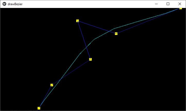
Kivy - Checkbox
在任何 GUI 工具包中,都使用复选框允许用户从可用选项中选择一个或多个。在 Kivy 中,CheckBox 可以配置为使选择互斥(仅可选择可用选项之一),或者允许用户标记任意数量的选择。
-
如果两个或更多复选框的 group 属性值相同,则它们显示为圆形单选按钮;用户只能选择一个选项,因为只有一个复选框的 active 属性可以为 True,对于其他属性,active 属性将自动变为 False。
-
对于没有 group 属性的复选框,它显示为一个矩形框,当按下时,显示一个复选标记,active 属性变为 True。再次单击它,并将删除复选标记,active 属性将变为 False。
CheckBox 类在 kivy.uix.checkbox 模块中定义
from kivy.uix.checkbox import CheckBox
cb = CheckBox(**kwargs)
如果复选框对象绑定到其 active 属性,则每次 active 属性更改时都将调用回调。
checkbox = CheckBox()
checkbox.bind(active=callback)
Example
以下 Python 代码展示了如何使用互斥以及多选复选框。
代码使用垂直 BoxLayout,其中包含两个水平布局和两个标签。上水平布局保留两个复选框,其 group 属性均为“sex”
self.m = CheckBox(group='sex', color=[1,0,1,1])
self.m.bind(active=self.on_male)
gendergrp.add_widget(self.m)
gendergrp.add_widget(Label(text='Female'))
self.f = CheckBox(active=False, group='sex')
self.f.bind(active=self.on_female)
gendergrp.add_widget(self.f)
这两个复选框都调用一个回调方法,该方法标识 active 属性。
下水平框保留三个独立复选框 −
interests.add_widget(Label(text='Sports'))
self.cb1 = CheckBox()
self.cb1.bind(active=self.on_interest)
interests.add_widget(self.cb1)

self.cb2 = CheckBox()
self.cb2.bind(active=self.on_interest)
interests.add_widget(Label(text='Music'))
interests.add_widget(self.cb2)

self.cb3 = CheckBox()
self.cb3.bind(active=self.on_interest)
interests.add_widget(Label(text='Travel'))
interests.add_widget(self.cb3)
单击这些复选框中的每一个时,都会建立和显示水平框下面标签上的已选择兴趣列表。
这是 complete code −
from kivy.app import App
from kivy.uix.label import Label
from kivy.uix.checkbox import CheckBox
from kivy.uix.boxlayout import BoxLayout
from kivy.core.window import Window

Window.size = (720,400)
class CheckBoxApp(App):
   gender=''
   intrst=[]
   def on_male(self, instance, value):
      if value:
         CheckBoxApp.gender='Male'
         self.lbl.text = "Gender selected: "+CheckBoxApp.gender
      else:
         self.lbl.text = "Gender selected: "
   def on_female(self, instance, value):
      if value:
         CheckBoxApp.gender='Female'
         self.lbl.text = "Gender selected: "+CheckBoxApp.gender
      else:
         self.lbl.text = "Gender selected: "
   def on_interest(self, instance, value):
      CheckBoxApp.intrst=[]
      if self.cb1.active:
         CheckBoxApp.intrst.append("Sports")
      if self.cb2.active:
         CheckBoxApp.intrst.append("Music")
      if self.cb3.active:
         CheckBoxApp.intrst.append("Travel")
      self.lbl1.text="Interests Selected: "+" ".join(CheckBoxApp.intrst)

   def build(self):
      main=BoxLayout(orientation='vertical')

      gendergrp=BoxLayout(orientation='horizontal')
      interests = BoxLayout(orientation='horizontal')

      gendergrp.add_widget(Label(text='Gender:'))
      gendergrp.add_widget(Label(text='Male'))
      self.m = CheckBox(group='sex', color=[1,0,1,1])
      self.m.bind(active=self.on_male)
      gendergrp.add_widget(self.m)
      gendergrp.add_widget(Label(text='Female'))
      self.f = CheckBox(active=False, group='sex')
      self.f.bind(active=self.on_female)

      gendergrp.add_widget(self.f)
      main.add_widget(gendergrp)
      self.lbl = Label(text="Gender selected: ", font_size=32)

      main.add_widget(self.lbl)

      interests.add_widget(Label(text='Interests:'))
      interests.add_widget(Label(text='Sports'))
      self.cb1 = CheckBox()
      self.cb1.bind(active=self.on_interest)
      interests.add_widget(self.cb1)

      self.cb2 = CheckBox()
      self.cb2.bind(active=self.on_interest)
      interests.add_widget(Label(text='Music'))
      interests.add_widget(self.cb2)

      self.cb3 = CheckBox()
      self.cb3.bind(active=self.on_interest)
      interests.add_widget(Label(text='Travel'))
      interests.add_widget(self.cb3)

      self.lbl1 = Label(text="Interests selected: ", font_size=32)
      main.add_widget(interests)
      main.add_widget(self.lbl1)

      return main

if __name__ == '__main__':
   CheckBoxApp().run()
Kivy - Dropdown List
Kivy 中的下拉小部件与其他 GUI 工具包中的类似小部件非常不同。Kivy 的下拉列表不仅显示标签,还显示任何其他小部件,例如按钮、图像等。
DropDown 类在“kivy.uix.dropdown”模块中定义。
from kivy.uix.dropdown import DropDown
dropdown=DropDown()
构建下拉对象需要以下步骤 −
-
在此对象中添加其他小部件时,我们需要通过禁用 size_hint 手动指定高度,从而下拉列表计算所需区域。
-
针对在 DropDown 中添加的每个子控件,你需要附加一个会调用下拉列表中 select() 方法的回调。绑定每个子对象并添加到下拉列表对象。
-
将下拉列表添加到一个主按钮并用下拉列表类的 open() 方法将其绑定
-
最后,运行应用程序并单击主按钮。你将看到一个子控件列表下拉。单击其中的任何一个控件以调用其关联的回调。
Example
在此示例中,我们将演示 Kivy 中的下拉列表控件如何工作。应使用 for 循环将十个按钮添加到下拉列表,如下所示:
dropdown = DropDown()

for index in range(1, 11):
   btn = Button(text ='Button '+str(index),
      size_hint_y = None, height = 40)
   btn.bind(on_release = lambda btn: dropdown.select(btn.text))
   dropdown.add_widget(btn)

box.add_widget(dropdown)
我们在 BoxLayout 中放置一个主按钮,将下拉列表对象添加到其中,并将主按钮绑定到下拉列表对象的 open() 方法。
box = BoxLayout(orientation='vertical')
mainbutton = Button(text ='Drop Down Button', size_hint=(None, None), size =(250, 75), pos_hint ={'center_x':.5, 'top':1})
box.add_widget(mainbutton)
mainbutton.add_widget(dropdown)
mainbutton.bind(on_release = dropdown.open)
最后,我们需要监听下拉列表中的选择并为按钮文本分配数据。
dropdown.bind(on_select = lambda instance, x: setattr(mainbutton, 'text', x))所有这些步骤都包含在以下代码的 App 类的 build() 方法中:
from kivy.app import App
from kivy.uix.dropdown import DropDown
from kivy.uix.button import Button
from kivy.uix.boxlayout import BoxLayout
from kivy.core.window import Window

Window.size = (720, 400)

class Drop_down_app(App):
   def build(self):
      box = BoxLayout(orientation='vertical')

      mainbutton = Button(
         text='Drop Down Button', size_hint=(None, None),
         size=(250, 75), pos_hint={'center_x': .5, 'top': 1}
      )
      box.add_widget(mainbutton)
      dropdown = DropDown()
      for index in range(1, 11):
         btn = Button(text='Button ' + str(index),
            size_hint_y=None, height=40)
         btn.bind(on_release=lambda btn: dropdown.select(btn.text))
      dropdown.add_widget(btn)
      box.add_widget(dropdown)

      mainbutton.add_widget(dropdown)
      mainbutton.bind(on_release=dropdown.open)

      dropdown.bind(on_select=lambda instance, x: setattr(mainbutton, 'text', x))
      return box

Drop_down_app().run()

Kivy - Windows
Window 类是 Kivy 框架中的核心类之一。应用程序窗口使用将一个或多个控件放置在特定布局中来构建。build() 方法通常返回单个根控件,它可能是多个其他控件组合而成的,这些控件以树状结构排列。而控件树的根可以被直接添加到应用程序窗口中。
Window 类在 "kivy.core.window" 模块中定义。它继承自 WindowBase 类,这是一个用于任何窗口实现的抽象窗口控件。使用 App 对象启动其事件循环来创建默认应用程序窗口。请注意,Kivy 每个应用程序仅支持一个窗口。
Window 的许多属性是从 Kivy 配置文件(KIVY_HOME 目录中的 "config.ini" 文件)中读取的。
控件维度取决于默认窗口的大小。App 类的 build() 方法中的以下代码将控件树放置到应用程序窗口中。请注意,根控件不会由 build() 方法返回。相反,将其添加到 Window 对象的 add_widget() 方法。
box=BoxLayout(orientation='vertical')

l=Label(text='Window Properties', font_size=32)
box.add_widget(l)

b1=ToggleButton(text='Fullscreen')
b2=ToggleButton(text='Border')
b3=ToggleButton(text='Position')

bh=BoxLayout(orientation='horizontal', size_hint=(1, .2))
bh.add_widget(b1)
bh.add_widget(b2)
bh.add_widget(b3)

box.add_widget(bh)
Window.add_widget(box)
Events
Window 对象可以识别不同类型的事件:
-
当新 MotionEvent 被分派时,触发 on_motion 事件。
-
窗口吸收触摸事件 on_touch_down, on_touch_move, on_touch_up 等。
-
窗口关闭时,触发 on_close 事件。
-
当用户希望通过按标题栏上的关闭按钮来结束事件循环时,会发生 on_request_close 事件。
-
当光标进入窗口时,触发 on_cursor_enter 事件。
-
同样, 当光标离开窗口时,会发生 on_cursor_leave 事件。
-
当窗口最小化和最大化后,会激发 on_minimize and on_maximize 事件。
-
当窗口恢复时,会激发 on_restore 事件。
与触摸事件类似,当按下或释放某个键时,键盘事件 on_key_down 和 on_key_up 会发出键、扫描码、代码点和模式。
在本章的演示示例中,我们用回调方法绑定一些窗口事件。
Window.bind(on_request_close = self.on_close)
Window.bind(on_cursor_leave=self.on_leave)
Window.bind(on_cursor_enter=self.on_enter)
无论何时鼠标指针离开窗口区域,on_leave() 方法都将被调用。
def on_leave(self, *args):
   print ("leaving the window")
同样,当鼠标进入窗口区域时,会调用 on_enter 回调。
def on_enter(self, *args):
   print ("Entering the window")
当用户选择关闭事件循环时,会引发 on_request_close 事件。如果用户按 X 按钮,以下回调则询问用户是否要退出。您还可以使弹出窗口出现。
def on_close(self, instance):
   resp=input("Do you want the window to close?")
   if resp=='y': Window.close()
Properties
应用程序窗口的外观由 Window 类中定义的许多属性决定。它们的默认值由 config.ini 文件提供。但是,可以在应用程序代码中修改它们。部分窗口属性如下所示:
-
borderless − 当设置为 True 时,此属性会移除窗口边框/装饰。
-
children − 返回此窗口的子项列表。
-
clearcolor − 用于清除窗口的颜色。clear() 方法用此颜色的值使用此属性
from kivy.core.window import Window
Window.clearcolor = (1, 0, 0, 1)
Window.clear()-
custom_titlebar − 当设置为 True 时,允许用户设置窗口小部件为标题栏。
-
fullscreen − 此属性设置窗口的全屏模式。可用的选项是:True、False、“auto”和“fake”。
-
left , top − 窗口的左上角位置。这是 SDL2 的属性,左上角是 [0, 0]。
-
size − 获取/设置窗口的大小。
from kivy.core.window import Window
Window.size = (720,400)
您还可以通过修改 config 值来设置大小:
from kivy.config import Config
Config.set('graphics', 'width', '720')
Config.set('graphics', 'height', '400')
Config.set('graphics', 'resizable', '1')
我们处理一些窗口属性。在这个程序的应用程序窗口上,我们有三个切换按钮。我们用回调将其绑定。
b1.bind(on_press=self.pressed)
b2.bind(on_press=self.bordered)
b3.bind(on_press=self.positioned)
pressed() 方法在全屏和正常之间切换全屏状态。
def pressed(self, instance):
   if instance.state=='down':
      Window.set_title("Kivy Full screen window")
      Window.maximize()
   elif instance.state=='normal':
      Window.set_title('Kivy Restored Window')
      Window.restore()
在按下 b2 按钮时,bordered() 方法使窗口无边框,而在释放时返回原始边框窗口。
def bordered(self, instance):
   print (Window.top, Window.left)
   if instance.state=='down':
      Window.borderless=True
   elif instance.state=='normal':
      Window.borderless=False
positioned() 回调将窗口移动到 (0,0) 位置,并在按下/释放 b3 时返回到其先前位置。
def positioned(self, instance):
   print (Window.top, Window.left)
   if instance.state=='down':
      self.x, self.y=Window.left, Window.top
      Window.left, Window.top=(0,0)
   elif instance.state=='normal':
      Window.left, Window.top=self.x,self.y
在开始时,Application 窗口如下所示。生成事件(在 request_close 上鼠标离开、进入)并查看回调动作。同样检查切换按钮的动作。

Kivy - ScrollView
Kivy 框架中的 ScrollView 小部件将尺寸大于分配给它的尺寸的任何其他小部件包裹起来,并向其提供一个可滚动的面板。这样,可以纵向或横向平移/滚动包裹的小部件。
ScrollView 类在 kivy.uix.scrollview 模块中进行定义。您通常在一个布局中组合一个或多个小部件,并将该布局添加到 ScrollView。
from kivy.uix.scrollview import ScrollView
view = ScrollView()
view.add_widget(layout)
ScrollView 对象的 “scroll_x” 和 “scroll_y” 属性控制滚动面板的滚动行为。Scrollview 允许双向滚动。您可以通过将 “do_scroll_x” 或 “do_scroll_y” 设置为 False 来禁用某个轴。
此外,“scroll_distance” 属性设置要移动的最小距离,默认为 20 像素。另外,scroll_timeout 属性指定最大时间段,默认为 55 毫秒。
“scroll_distance” 和 “scroll_timeout” 的重要性在于:如果通过触摸手势滚动的像素数多于或等于 scroll_distance,并且在 scroll_timeout 时间段内,它将被识别为滚动手势并将开始平移(滚动/平移)。如果发生超时,则触摸按下事件将传播到子级。
ScrollView 类的其他属性如下所示 −
-
do_scroll − 允许在 X 或 Y 轴上滚动。
-
do_scroll_x − 允许在 X 轴上滚动。这是一个 BooleanProperty,默认为 True。
-
do_scroll_y − 允许在 Y 轴上滚动。这是一个 BooleanProperty,默认为 True。
-
scroll_distance − 开始滚动 ScrollView 之前滚动的距离(以像素为单位)。这是一个数字属性,且默认值为 20 像素。
-
scroll_timeout − 允许触发 scroll_distance 的超时(以毫秒为单位),默认值为 55 毫秒。
-
scroll_to() − 滚动视区以确保给定小组件可见,可以选择使用填充和动画。
-
scroll_type − 设置用于 scrollview 中内容滚动的类型。可选的选项有:['content'], ['bars'], ['bars', 'content']。
-
ScrollView 对象发出以下事件 − on_scroll_start − 当从触控开始滚动时触发的通用事件。 on_scroll_move − 当滚动从触控移动时触发的通用事件。 on_scroll_stop − 当从触控停止滚动时触发的通用事件。
Example
为了能够理解 ScrollView 的运行机制,我们需要一个足够大的布局,方式可以溢出主应用程序窗口的尺寸。为此,我们向一列网格布局中添加 100 个按钮,并应用 scrollview 到它。
以下示例中的操作码如下:
layout = GridLayout(cols=1)

for i in range(100):
   btn = Button(text='Button ' + str(i), size_hint_y=None, height=40)
   layout.add_widget(btn)

root = ScrollView()
root.add_widget(layout)
为了确保高度能够滚动,将布局对象的 minimum_height 属性绑定到其 setter。
layout.bind(minimum_height=layout.setter('height'))以下为 ScrollView 示例代码的完整代码:
from kivy.uix.gridlayout import GridLayout
from kivy.uix.button import Button
from kivy.uix.scrollview import ScrollView
from kivy.app import App
from kivy.core.window import Window

Window.size = (720, 350)

class scrollableapp(App):
   def build(self):
      layout = GridLayout(cols=1, spacing=10, size_hint_y=None)
      layout.bind(minimum_height=layout.setter('height'))

      for i in range(100):
         btn = Button(text='Button ' + str(i), size_hint_y=None, height=40)
         layout.add_widget(btn)

      root = ScrollView(
         size_hint=(1, None),
         size=(Window.width, Window.height)
      )
      root.add_widget(layout)
      return root

scrollableapp().run()
Kivy - Carousel
走马灯是用于循环播放一系列内容的幻灯片放映。Kivy 框架包括一个 Carousel 窗口小部件,它允许你轻松创建可浏览的幻灯片放映,这对于诸如智能手机之类的触摸屏设备特别有用。走马灯中的页面可以在水平或垂直方向上移动。
Carousel 类定义在 “kivy.uix.carousel” 模块中。
from kivy.uix.carousel import Carousel
carousel = Carousel(**kwargs)
下面给出创建一个使用走马灯的简单幻灯片放映的 Python/Kivy 程序:
from kivy.app import App
from kivy.uix.carousel import Carousel
from kivy.uix.image import Image

class CarouselApp(App):
   def build(self):
      carousel = Carousel(direction='right')
      img1=Image(source='1.png')
      carousel.add_widget(img1)
      img2=Image(source='2.png')
      carousel.add_widget(img2)
      img3=Image(source='3.png')
      carousel.add_widget(img3)
      return carousel
CarouselApp().run()
你也可以使用 “kv” 语言脚本构建走马灯。
Carousel:
   direction: 'right'
   Image:
      source: '1.png'
   Image:
      source: '2.png'
   Image:
      source: '3.png'
   Image:
      source: '4.png'
Carousel 类定义了以下属性:
-
current_slide - 当前显示的幻灯片。current_slide 是一个 AliasProperty。
-
direction - 指定幻灯片的排序方向。它与用户从一个幻灯片切换到下一个幻灯片时滑动的方向相对应。它可以是 right、left、top 或 bottom。
-
index - 根据索引获取/设置当前幻灯片。index 默认值为 0(第一项)。
-
load_next(mode='next') - 动画播放到下一张幻灯片。
-
load_previous() - 动画播放到上一张幻灯片。
-
load_slide(slide) - 动画播放到作为参数传递的幻灯片。
-
loop - 允许走马灯无限循环。如果为 True,当用户尝试滑动到最后一页之外时,它将返回到第一页。如果为 False,它将停留在最后一页。
-
next_slide - 走马灯中的下一张幻灯片。如果当前幻灯片是走马灯中的最后一张幻灯片,则它为 None。
-
previous_slide - 走马灯中的上一张幻灯片。如果当前幻灯片是走马灯中的第一张幻灯片,则它为 None。
-
scroll_distance - 在以像素为单位滚动走马灯之前移动的距离。默认距离为 20dp。
-
scroll_timeout - 触发 scroll_distance 允许的超时,以毫秒为单位。默认为 200(毫秒)
-
slides − 轮播内幻灯片列表。
Example
以下是 Kivy 中轮播的一个示例代码。轮播对象用作应用程序的根小部件,我们将标签、按钮和图像添加为其幻灯片。
from kivy.app import App
from kivy.uix.button import Button
from kivy.uix.carousel import Carousel
from kivy.uix.image import Image
from kivy.core.window import Window
Window.size = (720,350)

class CarouselApp(App):
   def build(self):
      carousel = Carousel(direction='right')
      carousel.add_widget(Button(text='Button 1', font_size=32))
      src = "ganapati.png"
      image = Image(source=src, fit_mode="contain")
      carousel.add_widget(image)
      carousel.add_widget(Button(text="Button 2", font_size=32))
      return carousel
CarouselApp().run()

Kivy - Slider
在 Kivy 框架中,Slider 小部件在要设置连续可变数值属性的值时是一个非常有用的控件。例如,电视屏幕或移动设备或扬声器声音的亮度。
滑块小部件的外观是,有旋钮在其上滑动以设置值,是水平或垂直栏。当旋钮在水平滑块的左侧时,它对应于一个最小值;当它在极右侧时,它对应于一个最大值。
Slider 类在“kivy.uix.slider”类中定义。
from kivy.uix.slider import Slider slider = Slider(**kwargs)
要在 Kivy 中创建一个基本滑块控件,我们可以使用以下代码 −
from kivy.uix.slider import Slider
s = Slider(min=0, max=100, value=25)
滑块控件的默认方向为水平。如需要,设置 orientation='vertical' 。您应该在 Kivy 应用程序窗口上获得如下所示的滑块。

可以使用鼠标或触控(在触摸屏上)沿滑块移动旋钮。
要根据滑块值的更改调用某个操作,将值属性绑定到某个回调。
def on_value_changed(self, instance, val):
   print (val)

s.bind(value = on_value_changed)
以下是 Slider 类的部分重要属性 −
-
max − 允许的最大值。max 是一个 NumericProperty,默认为 100。
-
min − 允许的最小值。min 是一个 NumericProperty,默认为 0。
-
orientation − 滑块的方向。orientation 是一个 OptionProperty,默认为 'horizontal'。可以取 'vertical' 或 'horizontal' 的值。
-
padding − 滑块的内边距。内边距用于图形表示和交互操作。它可防止光标超出滑块边框的范围。padding 是一个 NumericProperty,默认为 16sp。
-
range − 滑块的范围格式为 (最小值,最大值) 是 (min, max) 属性的 ReferenceListProperty。
-
sensitivity − 触摸是与小部件的整个主体产生碰撞还是仅与滑块的处理手柄部分发生碰撞。sensitivity 是 OptionProperty,默认为“全部”。可采用“全部”或“处理程序”的值。
-
step − 滑块的步长。决定滑块在 min 和 max 之间采取的每个间隔或步骤的大小。step 是 NumericProperty,默认为 0。
-
value − 滑块使用的当前值。value 是 NumericProperty,默认为 0。
-
value_track − 决定滑块是否应绘制指示 min 和 value 属性值之间的空间的线。这是一个 BooleanProperty,默认为 False。
-
value_track_color − value_line 的颜色采用 rgba 格式。value_track_color 是 ColorProperty,默认为 [1, 1, 1, 1]。
-
value_track_width − 轨道线的宽度,默认为 3dp。
Example
在下面的代码中,我们使用三个滑块小部件允许用户为所需颜色设置 RGB 值。滑块的值用于更改 RGB 值。例如,RED 滑块变化会设置“r”分量值 −
def on_red(self, instance, val):
   self.r = int(val)/255
   self.colour=[self.r, self.g, self.b, self.t]
   self.redValue.text = str(int(val))
还编码了针对 Green 和 Blue 的类似回调。这些值被赋予 colur 变量的值,该变量是 ColorProperty 类型。它绑定到 Label 小部件的颜色属性。
colour = ColorProperty([1,0,0,1])

def on_colour_change(self, instance, value):
   self.ttl.color=self.colour
结果,通过滑块设置 RGB 值会改变 Label 的文本颜色。
三个滑块控件与必需的标签一起被放置在一个包含四列的内部网格布局中。包含一列的上层网格容纳一个标签,标签的颜色将根据滑块的移动而改变。
complete code 如下所示 -
from kivy.app import App
from kivy.uix.gridlayout import GridLayout
from kivy.uix.slider import Slider
from kivy.uix.label import Label
from kivy.properties import ColorProperty, NumericProperty
from kivy.core.window import Window

Window.size = (720, 400)

class SliderExample(App):
   r = NumericProperty(0)
   g = NumericProperty(0)
   b = NumericProperty(0)
   t = NumericProperty(1)
   colour = ColorProperty([1, 0, 0, 1])

   def on_colour_change(self, instance, value):
      self.ttl.color = self.colour

   def on_red(self, instance, val):
      self.r = int(val) / 255
      self.colour = [self.r, self.g, self.b, self.t]
      self.redValue.text = str(int(val))

   def on_green(self, instance, val):
      self.g = int(val) / 255
      self.colour = [self.r, self.g, self.b, self.t]
      self.greenValue.text = str(int(val))

   def on_blue(self, instance, val):
      self.b = int(val) / 255
      self.colour = [self.r, self.g, self.b, self.t]
      self.blueValue.text = str(int(val))

   def build(self):
      maingrid = GridLayout(cols=1)
      self.ttl = Label(
         text='Slider Example',
         color=self.colour, font_size=32
      )
      maingrid.add_widget(self.ttl)
      grid = GridLayout(cols=4)
      self.red = Slider(min=0, max=255)
      self.green = Slider(min=0, max=255)
      self.blue = Slider(min=0, max=255)
      grid.add_widget(Label(text='RED'))
      grid.add_widget(self.red)
      grid.add_widget(Label(text='Slider Value'))
      self.redValue = Label(text='0')
      grid.add_widget(self.redValue)
      self.red.bind(value=self.on_red)

      grid.add_widget(Label(text='GREEN'))
      grid.add_widget(self.green)
      grid.add_widget(Label(text='Slider Value'))
      self.greenValue = Label(text='0')
      grid.add_widget(self.greenValue)
      self.green.bind(value=self.on_green)

      grid.add_widget(Label(text='BLUE'))
      grid.add_widget(self.blue)
      grid.add_widget(Label(text='Slider Value'))
      self.blueValue = Label(text='0')
      grid.add_widget(self.blueValue)
      self.blue.bind(value=self.on_blue)
      self.bind(colour=self.on_colour_change)
      maingrid.add_widget(grid)
      return maingrid

root = SliderExample()
root.run()
Kivy - Images
能够显示图像对于任何 GUI 应用程序都是一项基本要求。Kivy 框架包含 Image 小部件作为图像容器。它能够从 png、jpg 和 GIF 文件加载图像数据。对于 SVG 文件,你可能必须使用另一个名为 Svg 的小部件本身。
Kivy 包含两个图像小部件 − Image 和 AsyncImage 。它们在“kivy.uix.image”模块中定义。
Image 小部件用于加载本地计算机中可用的图像文件。
from kivy.uix.image import Image
img = Image(source = 'logo.png')
要从任何外部源加载任何图像,你需使用 AsyncImage 小部件。AsyncImage 类是 Image 类的一个子类。
from kivy.uix.image import AsyncImage
img = AsyncImage(source = 'http://xyz.com/logo.png')
如果你需要通过从 URL 检索图像来显示图像,AsyncImage 会在后台线程中执行此操作,而不会阻塞你的应用程序。
Image 类定义以下属性 −
-
source − 图像的文件名/来源。source 是 StringProperty,默认为 None。
-
fit_mode − 如果图像的大小与小部件的大小不同,此属性决定如何调整图像大小以适应小部件框。
Available Options
-
scale-down − 对于大于 Image 小部件尺寸的图像,图像会缩小以适应小部件框,同时保持其纵横比并且不会被拉伸。如果图像尺寸小于小部件,它将以其原始大小显示。
-
fill − 图像将被拉伸以填充该控件,无论其纵横比或尺寸如何。如果图像的纵横比与该控件不同,此选项会导致图像变形。
-
contain − 图像调整大小以适合该控件框,同时保持其纵横比。如果图像大小大于控件大小,则行为类似于“缩小”。但是,如果图像大小小于控件大小,则与“缩小”不同,图像将调整大小以适合该控件。
-
cover − 图像将水平或垂直拉伸以填充控件框,同时保持其纵横比。如果图像的纵横比与该控件不同,则将剪裁图像以适合。
-
texture − 图像的纹理对象。纹理表示原始加载的图像纹理。它在渲染过程中根据 fit_mode 属性进行拉伸和定位。
-
texture_size − 图像的纹理大小。这表示原始加载的图像纹理大小。
-
color − 图像颜色,格式为 (r, g, b, a)。此属性可用于“着色”图像。但是,如果源图像不是灰色/白色,则颜色实际上不会按预期工作。
-
image_ratio − 返回图像比例(width / float(height))的只读属性。
-
reload() − 从磁盘重新加载图像。万一图像内容发生变化,这有助于重新从磁盘加载图像。
img = Image(source = '1.jpg')
img.reload()
Example
在下面的示例代码中,我们主要尝试演示 fit_mode 属性的影响。以下是一个“kv”语言脚本,用于在轮播控件中显示不同的图像。每个图像都有不同的 fit_mode 属性值。
“kv”语言脚本是 −
Carousel:
   direction:'top'
   Image:
      source:'1.png'
      fit_mode:"scale-down"
   Image:
      source:"TPlogo.png"
      fit_mode:"contain"
   Image:
      source:"TPlogo.png"
      fit_mode:"fill"
   Image:
      source:"TPlogo.png"
      fit_mode:"cover"


Kivy - Popup
Kivy 中的 Popup 控件提供了一个对话框,该对话框出现在主父窗口上,通常是对按钮单击事件的响应。对于许多目的使用对话框,例如向用户显示某个消息,让用户输入一些内容,或让用户确认某项操作。
一般来说,任何 GUI 应用程序中的对话框有两种类型:模态和非模态。一个不允许用户在不与它交互的情况下与父窗口交互的对话框称为模态对话框。另一方面,如果用户可以在不与之交互的情况下关闭对话框,则它是非模态对话框。
在 Kivy 中,弹出对话框通常会覆盖整个父窗口。您可以根据需要配置它的大小。
Popup 类在“kivy.uix.popup”模块中定义。
from kivy.uix.popup import Popup
popup = Popup(**kwargs)
Popup 对象预先配置了一个布局,该布局包含标题和分隔栏。我们可以通过向其布局参数中添加其他小工具来自定义布局。
以下代码片段在父窗口上方生成一个简单的弹出窗口 -
from kivy.uix.popup import Popup
popup = Popup(title='Popup Demo',
   content=Label(text='This is a Popup'),
   size_hint=(None, None), size=(400, 400))
您需要调用 Popup 对象的 open() 方法来显示它。
popup.open()弹出窗口显示后,其将通过点击其外部而消失。若要防止弹出窗口自动消失,请将 auto_dismiss 属性设置为 False。您需要显式调用 popup.dismiss() 方法。通常,这是通过将其绑定到按钮的 on_press 事件来完成的。
class popdemo(App):
   def build(self):
      btn = Button(text="Click here")
      btn.bind(on_press=self.onButtonPress)
      return btn

   def onButtonPress(self, button):
      layout = GridLayout(cols=1)
      lbl = Label(text='Hello world')
      closeButton = Button(text="OK")
      layout.add_widget(lbl)
      layout.add_widget(closeButton)
      popup = Popup(
         title='Popup Demo', content=layout,
         auto_dismiss=False, size_hint=(None, None),
         size=(400, 400)
      )
      popup.open()
      closeButton.bind(on_press=self.on_close)

   def on_close(self, event):
      self.popup.dismiss()
当带有“单击此处”标题的按钮被单击时,您将得到一个弹出对话框,如下所示 -

按弹出窗口上的确定按钮以将其关闭。
Popup 类定义了以下属性 -
-
content - 在标题正下方显示的弹出窗口的内容。content 是一个 ObjectProperty,默认为 None。
-
title - 表示弹出窗口标题的字符串。title 是一个 StringProperty,默认为“无标题”。
Popup 对象响应以下事件 -
-
on_open - 在打开 Popup 时触发。
-
on_dismiss - 在关闭 Popup 时触发。如果回调返回 True,则取消关闭。
Example
以下代码给出了 Kivy 中 Popup 对话框的一个很好的示例。首先,我们将一个标签和一个按钮添加到父窗口的垂直框布局中。按钮单击会弹出包含文本输入框的单列网格布局,要求用户输入姓名。在弹出窗口关闭后,该文本用于更改父窗口的标签。
这是 complete code −
from kivy.app import App
from kivy.uix.button import Button
from kivy.uix.label import Label
from kivy.uix.textinput import TextInput
from kivy.uix.gridlayout import GridLayout
from kivy.uix.popup import Popup
from kivy.core.window import Window

Window.size = (720, 400)

class PopupExample(App):
   def build(self):
      self.layout = GridLayout(cols=1, padding=10)

      self.l1 = Label(
         text='enter your name', font_size=32,
         color=[.8, .6, .4, 1]
      )
      self.layout.add_widget(self.l1)

      self.button = Button(text="Click Here")
      self.layout.add_widget(self.button)
      self.button.bind(on_press=self.onButtonPress)
      return self.layout

   def onButtonPress(self, button):
      layout = GridLayout(cols=1, padding=10)

      popupLabel = Label(text="Enter name")
      self.t1 = TextInput()
      closeButton = Button(text="OK")

      layout.add_widget(popupLabel)
      layout.add_widget(self.t1)
      layout.add_widget(closeButton)

      self.popup = Popup(
         title='Hello', content=layout,
         auto_dismiss=False, size_hint=(None, None),
         size=(200, 200)
      )
      self.popup.open()
      closeButton.bind(on_press=self.on_close)

   def on_close(self, event):
      self.l1.text = 'Thanks ' + self.t1.text
      self.popup.dismiss()
PopupExample().run()
Kivy - Switch
Kivy 框架中的 Switch 小工具类似于我们在家里用来打开或关闭灯泡或风扇的电气开关。应用程序窗口上的开关可以通过将其活动属性切换为 True 或 False 来翻转。
Switch 类定义在“kivy.uix.switch: 模块中。
from kivy.uix.switch import Switch
switch = Switch(**kwargs)
当放置在应用程序窗口上时,Switch 对象会显示如下 -

Switch 类定义了一个名为 active 的布尔属性,该属性指示开关是否打开/关闭。通常,此属性附加到回调函数中,以便在其值从 True 更改为 False 或从 False 更改为 True 时调用所需的操作。
def callback(instance, value):
   if value:
      print('the switch is ON')
   else:
      print ('The switch is OFF')
switch = Switch()
switch.bind(active=callback)
Example
我们将在以下代码中使用 Switch 小工具开始或停止播放音频。应用程序设计包含一个标签和一个放置在水平框布局中的开关。
Switch 的活动属性已绑定到 switched() 方法。当开启时,将加载 Sound 对象,并调用其 play() 方法。另一方面,当切换到关闭时,将调用 stop() 方法。
from kivy.app import App
from kivy.uix.label import Label
from kivy.uix.boxlayout import BoxLayout
from kivy.core.audio import SoundLoader
from kivy.uix.switch import Switch
from kivy.core.window import Window

Window.size = (720, 250)

class switchdemoapp(App):
   def switched(self, instance, value):
      if value == True:
         self.sound = SoundLoader.load('sample.mp3')
         self.l1.text = 'Playing. . .'
         self.sound.play()
      else:
         self.sound.stop()
         self.l1.text = 'Switch ON to Play'
   def build(self):
      box = BoxLayout(orientation='horizontal')
      self.l1 = Label(
         text = 'Switch ON to Play',
         font_size = 32, color = [.8, .6, .4, 1]
      )
      box.add_widget(self.l1)
      switch = Switch()
      switch.bind(active = self.switched)
      box.add_widget(switch)
      return box

switchdemoapp().run()
Kivy - Spinner
Kivy 框架中的 Spinner 控件是一种更传统的下拉控件类型,不同于 Kivy 的 DropDown 小部件。与 DropDown相比,构造和使用 Spinner 小部件更加容易和方便。
Kivy 的下拉菜单和小部件之间主要的区别是,下拉菜单小部件可能包含任何其他 Kivy 小部件,例如标签、按钮、图像等;而下拉菜单只是字符串的列表。
Spinner 类在“kivy.uix.spinner”模块中定义
from kivy.uix.spinner import Spinner
spin = Spinner(**kwargs)
Spinner 小部件显示与当前选择的值相对应的文本标题。Spinner 对象可以用不同的属性构造,作为关键字参数。但是,这两个属性很重要 -
-
text 属性是一个字符串,显示默认值。
-
values 属性是一个 ListProperty,包含从中选择的所有值。
要构造一个简单的下拉列表,请使用以下代码段 -
from kivy.base import runTouchApp
from kivy.uix.spinner import Spinner

spinner = Spinner(
   text='English',
   values=('English', 'French', 'German', 'Chinese')
)
下拉列表对象的文本属性可以绑定到一个回调,以便在进行选择时调用适当的操作。
def value_changed(spinner, text):
   print(You selected', text, 'language')

spinner.bind(text=show_selected_value)
Spinner 类中的其他属性如下所列 -
-
dropdown_cls - 一个类,用于在按下 Spinner 时显示下拉列表。它是一个 ObjectProperty,默认为 DropDown。
-
is_open - 默认情况下,下拉列表不打开。设置为 True 以打开它。
-
option_cls - 一个类,用于显示 Spinner 下方显示的下拉列表中的选项。该类的文本属性将用于表示该值。它的 on_release 事件用于在按下/触摸时触发该选项。
-
text_autoupdate - 这是一个 BooleanProperty。它表示下拉列表的文本是否应使用 values 属性的第一个值自动更新。将其设置为 True 将导致下拉列表在每次更改值时更新其文本属性。
-
values - 用户可以选择的值。它必须是字符串列表。它是一个 ListProperty,默认为 []。
下面的代码组合了一个 Spinner,它与一个标签关联,以在水平框中显示选定的值。较低的水平框有一个 TextInput 和一个 Button。目的是在此按钮上提供一个回调,将文本框中的字符串添加到 Spinner 值
程序在 App 类中有两个回调方法。一个用于显示从下拉菜单中选定的值,另一个用于向下拉菜单中添加新语言。
用于添加新语言的回调——
def addvalue(self, instance):
   self.spin1.values.append(self.t1.text)
我们要将这个方法绑定到“添加”按钮上。
要在标签上显示选定的语言——
def on_spinner_select(self, spinner, text):
   self.spinnerSelection.text = "Selected Language is: %s" %self.spin1.text
我们要将这个方法绑定到下拉菜单小部件的“文本”属性上。
Example
将以下代码另存为“spiinerdemo.py”并运行
from kivy.app import App
from kivy.uix.label import Label
from kivy.uix.spinner import Spinner
from kivy.uix.boxlayout import BoxLayout
from kivy.uix.textinput import TextInput
from kivy.uix.button import Button
from kivy.core.window import Window

Window.size = (720, 400)

class SpinnerExample(App):
   def addvalue(self, instance):
      self.spin1.values.append(self.t1.text)

   def build(self):
      layout = BoxLayout(orientation='vertical')
      lo1 = BoxLayout(orientation='horizontal')
      self.spin1 = Spinner(
         text="Python",
         values=("Python", "Java", "C++", "C", "C#", "PHP"),
         background_color=(0.784, 0.443, 0.216, 1),
         size_hint=(.5, .4), pos_hint={'top': 1}
      )
      lo1.add_widget(self.spin1)
      self.spinnerSelection = Label(
         text="Selected value in spinner is: %s" % self.spin1.text,
         pos_hint={'top': 1, 'x': .4}
      )
      lo1.add_widget(self.spinnerSelection)
      layout.add_widget(lo1)
      lo2 = BoxLayout(orientation='horizontal')
      lo2.add_widget(Label(text="Add Language"))
      self.t1 = TextInput()

      self.b1 = Button(text='add')
      lo2.add_widget(self.t1)
      lo2.add_widget(self.b1)
      layout.add_widget(lo2)
      self.spin1.bind(text=self.on_spinner_select)
      self.b1.bind(on_press=self.addvalue)
      return layout

   def on_spinner_select(self, spinner, text):
      self.spinnerSelection.text = "Selected value in spinner is: %s" % self.spin1.text
      print('The spinner', spinner, 'have text', text)

if __name__ == '__main__':
   SpinnerExample().run()
Kivy - Splitter
Kivy 中的 Splitter 小部件在任何其他小部件或其中包含的布局周围放置一个可拖动的边界。您可以拖动边界以调整其中封闭的对象的大小。该边界可以放置在封闭小部件的顶部或底部,或者其左侧或右侧。
Splitter 类在 “kivy.uix.splitter” 模块中定义。
from kivy.uix.splitter import Splitter
split = Splitter(**kwargs)
配置边界放置所需的一个重要属性是 'sizable_from'。它定义了小部件可从哪个方向调整大小。选项包括:左、右、上或下;默认为“左”。
边界中间有一个 grip 。您可以使用此抓手甚至通过双击它来拖动边界。
Splitter 类的其他属性如下 -
-
border - 用于 BorderImage 图形指令的边框。这必须是四个值列表:(下、右、上、左),默认值为 [4,4,4,4]
-
keep_within_parent - 如果为 True,它会将分割器限制在父小部件中。
-
max_size - 指定小部件不可调整大小的最大尺寸。max_size 默认为 500pt。
-
min_size - 指定小部件不可调整大小的最小尺寸。默认为 100 pt。
-
rescale_with_parent - 如果为 True,当在 min_size 和 max_size 内调整大小时,将自动调整大小以保持父小部件的相同比例。
-
sizable_from - 指定小部件是否可调整大小。选项包括:左、右、上或下;默认为左。

Example
让我们创建一个简单的水平框布局,并将一个 Image 小部件放置在两个按钮之间。然而,Image 对象被放置在从左侧可调整大小的 Splitter 中。
from kivy.app import App
from kivy.uix.button import Button
from kivy.uix.image import Image
from kivy.uix.boxlayout import BoxLayout
from kivy.uix.splitter import Splitter
from kivy.core.window import Window

Window.size = (720,350)

class splitterApp(App):
   def build(self):
      layout=BoxLayout(orientation='horizontal')
      b1=Button(
         text='Button1',
         font_size=24, color=(1,0,0,1)
      )
      layout.add_widget(b1)
      spl=Splitter(sizable_from = 'left')
      img=Image(source='Logo.jpg')
      spl.add_widget(img)
      layout.add_widget(spl)
      b2=Button(
         text='Button 2', font_size=24,
         background_color =(.8, .4, .3, 1)
      )
      layout.add_widget(b2)
      return layout

splitterApp().run()
Output
随着程序的运行,您将在图像左侧看到带有抓手的可拖动边界。拖动它以调整图像大小。

以下是展示从底部可调整大小的垂直分割器用法的程序的 “kv” 脚本版本。
BoxLayout:
   orientation:'vertical'
   Button:
      text: 'Button 1'
      font_size:24
      color:(1,0,0,1)
   Splitter:
      sizable_from : 'bottom'
      Image:
         source:'Logo.jpg'
   Button:
      text:'Button 2'
      font_size:24
      background_color: (.8, .4, .3, 1)
垂直可调整大小的图像小部件如下所示 -

Kivy - Progress Bar
当 GUI 应用程序执行某个耗时过程时,应有一些机制让用户了解其进度。Kivy 框架中的 Progressbar 小部件显示了正在进行的任务进度的可视化表示。
Kivy 的进度条小部件只支持水平模式,并以增量进度显示在应用程序窗口上。
Progressbar 类被定义在 "kivy.uix.progressbar" 模块中。
from kivy.uix.progressbar import ProgressBar
pb = Progressbar(**kwargs)
Progressbar 控件是一个仅显示控件,并且没有任何互动元素,因为它不会引发和传播任何事件。
要创建 Progressbar 的实例,您需要设置其 max 属性。
from kivy.uix.progressbar import ProgressBar
pb = ProgressBar(max=1000)
该控件具有 value 属性。您可以将其分配给小于其 "max" 属性的任何数字。
pb.value=100然而,由于 progressbar 类没有任何事件和事件处理程序,我们需要将 value 属性手动链接到某个进程。
可以通过周期性地读取渐进式任务的某个属性的瞬时值,进而更新进度条的 value 属性来完成此操作。
让我们说我们有一个长 for 循环,它每隔一秒就执行下一个迭代。
for i in range(1000):
   time.delay(1)
   print (i)
我们希望在进度条上显示 I 的增量。因此,我们安排了一个时钟事件,在每隔一秒后调用函数。
progev = Clock.schedule_interval(update_progress, 1.0)在每秒之后,update_progesss() 函数将进度条的 value 属性更新为迭代计数器 i
def update_progress():
   pb.value = i
Example
让我们在下面的代码中实现此方法。GUI 设计中包含两个按钮和一个标签。当按下了启动按钮时,它将一个 mp3 文件加载到 Sound 对象中。声音文件的长度被用作 progressbar 的 max 属性。
self.sound = SoundLoader.load('sample.mp3')
self.length = self.sound.length
当调用 play() 方法时,我们如上所述安排了一个进度事件。
self.prog_ev = Clock.schedule_interval(self.update_progress, 1.0)update_progress() 方法读取 Sound 对象的 pos 属性,并使用它来更新 progressbar 的 value 属性
def update_progress(self, dt):
   if self.sound.state=='play':
      if self.prg.value < self.length:
         self.progress += 1 # Update value.
         self.prg.value=self.progress
这是 complete code −
from kivy.app import App
from kivy.clock import Clock
from kivy.uix.button import Button
from kivy.uix.label import Label
from kivy.uix.boxlayout import BoxLayout
from kivy.uix.gridlayout import GridLayout
from kivy.core.audio import SoundLoader
from kivy.uix.progressbar import ProgressBar
from kivy.properties import NumericProperty
from kivy.core.window import Window

Window.size = (720, 400)

class audiodemoapp(App):
   length = NumericProperty(0.0)
   progress = NumericProperty(0.0)

   def build(self):
      layout = GridLayout(cols=1, padding=10)
      self.prg = ProgressBar()
      layout.add_widget(self.prg)
      self.l1 = Label(
         text='Press Start to Play', font_size=40,
         color=[.8, .6, .4, 1]
      )
      layout.add_widget(self.l1)
      box = BoxLayout(orientation='horizontal')
      self.button1 = Button(text="Start", font_size=32)
      self.button2 = Button(
         text='Pause', font_size=32,
         disabled=True
      )
      box.add_widget(self.button1)
      box.add_widget(self.button2)
      layout.add_widget(box)
      self.button1.bind(on_press=self.start_stop)
      self.button2.bind(on_press=self.pause_resume)

      return layout

   def start_stop(self, event):
      if self.button1.text == 'Start':
         self.l1.text = 'Playing'
         self.button1.text = 'Stop'
         self.sound = SoundLoader.load('sample.mp3')
         self.length = self.sound.length
         self.pos = 0
         self.button2.disabled = False
         self.sound.play()
         self.prog_ev = Clock.schedule_interval(self.update_progress, 1.0)
      else:
         if self.button1.text == 'Stop':
            self.l1.text = 'Press Start to Play'
            self.sound.state = 'stop'
            self.button1.text = 'Start'
            self.sound.unload()
            self.button2.disabled = True
            self.pos = 0

   def pause_resume(self, event):
      if self.button2.text == 'Pause':
         self.button2.text = 'Resume'
         self.l1.text == 'Paused'
         self.pos = self.sound.get_pos()
         self.sound.stop()
      else:
         if self.button2.text == 'Resume':
            self.l1.text = 'Playing'
            self.button2.text = 'Pause'
            print(self.pos)
            self.sound.seek(self.pos)
            self.sound.play()
            self.prog_ev = Clock.schedule_interval(self.update_progress, 1.0)
   def update_progress(self, dt):
      if self.sound.state == 'play':
         if self.prg.value < self.length:
            self.progress += 1 # Update value
            self.prg.value = self.progress
         else: # End case.
            self.progress = 0 # Reset value
            self.prog_ev.cancel() # Stop updating

audiodemoapp().run()
Kivy - Bubble
Kivy 框架包含一个 Bubble 小部件,作为一个小弹出菜单,其内容的任何一侧都带有一个箭头。可以根据需要配置箭头的方向。您可以通过设置其“arrow_pos”属性的相对位置来放置它。
气泡的内容放置在“BubbleContent”对象中,它是 BoxLayout 的子类。一个或多个 BubbleButton 可以水平或垂直放置。虽然建议使用 BubbleButton,但您可以在气泡内容中添加任何小部件。

Bubble、BubbleContent 和 BubbleButton 类在 kivy.uix.bubble 模块中定义。
from from kivy.uix.bubble import BubbleBubble 类的以下属性有助于自定义 Bubble 菜单的外观和行为 −
-
arrow_color − 箭头颜色,格式为 (r, g, b, a)。要使用它,您必须首先设置 arrow_image,默认为 [1, 1, 1, 1]。
-
arrow_image − 指向气泡的箭头的图像。
-
arrow_margin − 自动计算箭头小部件以像素为单位在 x 和 y 方向占据的边距。
-
arrow_pos − 根据预定义的值之一指定箭头的位置:left_top、left_mid、left_bottom top_left、top_mid、top_right right_top、right_mid、right_bottom bottom_left、bottom_mid、bottom_right。默认值为 'bottom_mid'。
-
content − 这是存放气泡主要内容的对象。
-
show_arrow − 指示是否显示箭头。默认为 True。
-
BubbleButton − 一个旨在在 BubbleContent 小部件中使用的按钮。您可以使用“普通”按钮来代替它,但除非更改了背景,否则它看起来可能很好。
-
BubbleContent − 一种可样式化的 BoxLayout,可以用作 Bubble 的内容小部件。
以下模式“kv”语言脚本来构建一个简单的 Bubble 对象 −
Bubble:
   BubbleContent:
      BubbleButton:
         text: 'Button 1'
      BubbleButton:
         text: 'Button 2'
就像正常按钮一样,我们可以将 BubbleButton 绑定到其“on_press”事件的回调。
Example
当执行以下代码时,会显示一个普通按钮。当单击时,会弹出一个包含三个 BubbleButton 的 Bubble 菜单。这些 BubbleButton 每个都会调用一个读取按钮标题并在控制台上打印它的 pressed() 回调方法。
我们使用以下“kv”语言脚本来组装 Bubble 菜单。已经定义了一个名为“Choices”的类,该类是“kivy.uix.bubble.Bubble”类的子类。
class Choices(Bubble):
   def pressed(self, obj):
      print ("I like ", obj.text)
      self.clear_widgets()
此类有 pressed() 实例方法,由每个 BubbleButton 调用。
以下是“kv”脚本 −
<Choices>
   size_hint: (None, None)
   size: (300, 150)
   pos_hint: {'center_x': .5, 'y': .6}
   canvas:
      Color:
         rgb: (1,0,0)
      Rectangle:
         pos:self.pos
         size:self.size
   BubbleContent:
      BubbleButton:
         text: 'Cricket'
         size_hint_y: 1
         on_press:root.pressed(self)
      BubbleButton:
         text: 'Tennis'
         size_hint_y: 1
         on_press:root.pressed(self)
      BubbleButton:
         text: 'Hockey'
         size_hint_y: 1
         on_press:root.pressed(self)
BoxLayout 小部件用作主应用程序窗口的根小部件,由一个 Button 和一个标签组成。“on_press”事件调用“show_bubble()”方法,弹出气泡。
class BubbleTest(FloatLayout):
   def __init__(self, **temp):
      super(BubbleTestApp, self).__init__(**temp)
      self.bubble_button = Button(
         text ='Your favourite Sport',
         pos_hint={'center_x':.5, 'center_y':.5},
         size_hint=(.3, .1),size=(300, 100)
      )
      self.bubble_button.bind(on_release = self.show_bubble)
      self.add_widget(self.bubble_button)

   def show_bubble(self, *arg):
      self.obj_bub = Choices()
      self.add_widget(self.obj_bub)
驱动器应用程序代码如下 -
from kivy.app import App
from kivy.uix.floatlayout import FloatLayout
from kivy.uix.button import Button
from kivy.uix.label import Label
from kivy.uix.bubble import Bubble
from kivy.properties import ObjectProperty
from kivy.core.window import Window

Window.size = (720,400)

class MybubbleApp(App):
   def build(self):
      return BubbleTest()

MybubbleApp().run()
Kivy - Tabbed Panel
许多 GUI 工具包都包含一个标签页面板,因为它非常方便地将界面控件分组显示,而不是一个大表单,超出显示设备的维度。Kivy 中的 TabbedPanel 控件可以将一个小部件或布局显示在不同面板中,而不会使 GUI 设计看起来笨拙。不同面板中的控件可以在它们之间共享数据。
不同的选项卡作为顶部的菜单显示,其中实际选项卡按钮有一个标题区域,当前选项卡内容有一个内容区域。

TabbedPanel 对象是多个面板的顶级容器。对于每个面板,都添加了一个 TabbedPanelItem 对象。每个 TabbedPAnelItem 反过来可以容纳任何一个小部件或一个包含多个小部件的布局(例如 GridLayout 或 BoxLayout 等)。
这两个类都被定义在 kivy.uix.tabbedpanel 模块中。
from kivy.uix.tabbedpanel import TabbedPanel, TabbedPanelItem构建标签页面板的流程图说明可能如下 −
main=TabbedPanel()
tab1=TabbedPanelItem(text='Tab 1')
Label=Label(text='Label')
tab1.add_widget(label)
tab2=TabbedPanelItem(text='Tab 2')
btn=Button(text="Button")
tab2.add_widget(btn)
main.add_widget(tab1)
main.add_widget(tab2)
可以通过调整几个属性进一步定制标签页面板 −
可以通过将 tab_pos 属性设置到以下任意值来选择选项卡的显示位置:left_top、left_mid、left_bottom、top_left、top_mid、top_right、right_top、right_mid、right_bottom、bottom_left、bottom_mid、bottom_right。
-
每个选项卡都有一个特殊按钮 TabbedPAnelHeader ,包含 content 属性。
-
选项卡面板带有默认选项卡,可以通过将 do_default_tab 设置为 False 来摆脱它。
如果显示默认选项卡,则提供一个 on_default_tab 事件用于关联一个回调 −
tp.bind(default_tab = my_default_tab_callback)选项卡和内容可以通过以下几种方式来删除:
-
tp.remove_widget() 删除选项卡及其内容。
-
tp.clear_widgets() 清除内容区域中的所有小工具。
-
tp.clear_tabs() removes the TabbedPanelHeaders
Example
在下面的示例中,我们使用了两个选项卡面板,第一个显示简单的注册表单,第二个显示登录表单。
我们应当使用“kv”语言脚本来构建设计。
-
默认选项卡已被删除。
-
第一个选项卡包含 2 列网格布局,包含标签和文本输入框,供用户输入其详细信息,然后是“Submit”按钮。
-
第二个选项卡也有一个两列网格,供已注册用户输入电子邮件和密码。
TabbedPanel:
   size_hint: .8, .8
   pos_hint: {'center_x': .5, 'center_y': .5}
   do_default_tab: False
   TabbedPanelItem:
      text:"Register Tab"
      GridLayout:
         cols:2
         Label:
            text:"Name"
            size_hint:(.2, .1)
            pos_hint:{'x':.2, 'y':.75}

         TextInput:
            size_hint:(.4, .1)
            pos_hint:{'x':.3, 'y':.65}

         Label:
            text:"email"
            size_hint:(.2, .1)
            pos_hint:{'x':.2, 'y':.55}

         TextInput:
            size_hint:(.4, .1)
            pos_hint:{'x':.3, 'y':.45}

         Label:
            text:"Password"
            size_hint:(.2, .1)
            pos_hint:{'x':.2, 'y':.35}

         TextInput:
            password:True
            size_hint:(.4, .1)
            pos:(400, 150)
            pos_hint:{'x':.3, 'y':.25}

         Button:
            text:'Submit'
            size_hint : (.2, .1)
            pos_hint : {'center_x':.5, 'center_y':.09}

   TabbedPanelItem:
      text:'Login Tab'
      GridLayout:
         cols:2

      Label:
         text:"email"
         size_hint:(.2, .1)
         pos_hint:{'x':.2, 'y':.55}

      TextInput:
         size_hint:(.4, .1)
         pos_hint:{'x':.3, 'y':.45}

      Label:
         text:"Password"
         size_hint:(.2, .1)
         pos_hint:{'x':.2, 'y':.35}

      TextInput:
         password:True
         size_hint:(.4, .1)
         pos:(400, 150)
         pos_hint:{'x':.3, 'y':.25}

      Button:
         text:'Submit'
         size_hint : (.2, .1)
         pos_hint : {'center_x':.5, 'center_y':.09}
利用上述“kv”脚本设计应用代码如下:
from kivy.app import App
from kivy.core.window import Window

Window.size = (720,300)

class TabDemoApp(App):
   def build(self):
      pass

TabDemoApp().run()
Kivy - Scatter
Kivy 中的 Scatter 小部件对于多点触控设备特别有用,其中它用于旋转和缩放上下应用窗口的内容。
Scatter 小部件在绘制子级之前通过更改模型视图矩阵来执行矩阵变换,并且在完成绘制后还原先前的矩阵,以便可以在整个子级树上执行旋转、缩放和平移,而不更改任何小部件属性。
默认情况下,Scatter 小部件没有图形表示:它只是一个容器。其他小部件被添加到 Scatter 对象。但需要注意的是,Scatter 小部件不是布局。你必须自己管理子级的大小。它们相对于 Scatter 的位置,类似于 RelativeLayout。这就是为什么拖动 Scatter 不会改变子级的位置,而只会改变 Scatter 的位置。Scatter 的大小不影响其子级的大小。
Scatter 类在“kivy.uix.scatter”模块中定义。Scatter 小部件的基本用法如下——
from kivy.uix.scatter import Scatter
scatter=Scatter.add_widget(Image(source='logo.jpg'))
Scatter 对象在创建时默认启用所有交互。但是,你可能需要自定义交互,为此必须相应地定义 Scatter 对象的属性。
-
auto_bring_to_front ——如果为 True,小部件将自动推到父小部件列表的顶部以进行绘制。
-
do_rotation ——允许旋转。默认情况下,此属性为 True。
-
do_scale ——允许缩放。默认值为 True。
-
do_translation ——允许在 X 或 Y 轴上平移。
-
scale ——Scatter 的缩放值。scale 是 AliasProperty,默认为 1.0。
-
scale_max ——允许的最大缩放因子。允许的最大缩放的默认值为 1e20。
-
scale_min - 允许的最小缩放因子,默认值为 0.01
Example 1
以下是如何使用分散小部件工作的简单示例。我们在 Kivy 应用程序中的分散小部件中添加了一个标签。该应用程序从标签文本出现在应用程序窗口的左下角开始。使用鼠标将其拖到窗口表面的任意位置。
若要模拟在普通桌面上进行多点触控操作,请通过右键单击鼠标在标签区域创建两个标记,然后你可以通过拖动这两个标记来放大或旋转标签。
如果你使用的是多点触控设备,你可以通过双指触摸来执行缩放和旋转。
from kivy.app import App
from kivy.uix.label import Label
from kivy.uix.scatter import Scatter
from kivy.uix.boxlayout import BoxLayout
from kivy.uix.textinput import TextInput
from kivy.core.window import Window

Window.size = (720,350)

class scatterdemoapp(App):
   def build(self):
      box=BoxLayout(orientation='vertical')
      scatr=Scatter()
      lbl=Label(text="Hello", font_size=60)
      scatr.add_widget(lbl)
      box.add_widget(scatr)
      return box

scatterdemoapp().run()
Example 2
或者,“kv”语言脚本也可以用于构建相同的外观。
BoxLayout:
   orientation:'vertical'
   Scatter:
      Label:
         text:"Hello"
         font_size:60
让我们为上面的示例添加一些更多的交互性。这里,我们已在垂直盒布局中向分散小部件上方添加了一个文本输入框。
“文本”属性绑定到标签的文本属性。因此,当你从文本框中添加/删除字母时,标签文本将得到更新。仍然可以执行所有分散操作,例如旋转和缩放。
from kivy.app import App
from kivy.uix.label import Label
from kivy.uix.scatter import Scatter
from kivy.uix.boxlayout import BoxLayout
from kivy.uix.textinput import TextInput
from kivy.core.window import Window

Window.size = (720,300)

class scatterdemoapp(App):
   def build(self):
      box = BoxLayout(orientation='vertical')
      text1 = TextInput(
         text='Hello World', height=100,
         size_hint=(Window.width, None)
      )
      box.add_widget(text1)
      scatr = Scatter()
      self.lbl = Label(text="Hello", font_size=60)

      text1.bind(text=self.lbl.setter('text'))
      scatr.add_widget(self.lbl)
      box.add_widget(scatr)
      return box

scatterdemoapp().run()
Kivy - Accordion
此 GUI 小工具因为与同名的乐器相似,被称为“手风琴”。在 Kivy 中,手风琴是图形控制元素,由水平或垂直堆叠的项目列表组成,例如标签或按钮或图像。
就像音乐手风琴在可以拉出风箱部分一样,每个项目都可以“展开”或“折叠”以显示与该项目关联的内容。可以同时展开零个项目、一个项目或多个项目,具体取决于配置。
手风琴在用途上类似于选项卡面板,是一个列表,其中只有一个项目会展开为面板。
“kivy.uix.accordion”模块中有两个重要的类——“Accordion”和“AccordionItem”。每个 AccordionItem 对象持有任何一个 Kivy 小工具,例如标签、按钮、图像甚至其他布局对象。最终将多个 AccordionItem 添加到主 Accordion 对象。
Accordion 类支持以下属性/方法:
-
title —— 手风琴项的标题字符串。
-
min_space —— 用每个项目的标题的最小空间。此值在布局事件发生时为每个子项自动设置。它是一个 NumericProperty,默认为 44(px)。
-
orientation —— 手风琴布局的方向。可以是垂直或水平。
-
collapse —— 布尔属性,表示当前项目是否已折叠。
Example 1
在以下代码中,Accordion 对象用作应用程序窗口的根控件。分别向其每个 AccordionItem 控件添加一个标签、一个按钮和一个图像控件。
以下是完整代码 −
from kivy.app import App
from kivy.uix.boxlayout import BoxLayout
from kivy.uix.button import Button
from kivy.uix.label import Label
from kivy.uix.image import Image
from kivy.uix.accordion import Accordion, AccordionItem
from kivy.core.window import Window

Window.size = (720,400)

class accordiandemoapp(App):
   def build(self):
      acc=Accordion(orientation='horizontal')
      item1=AccordionItem(title='Text Panel')
      item1.add_widget(Label(text='Hello World'))

      item2=AccordionItem(title='Button Panel')
      self.btn=Button(text='ok')
      item2.add_widget(self.btn)

      item3=AccordionItem(title='Image Panel')
      img = Image()
      img.source='kivy-logo.png'

      item3.add_widget(img)
      acc.add_widget(item1)
      acc.add_widget(item2)
      acc.add_widget(item3)

      return acc

accordiandemoapp().run()
Example 2 (using "kv" script)
我们删除 build() 方法中的所有语句,用 pass 语句代替,然后将以下脚本另存为 accordiondemo.kv 文件。这次,Accordion 的默认方向已更改为垂直方向。
BoxLayout:
   orientation: "vertical"
   size: root.width, root.height

   Accordion:
      orientation: 'vertical'

      AccordionItem:
         title: "Button Panel"
         Button:
            text: 'OK'

      AccordionItem:
         title: "Text Panel"
         Label:
            text: "Hello World"
            font_size: 32
      AccordionItem:
         title: "Image Panel"
         Image:
            source: 'kivy-logo.png'
Kivy - File Chooser
在 GUI 应用程序中,通常需要从本地文件系统中选择所需的文件。Kivy 框架提供了“kivy.uix.filechooser”模块,它提供了用于描述、显示和浏览文件系统的各种类。
filechooser 模块中的类采用 MVC 设计。它们可以分类如下 -
-
Models 由 FileSystemAbstract 类的具体实现表示,例如 FileSystemLocal 。
-
Views 由 FileChooserListLayout 和 FileChooserIconLayout 类表示。它们分别被 FileChooserListView 和 FileChooserIconView 控件使用。
-
Controllers 由 FileChooserController 的具体实现表示,即 FileChooser, FileChooserIconView 和 FileChooserListView 类。
FileChooserIconView 和 FileChooserListView 类提供了非常易于使用的控件,可使用两种不同的可视表示形式访问文件系统,如名称所示。
FileChooserListView 控件将文件和文件夹显示为垂直列表中的文本项。文件夹在其名称左侧用“>”符号标识,单击可展开或折叠其文件和子文件夹。

FileChooserIconView 控件显示一个文件夹图标,下面是名称,以及一个文件图标及其名称。

如果文件/文件夹数超过控件的高度和宽度,则垂直和水平滚动条会附加到它。
文件选择器视图具有以下属性 -
-
files − 应用筛选后,指定路径目录中的文件列表。files 是一个只读 ListProperty。
-
filter_dirs − 表示筛选是否也应该应用于目录。filter_dirs 是一个 BooleanProperty,其默认值为 False。
-
filters − filters 指定要应用于目录中的文件的筛选。filters 是一个 ListProperty,其默认值为 []。如果为空,它相当于 '*',表示没有文件被从该列表中筛选出来。当路径更改时,筛选不会重置。如果您需要重置,则需要自己执行此操作。
您可以在列表中指定一个或多个以下模式 −
Sr.No |
Patterns List & Description |
1 |
***matches everything |
2 |
*?*matches any single character |
3 |
[seq] 匹配 seq 中的任何字符 |
4 |
[!seq] 匹配不在 seq 中的任何字符 |
这两个视图都会引发事件 on_selection,对该事件可以绑定一个回调。生成此事件时,如果选择某个文件夹,将对其进行展开或折叠。如果选择某个文件,则将它的名称传递给回调。
ListView Example
在第一个示例中,我们通过在垂直框布局中使用一个 FileChhoserListView 窗口小部件和一个标签来构造 App 窗口。
为此,请使用以下“kv”文件脚本。select() 方法绑定到视图的“on_selection”事件。
<Filechooser>:
   label: label
   orientation: 'vertical'
   BoxLayout:
      FileChooserListView:
         canvas.before:
            Color:
               rgb: .4, .5, .5
            Rectangle:
               pos: self.pos
               size: self.size
         on_selection: root.select(*args)

   Label:
      id: label
      size_hint_y: .1
      canvas.before:
         Color:
            rgb: .5, .5, .4
         Rectangle:
            pos: self.pos
            size: self.size
注意,该文件使用了 FileChooseListView 和 Label 窗口小部件的 canvas 对象来提供背景色。
Kivy 应用程序类代码如下 −
from kivy.app import App
from kivy.uix.boxlayout import BoxLayout
from kivy.core.window import Window

Window.size = (720,400)

class Filechooser(BoxLayout):
   def select(self, *args):
      try: self.label.text = args[1][0]
      except: pass

class FileDemoApp(App):
   def build(self):
      return Filechooser()
if __name__ == '__main__':
   FileDemoApp().run()
IconView Example
我们现在演示如何使用 FileChooserIconView。它与在它旁边的一个 Image 窗口小部件一起放置在水平框中。虽然 FileChooserIconView 的大部分配置与上一个示例中相同,但是我们会添加名为 filters 的属性,以将文件的显示限制为仅 png 文件。
<Filechooser>:
   img: img
   orientation: 'horizontal'
   BoxLayout:
      FileChooserIconView:
      filters: ['*.png']
         canvas.before:
            Color:
               rgb: .5, .4, .5
            Rectangle:
               pos: self.pos
               size: self.size
         on_selection: root.select(*args)

   Image:
      id: img
      source:""
由于我们打算显示选定的图像,因此修改了 select() 方法,以便将 Image 对象的 source 属性分配给选定的文件。
class Filechooser(BoxLayout):
   def select(self, *args):
      try:
         self.img.source = args[1][0]
      except:
         print ('error')

class FileIconApp(App):
   def build(self):
      return Filechooser()

# run the App
if __name__ == '__main__':
   FileIconApp().run()
Kivy - Color Picker
Kivy 的 ColorPicker 窗口小部件是一个内置对话框,它允许您通过多种方式选择颜色。它提供了一个色谱色轮,您可以从中选择所需的颜色。它还提供滑块控件,您可以调整它以获得所需的色值。还提供了 HSV 方案中透明度和色值的滑块。
每个这些颜色属性都包含一个文本框,您可以在其中直接输入介于 0 和 255 之间的数字色值。
ColorPicker 窗口小部件如下所示 −

ColorPicker 类在“kivy.uix.colorpicker”模块中定义。
from kivy.uix.colorpicker import ColorPicker
colour = ColorPicker(**kwargs)
若要呈现上述颜色对话框,只需将 ColorPicker 对象添加到父窗口中。如果它的 color 属性已绑定到事件处理程序,则可以将 color 值用于进一步处理,例如使用所选颜色更改某个对象的颜色。
除了 color 之外, ColorPicker 对象还有 hsv 和 hex_color 属性。在以下代码段中,当选择一种颜色时,color、hsv 和 hex_color 值会打印在控制台上。
对于从颜色盘中选择的颜色,RGB、HSV、A 和十六进制值都将显示在文本框中,并由滑块位置指示。

回调方法在控制台上打印以下值:
RGBA = [1, 0.5, 0.5, 1]
HSV = (0.0, 0.5, 1)
HEX = #ff7f7fff
ColorPicker Properties
-
r - 当前已选颜色的红色值。它是 BoundedNumericProperty,可以是 0 到 1 之间的值。其默认值是 0。
-
g - 当前已选颜色的绿色值。“g”是 BoundedNumericProperty,可以是 0 到 1 之间的值。
-
b - 当前已选颜色的蓝色值。“b”是 BoundedNumericProperty,可以是 0 到 1 之间的值。
-
a - 当前已选颜色的 Alpha 值。“a”是 BoundedNumericProperty,可以是 0 到 1 之间的值。
-
hsv - hsv 以 hsv 格式保存当前所选颜色。hsv 是 ListProperty,其默认值为 (1, 1, 1)。
-
hex_color - hex_color 以十六进制保存当前所选颜色。hex_color 是 AliasProperty,其默认值为 #ffffffff。
-
color - color 以 rgba 格式保存当前所选颜色。color 是 ListProperty,其默认值为 (1, 1, 1, 1)。
-
font_name - 指定 ColorPicker 中使用的字体。font_name 是 StringProperty。
-
wheel - wheel 保存色环。wheel 是 ObjectProperty,其默认值为 None。
Example
让我们使用 ColorPicker 窗口小部件选择所需的任意颜色,无论是从颜色盘、滑块还是通过直接输入颜色值,然后将其应用到父窗口上的标签。
Kivy 应用程序窗口包含放置在网格布局中的一个标签和一个按钮。在按钮的 on_press 事件中显示一个弹出窗口。
弹出窗口使用另一个网格布局中的 ColorPicker 和一个按钮设计而成。弹出窗口按钮在关闭弹出窗口之前将所选颜色应用到应用程序窗口上的标签。
from kivy.app import App
from kivy.uix.button import Button
from kivy.uix.label import Label
from kivy.uix.gridlayout import GridLayout
from kivy.uix.popup import Popup
from kivy.uix.colorpicker import ColorPicker
from kivy.core.window import Window

Window.size = (720, 350)

class ColorPickApp(App):
   def build(self):
      self.layout = GridLayout(cols=1, padding=10)
      self.l1 = Label(
         text='www.tutorialspoint.com',
         font_size=32, color=[.8, .6, .4, 1]
      )
      self.layout.add_widget(self.l1)
      self.button = Button(text="Click Here")
      self.layout.add_widget(self.button)
      self.button.bind(on_press=self.onButtonPress)
      return self.layout

   def onButtonPress(self, button):
      layout = GridLayout(cols=1, padding=10)

      self.clr = ColorPicker()
      closeButton = Button(text="OK", size_hint=(.1, .05))

      layout.add_widget(self.clr)
      layout.add_widget(closeButton)

      self.popup = Popup(
         title='Hello', content=layout, auto_dismiss=False
      )
      self.popup.open()

      closeButton.bind(on_press=self.on_close)
   def on_close(self, event):
      self.l1.color = self.clr.hex_color
      self.popup.dismiss()

ColorPickApp().run()
Kivy - Code Input
Kivy 框架中的 CodeInput 窗口小部件是一个专门的 TextInput 框,它能够显示可编辑的文本,并且该文本会根据所选语言词法分析器的语法高亮显示。
CodeInput 小部件需要 pygments 包已安装。
-
pygments 包是一个 Python 语法高亮显示器。
-
它用于需要美化源代码的应用程序。
-
Pygments 支持几乎所有的语言,包括编程、脚本语言,甚至有能力提供根据框架和库语法进行的语法高亮显示。
-
支持以 Lexer 类的形式提供。例如,要拾取 Python 语法以高亮显示语言元素,我们需要导入 Python3Lexer,对于 C++ 代码,需要导入 CppLexer 类。具体而言,Kivy 代码使用 KivyLexer 高亮显示。
如果当前的工作环境中没有安装 pygments,请运行以下命令 −
pip3 install pygmentsCodeInput 类在“kivy.uix.codeinput”模块中定义。
from kivy.uix.codeinput import CodeInput
codewidget = CodeInput(**kwargs)
CodeInput 类继承了 TextInput 类以及 CodeNavigationBehaviou mixin。与 TextInput 对象一样,CodeInput 小部件是一个多行文本框,可以添加到其他布局类。可以通过指定以下属性来对其进行实例化 −
-
lexer − 保存了 pygments 用于高亮显示代码所使用的选定 Lexer。它是一个 ObjectProperty,其默认值为 PythonLexer。
-
style − 用于格式化的 pygments 样式对象。设置 style_name 时,这将更改为相应的样式对象。
-
style_name − 用于格式化的 pygments 样式的名称。style_name 是一个 OptionProperty,其默认值为“默认”。pygments 中有一些样式可用。其中一些示例是 emacs、xcode、vs、bw、colorful 等。
除此之外,该属性还从 TextInput 类中继承。CodeNavigationBehavior mixin 修改了 TextInput 中的导航行为,使其像一个 IDE 而不是文字处理器一样工作。
Example
在以下代码中,CodeInput 小部件使用 PythonLexer 对 Python 源代码执行语法高亮显示。使用 Python 的文件对象读取“code.py”文件,并且将数据分配给 CodeInput 对象的 text 属性。
from kivy.app import App
from kivy.uix.gridlayout import GridLayout
from kivy.uix.codeinput import CodeInput
from pygments.lexers.python import Python3Lexer
from kivy.uix.scrollview import ScrollView
from kivy.uix.codeinput import CodeInput
from kivy.core.window import Window

Window.size = (720,400)

class codeinputdemoapp(App):
   def build(self):
      scr = ScrollView(size=Window.size)
      codinp = CodeInput(style='emacs')
      codinp.height = max(codinp.minimum_height, scr.height)
      file=open('code.py')
      text=file.read()
      codinp.text=text
      scr.add_widget(codinp)
      return scrx

codeinputdemoapp().run()
要突出显示使用与 Kivy 相关的关键字和函数的代码,请加载 KivyLexer。您还可以尝试使用“pigment”样式,将其更改为“colorful”或任何其他可用样式。
from kivy.extras.highlight import KivyLexer读取“kivycode.py”文件并将其加载到 CodeInput 框中。
file=open('kivycode.py')
text=file.read()
codinp.text=text
您还可以尝试使用 CppLexer 显示 C++ 代码 −
from pygments.lexers.c_cpp import CppLexer此时,将样式更改为“friendly”。
file=open('test.cpp')
text=file.read()
codinp.text=text
Kivy - Modal View
Kivy 框架中的 ModalView 小部件用于在父窗口顶部弹出一个对话框。ModalView 小部件的行为类似于 Kivy 的 Popup 小部件。事实上,Popup 类本身是 ModalView 类的子类,具有某些附加功能,例如具有标题和分隔符。
默认情况下,Modalview 的大小等于“main”窗口的大小。小部件的大小提示=(1, 1) 为默认值。如果您不想让您的视图全屏显示,请使用值低于 1 的大小提示(例如 size_hint=(.8, .8)),或将 size_hint 设置为 None 并使用固定大小属性。
ModalView 类在 kivy.uix.modalview import ModalView 模块中定义。以下语句将生成一个 ModalView 对话框:
from kivy.uix.modalview import ModalView
view = ModalView(size_hint=(None, None), size=(300, 200))
view.add_widget(Label(text='ModalView Dialog'))
与弹出窗口类似,当你在 ModalView 对话框外部点击时,它会被关闭。要阻止这种行为,将自动关闭设为 False。
要使 ModalView 对话框出现,你需要调用其 open() 方法。
view.open()如果自动关闭为 False,你需要调用其 dismiss() 方法来关闭它。
view.dismiss()正常情况下, open() 和 dismiss() 方法都会在特定事件中被调用,例如按钮的 on_press 事件中。当点击父窗口上的某个按钮时,你通常会打开 ModalView,当点击 ModalView 布局中的某个按钮时,会将其关闭。
ModalView Events
ModalView 在视图打开和关闭之前以及视图打开和关闭时会发出事件。
-
on_pre_open − 在 ModalView 打开之前触发。在触发此事件时,ModalView 尚未添加到窗口。
-
on_open − 当 ModalView 打开时触发。
-
on_pre_dismiss − 在 ModalView 关闭之前触发。
-
on_dismiss − 当 ModalView 关闭时触发。如果回调返回 True,则将取消关闭。
Example
以下代码提供了一个易于实现的 ModalView 对话框示例。主应用程序窗口显示按钮标题为“单击此处”。单击时,会弹出一个模态对话框。
通过在网格布局中放置一个标签和一个按钮来构建 ModalView。在弹出窗口上,有一个按钮,其标题为“确定”。其 on_press 事件绑定到 ModalView 对象的 dismiss() 方法,导致它消失。
该示例的完整代码如下:
from kivy.app import App
from kivy.uix.label import Label
from kivy.uix.button import Button
from kivy.uix.modalview import ModalView
from kivy.uix.floatlayout import FloatLayout
from kivy.uix.gridlayout import GridLayout
from kivy.core.window import Window

Window.size = (720, 300)

class ModalViewDemoApp(App):
   def showmodal(self, obj):
      view = ModalView(
         auto_dismiss=False, size_hint=(None, None),
         size=(400, 100)
      )
      grid = GridLayout(cols=1, padding=10)
      grid.add_widget(Label(
         text='ModalView Popup', font_size=32,
         color=[1, 0, 0, 1]
      ))
      btn = Button(
         text='ok', font_size=32,
         on_press=view.dismiss
      )
      grid.add_widget(btn)
      view.add_widget(grid)
      view.open()

   def build(self):
      btn = Button(
         text='click here', font_size=32,
         on_press=self.showmodal,
         pos_hint={'center_x': .5, 'center_y': .1},
         size_hint=(.3, None), size=(200, 100)
      )
      return btn
ModalViewDemoApp().run()
Kivy - Toggle Button
Kivy 框架中的 ToggleButton 小组件的行为有点像 Checkbox 小组件。它还有一个名为 state 的二进制属性,它有两个可能的值− normal 或 down 。
ToggleButton 与按钮不同,当按下按钮时,按下和释放事件几乎同时发生;而当按下切换按钮时,下降状态将一直持续到再次按下使其恢复到正常状态。

ToggleButton 的两个状态对于每个状态都有一个不同的背景颜色,可以通过将值分配给“background_normal”和“background_down”属性来自定义颜色。
ToggleButton 类继承 Button 类并使用 ToggleButtonBehavior 混合。它在 kivy.uix.togglebutton 模块中定义
from kivy.uix.togglebutton import ToggleButton
toggle = ToggleButton(**kwargs)
就像 Checkbox 一样,多个 ToggleButton 对象可以组合在一起。默认情况下,每个切换按钮可用于表示两个状态(例如 Switch 小组件中的 ON/OFF)。但是,如果多个切换按钮的 group 属性具有相同的值,则只有组中的一个按钮处于下降状态。当其中一个分组按钮处于下降状态时,其余按钮将自动设置为正常状态。
btn1 = ToggleButton(text='Male', group='sex',)
btn2 = ToggleButton(text='Female', group='sex', state='down')
在这种情况下,两个按钮属于同一组,因此一次只能有一个按钮处于下降状态。
由于它继承了 Button 类,因此我们可以在切换按钮上处理 on_press 事件。此外,“on_state”事件可以绑定到其 state 属性。
Example 1
下面的代码增加了三个未分组的切换按钮。因此,每个按钮都可以设置成正常状态或关闭状态。在下面的例子中,这些切换按钮代表用户要选择的主题。
self.button1 = ToggleButton(text ="Sports", font_size=32)
self.button2 = ToggleButton(text='Music', font_size=32)
self.button3 = ToggleButton(text='Travel', font_size=32)
它们绑定到回调,用于识别每个按钮的状态
self.button1.bind(on_press=self.btn1pressed)
self.button2.bind(on_press=self.btn2pressed)
self.button3.bind(on_press=self.btn3pressed)
每个回调方法都会检查状态是否关闭,并相应地更新标签文本。
def btn1pressed(self, instance):
   if instance.state=='down':
      self.sports='Sports'
   else:
      self.sports=''
   self.l1.text="{} {} {}".format(self.sports, self.music, self.travel)
此练习的完整代码如下所示
from kivy.app import App
from kivy.uix.togglebutton import ToggleButton
from kivy.uix.label import Label
from kivy.uix.boxlayout import BoxLayout
from kivy.uix.gridlayout import GridLayout
from kivy.core.window import Window
Window.size = (720, 350)
class toggledemoapp(App):
def build(self):
self.sports = self.music = self.travel = ''
layout = GridLayout(cols=1, padding=10)
box = BoxLayout(orientation='horizontal')
lbl = Label(text="My Interests", font_size=40)
layout.add_widget(lbl)
self.l1 = Label(
text='Choose One or More', font_size=32,
color=[.8, .6, .4, 1]
)
layout.add_widget(self.l1)
self.button1 = ToggleButton(text="Sports", font_size=32)
self.button2 = ToggleButton(text='Music', font_size=32)
self.button3 = ToggleButton(text='Travel', font_size=32)
self.button1.bind(on_press=self.btn1pressed)
self.button2.bind(on_press=self.btn2pressed)
self.button3.bind(on_press=self.btn3pressed)
box.add_widget(self.button1)
box.add_widget(self.button2)
box.add_widget(self.button3)
layout.add_widget(box)
return layout
def btn1pressed(self, instance):
if instance.state == 'down':
self.sports = 'Sports'
else:
self.sports = ''
self.l1.text = "{} {} {}".format(self.sports, self.music, self.travel)
def btn2pressed(self, instance):
if instance.state == 'down':
self.music = 'Music'
else:
self.music = ''
self.l1.text = "{} {} {}".format(self.sports, self.music, self.travel)
def btn3pressed(self, instance):
if instance.state == 'down':
self.travel = 'Travel'
else:
self.travel = ''
self.l1.text = "{} {} {}".format(self.sports, self.music, self.travel)
toggledemoapp().run()
Example 2
以下示例将标签和切换按钮组合成类似于上图所示的布局,只不过切换按钮现在被组合在一起。
我们将使用“kv”脚本来设计应用程序布局。Mylayout 类用作应用程序的根,并使用 GridLayout 作为其基础。
class Mylayout(GridLayout):
def callback(self, *args):
print (args[0].text)
self.ids.l1.text=args[0].text
class togglegroupapp(App):
def build(self):
return Mylayout()
togglegroupapp().run()下面是“kv”语言脚本。它将三个切换按钮放在一个水平方框中,而这个方框又是一个单列网格布局的一部分。所有按钮都具有 group 属性的相同值 'branch',并且绑定到上面 MyLayout 类的 callback() 方法。callback() 方法将导致 on_press 事件的按钮标题放在标签上,以显示用户选择了哪个分支。
<Mylayout>:
size: root.width, root.height
cols:1
Label:
text:"Which is your Engineering branch?"
font_size:40
Label:
id:l1
text: 'Choose Any One'
font_size:32
color:[.8,.6,.4,1]
BoxLayout:
orientation:'horizontal'
ToggleButton:
text : "Electronics"
font_size : 32
group:'branch'
on_press:root.callback(*args)
ToggleButton:
text:'Mechanical'
font_size:32
group:'branch'
on_press:root.callback(*args)
ToggleButton:
text:'Comp.Sci'
font_size:32
group:'branch'
on_press:root.callback(*args)
Kivy - Camera
借助 Kivy 中的相机小部件,可以显示来自相机设备的视频流。Kivy 可能需要一些时间来初始化相机设备,然后更新小部件纹理。
Camera 类在 "kivy.uix.camera: 模块中定义。
from kivy.uix.camera import Camera
cam = Camera(**kwargs)如果系统找到多个相机设备,你需要根据其索引指定要使用的相机。
cam = Camera(index=1)你还可以通过 resolution 参数指定相机分辨率:
cam = Camera(index=1, resolution=(640, 480))kivy.uix.camera.Camera 类是 "kivy.core.camera" 模块中核心 Camera 类的具体实现,并执行初始化和帧捕获函数。
Kivy 需要找到合适的摄像头提供器,以便检测硬件。为此,安装最新版本的 opencv-python 包,该包还安装其依赖项包,包括 NumPy。
pip install opencv-python若要从摄像头上向应用窗口传输视频流,请将 Camera 对象的播放属性设置为 True,将其设置为 False 则停止视频传输。
cam.play = True若要将摄像头视频流的快照保存到图片中,请使用 export_to_png() 方法。指定要保存的文件名。
Camera 类定义了以下属性 −
-
index − 使用的摄像头的索引,从 0 开始。将其设置为 -1 以允许自动选择。
-
play − 用于指示摄像头是否正在播放的布尔值。你可以通过设置此属性来启动/停止摄像头 −
# create the camera, and start later (default)
cam = Camera()
# and later
cam.play = True
# to sop
cam.play = False-
resolution − 调用摄像头时使用的首选分辨率。如果你使用的是 [-1, -1],那么分辨率将为默认分辨率。要设置所需分辨率(前提是该设备支持该分辨率)−
cam = Camera(resolution=(640, 480))Example
以下示例代码在垂直 BoxLayout 内添加了一个 Camera 控件和一个 ToggleButton。与切换按钮绑定的回调在按钮按下时将摄像头对象的播放属性设置为 True,否则停止视频。
from kivy.app import App
from kivy.uix.boxlayout import BoxLayout
from kivy.uix.togglebutton import ToggleButton
from kivy.uix.camera import Camera
from kivy.core.window import Window
Window.size = (720,350)
class TestCameraApp(App):
def build(self):
box=BoxLayout(orientation='vertical')
self.mycam=Camera(play=False, resolution= (640, 480))
box.add_widget(self.mycam)
tb=ToggleButton(text='Play', size_hint_y= None, height= '48dp')
tb.bind(on_press=self.play)
box.add_widget(tb)
return box
def play(self, instance):
if instance.state=='down':
self.mycam.play=True
instance.text='Stop'
else:
self.mycam.play=False
instance.text='Play'
TestCameraApp().run()Output
运行代码并检查输出 −

你还可以使用 “kv” 语言脚本设计应用程序窗口布局。将以下脚本另存为 “TestCamera.kv”,将 build() 方法中的代码注释掉,并只在其中放置一条 “pass” 语句。
BoxLayout:
orientation: 'vertical'
Camera:
id: camera
resolution: (640, 480)
play: False
ToggleButton:
text: 'Play'
on_press: camera.play = not camera.play
size_hint_y: None
height: '48dp'Kivy - Tree View
大多数 GUI 工具包(包括 Kivy)提供一个 TreeView 控件,用户可以使用该控件在以树状格式表示的节点中导航和交互层级数据。文件资源管理器中显示的文件和目录结构就是 TreeView 的一个典型示例。
“kivy.uix.treeview” 模块包括三个重要类的定义:TreeView、TreeViewNode 和 TreeViewLabel。这些类对象构成了树形视图控件。
TreeView 由 TreeViewNode 实例实例填充。库中的任何控件,例如标签或按钮,或用户定义的控件对象都与 TreeViewNode 结合。
树形视图的根是 TreeView 对象本身。
from kivy.uix.treeview import TreeView
tv = TreeView()可以在此根下直接添加一个或多个节点。TreeViewLabel 被用作 add_node 方法的参数
from kivy.uix.treeview import TreeViewLabel
n1 = tv.add_node(TreeViewLabel(text='node 1'))无需将节点添加到树的根,你也可以将其添加到节点本身。将父节点的实例作为 add_node() 方法的第二个参数提供 −
n2 = tv.add_node(TreeViewLabel(text='Political Sci'), n1)默认情况下,树形视图的根控件是打开的,其默认标题为 'Root'。要更改该标题,你可以使用 TreeView.root_options 属性。这会将选项传递到根控件 −
tv = TreeView(root_options=dict(text='My root'))TreeViewLabel 本身是一个标签,因此无法生成任何 on_press 事件。为此,你应该定义继承于 TreeView 和 Button 的类。
class TreeViewButton(Button, TreeViewNode):
pass然后你可以处理不同的事件,例如 −
-
on_node_expand − 当节点正在展开时触发
-
on_node_collapse − 当节点正在收缩时触发
Example
下面给出的代码组合了一个简单的树视图,其中包含大学每个院系提供的科目。垂直盒布局包含一个 treeview 小组件和一个按钮。树视图的根节点是打开的。
要展开节点,请单击其左边的“>”按钮。它会变成一个向下箭头。如果再次单击,节点将收缩。
from kivy.app import App
from kivy.uix.treeview import TreeView, TreeViewLabel
from kivy.uix.button import Button
from kivy.uix.boxlayout import BoxLayout
from kivy.core.window import Window
Window.size = (720, 350)
class DemoApp(App):
def build(self):
lo = BoxLayout(orientation='vertical')
self.tv = TreeView(root_options={
'text': 'Faculty-wise Subjects',
'font_size': 20}
)
self.n1 = self.tv.add_node(TreeViewLabel(text='Arts'))
self.n2 = self.tv.add_node(TreeViewLabel(text='Commerce'))
self.n3 = self.tv.add_node(TreeViewLabel(text='Science'))
self.n4 = self.tv.add_node(
TreeViewLabel(text='Sociology'), self.n1
)
self.n5 = self.tv.add_node(
TreeViewLabel(text='History'), self.n1
)
self.n6 = self.tv.add_node(
TreeViewLabel(text='Political Sci'), self.n1
)
self.n7 = self.tv.add_node(
TreeViewLabel(text='Accountancy'), self.n2
)
self.n8 = self.tv.add_node(
TreeViewLabel(text='Secretarial Practice'), self.n2
)
self.n9 = self.tv.add_node(
TreeViewLabel(text='Economics'), self.n2
)
self.n10 = self.tv.add_node(
TreeViewLabel(text='Physics'), self.n3
)
self.n11 = self.tv.add_node(
TreeViewLabel(text='Mathematics'), self.n3
)
self.n12 = self.tv.add_node(
TreeViewLabel(text='Chemistry'), self.n3
)
lo.add_widget(self.tv)
return lo
DemoApp().run()
Kivy - reStructuredText
reStructuredText 是一种文本文件格式,其中包含主要用于技术文档的 Python 中使用的数据。该文件通常具有“.rst”扩展名。
-
reStructuredText 是 DocUtils 项目的一部分,其主要目的是为 Python 提供一组类似于 Java 中 Javadoc 的工具。由 David Goodger 编写,其最早版本于 2001 年发布,最新版本于 2019 年发布。
-
reStructuredText 可被视为轻量级标记语言,与 MarkDown 语法有很多相似之处。它被用作 Python 的 Sphinx 文档生成系统的一个核心组件。
Kivy 提供了 RstDocument 类形式的 reStructuredText 文档渲染器,该类定义在“kivy.uix.rst”模块中。
from kivy.uix.rst import RstDocument
doc = RstDocument(**kwargs)Formatting reStructuredText
-
Paragraph − 由空行分隔的一段文本(一行就够了)。段落必须具有相同的缩进。
-
Bold − 两个星号之间的字符(示例:你好)
-
Italics − 单个星号之间的字符(示例: world )
-
Enumerated list − 以数字或字母开头,后跟一个句点“.”、右括号“)”或括在括号“( )”中开始一行。例如 −
1. Python
2. Java
3. C++-
Bulleted list − 以项目符号 -、+ 或 * 开头开始出行
-
Sections − 这些是一行文本(一个或多个单词),带装饰:单独下划线或下划线和上划线一起,用短划线“-----”、等号“======"
-
Images − 要在文档中包含图像,请使用图像指令。例如 −
.. image:: kivi-logo.pngExample
以下文本按照 reStructuredText 语法进行格式化。将以下文本另存为 index.rst −
================
Welcome to Kivy
================
Welcome to Kivy's documentation. **Kivy** is an open source software library for the rapid development of applications equipped with novel user interfaces, such as multi-touch apps.
With Kivy, you can create apps that run on:
* Desktop computers: macOS, Linux, *BSD Unix, Windows.
* iOS devices: iPad, iPhone.
* Android devices: tablets, phones.
-------------------
Virtual environment
-------------------
Create the virtual environment named kivy_venv in your current directory_::
python -m virtualenv kivy_venv
Activate the *virtual environment*.
For Windows default CMD, in the command line do_::
kivy_venv\Scripts\activate
Your terminal should now preface the path with something like (kivy_venv), indicating that the kivy_venv environment is active.
If it doesn't say that, the virtual environment is not active and the following won't work.
Install Kivy
------------
The simplest is to install the current stable version of kivy is to use pip_::
python -m pip install "kivy[base]" kivy_examples让我们编写一个程序在 Kivy 应用程序中渲染此 reStructuredText 文档。我们把一个 RstDocument 小组件放在一个仅有一列的网格布局中。将此对象的 source 属性设置为我们创建的 RST 文件。
from kivy.app import App
from kivy.uix.rst import RstDocument
from kivy.uix.gridlayout import GridLayout
from kivy.core.window import Window
Window.size = (720,400)
class rstdemoapp(App):
def build(self):
grid=GridLayout(cols=1)
doc = RstDocument(source="index.rst")
grid.add_widget(doc)
return grid
rstdemoapp().run()
Kivy - Action Bar
Kivy 框架提供 ActionBar 小组件,它充当易于访问的菜单,通常位于应用程序窗口的顶部或底部,有点类似于 Android 中的 ActionBar。
ActionBar 类在 kivy.uix.actionbar 模块中定义。操作栏的外观取决于其内部 ActionView 的组成。ActionView 包含一个或多个 ActionButton,这些按钮由适当的文本标题和/或图标表示。

ActionView 包含 ActionButton、分隔符或 ActionGroup。ActionGroup 是 ActionButton 的集合。当您单击 ActionGroup 标题时,按钮将显示在下拉菜单中。
当 ActionBar 区域变得太窄而无法容纳所有内容时,小部件将移到 ActionOverflow 区域。
您可能希望在 ActionBar 上始终显示一些 ActionItem,而不管有多少个项目存在。如果将 ActionButton 的 Important 属性设置为 True,它将在栏上获得优先级位置。
Example
下面给出的代码在应用程序窗口的底部放置了一个标签和一个 ActionBar。ActionBar 显示几个 ActionButton,每个按钮的“on_press”事件都会将其标签标题更新为其自身文本属性。
App 代码由 myActionApp 类组成,其 build 方法通过加载关联的 kv 文件脚本构造窗口的外观。
Python 代码如下所示 −
from kivy.app import App
from kivy.uix.widget import Widget
from kivy.core.window import Window
Window.size = (720,400)
class mywidget(Widget):
def pressed(self, obj):
self.ids.l1.text=obj.text
class myActionApp(App):
def build(self):
return mywidget()
myActionApp().run()在此,mywidget 类是 Widget 类的子类。按照 kv 语言脚本(保存为 myAction.kv)的规定,使用两个按钮编写 ActionBar。它还放置了一个标签以显示按下的 ActionButton 的标题。
<mywidget>
Label:
id:l1
text:'Hello'
pos_hint:{'center_x':.5, 'center_y':1}
pos:(root.width/2-150, root.height/2-50)
font_size:48
size:(300,100)
ActionBar:
size:root.width, 50
pos_hint: {'top':1}
background_color: .6, 4, .2, .6
ActionView:
use_separator: True
ActionPrevious:
title: 'Action Bar'
with_previous: False
ActionOverflow:
ActionButton:
icon: 'atlas://data/images/defaulttheme/audio-volume-high'
ActionButton:
important: True
text: 'Important'
on_press:root.pressed(self)
ActionButton:
text: 'Btn1'
on_press:root.pressed(self)
Kivy - Video Player
Kivy 库中的 VideoPlayer 小部件是一个随时可用的控件,用于播放视频文件并控制其播放和声音。它是一种预定义的布局,具有播放区域和用于播放/停止和暂停/恢复播放的按钮。它还有一个进度条,可以用它将播放位置移动到所需位置。
VideoPlayer 类在“kivy.uix.videoplayer”模块中定义。
from kivy.uix.videoplayer import VideoPlayer
player = VideoPlayer(**kwargs)您需要使用表示要播放的视频文件的一个字符串为 VideoPlayer 对象的 source 属性赋值。Kivy 支持包括“mp4”、“avi”和“mpg”在内的各种视频格式。
要启动视频,您应将 state 属性设置为“play”。
from kivy.uix.videoplayer import VideoPlayer
player = VideoPlayer(source = "test.mp4")
player.state = 'play'Kivy 的 VideoPlayer 的重要特性之一是能够在视频中的特定位置和特定持续时间内显示文本注释。注释保存在具有“.jsa”扩展名且与视频文件同名的文件中。
[
{"start": 0, "duration": 2,
"text": "Introduction"},
{"start": 10, "duration": 5,
"text": "Hello World"},
]若要让视频循环播放,请将 eos 选项设置为 loop −
options={'eos': 'loop'}VideoPlayer 类定义了以下属性 −
-
source − 要读取的视频源。source 是一个 StringProperty,它表示要播放的视频文件的路径
-
state − 一个字符串,指示播放、暂停或停止视频。state 是一个 OptionProperty,默认为“stop”。
-
allow_fullscreen − 默认情况下,您可以双击视频以使其全屏显示。将此属性设置为 False 以防止出现此行为。
-
position − 视频在 0 和持续时间之间的位置。位置默认为 -1,并在视频加载时设置为实际位置。
-
seek(percent, precise=True) − 将位置更改为持续时间的一个百分比(严格来说,是一个比例)。百分比值应该是一个浮点数或整数,介于 0-1 之间。参数 precise 是一个布尔值,默认为 True,其中精确查找较慢,但会查找确切请求的百分比。
-
thumbnail − 要显示的视频缩略图。如果为 None,VideoPlayer 将尝试从 source + '.png' 中查找缩略图。
-
volume − 视频音量,范围为 0-1。1 表示全音量,0 表示静音。
-
annotation − VideoPlayer 使用一个 VideoPlayerAnnotation 对象构造注释,该对象基于存储在 JSA 文件中的 JSON 数据。
JSA 文件中允许使用以下键 −
-
start − 要显示注释的位置
-
duration − 注释标签在播放器窗口上显示的时间。
-
text − 要作为注释显示的文本。
-
bgcolor − [r, g, b, a] - 文本框的背景色
-
bgsource − 'filename' - 用于背景文本框的背景图像
-
border − (n, e, s, w) - 用于背景图像的边框
Example
以下代码在应用程序窗口上呈现视频播放器小组件 −
from kivy.app import App
from kivy.uix.videoplayer import VideoPlayer
from kivy.core.window import Window
Window.size = (720, 350)
class MainApp(App):
title = "Simple Video"
def build(self):
player = VideoPlayer(
source="video.mp4",
size_hint=(0.8, 0.8),
options={'fit_mode': 'contain'}
)
player.state = 'play'
player.options = {'eos': 'loop'}
player.allow_stretch = True
return player
MainApp().run()
Kivy - Stencil View
Kivy 库中的 StencilView 小组件限制了添加到它的其他子小组件的画布区域。尝试绘制在模板视图区域之外的任何指令都将被剪切。
StencilView 小组件在内部使用模板图形指令。它提供了一种有效的方法来剪切子组件的绘图区域。
StencilView 类在“kivy.uix.stencilview”模块中定义。
from kivy.uix.stencilview import StencilView请注意,StencilView 不是一个布局。因此,要将小组件添加到 StencilView,您必须组合一个 StencilView 和一个 Layout 才能实现布局的行为。此外,您不能将超过 128 个支持模板的小组件添加到 StencilView。
StencilView 的一般用法如下 −
st = StencilView(size=(x,y))
w = Widget()
st.add_widget(w)为了了解 StencilView 如何确切地限制小组件的可绘制区域,让我们首先执行某些图形绘制指令,然后施加 StencilView 来查看差异。
Example
在以下代码中,一个 mywidget 类扩展了 Widget 类,并随机位置绘制了 200 个圆,其 RGB 值也随机。(这还未使用 StencilView)
from kivy.app import App
from kivy.uix.widget import Widget
from kivy.graphics import *
import random
from kivy.core.window import Window
Window.size = (720, 350)
class mywidget(Widget):
def __init__(self, *args):
super().__init__(*args)
for i in range(200):
colorR = random.randint(0, 255)
colorG = random.randint(0, 255)
colorB = random.randint(0, 255)
posx = random.randint(0, Window.width)
posy = random.randint(0, Window.height)
self.canvas.add(Color(rgb=(colorR / 255.0, colorG / 255.0, colorB / 255.0)))
d = 30
self.canvas.add(Ellipse(pos=(posx, posy), size=(d, d)))
class circlesapp(App):
def build(self):
w = mywidget()
return w
circlesapp().run()Output
正如你可以看到的,圆形在整个应用程序窗口区域的随机位置绘制。

现在我们应用 StencilView 并将主窗口中心绘制位置限制为 400×300 像素。
创建 StencilView 对象并向其添加一个 Widget 对象。绘制循环保持不变。
class circlesapp(App):
def build(self):
st = StencilView(
size_hint=(None, None), size=(400, 300),
pos_hint={'center_x':.5, 'center_y':.5}
)
w=widget()
st.add_widget(w)
return st如果我们现在运行应用程序,我们应该能看到随机圆出现于模板区域内,对于其外部所有位置,绘制指令都受到了限制。

Kivy - VKeyboard
Kivy 库中的 VKeyboard 插件对于运行于多点触控设备(例如智能手机和平板电脑)的应用程序特别有用。VKeyboard 是一个屏幕键盘。其操作对用户而言应当是透明的。
VKeyboard 用于 docked 和 free mode 两种模式。自由模式适用于多点触控设备,而固定模式在使用类似平板电脑的计算机时启用。
VKeyboard 类在 kivy.uix.vkeyboard 模块中定义。
from kivy.uix.vkeyboard import VKeyboard
kb = VKeyboard(**kwargs)虚拟键盘决不直接使用。相反,它受配置控制。如果应用程序包含任何要求键盘的插件(例如 TextInput),则不要直接使用虚拟键盘,而是首选使用平台上可用的最佳方法。
VKeyboard 类继承了 ScatterLayout。虚拟键盘插件右下角的按钮让你在可用的布局之间切换。
VKeyboard 对象具有以下属性 −
-
available_layouts − 所有可用布局的字典。键是布局 ID,值是 JSON,默认为 {}。
-
callback − 回调可设置为一个函数,这个函数如果由用户关闭了 VKeyboard,就会被调用。
-
docked − 指出 VKeyboard 是否固定在屏幕上。如果你改变它,你必须手动调用 setup_mode(),否则它不会有任何影响。
-
key_margin − 键边距,用于在键之间创建空间。边距由 4 个以像素为单位的值组成 −
key_margin = [top, right, bottom, left]key_margin 默认为 [2, 2, 2, 2]
-
target − 与 VKeyboard 关联的目标插件。如果设置了它,它将被用于发送键盘事件。
Example
在以下示例中,单列网格布局的初始组成显示了一个标签和一个 TextInput 插件。随着用户单击文本框内部而生成 touch_down 事件,VKeyboard 插件被添加到该布局中。
def ontouch(self, instance, value):
self.kb = VKeyboard(
on_key_up = self.vkbinput,
pos_hint={'center_x':.5},
size_hint=(.8, None)
)
self.layout.add_widget(self.kb)当键盘上的任何键被按下时,它会生成 on_key_up 事件。它绑定到 vkbinput() 方法。此方法读取被按下的键的键码并更新文本框的内容。
def vkbinput(self, keyboard, keycode, *args):
text = self.text1.text
if keycode == '~':
self.layout.remove_widget(self.kb)
return
self.text1.text = f'{text}{keycode}'每当用户按下“~”键时,键盘组件就会从布局中移除。
complete code 如下所示 -
from kivy.app import App
from kivy.uix.vkeyboard import VKeyboard
from kivy.uix.textinput import TextInput
from kivy.uix.label import Label
from kivy.uix.gridlayout import GridLayout
from kivy.core.window import Window
Window.size = (720, 400)
class MainApp(App):
def build(self):
self.layout = GridLayout(cols=1)
self.text1 = TextInput(
font_size=32,
on_touch_down=self.ontouch
)
self.label = Label(
text="Enter Text....",
font_size=32,
color=[.8, .6, .1]
)
self.layout.add_widget(self.label)
self.layout.add_widget(self.text1)
return self.layout
def ontouch(self, instance, value):
self.kb = VKeyboard(
on_key_up=self.vkbinput,
pos_hint={'center_x': .5},
size_hint=(.8, None)
)
self.layout.add_widget(self.kb)
def vkbinput(self, keyboard, keycode, *args):
text = self.text1.text
if keycode == '~':
self.layout.remove_widget(self.kb)
return
self.text1.text = f'{text}{keycode}'
MainApp().run()


Kivy - Touch Ripple
在 Kivy 框架中,“触摸波纹”实际上并不是一个组件或任何具体类。相反,TouchRippleBehavior mixin 将触摸波纹视觉效果添加到布局或单个组件。通常,Kivy 具有默认的按下/释放可视化效果。这个类添加了 Google Material Design 的波纹效果。
这个 mixin 类在“kivy.uix.behaviors.touchripple”模块中定义。
from kivy.uix.behaviors.touchripple import TouchRippleBehavior波纹行为不会自动触发。一个具体类需要实现这个行为 mixin,并手动显式调用 respective ripple_show() 和 ripple_fade() 方法。
要自定义波纹效果,请使用以下属性:
-
ripple_duration_in - 显示覆盖层所需的动画持续时间。它是一个 NumericProperty,默认值为 0.5。
-
ripple_duration_out - 一个 NumericProperty,默认值为 0.2,用于设置使覆盖层淡出的动画持续时间。
-
ripple_fade_from_alpha - 动画开始时的波纹颜色透明度通道。默认值为 0.5。
-
ripple_fade_to_alpha - 动画的目标波纹颜色透明度通道,默认值为 0.8。
-
ripple_rad_default - 动画开始时的默认半径。它是一个 NumericProperty,默认值为 10。
-
ripple_scale - 动画覆盖层的最大缩放比,按装饰组件的 max(width/height) 计算得出。
-
ripple_show() 方法在当前组件上开始波纹动画。您需要传递一个触摸事件作为参数。
-
调用 ripple_fade() 方法来结束当前组件上的波纹动画。
-
ripple_func_in 和 ripple_funcion_out 是用于显示和隐藏覆盖层的动画回调。
Example
在以下示例中,我们使用将一个标签放在网格布局中的 kv 脚本,并处理 touch_down 和 touch_up 事件。
on_touch_down() 方法调用 ripple_show() 方法,以 3 秒的持续时间生成波纹效果。
on_touch_up() 方法通过调用 ripple_fade() 方法结束波纹效果。
from kivy.app import App
from kivy.uix.gridlayout import GridLayout
from kivy.uix.behaviors.touchripple import TouchRippleBehavior
from kivy.core.window import Window
Window.size = (720,300)
class RippleLabel(TouchRippleBehavior, GridLayout):
def __init__(self, **kwargs):
super(RippleLabel, self).__init__(**kwargs)
def on_touch_down(self, touch):
collide_point = self.collide_point(touch.x, touch.y)
if collide_point:
touch.grab(self)
self.ripple_duration_in=3
self.ripple_show(touch)
return True
return False
def on_touch_up(self, touch):
if touch.grab_current is self:
touch.ungrab(self)
self.ripple_duration_out=3
self.ripple_fade()
return True
return False
class MyRippleApp(App):
def build(self):
return RippleLabel(cols=1)
MyRippleApp().run()“kv” 脚本 −
<RippleLabel>:
GridLayout:
cols:1
Label:
size:(root.width, root.height)
pos_hint:{'center_x':.5, 'center_y':.5}
text:'OK'
font_size:100
color:(1,0,0,1)
Kivy – Audio
Kivy 框架提供了 Sound 类,它处理加载音频文件、播放和停止播放等功能。Sound 类是核心类之一,在“kivy.core.audio”模块中定义。
不建议直接实例化 Sound 对象。相反,使用 SoundLoader 函数,如下所示 −
from kivy.core.audio import SoundLoader
sound = SoundLoader.load('test.mp3')音频播放由 Gstreamer 实现处理:使用 Gi/Gst 和 PyGST。Gi/GST 适用于具有 Gstreamer 1.0 的 Python 2+3,而 PyGST 仅适用于 Python 2 + Gstreamer 0.10。
请注意,核心音频库不支持录制音频。如果您需要此功能,请参阅 audiostream 扩展。
Sound 对象具有以下重要的属性/方法 −
Sr.No |
Properties/Methods & Description |
1 |
load() 将文件加载到内存中。 |
2 |
*play()*Play the file. |
3 |
*stop()*Stop playback. |
4 |
unload() 从内存中卸载文件。 |
5 |
seek(position) 转到 <position>(以秒为单位)。 |
6 |
get_pos() 返回音频文件当前的位置。如果不播放,则返回 0。 |
7 |
length 获取声音的长度(以秒为单位)。 |
8 |
loop 如果声音在其结束时应该自动循环播放,则设置为 True。 |
9 |
source 音频文件的名称 / 源。 |
10 |
state 声音的状态,“stop”或“play”之一。 |
让我们使用 Sound 对象并在 Kivy 中构建一个简单的音频播放器。应用程序窗口包含一个标签,显示播放器的当前状态,即它是否正在播放还是已停止,以及两个按钮来控制播放。左边的按钮被标注为“Play”。

当被单击时,它从 mp3 文件加载声音对象,调用 play() 方法,将标签标题更改为“Playing”并启用暂停按钮,它的标题更改为“Stop”。
当左键单击而其标题为“Stop”时,播放将停止,恢复标签标题并禁用暂停按钮。
当点击暂停按钮时,音频文件当前位置存储在 pos 变量中,按钮标题变为继续。当点击该按钮时,通过调用 seek() 方法来检索播放位置。
Example
以下是完整代码——
from kivy.app import App
from kivy.uix.button import Button
from kivy.uix.label import Label
from kivy.uix.boxlayout import BoxLayout
from kivy.uix.gridlayout import GridLayout
from kivy.core.audio import SoundLoader
from kivy.core.window import Window
Window.size = (720, 350)
class audiodemoapp(App):
def build(self):
layout = GridLayout(cols=1, padding=10)
self.l1 = Label(
text='Press Start to Play',
font_size=40, color=[.8, .6, .4, 1]
)
layout.add_widget(self.l1)
box = BoxLayout(orientation='horizontal')
self.button1 = Button(text="Play", font_size=32)
self.button2 = Button(
text='Pause', font_size=32, disabled=True
)
box.add_widget(self.button1)
box.add_widget(self.button2)
layout.add_widget(box)
self.button1.bind(on_press=self.start_stop)
self.button2.bind(on_press=self.pause_resume)
return layout
def start_stop(self, event):
if self.button1.text == 'Play':
self.l1.text = 'Playing'
self.button1.text = 'Stop'
self.sound = SoundLoader.load('sample.mp3')
self.pos = 0
self.button2.disabled = False
self.sound.play()
else:
if self.button1.text == 'Stop':
self.l1.text = 'Press to Play'
self.button1.text = 'Play'
self.sound.unload()
self.button2.disabled = True
self.pos = 0
def pause_resume(self, event):
if self.button2.text == 'Pause':
self.button2.text = 'Resume'
self.l1.text == 'Paused'
self.pos = self.sound.get_pos()
print(self.pos)
self.sound.stop()
else:
if self.button2.text == 'Resume':
self.l1.text = 'Playing'
self.button2.text = 'Pause'
print(self.pos)
self.sound.seek(self.pos)
self.sound.play()
audiodemoapp().run()
Kivy - Videos
Kivy 框架中的视频小组件能够显示视频文件和流。你可以用视频小组件播放的视频格式取决于操作系统、安装的视频提供商以及任何所需的插件。GStreamer 提供商能够处理几乎所有视频编解码器,例如 mpg、avi、mp4、mov 等。
Video 类在 “kivy.uix.video” 模块中定义。
from kivy.uix.video import Video
vid = Video(**args)构造函数所需的唯一必需参数是 source 属性 - 一个表示视频文件路径的字符串。
vid = Video(source = "test.mp4")要开始视频回放,你需要将其 play 属性设置为 True。你可以在构造函数中传递此参数以在视频加载后立即开始播放视频,或根据需要将其设置为 True/False。
# start playing the video at creation
video = Video(source='test.mp4', play=True)
# create the video, and start later
video = Video(source='test.mp4')
# and later
video.play = True视频类的其他属性如下:
-
duration - 视频的持续时间。持续时间默认为 “-1”,当视频加载时被设置为实际持续时间。
-
eos - 代表 “流结束”。布尔属性表示视频是否已完成播放(已达到流结束)。
-
play - 表示视频是否正在播放。你可以通过将此属性设置为 True 或 False 开始/停止视频。
-
position - 视频在 0 和持续时间之间的位置。位置默认为 -1,当视频加载时被设置为实际位置。
-
seek() - 将位置更改为总持续时间的比例,必须介于 0-1 之间。
-
state - 一个字符串,指示播放、暂停或停止视频 -
# start playing the video at creation
video = Video(source='test.mp4', state='play')
# create the video, and start later
video = Video(source='test.mp4')
# and later
video.state = 'play'-
volume - 视频的音量,范围 0-1。1 表示全音量,0 表示静音。
Example
from kivy.app import App
from kivy.uix.videoplayer import VideoPlayer
from kivy.uix.video import Video
from kivy.core.window import Window
Window.size = (720,400)
class MainApp(App):
title = "Simple Video"
def build(self):
player = Video(source = "earth.mp4",
size_hint = (1,1),
options={'fit_mode': 'contain'})
player.state = 'play'
player.options = {'eos': 'loop'}
player.allow_stretch=True
return player
MainApp().run()
Kivy - Spelling
Kivy 库伴随“kivy.core”包中的拼写模块提供。它提供对一系列拼写检查后端的抽象访问以及单词建议。API 受“python-enchant”库启发。
您需要安装 enchant 才能使用此功能。
pip3 install pyenchantExample
创建 Spelling 类的对象(在“kivy.core.spelling”模块中定义),以调用其各种方法。例如,list_languages() 方法返回受支持的语言列表。
from kivy.core.spelling import Spelling
s = Spelling()
s.list_languages()Output
它将列出所有受支持的语言-
['en_BW', 'en_AU', 'en_BZ', 'en_GB', 'en_JM', 'en_DK',
'en_HK', 'en_GH', 'en_US', 'en_ZA', 'en_ZW', 'en_SG', 'en_NZ',
'en_BS', 'en_AG', 'en_PH', 'en_IE', 'en_NA', 'en_TT', 'en_IN',
'en_NG', 'en_CA']您可以从列表中选择一种特定语言以供后续使用。
s.select_language('en_US')Spelling 类中的 check() 方法检查给定单词在当前活动语言中是否有效。如果是,它返回 True。如果不需要检查该单词,则返回 None(例如,对于 '')。如果它不是 self._language 中的有效单词,则返回 False。
>>> s.check('this')
True
>>> s.check('thes')
False您可以从 Spelling 类中获取给定单词的建议。
s.suggest('wold')
['wild', 'wolf', 'old', 'wolds', 'woald', 'world', 'would',
'weld', 'sold', 'woad', 'word', 'told', 'wood', 'cold', 'gold']如果您尝试选择不在受支持语言列表中的语言,Kivy 将引发以下 NoSuchLangError 异常-
s.select_language('Hindi')
kivy.core.spelling.NoSuchLangError: Enchant Backend: No
language for "Hindi"当调用使用语言的方法但在调用之前未选择任何语言时,Kivy 将引发“NoLanguageSelectedError”。
Kivy - Effects
Kivy 库提供“kivy.effects”子包,用于在 Kivy 应用程序中使用 ScrollView 小部件时控制滚动效果。Effect 类可以执行诸如反弹、改变不透明度或防止滚动超出正常边界等操作。
有三个 Effect 类-
-
ScrollEffect - 用于实现效果的基本类。它只计算滚动和卷动。此类在 kivy.effects.scroll 模块中定义。
-
DampedScrollEffect - 使用滚动信息允许用户拖动超预期。一旦用户停止拖动,位置就会恢复到其中一个边界。此类的定义在 kivy.effects.dampedscroll 模块中。
-
OpacityScrollEffect - 使用滚动信息来降低滚动视图小部件的不透明度。当用户停止拖动时,不透明度会被设回为 1。类定义在 kivy.effects.opacityscroll 模块中。
这些类使用 KineticEffect 作为基本类,从移动中计算速度。
要在 ScrollView 的滚动行为中应用这些类中的任何一个的效果,请将其中一个类设置为 ScrollView 小部件的 effect_cls 属性的值。
scr = ScrollView(size=Window.size)
scr.eefect_cls=ScrollEffectExample
以下“kv”语言脚本构建了一个 ScrollView,其中添加了一个包含一百个按钮的 GridLayout。“effect_cls”属性被设为 ScrollEffect 类。
#:import ScrollEffect kivy.effects.scroll.ScrollEffect
#:import Button kivy.uix.button.Button
<RootWidget>
effect_cls: ScrollEffect
GridLayout:
size_hint_y: None
height: self.minimum_height
cols: 1
on_parent:
for i in range(100):
self.add_widget(Button(text=str(i), size_hint_y=None))上面的“kv”代码使用了一个名为 RootWidget 的类规则。以下 Python 代码中的 App 类的 build() 方法返回一个 RootWidget 类对象。
from kivy.uix.gridlayout import GridLayout
from kivy.uix.button import Button
from kivy.uix.scrollview import ScrollView
from kivy.effects.dampedscroll import DampedScrollEffect
from kivy.core.window import Window
from kivy.app import App
from kivy.core.window import Window
Window.size = (720,350)
class RootWidget(ScrollView):
pass
class scrollableapp(App):
def build(self):
return RootWidget()
scrollableapp().run()
Kivy - Input Recorder
Kivy 框架中 Recorder 类的功能仍在开发中,目前正处于实验阶段。Recorder 对象记录了输入事件,例如触摸事件、键事件和单击事件。这些事件记录在一个扩展名为“ .kvi”的文件中。Kivy 使用此文件并通过生成等效的伪事件并将其分派到事件循环来重放事件。
Recorder 类在“kivy.input.recorder”模块中定义 −
from kivy.input.recorder import Recorder
rec = Recorder(**kwargs)要开始录制,请在实例化 Recorder 对象后按 F8。事件数据记录在当前文件夹中的“recorder.kvi”文件中。你可以为 file 属性指定任何其他文件名。
rec = Recorder(filename='myrecorder.kvi')按 F7 重播事件。
要手动控制录制和重放,请使用 Recorder 对象的 record 和 play 属性。
开始录制 −
rec = Recorder(filename='myrecorder.kvi')
rec.record = True
rec.start()停止录制 −
rec.record = False
rec.stop()类似地,开始重播 −
rec.play = True
rec.start()停止播放 −
rec.play = False
rec.stop()你可以让重播持续循环 −
def playloop(instance, value):
if value is False:
instance.play = True
rec = Recorder(filename='myrecorder.kvi')
rec.bind(play=playloop)
rec.play = TrueExample
在下面的代码中,一个标签被添加到一个 Scatter 窗口小部件,这样你就可以执行旋转、缩放和变换。此外,文本属性的标签在用户更改 TextInput 框的内容时更新。
事件的录制和重放是在两个按钮的 on_press 事件中定义的。
下面是完整的代码 −
from kivy.app import App
from kivy.uix.label import Label
from kivy.uix.scatter import Scatter
from kivy.uix.boxlayout import BoxLayout
from kivy.uix.textinput import TextInput
from kivy.uix.togglebutton import ToggleButton
from kivy.input.recorder import Recorder
from kivy.core.window import Window
Window.size = (720,400)
class scatterdemoapp(App):
def build(self):
self.rec = Recorder(filename='myrecorder.kvi')
box=BoxLayout(orientation='vertical')
box1=BoxLayout(orientation='horizontal')
text1=TextInput(text='Hi', pos_hint={'top':1},height=100, size_hint=(.5, None))
b1=ToggleButton(text='record',pos_hint={'top':1}, height=100, size_hint=(.25, None))
b1.bind(on_press=self.on_recording)
b2=ToggleButton(text='play', pos_hint={'top':1},height=100, size_hint=(.25, None))
b2.bind(on_press=self.on_playing)
box1.add_widget(text1)
box1.add_widget(b1)
box1.add_widget(b2)
box.add_widget(box1)
scatr=Scatter()
self.lbl=Label(text="Hi", font_size=60, pos=(Window.width/2-100,200 ))
text1.bind(text=self.lbl.setter('text'))
scatr.add_widget(self.lbl)
box.add_widget(scatr)
return box
def on_recording(self, obj):
if obj.state=='down':
self.rec.record=True
self.rec.start()
else:
self.rec.record=False
self.rec.stop()
def on_playing(self, obj):
if obj.state=='down':
self.rec.play=True
self.rec.start()
else:
self.rec.play=False
self.rec.stop()
scatterdemoapp().run()
Kivy - OpenGL
Kivy 框架配备了强大的图形功能,该功能建立在 OpenGL 和 SDL 指令之上。Kivy 使用 OpenGL ES 2 图形库,并基于顶点缓冲对象和着色器。“kivy.graphics.opengl”模块是 OpenGL 命令的 Python 包装器。
着色器是用户定义的程序,旨在图形处理器的某些阶段运行。着色器使用 OpenGL 着色语言 (GLSL) 编写,GLSL 是一种高级着色语言,其语法基于 C 编程语言。
在 Web 上创建图形的两个常用着色器是顶点着色器和片段(像素)着色器。
-
Vertex shaders - 它们采用前一个管道阶段(例如顶点位置、颜色和光栅化像素)的输入,并自定义输出到下一个阶段。
-
Fragment shaders - 它们采用所有像素的 2D 位置作为输入,并自定义每个像素的输出颜色。
有关 GLSL 的功能和语法的详细讨论超出了本教程的范围。我们将在本章中使用一个开源着色器文件 (kaleidoscope.glsl)。
#ifdef GL_ES
precision highp float;
#endif
uniform vec2 resolution;
uniform float time;
uniform sampler2D tex0;
uniform sampler2D tex1;
void main(void){
vec2 p = -1.0 + 2.0 * gl_FragCoord.xy / resolution.xy;
vec2 uv;
float a = atan(p.y,p.x);
float r = sqrt(dot(p,p));
uv.x = 7.0*a/3.1416;
uv.y = -time+ sin(7.0*r+time) + .7*cos(time+7.0*a);
float w = .5+.5*(sin(time+7.0*r)+ .7*cos(time+7.0*a));
vec3 col = texture2D(tex0,uv*.5).xyz;
gl_FragColor = vec4(col*w,1.0);
}在我们的 Kivy 应用程序代码中,我们使用了一个 .kv 文件,该文件仅在 FloatLayout 窗口小部件的画布上绘制一个矩形。
<ShaderWidget>:
canvas:
Color:
rgb: 1, 0, 0
Rectangle:
pos: self.pos
size: self.size此“kv”文件的 ShaderWidget 规则对应于 ShaderWidget 类。它计划在每秒后触发一次时钟间隔,以更新着色器定义中的 glsl 变量。
class ShaderWidget(FloatLayout):
fs = StringProperty(None)
def __init__(self, **kwargs):
self.canvas = RenderContext()
super(ShaderWidget, self).__init__(**kwargs)
Clock.schedule_interval(self.update_glsl, 1 / 60.)“fs”类变量存储来自 glsl 文件的代码。kivy.graphics 模块中的 RenderContext() 方法存储绘制所需的所有必要信息,即顶点着色器和片段着色器等。
“fs”字符串属性绑定到将设置着色器的“on_fs()”方法。
def on_fs(self, instance, value):
shader = self.canvas.shader
old_value = shader.fs
shader.fs = value
if not shader.success:
shader.fs = old_value
raise Exception('failed')每次发生计划的时钟事件时,都将调用 update_glsl() 方法。它基本上会更新应用程序窗口上每个像素的片段颜色。
def update_glsl(self, *largs):
self.canvas['time'] = Clock.get_boottime()
self.canvas['resolution'] = list(map(float, self.size))
win_rc = Window.render_context
self.canvas['projection_mat'] = win_rc['projection_mat']
self.canvas['modelview_mat'] = win_rc['modelview_mat']
self.canvas['frag_modelview_mat'] = win_rc['frag_modelview_mat']App 类简单地从 kv 文件和类定义中加载 ShaderWidget。
Example
complete code 如下所示 -
from kivy.clock import Clock
from kivy.app import App
from kivy.uix.floatlayout import FloatLayout
from kivy.core.window import Window
from kivy.graphics import RenderContext
from kivy.properties import StringProperty
from kivy.core.window import Window
Window.size=(720,400)
file=open('kaleidoscope.glsl')
shader=file.read()
class ShaderWidget(FloatLayout):
fs = StringProperty(None)
def __init__(self, **kwargs):
self.canvas = RenderContext()
super(ShaderWidget, self).__init__(**kwargs)
Clock.schedule_interval(self.update_glsl, 1 / 60.)
def on_fs(self, instance, value):
shader = self.canvas.shader
old_value = shader.fs
shader.fs = value
if not shader.success:
shader.fs = old_value
raise Exception('failed')
def update_glsl(self, *largs):
self.canvas['time'] = Clock.get_boottime()
self.canvas['resolution'] = list(map(float, self.size)).
win_rc = Window.render_context
self.canvas['projection_mat'] = win_rc['projection_mat']
self.canvas['modelview_mat'] = win_rc['modelview_mat']
self.canvas['frag_modelview_mat'] = win_rc['frag_modelview_mat']
class 'kaleidoscopeApp(App):
title='kaleidoscope'
def build(self):
return ShaderWidget(fs=shader)
'kaleidoscopeApp().run()
Kivy - Text
Kivy 库中的“kivy.core.text”模块作为渲染文本的后端层。但是,仅当“kivy.uix.label.Label”窗口小部件不能给出令人满意的结果时才应使用它。
此模块有两个重要的用途:一是从核心 Label 对象获取纹理并将其应用到应用程序中的任何窗口小部件,二是将自定义字体应用于窗口小部件(如标签、按钮或文本输入(或任何具有文本属性的窗口小部件)的文本属性。
Using Texture
Label 窗口小部件(在“kivy.uix.label”模块中)通常在加载内存时效率不高。为克服这个问题,方法是拥有一个 core.label 类对象,并将其纹理与传统窗口小部件一起使用。
首先从“kivy.core.label”导入 Label 类(为避免混淆,将其命名为 CoreLabel)。
from kivy.core.text import Label as CoreLabel
cl=CoreLabel(text="Hi there!", font_size=50, color=(1, 0, 0, 1))对这个对象调用 refresh() 方法来计算事物并生成纹理。
cl.refresh()获取纹理和纹理大小。
texture = cl.texture
texture_size = list(texture.size)现在,所有的小部件都可以使用了。
Example
在下面的代码中,我们将标签小部件添加到垂直框布局,并使用核心级别对象的纹理。
from kivy.app import App
from kivy.uix.boxlayout import BoxLayout
from kivy.graphics import *
from kivy.core.text import Label as CoreLabel
from kivy.uix.label import Label
from kivy.uix.widget import Widget
from kivy.core.window import Window
Window.size = (720,400)
class CoreLabelApp(App):
def build(self):
cl=CoreLabel(text="Hi there!", font_size=50, color=(1, 0, 0, 1))
cl.refresh()
texture = cl.texture
main=BoxLayout(orientation='vertical')
l=Label()
texture_size = list(texture.size)
l.canvas.add(Rectangle(texture=texture, size=texture_size))
main.add_widget(l)
return main
CoreLabelApp().run()
Custom Fonts
所有拥有文本属性的小部件都使用 Kivy 安装的 config.ini 文件中的设置,按默认字体集呈现。
default_font = ['Roboto', 'data/fonts/Roboto-Regular.ttf',
'data/fonts/Roboto-Italic.ttf', 'data/fonts/Roboto-Bold.ttf',
'data/fonts/Roboto-BoldItalic.ttf']不过,你可能想在文本中使用特定字体,这个文本位于任何小部件上,它可能是一个标签、TextInput 框或按钮。要实现此目的,你需要下载相关字体文件(真字体由 .ttf 文件表示),并把它放在应用程序文件夹中。
为了使这些字体可用于我们的应用程序,必须使用应用程序对它们进行注册。为此调用 LabelBase 类的 register() 方法。LabelBase 是一个抽象类,它由操作系统使用的特定字体渲染器使用。
register() 是一个静态方法,其参数如下 −
register(name, fn_regular, fn_italic=None, fn_bold=None,
fn_bolditalic=None)其中“name”是你将在程序中引用字体的字体名,“fn_regular”参数是字体的 TTF 文件。
下载 Consolas 字体和 Monotype Corsiva 字体的 TTF 文件,并把它们存储在应用程序文件夹中。
Example
在下面的程序中,我们在三个文本输入框中显示同一字符串。第一个框使用默认字体呈现文本。第二个框使用 Monotype Corsiva,第三个框应用 Consolas 字体。
from kivy.app import App
from kivy.uix.gridlayout import GridLayout
from kivy.uix.textinput import TextInput
from kivy.core.text import LabelBase
from kivy.core.window import Window
Window.size = (720,400)
class CustomFontApp(App):
def build(self):
main=GridLayout(cols=1)
LabelBase.register(name='font1', fn_regular='consolas.ttf')
LabelBase.register(name='font2', fn_regular='MonotypeCorsivaFont.ttf')
txt='Simple Is Better Than Complicated'
t1=TextInput(text=txt, halign='center', font_size=48)
t2=TextInput(
text=txt, halign='center',
font_name='font2', font_size=48
)
t3=TextInput(
text=txt, halign='center',
font_name='font1', font_size=48
)
main.add_widget(t1)
main.add_widget(t2)
main.add_widget(t3)
return main
CustomFontApp().run()
Kivy - Text Markup
尽管 Kivy 的 Label 对象具有粗体、斜体和颜色等属性,但它还提供标记设施,使用类似于 HTML 标记的语法装饰标签文本。为了显示标记效果,你需要将标记属性的值设为 True。
l = Label(text='Hello [b]World[/b]', markup=True)请注意,kivy 标记只能用于内联样式。这里不用带有尖括号的标签,而用方括号(示例:[b]Hello</b])。
具有此标记语法的文本与 HTML 语法非常相似,如下表所示 −
HTML |
Kivy Markup |
<b>bolded text</b> |
[b]bolded text[/b] |
<i>italicized text</i> |
[i]italicized text[/i] |
<u>underlined text</u> |
[u]underlined text[/u] |
以下标签可用于标签小部件的文本属性内联样式 −
Sr.No |
Text Property & Description |
1 |
[b][/b] Activate bold text |
2 |
[i][/i] Activate italic text |
3 |
[u][/u] Underlined text |
4 |
[s][/s] Strikethrough text |
5 |
[font=<str>][/font] 更改字体(str 应该是 TTF 文件的名称) |
6 |
[font_family=<str>][/font_family] 请求用于绘图的字体系列。 |
7 |
[size=<size>][/size] 更改字体大小。应该是一个整数。 |
8 |
[color=#<color>][/color] Change the text color |
9 |
[anchor=<str>] 在文本中放置锚点。 |
10 |
[sub][/sub] 相对于前面文本,以下标位置显示文本。 |
11 |
[sup][/sup] 相对于其之前的文字以上角标位置显示文字。 |
如果您需要从当前文字中转义标记,请使用 kivy.utils.escape_markup()。
Kivy - Settings
“kivy.uix.settings”模块包含一个非常有用的功能,让您能够处理 Kivy 安装环境的设置参数。您可以在应用程序窗口上打开“设置”面板,并修改任何的配置标记。
在安装 Kivy 软件时,它会创建配置文件,其中包含各种带有默认值的参数标记。该文件名为“config.ini”,存储在由 KIVY_HOME 环境变量指定的目录中。
-
在 Windows 机器 − 文件存储在 C:\Users\user\.kivy\config.ini。
-
On Linux − /home/user/.kivy/config.ini.
-
On macOS − /Users/user/.kivy/config.ini.
-
On Android − /data/data/org.kivy.launcher/files/.kivy/config.ini.
-
On iOS − <HOME_DIRECTORY>/Documents/.kivy/config.ini.
要打开设置面板,请调用 App 类中 open_settings() 方法,通常是对 GUI 的 on_press 事件(或任何其他事件)的响应。
def onpress(self, instance):
app.open_settings()我们从简单的 Kivy App 开始,在窗口上安装 Button。当按下该按钮时,它将调用 onpress() 方法以显示 Kivy 设置面板。
class HelloApp(App):
def onpress(self, instance):
app.open_settings()
def build(self):
b1=Button(
text='Click Here', font_size=50,
on_press=self.onpress
)
return b1
app = HelloApp()
app.run()在应用程序运行后,单击按钮以进入设置面板。

此处显示的设置与您在 config.ini 文件中看到的设置相同。尝试更改任何配置标记的值,您将看到对 config 文件所做的更改。
有几个设置面板布局可用。
-
Settings − 使用左侧边栏显示设置以便在 json 面板之间切换。
-
SettingsWithSidebar − Settings 的一个简单子类。
-
SettingsWithSpinner − 使用顶部的一个筛选器显示设置,该筛选器可以用于在 json 面板之间切换。这是默认设置。
-
SettingsWithTabbedPanel − 在 TabbedPanel 中将 json 面板显示为单个选项卡。
-
SettingsWithNoMenu − 显示单个 json 面板,而无法切换到其他面板,也没有关闭按钮。
要使用 SeetingsWithSidebar 布局,请从 kivy.uix.settings 模块导入该布局,并将其指定为 App 类中 settings_cls 参数的值。
from kivy.uix.settings import SettingsWithSidebar
class HelloApp(App):
def onpress(self, instance):
app.open_settings()
def build(self):
self.settings_cls = SettingsWithSidebar
b1=Button(text='Click Here', font_size=50, on_press=self.onpress)
return b1窗口现在提供侧边栏,可在设置面板之间切换。

Create a New Panel
现在,您只有一个名为 Kivy 的面板,该面板显示 Kivy 配置的默认设置。您可以添加新的面板来定义应用程序的设置。您需要两件事 −
-
带有默认值的一个 ConfigParser 实例。
-
a JSON object.
您必须创建和处理 ConfigParser 对象来告知 kivy 的 configparser 在配置文件中存储哪些设置。SettingsPanel 将从中读取值。这些设置的默认值使用 JSON 对象中所有部分/键的 setdefaults 指定。
让我们添加 build_config 方法,该方法为按钮的“文本”和字体大小”属性提供默认值。
def build_config(self, config):
config.setdefaults('My Button', {'text': 'Hello Kivy, 'font_size': 20})build_settings() 方法使用代码中的 JSON 对象在配置中构建一个新面板。
此示例中使用的 JSON 对象为:
json = '''
[
{
"type": "string",
"title": "Button text",
"desc": "text on the button",
"section": "My Button",
"key": "text"
},
{
"type": "numeric",
"title": "Button font size",
"desc": "font size",
"section": "My Button",
"key": "font_size"
}
]要基于此 JSON 对象的定义添加一个新面板,请定义 build_settings() 方法:
def build_settings(self, settings):
settings.add_json_panel('My Button', self.config, data=json)然后完成。当您打开设置时,您应该会看到一个新添加的“我的按钮”面板。
Example
complete code 如下所示 -
from kivy.app import App
from kivy.uix.button import Button
from kivy.core.window import Window
from kivy.uix.settings import SettingsWithSidebar
Window.size = (720,350)
json = '''
[
{
"type": "string",
"title": "Button text",
"desc": "text on the button",
"section": "My Button",
"key": "text"
},
{
"type": "numeric",
"title": "Button font size",
"desc": "font size",
"section": "My Button",
"key": "font_size"
}
]
'''
class MyApp(App):
def onpress(self, instance):
app.open_settings()
def build(self):
self.settings_cls = SettingsWithSidebar
self.btn = Button(on_press=self.onpress)
self.btn.text = self.config.get('My Button', 'text')
self.btn.font_size = float(self.config.get('My Button', 'font_size'))
return self.btn
def build_config(self, config):
config.setdefaults(
'My Button', {'text': 'Hello Python', 'font_size': 20}
)
def build_settings(self, settings):
settings.add_json_panel('My Button', self.config, data=json)
def on_config_change(self, config, section, key, value):
if section == "My Button":
if key == "text":
self.btn.text = value
elif key == 'font_size':
self.btn.font_size = float(value)
app=MyApp()
app.run()
Kivy - Layouts
Kivy 应用程序窗口一次容纳一个微件。因此,如果您尝试添加两个按钮,则只会显示第二个按钮。另一方面,一个好的 GUI 需要不同的微件,即标签、文本输入框、按钮等,以符合人体工程学。为此,Kivy 框架提供了布局。布局本身就是一个微件,能够容纳其他微件。因此,布局被称为容器微件。
在 Kivy 中,提供了不同类型的布局容器。所有这些都实现了 Layout 接口,该接口在 “kivy.uix.layout “模块中定义。Layout 接口本身继承了 Widget 类。
该接口最重要的两个方法是:
-
add_widget()
-
remove_widget()
Parameters
-
widget - 要添加到我们子级列表的微件。
-
index - 在列表中插入微件的索引。请注意,默认值为 0,这意味着微件插入在列表的开头,因此将绘制在其他同级微件之上。
-
canvas - 用于将微件的画布添加到画布的“之前”、“之后”或 None(表示默认画布)。
remove_widget
此方法用于从此微件的子级中删除一个微件。以下是其语法:
remove_widget(self, widget, *args, **kwargs)其中,参数 "widget" 表示要从子级列表中删除的微件。
请注意,Layout 是一个接口,因此不能直接使用。实现这些方法的 Layout 类是具体类,如下表所示:
Sr.No |
Methods & Description |
1 |
AnchorLayout 微件可以锚定到“顶部”、“底部”、“左侧”、“右侧”或“中央”。 |
2 |
BoxLayout 微件按顺序排列,方向为“垂直”或“水平”。 |
3 |
FloatLayout Widgets are essentially unrestricted. |
4 |
RelativeLayout 子部件相对于布局定位。 |
5 |
GridLayout 小工具按 rows 和 cols 属性定义的网格排列。 |
6 |
PageLayout 用于创建简单的多页布局,这种布局使用边框轻松地从一页翻到另一页。 |
7 |
ScatterLayout 小部件的定位方式与相对布局类似,但它们可以平移、旋转和缩放。 |
8 |
StackLayout 小部件按 lr-tb(从左到右,然后从上到下)或 tb-lr 顺序堆叠。 |
在随后的章节中,我们将详细讨论这些布局中的每一个,并附上相关的示例。
Kivy - Float Layout
在 Kivy 中,FloatLayout 使你能够完全控制小部件的放置。它不对小部件的定位和大小施加任何限制。FloatLayout 遵守其子级的 “pos_hint” 和 “size_hint” 属性。
FloatLayout 类在 “kivy.uix.floatlayout” 模块中定义。
from kivy.uix.floatlayout import FloatLayout
layout = FloatLayout(**kwargs)可以使用 size 参数指定布局大小。它是宽度和高度的元组,单位为像素。
layout = FloatLayout(size=(300, 300))当使用 add_widget() 方法将小部件放在 FloatLayout 对象中时,将采用与布局相同的大小。
可以指定 “size_hint”、“pos_hint”、“pos” 和 “size” 属性来定义 FloatLayout 中小部件的大小和位置。
button = Button(
text='TutorialsPoint',
size_hint=(.4, .3),
pos=(100, 100))这会将一个按钮定位在 100,100 坐标处(从左下角测量),大小为布局宽度的 40%,布局高度的 30%。
FloatLayout 支持从 Widget 类继承的两个主要方法:add_widget() 和 remove_widget()。
下面显示 basic usage of FloatLayout −
class FloatApp(App):
def build(self):
flo = FloatLayout()
l1 = Label(text="TutorialsPoint")
flo.add_widget(l1)
return flo还可以使用 “kv” 文件来填充应用程序窗口,如下所示 −
FloatLayout:
Label:
text : 'TutorialsPoint'Example
让我们设计一个由三个标签、三个文本输入框(一个多行文本框)和一个提交按钮组成的表单。
为此目的,使用了 FloatLayout 对象。标签放置在 200 px 作为 x 坐标值,文本框放置在 400 px 作为 x 坐标值。标签和文本框的宽度是布局的 10%。单个按钮水平放置在中心。
from kivy.app import App
from kivy.uix.label import Label
from kivy.uix.button import Button
from kivy.uix.textinput import TextInput
from kivy.uix.floatlayout import FloatLayout
from kivy.graphics import Color, Rectangle
from kivy.core.window import Window
Window.size = (720,350)
class FloatApp(App):
def build(self):
flo = FloatLayout()
l1 = Label(
text="Name", size_hint=(.2, .1),
pos=(200, 350), color = [1,1,1,1]
)
with l1.canvas:
Color(0, 1, 0, 0.25)
Rectangle(pos=l1.pos, size=(350, 50))
flo.add_widget(l1)
t1 = TextInput(size_hint=(.4, .1), pos=(400, 350))
flo.add_widget(t1)
l2 = Label(
text="Address", size_hint=(.2, .1),
pos=(200, 250),color = [1,1,1,1]
)
with l2.canvas:
Color(0, 1, 0, 0.25)
Rectangle(pos=l2.pos, size=(350, 50))
flo.add_widget(l2)
t2 = TextInput(
multiline=True, size_hint=(.4, .1), pos=(400, 250)
)
flo.add_widget(t2)
l3 = Label(
text="College", size_hint=(.2, .1),
pos=(200, 150), color = [1,1,1,1]
)
with l3.canvas:
Color(0, 1, 0, 0.25)
Rectangle(pos=l3.pos, size=(350, 50))
flo.add_widget(l3)
t3 = TextInput(size_hint=(.4, .1), pos=(400, 150))
flo.add_widget(t3)
b1 = Button(
text='Submit', size_hint = (.2, .1),
pos_hint = {'center_x':.5, 'center_y':.09}
)
flo.add_widget(b1)
return flo
FloatApp().run()Output
运行此代码后,将生成如下所示的输出窗口 −

请注意,通过在标签画布上绘制矩形并使用 RGBA 颜色值 (0, 1, 0, 0.25),给标签赋予了背景颜色。
如果您希望使用“kv”文件来代替设计在 build() 方法中的 UI,请使用“kv”语言脚本 −
FloatLayout:
Label:
id:l1
text:"Name"
size_hint:(.2, .1)
pos:(200, 350)
color : [1,1,1,1]
canvas:
Color :
rgba: 0, 1, 0, 0.25
Rectangle:
pos:self.pos
size : (350, 50)
Label:
id:l2
text:"Address"
size_hint:(.2, .1)
pos:(200, 250)
color : [1,1,1,1]
canvas:
Color :
rgba: 0, 1, 0, 0.25
Rectangle:
pos:self.pos
size : (350, 50)
Label:
id:l3
text:"College"
size_hint:(.2, .1)
pos:(200, 150)
color : [1,1,1,1]
canvas:
Color :
rgba: 0, 1, 0, 0.25
Rectangle:
pos:self.pos
size : (350, 50)
TextInput:
id:t1
size_hint:(.4, .1)
pos:(400, 350)
TextInput:
id:t2
multiline:True
size_hint:(.4, .1)
pos:(400, 250)
TextInput:
id:t3
size_hint:(.4, .1)
pos:(400, 150)
Button:
id:b1
text:'Submit'
size_hint : (.2, .1)
pos_hint : {'center_x':.5, 'center_y':.09}Kivy - Grid Layouts
GridLayout 是 Kivy 中一个常用的布局类型。GridLayout 对象充当容器网格。它将窗口区域划分为指定数量的行和列,并将其他小组件放入单元格中。
GridLayout 类在 kivy.uix.gridlayout 模块中定义。该对象至少必须有一个已定义的属性 - rows 和 cols。如果您未指定这两个中的任何一个,Kivy 会引发 GridLayoutException。
from kivy.uix.gridlayout import GridLayout
grid = GridLayout(**kwargs)properties of GridLayout 对象如下 −
-
cols − 网格中的列数。您无法再将其设置为负值。cols 是一个 NumericProperty,默认为 None。
-
rows − 网格中的行数。您无法再将其设置为负值。rows 是一个 NumericProperty,默认为 None。
-
cols_minimum − 每列的最小宽度的字典。字典键是列号(例如 0、1、2……)。它是一个 DictProperty,默认为 {}。
-
rows_minimum − 每行的最小高度的字典。字典键是行号(例如 0、1、2……)。它是一个 DictProperty,默认为 {}。
-
minimum_width - 自动计算包含所有子项所需的最小宽度。它是一个 NumericProperty,默认为 0。它是只读的。
-
minimum_height - 自动计算包含所有子项所需的最小高度。它是一个 NumericProperty,默认为 0。它是只读的。
-
orientation − 布局的方向。该属性决定小组件如何按顺序放置在网格中的单元格中。“orientation”是一个 OptionProperty。它的有效值如下 −'lr-tb' − 从左至右、从上至下依次填充单元格。'tb-lr' − 从上到下、从左到右依次填充单元格。'rl-tb' − 从右到左、从上到下依次填充单元格。'tb-rl' − 从上到下、从右到左依次填充单元格。'lr-bt' − 从左到右、从下到上依次填充单元格。'bt-lr' − 从下到上、从左到右依次填充单元格。'rl-bt' − 从右到左、从下到上依次填充单元格。'bt-rl' − 从下到上、从右到左依次填充单元格。
orientation 属性的默认值为 ‘lr-tb’。
-
row_default_height − 行使用的默认最小尺寸。row_default_height 是一个 NumericProperty,默认为 0。
-
row_force_default − 如果为 True,则忽略子元素的 height 和 size_hint_y,并使用默认行高。row_force_default 是一个 BooleanProperty,默认为 False。
-
spacing −: 子元素之间的间距:[spacing_horizontal, spacing_vertical]。spacing 是一个 VariableListProperty,默认为 [0, 0]。
-
padding − 布局框与其子元素之间的内边距:[padding_left, padding_top, padding_right, padding_bottom]。padding 是一个 VariableListProperty,默认为 [0, 0, 0, 0]。
默认情况下,所有小组件具有相同尺寸。这是因为默认的 size_hint 为 (1,1)。
def build(self):
self.lo = GridLayout(cols=2)
self.b1 = Button(text='Button 1', font_size=20)
self.b2 = Button(text='Button 2', font_size=20)
self.b3 = Button(text='Button 3', font_size=20)
self.b4 = Button(text='Button 4', font_size=20)
self.lo.add_widget(self.b1)
self.lo.add_widget(self.b2)
self.lo.add_widget(self.b3)
self.lo.add_widget(self.b4)
return self.lo使用此代码,您将得到以下布局 −

现在,让我们将 Hello 按钮的 size 固定为 250px,而不是使用“size_hint_x=None”。
self.lo = GridLayout(cols = 2)
self.b1 = Button(
text='Button 1', font_size=20,
size_hint_x=None, width=250
)
self.b2 = Button(text='Button 2', font_size=20)
self.b3 = Button(
text='Button 3', font_size=20,
size_hint_x=None, width=250
)
self.b4 = Button(text='Button 4', font_size=20App 窗口如下所示 −

如果我们将 row_default_height 定义为 100 并设置“row_force_default=True”−
self.lo = GridLayout(
cols=2, row_force_default=True, row_default_height=100
)
self.b1 = Button(
text='Button 1', font_size=20, size_hint_x=None, width=250
)
self.b2 = Button(text='Button 2', font_size=20)
self.b3 = Button(
text='Button 3', font_size=20, size_hint_x=None, width=250
)
self.b4 = Button(text='Button 4', font_size=20)现在窗口外观如下 −

Example 1
本程序中,我们在网格布局中添加了 15 个按钮,分为四列。每个按钮的标题是 1 到 15 之间的唯一随机生成数字。为此目的使用了 random 模块中的 randint() 函数。
from kivy.app import App
from kivy.uix.button import Button
from kivy.uix.gridlayout import GridLayout
from kivy.config import Config
import random
Config.set('graphics', 'width', '720')
Config.set('graphics', 'height', '400')
Config.set('graphics', 'resizable', '1')
class MyApp(App):
def build(self):
self.grid = GridLayout(cols = 4)
nums=[]
for i in range(1,16):
while True:
num = random.randint(1,15)
if num not in nums:
nums.append(num)
self.grid.add_widget(Button(text = str(num)))
break
return self.grid
if __name__ == '__main__':
MyApp().run()
Example 2
Kivy 中的 GridLayout 没有按行和/或列跨越小部件的规定。也不可能按行数和列数放置小部件。
需要在一个两列网格中排列几个标签和文本输入框,但下面的提交按钮应跨两列。为实现此目的,我们在一个列网格内放置一个 2 列网格,并在其下方放置一个按钮。
from kivy.app import App
from kivy.uix.label import Label
from kivy.uix.button import Button
from kivy.uix.textinput import TextInput
from kivy.uix.gridlayout import GridLayout
from kivy.core.window import Window
Window.size = (720, 400)
class DemoApp(App):
def build(self):
self.grid = GridLayout(rows=2)
self.top_grid = GridLayout(
cols=2, row_force_default=True,
row_default_height=100
)
self.top_grid.cols = 2
self.top_grid.add_widget(
Label(text="Name: ", size_hint_x=None, width=250)
)
self.fname = TextInput(
multiline=False, size_hint_x=None, width=650
)
self.top_grid.add_widget(self.fname)
self.top_grid.add_widget(Label(text="Address: "))
self.address = TextInput(multiline=True)
self.top_grid.add_widget(self.address)
self.top_grid.add_widget(Label(text="College: "))
self.college = TextInput(multiline=False)
self.top_grid.add_widget(self.college)
self.grid.add_widget(self.top_grid)
self.b1 = Button(text='Submit', size_hint_y=None, height=200)
self.grid.add_widget(self.b1)
return self.grid
if __name__ == '__main__':
DemoApp().run()
Kivy - Box Layouts
Kivy 框架提供 BoxLayout 类,可通过此类对小部件进行按顺序排列。序列由 BoxLayout 对象的方向属性决定,并且可以是字符串:“vertical”或“horizontal”。
BoxLayout 类在“kivy.uix.boxlayout”模块中定义。要声明 BoxLayout 对象,请使用。
from kivy.uix.boxlayout import BoxLayout
blo = BoxLayout(**kwargs)Properties
-
orientation − 布局方向。orientation 是一个 OptionProperty,默认为“horizontal”。可以是“vertical”或“horizontal”。
-
padding − 布局框与子类之间的填充:[padding_left, padding_top, padding_right, padding_bottom]。padding 也接受一个双参数形式 [padding_horizontal, padding_vertical] 和一个单参数形式 [padding]。
-
minimum_height - 自动计算包含所有子项所需的最小高度。minimum_height 是一个 NumericProperty,默认为 0。它是只读的。
-
minimum_size - 自动计算包含所有子项所需的最小大小。minimum_size 是 (minimum_width, minimum_height) 属性的 ReferenceListProperty。它是只读的。
-
minimum_width - 自动计算包含所有子项所需的最小宽度。minimum_width 是一个 NumericProperty,默认为 0。它是只读的。


BoxLayout 类还继承了 add_widget() 和 remove_widget() 方法,我们之前已经讨论过这些方法。
Vertical BoxLayout
以下是 BoxLayout 的典型用法。我们在垂直框布局中添加了一个标签、一个文本输入和一个按钮。
Example
from kivy.app import App
from kivy.uix.label import Label
from kivy.uix.button import Button
from kivy.uix.textinput import TextInput
from kivy.uix.boxlayout import BoxLayout
from kivy.core.window import Window
Window.size = (720,200)
class DemoApp(App):
def build(self):
lo = BoxLayout(orientation = 'vertical')
self.l1 = Label(text='Enter your name', font_size=20)
self.t1 = TextInput(font_size = 30)
self.b1 = Button(text = 'Submit', size_hint = (None, None),pos_hint={'x':.4, 'y':.2}, size = (200,75))
lo.add_widget(self.l1)
lo.add_widget(self.t1)
lo.add_widget(self.b1)
return lo
if __name__ == '__main__':
DemoApp().run()
Horizontal BoxLayout
在以下程序中,我们在具有水平方向的框布局中放置了一个标签、一个文本输入框和一个按钮。
Example
from kivy.app import App
from kivy.uix.label import Label
from kivy.uix.button import Button
from kivy.uix.textinput import TextInput
from kivy.uix.boxlayout import BoxLayout
from kivy.clock import Clock
from kivy.core.window import Window
Window.size = (720,200)
class DemoApp(App):
def build(self):
self.lo = BoxLayout(orientation = 'horizontal')
self.l1 = Label(text='Enter your name', font_size=20)
self.t1 = TextInput(font_size = 30, pos_hint={'y':0.25}, pos = (0,100), size_hint = (None, None), size = (650,100))
self.b1 = Button(text = 'Submit', size_hint = (None, None),pos_hint={'x':.4, 'y':.35}, size = (75, 40))
self.lo.add_widget(self.l1)
self.lo.add_widget(self.t1)
self.lo.add_widget(self.b1)
return self.lo
if __name__ == '__main__':
DemoApp().run()Output
它将生成如下输出:

可以使用以下“Demo.kv”文件获得相同的 GUI 设计 −
BoxLayout:
orientation : 'horizontal'
Label:
text : 'Enter your name'
font_size : '20pt'
TextInput :
font_size : '30pt'
pos_hint : {'y':0.25}
pos : (0,100)
size_hint : (None, None)
size : (650,100)
Button :
text : 'Submit'
size_hint : (None, None)
pos_hint : {'x':.4, 'y':.35}
size : (75, 40)Kivy - Stack Layout
StackLayout 类的对象充当一个部件容器,在其中子部件放置在彼此旁边,水平或垂直方向,取决于方向属性。当布局尺寸能容纳时,将容纳许多部件。每个部件的大小可以不同。
让我们假设 StackLayout 对象配置为从左到右和从上到下容纳部件。水平放置 “x” 个部件后,如果无法将 “x+1” 部件放入同一行,它将被推到下一行,依此类推,直至布局的高度用尽。
StackLayout 类在 “kivy.uix.stacklayout” 模块中定义。
from kivy.uix.stacklayout import StackLayout
stack = StackLayout(**kwargs)StackLayout 对象通过定义以下属性来定制 –
-
minimum_width - 自动计算包含所有子项所需的最小宽度。它是一个 NumericProperty,默认为 0。它是只读的。
-
minimum_height - 自动计算包含所有子项所需的最小高度。它是一个 NumericProperty,默认为 0。它是只读的。
-
minimum_height - 自动计算包含所有子项所需的最小高度。minimum_height 是一个 NumericProperty,默认为 0。它是只读的。
-
minimum_size - 自动计算包含所有子项所需的最小大小。minimum_size 是 (minimum_width, minimum_height) 属性的 ReferenceListProperty。它是只读的。
-
minimum_width - 自动计算包含所有子项所需的最小宽度。minimum_width 是一个 NumericProperty,默认为 0。它是只读的。
-
orientation - 布局的方向。此属性确定部件在网格中连续单元格中的放置方式。orientation 是一个 OptionProperty。其有效值如下: - ‘lr-tb’ - 从左到右和从上到下顺序填充单元格。‘tb-lr’ - 从上到下和从左到右顺序填充单元格。‘rl-tb’ - 从右到左和从上到下顺序填充单元格。‘tb-rl’ - 从上到下和从右到左顺序填充单元格。‘lr-bt’ - 从左到右和从下到上顺序填充单元格。‘bt-lr’ - 从下到上和从左到右顺序填充单元格。‘rl-bt’ - 从右到左和从下到上顺序填充单元格。‘bt-rl’ - 从下到上和从右到左顺序填充单元格。
orientation 属性的默认值为 ‘lr-tb’。
Example
以下程序演示了 StackLayout 的使用。如前所述,默认方向为 ‘lr-tb’。从左到右然后从上到下顺序放置宽度逐渐增加但高度相同的按钮。
当下一个按钮无法放在当前行中时,它将被向下推。每个按钮标题都是从 1 到 50 之间随机生成的唯一数字。
from kivy.app import App
from kivy.uix.button import Button
from kivy.config import Config
from kivy.uix.stacklayout import StackLayout
import random
Config.set('graphics', 'width', '720')
Config.set('graphics', 'height', '400')
Config.set('graphics', 'resizable', '1')
class StackApp(App):
def build(self):
stack = StackLayout()
width=100
nums=[]
for i in range(1, 25):
while True:
num = random.randint(1,25)
if num not in nums:
nums.append(num)
btn = Button(
text = str(num), width=width,
size_hint=(None, 0.15)
)
width = width+num*2
stack.add_widget(btn)
break
return stack
StackApp().run()


Kivy - Anchor Layout
当使用此布局时,我们可以将小部件排列在其中,使其固定在布局尺寸的某个位置。AnchorLayout 类在“kivy.uix.anchorlayout”模块中定义。
from kivy.uix.anchorlayout import AnchorLayout
lo = AnchorLayout(**kwargs)Keyword Parameters
-
anchor_x − 定义要放置的小部件的水平锚点。它是一个 OptionProperty,其值必须是“left”、“center”或“right”。默认为“center”。
-
anchor_y − 定义要放置的小部件的垂直锚点。它是一个 OptionProperty,其值必须是“top”、“center”或“bottom”。默认为“center”。
-
padding − 小部件框与其子类之间的填充,以像素为单位:[padding_left, padding_top, padding_right, padding_bottom]。它还接受一个双参数形式 [padding_horizontal, padding_vertical] 和一个单参数形式 [padding]。padding 是一个 VariableListProperty,默认为 [0, 0, 0, 0]。

AnchorLayout 类继承了两个方法“add_widget()”和“remove_widget()”,我们已在前面的章节中介绍过这两个方法。
Example 1
以下示例展示了 AnchorLayout 的典型用法 −
from kivy.app import App
from kivy.uix.label import Label
from kivy.uix.anchorlayout import AnchorLayout
from kivy.core.window import Window
Window.size = (720, 400)
class DemoApp(App):
def build(self):
lo = AnchorLayout(
anchor_x='left', anchor_y='bottom'
)
self.l1 = Label(
text='Hello World', font_size=20,
size_hint=(None, None), size=(200, 75)
)
lo.add_widget(self.l1)
return lo
if __name__ == '__main__':
DemoApp().run()Output
可以看出,该标签已锚定到布局的左下角。

具有 AnchorLayout 的 Kivy 应用程序也可以通过“kv”语言脚本构建 −
AnchorLayout:
anchor_x : 'left'
anchor_y : 'bottom'
Label:
id:l1
text: 'Hello World'
font_size: '20pt'
size_hint : (None, None)
size : (200, 75)Example 2
在以下示例中,应用程序窗口具有带有可排列在 3 行中的小部件的顶级 GridLayout。在每一行中,我们将放置三个 AnchorLayout,以便窗口包含九个具有 lefttop、left-center、left-bottom、center-top、center-center、center-bottom、right-top、right-center 和 right-bottom anchor-x 和 anchor-y 属性的锚布局。
在每个布局中,根据锚配置放置一个按钮小部件。
from kivy.app import App
from kivy.uix.button import Button
from kivy.config import Config
from kivy.uix.anchorlayout import AnchorLayout
from kivy.uix.gridlayout import GridLayout
Config.set('graphics', 'width', '720')
Config.set('graphics', 'height', '400')
Config.set('graphics', 'resizable', '1')
class AnchorApp(App):
def build(self):
lo = GridLayout(rows=3)
ax = ['left', 'center', 'right']
ay = ['top', 'center', 'bottom']
c = 0
# 3X3 grid with anchor layout in each
for i in range(3):
for j in range(3):
print(ax[i], ay[j])
anchrlo = AnchorLayout(
anchor_x=ax[i], anchor_y=ay[j]
)
b = Button(
text=ax[i] + "-" + ay[j],
size_hint=(None, None),
size=(200, 75), halign=ax[i]
)
# red text color for top row,
# green for middle row,
# blue for bottom row
if i == 0: b.color = [1, 0, 0, 1]
if i == 1: b.color = [0, 1, 0, 1]
if i == 2: b.color = [0, 0, 1, 1]
anchrlo.add_widget(b)
lo.add_widget(anchrlo)
return lo
AnchorApp().run()
Kivy - Relative Layout
RelativeLayout 的行为与 FloatLayout 的行为非常相似。两者之间的主要区别在于相对布局中子小部件的定位坐标与布局大小相关,而不是像浮动布局那样的窗口大小。
要理解它的含义,请考虑用 FloatLayout 设计的以下 UI。

调整窗口大小时,由于浮动布局中的绝对定位,小部件的放置与调整大小的窗口不成比例。因此,界面设计不一致。

相对布局没有这样的效果,因为小部件的大小和位置与布局相关。
当将具有位置 (0,0) 的小部件添加到 RelativeLayout 时,当 RelativeLayout 的位置更改时,子小部件也会随之移动。子小部件的坐标始终相对于父布局。
RelativeLayout 类在“kivy.uix.relativelayout”模块中定义。
from kivy.uix.relativelayout import RelativeLayout
rlo = RelativeLayout(**kwargs)Example
以下代码将标签、文本框和提交按钮组装在 RelativeLayout 中。
from kivy.app import App
from kivy.uix.label import Label
from kivy.uix.button import Button
from kivy.uix.textinput import TextInput
from kivy.uix.relativelayout import RelativeLayout
from kivy.core.window import Window
Window.size = (720, 400)
class RelDemoApp(App):
def build(self):
rlo = RelativeLayout()
l1 = Label(
text="Name", size_hint=(.2, .1),
pos_hint={'x': .2, 'y': .75}
)
rlo.add_widget(l1)
t1 = TextInput(
size_hint=(.4, .1), pos_hint={'x': .3, 'y': .65}
)
rlo.add_widget(t1)
l2 = Label(
text="Address", size_hint=(.2, .1),
pos_hint={'x': .2, 'y': .55}
)
rlo.add_widget(l2)
t2 = TextInput(
multiline=True, size_hint=(.4, .1),
pos_hint={'x': .3, 'y': .45}
)
rlo.add_widget(t2)
l3 = Label(
text="College", size_hint=(.2, .1),
pos_hint={'x': .2, 'y': .35}
)
rlo.add_widget(l3)
t3 = TextInput(
size_hint=(.4, .1), pos=(400, 150),
pos_hint={'x': .3, 'y': .25}
)
rlo.add_widget(t3)
b1 = Button(
text='Submit', size_hint=(.2, .1),
pos_hint={'center_x': .5, 'center_y': .09}
)
rlo.add_widget(b1)
return rlo
RelDemoApp().run()

"kv" design language script
用于在 App 类的 build() 方法中生成上述 UI 的“kv”文件如下 −
RelativeLayout:
Label:
text:"Name"
size_hint:(.2, .1)
pos_hint:{'x':.2, 'y':.75}
TextInput:
size_hint:(.4, .1)
pos_hint:{'x':.3, 'y':.65}
Label:
text:"Address"
size_hint:(.2, .1)
pos_hint:{'x':.2, 'y':.55}
TextInput:
multiline:True
size_hint:(.4, .1)
pos_hint:{'x':.3, 'y':.45}
Label:
text:"College"
size_hint:(.2, .1)
pos_hint:{'x':.2, 'y':.35}
TextInput:
size_hint:(.4, .1)
pos:(400, 150)
pos_hint:{'x':.3, 'y':.25}
Button:
text:'Submit'
size_hint : (.2, .1)
pos_hint : {'center_x':.5, 'center_y':.09}Kivy - Page Layout
Kivy 中的 PageLayout 类与 Kivy 中的其他容器小部件略有不同。通过 PageLayout,您可以创建简单的多页布局,以便使用边框轻松地从一页翻页到另一页。
通过从右侧或左侧的边框区域轻扫来实现从一页到下一页的过渡。由于 PageLayout 不支持 size_hint、size_hint_min、size_hint_max 或 pos_hint 属性,因此每页只能显示一个小部件。但是,您可以通过将复合布局对象(如框布局、网格布局或浮动布局)置于单个页面中,在页面中放置多个小部件。
PageLayout 类在“kivy.uix.pagelayout”模块中定义。
from kivy.uix.pagelayout import PageLayout
pg = PageLayout(**kwargs)您可以将以下属性定义为 PageLayout 构造函数的关键字参数 −
-
anim_kwargs − 用于构建动画的动画 kwargs。它是一个 DictProperty,默认值为 {'d': .5, 't': 'in_quad'}。
-
border − 当前页面周围边框的宽度,用于在需要时显示上一页/下一页轻扫区域。它是一个 NumericProperty,默认值为 50dp。
-
page − 当前显示的页面,是 NumericProperty,默认为 0。
-
swipe_threshold − 用作滑动阈值的部件大小比率。swipe_threshold 是 NumericProperty,默认为 0.5。
PageLayout 识别触摸事件,而且可以覆盖以下事件处理程序 −
-
on_touch_down(touch) − 使用 MotionEvent 课程以触摸参数接收触摸按下事件。它返回一个布尔值。如果是 True,将停止分派触摸事件。如果是 False,将继续向其他部件树分派事件。
-
on_touch_move(touch) - 接收触摸移动事件。touch 位于父坐标中。
-
n_touch_up(touch) − 接收触摸抬起事件。触摸位于父坐标中。
以下是一个简单的 PageLayout 示例。我们将三个按钮放置为单独的页面。
class PageApp(App):
def build(self):
pg = PageLayout()
btn1 = Button(text ='Page 1')
btn2 = Button(text ='Page 2')
btn3 = Button(text ='Page 3')
pg.add_widget(btn1)
pg.add_widget(btn2)
pg.add_widget(btn3)
return pg运行后,将显示带有页面 1 标题的 Button。在按下鼠标的情况下从右向左滑动,以显示第二个和第三页。从左向右滑动将使前一页成为焦点。

Example
在以下示例中,我们在 PageLayout 中添加了两个浮动布局。“kv”文件用于设计 UI。
首先是运行 PageLayout 应用程序的 Python 代码 −
from kivy.app import App
from kivy.uix.label import Label
from kivy.uix.button import Button
from kivy.uix.textinput import TextInput
from kivy.uix.floatlayout import FloatLayout
from kivy.uix.pagelayout import PageLayout
from kivy.config import Config
Config.set('graphics', 'width', '720')
Config.set('graphics', 'height', '400')
Config.set('graphics', 'resizable', '1')
class PageDemoApp(App):
def build(self):
pass
if __name__ == '__main__':
PageDemoApp().run()以下是“PageDemo.kv”文件脚本。PageLayout 嵌入了 FloatLayout 对象。上层的浮动布局是注册页面的设计,而下层的浮动布局则是第二页,该页面包含登录屏幕。
PageLayout:
FloatLayout:
orientation:'vertical'
Label:
text:'Register'
font_size:'20pt'
pos_hint:{'center_x': .5, 'center_y': .9}
Label:
text:"Name"
size_hint:(.2, .1)
pos_hint:{'x':.2, 'y':.75}
TextInput:
size_hint:(.4, .1)
pos_hint:{'x':.3, 'y':.65}
Label:
text:"email"
size_hint:(.2, .1)
pos_hint:{'x':.2, 'y':.55}
TextInput:
size_hint:(.4, .1)
pos_hint:{'x':.3, 'y':.45}
Label:
text:"Password"
size_hint:(.2, .1)
pos_hint:{'x':.2, 'y':.35}
TextInput:
password:True
size_hint:(.4, .1)
pos:(400, 150)
pos_hint:{'x':.3, 'y':.25}
Button:
text:'Submit'
size_hint : (.2, .1)
pos_hint : {'center_x':.5, 'center_y':.09}
FloatLayout:
orientation:'vertical'
size:(720,400)
canvas.before:
Color:
rgba: 0,0,0, 1
Rectangle:
pos: self.pos
size: self.size
Label:
text:"Login"
font_size: '30pt'
pos_hint:{'center_x': .5, 'center_y': .75}
Label:
text:"email"
size_hint:(.2, .1)
pos_hint:{'x':.2, 'y':.55}
TextInput:
size_hint:(.4, .1)
pos_hint:{'x':.3, 'y':.45}
Label:
text:"Password"
size_hint:(.2, .1)
pos_hint:{'x':.2, 'y':.35}
TextInput:
password:True
size_hint:(.4, .1)
pos:(400, 150)
pos_hint:{'x':.3, 'y':.25}
Button:
text:'Submit'
size_hint : (.2, .1)
pos_hint : {'center_x':.5, 'center_y':.09}

Kivy - Recycle Layout
通常,如果一个应用程序界面需要大量的部件来显示数据项目,其性能就会下降。Kivy 中的 RecycleView 部件提供了一个灵活的替代方案。使用 RecycleView,可以只查看一个大数据集的选定部分。它能够复用部件来显示可滚动的数据项目列表。这个功能非常适用于让用户滚动产品、图像等的列表。
循环布局的机制基于 MVC(模型-视图-控制器)架构。
-
RecycleView.data 属性构成了模型层。
-
RecycleDataModel 课程实现了视图层。视图被拆分为布局和视图,并使用适配器实现。在 RecycleLayout 中定义它,RecycleLayout 是一个抽象课程。
-
对于第三个组件 - 控制器 - RecycleViewBehavior 课程,并定义逻辑交互。RecycleView 课程实现了逻辑。它在“kivy.uix.recycleview”模块中定义。
需要实例化一个 RecycleView 对象,它会自动创建视图和数据课程。RecycleView 的两个重要属性必须设置,即 viewclass 和 data。
-
viewclass − 将该属性设置为部件课程的名称。可循环利用的视图将包含该课程的对象。例如,如果 viewclass 是 Button,则循环视图将是可滚动的按钮列表。任何部件都可以用作该属性的值。
-
data −数据本质上是字典的列表,并使用这些字典根据需要生成 viewclass 的实例。这是一个字典列表,其键映射到 viewclass 的对应属性名称。例如,如果 viewclass 设置为 Button,则数据可以是字典项的列表,在每个字典中,键应该是 Button 类的一个属性。
RecycleView 窗口树还必须包括某个布局管理器,以便可以找到视图端口。有两个布局可与 RecycleView 一起使用。一个为 RecycleBoxLayout (在 “kivy.uix.recycleboxlayout” 模块中可用),另一个为 RecycleGridLayout (在 “kivy.uix.recyclegridlayout” 模块中)。布局类都继承 BoxLayout 和 GridLayout 类。
Example
让我们在 RecycleView 窗口小部件中加载 100 个按钮。它们被添加到 RecycleBoxLayout。
要将按钮用作循环视图中的元素,请将其 viewclass 设置为 Button。
它的 data 属性是字典列表。每个字典都有 'text' 键,每个键的值都是按钮标题,如 BTN 1、BTN 2 等。以下列表解析语句以 − 形式编写字典
data=[{'text': 'BTN {}'.format(str(x))} for x in range(20)]
[{'text': 'BTN 0'}, {'text': 'BTN 1'}, {'text': 'BTN 2'},
{'text': 'BTN 3'}, {'text': 'BTN 4'}, {'text': 'BTN 5'},
{'text': 'BTN 6'}, {'text': 'BTN 7'}, {'text': 'BTN 8'},
{'text': 'BTN 9'}, {'text': 'BTN 10'}, {'text': 'BTN 11'},
{'text': 'BTN 12'}, {'text': 'BTN 13'}, {'text': 'BTN 14'},
{'text': 'BTN 15'}, {'text': 'BTN 16'}, {'text': 'BTN 17'},
{'text': 'BTN 18'}, {'text': 'BTN 19'}]以下是 RecycleView 应用程序的 “kv” 语言脚本 −
RecycleView:
viewclass: 'Button'
data: [{'text': 'BTN {}'.format(str(x))} for x in range(20)]
RecycleBoxLayout:
default_size: None, dp(56)
default_size_hint: 1, None
size_hint_y: None
height: self.minimum_height
orientation: 'vertical'App 类只需要加载此 “kv” 文件,只需使用 pass 语句保留 build() 方法即可。
from kivy.app import App
from kivy.uix.button import Button
from kivy.core.window import Window
Window.size = (720,400)
class recycled(App):
def build(self):
pass
recycled().run()
Kivy - Layouts in Layouts
Kivy 中的布局是一个容器窗口小部件。它提供了一个有效的机制来构建具有不同窗口小部件的 GUI。Kivy 库包括不同的布局窗口小部件,例如 GridLayout、BoxLayout、AnchorLayout 等等。
布局本身是 Widget 类的子类。因此,我们可以在布局内策略性地放置一个或多个布局。通过这种方式,可以构建窗口小部件结构的层次结构,以为应用程序设计一个有效的 GUI。任何布局都可以包括在任何其他布局中。一切都取决于开发者设想应用程序设计的方式。
让我们根据以下示意图规划我们的应用程序界面布局 −

在这里,我们需要一个最上面的单列网格布局。在其中,我们希望放置一个 TextInput 和两个更水平的框布局。
第一个框包含三个按钮。它下方的那个有一个 Image 控件和一个 AnchorLayout 窗口小部件,其中有一个滑块控件。
Example
以下 “kv” 语言脚本使用此计划结构 −
GridLayout:
cols: 1
size: root.width, root.height
TextInput:
text: "Hello World!"
font_size: 32
size_hint: (1, .2)
BoxLayout:
orientation:'horizontal'
size_hint: (1, .2)
Button:
text:"Btn 1"
font_size:32
Button:
text:"Btn 2"
font_size:32
Button:
text:"Btn 3"
font_size:32
FloatLayout:
Image:
source: "kivy-logo.png.png"
size_hint: .5, .75
pos_hint: {"center_x": 0.25}
AnchorLayout:
anchor_x : 'center'
anchor_y : 'top'
size_hint: .5, .75
pos_hint: {"center_x": 0.75}
Slider:
min:0
max:100
value:25您可以在以下 App 类中加载此 “kv” 脚本 −
from kivy.app import App
from kivy.uix.widget import Widget
from kivy.animation import Animation
from kivy.core.window import Window
Window.size = (720,400)
class MyLayoutApp(App):
def build(self):
pass
if __name__ == '__main__':
MyLayoutApp().run()
Kivy - Configuration Object
当安装 Kivy 软件时,它会创建一个配置文件,其中包含带有其默认值的各种参数。命名为 “config.ini” 的文件存储在由 KIVY_HOME 环境变量标识的目录中。
-
在 Windows 上:文件存储在 C:\Users\user\.kivy\config.ini。
-
On Linux: /home/user/.kivy/config.ini.
-
On macOS: /Users/user/.kivy/config.ini.
-
On Android: /data/data/org.kivy.launcher/files/.kivy/config.ini.
-
On iOS: <HOME_DIRECTORY>/Documents/.kivy/config.ini.
为了更改默认设置,您可以手动更改此文件或使用 Config 对象。Config 对象的 read()、set() 和 write() 方法用于读取设置的值、分配新值并将更改写入配置文件。
from kivy.config import Config
Config.read(<file>)
Config.write() # set config您还可以仅在当前会话中将一个值分配给任何配置参数(称为令牌),方法是设置环境变量——通过编程方式或通过操作系统终端。
从 Python 设置环境变量:
import os
os.environ['KIVY_LOG_MODE'] = MIXED'您还可以从 OS 终端设置环境变量。在 Windows 命令提示符终端中:
set KIVY_LOG_MODE = MIXED'在 Linux/MacOS 中:
export KIVY_LOG_MODE = MIXED'配置文件 config.ini 包含一个或多个部分,每个部分包含称为令牌的参数。KIvy 安装的典型“config.ini”文件包含 Kivy、Graphics、widgets 等部分。

要使用环境变量更改某个配置设置,请使用以下指令格式:
KCFG_<section>_<key> = <value>例如,若要设置日志级别:
KCFG_KIVY_LOG_LEVEL= "warning"使用以下语法可以通过编程方式完成相同的操作:
os.environ["KCFG_KIVY_LOG_LEVEL"] = " warning"Configuration Tokens
配置文件被划分到多个部分,每个部分包含令牌或参数。按部分顺序给出的部分重要令牌如下:
Section - [Kivy]
-
default_font - 用于显示任何文本的小组件的默认字体。
-
desktop - 整数,0 或 1。此选项控制功能,例如,启用或禁用滚动视图中的可拖动滚动条,禁用 TextInput 中的气泡等。
-
log_dir - 日志目录的路径。
-
log_level - 字符串,“trace”、“debug”、“info”、“warning”、“error”或“critical”之一。设置要使用的最小日志级别。
Section - [postproc]
-
double_tap_distance - 双击允许的最大距离,在 0 - 1000 范围内归一化。
-
double_tap_time - 检测双击允许的时间,以毫秒为单位。
-
triple_tap_distance - 三次点击允许的最大距离,在 0 - 1000 范围内归一化。
-
triple_tap_time - 检测三次点击允许的时间,以毫秒为单位。
Kivy - Atlas
如果你的应用预计要处理很多图像,尤其是在远程服务器上,则需要优化它们的加载时间。Kivy 框架中的 Atlas 有助于减少加载时间。使用 Kivy Atlas,该应用只需要加载一个图像文件,这不会容易出错,并且使用的资源也比加载多个图像要少。Atlas 通常在 Kivy 游戏应用中用于渲染图像。
Atlas 类可在“kivy.atlas”模块中获取。此模块可用于通过编程方式以及通过其命令行界面构建一个 Atlas 对象。
为了能够使用 Atlas,当前 Kivy 环境必须具有 pillow 包 - 一个适用于 Python 的图像库。如果不可用,请使用 - 安装它
pip3 install pillow一个 Atlas 由两个文件组成 −
-
一个 json file (具有“.atlas”扩展名),其中包含图像文件名和图集的纹理位置。
-
一个 image files ,其中包含“.atlas”文件引用的纹理。
假设以下图像位于名为 imges 的目录中 −
目录 C:\kivyenv\images
forward.png pause.png play.png previous.png这些图像每个都为 64×64 像素大小。因此,我们指定一个 256×256 像素大小的图集文件来容纳所有这四个文件。打开你的操作系统的命令终端并运行命令 −
python -m kivy.atlas myatlas 256x256 *.png终端显示了以下日志信息,在日志末尾,会在 images 文件夹中创建两个文件。
(kivyenv) C:\kivyenv\images>python -m kivy.atlas myatlas 256x256 *.png
[INFO ] [Logger ] Record log in C:\Users\mlath\.kivy\logs\kivy_23-07-20_33.txt
[INFO ] [deps ] Successfully imported "kivy_deps.gstreamer" 0.3.3
[INFO ] [deps ] Successfully imported "kivy_deps.angle" 0.3.3
[INFO ] [deps ] Successfully imported "kivy_deps.glew" 0.3.1
[INFO ] [deps ] Successfully imported "kivy_deps.sdl2" 0.6.0
[INFO ] [Kivy ] v2.2.0
[INFO ] [Kivy ] Installed at "c:\kivyenv\Lib\sitepackages\kivy\__init__.py"
[INFO ] [Python ] v3.11.2 (tags/v3.11.2:878ead1, Feb 7 2023, 16:38:35) [MSC v.1934 64 bit (AMD64)]
[INFO ] [Python ] Interpreter at "c:\kivyenv\Scripts\python.exe"
[INFO ] [Logger ] Purge log fired. Processing...
[INFO ] [Logger ] Purge finished!
[DEBUG ] STREAM b'IHDR' 16 13
[DEBUG ] STREAM b'sRGB' 41 1
[DEBUG ] STREAM b'gAMA' 54 4
[DEBUG ] STREAM b'pHYs' 70 9
[DEBUG ] STREAM b'IDAT' 91 1115
[DEBUG ] STREAM b'IHDR' 16 13
[DEBUG ] STREAM b'sRGB' 41 1
[DEBUG ] STREAM b'gAMA' 54 4
[DEBUG ] STREAM b'pHYs' 70 9
[DEBUG ] STREAM b'IDAT' 91 990
[DEBUG ] STREAM b'IHDR' 16 13
[DEBUG ] STREAM b'sRGB' 41 1
[DEBUG ] STREAM b'gAMA' 54 4
[DEBUG ] STREAM b'pHYs' 70 9
[DEBUG ] STREAM b'IDAT' 91 1230
[INFO ] [Atlas ] create an 256x256 rgba image
Atlas created at myatlas.atlas
1 image has been created你可以看到创建了两个附加文件 myatlas-0.png,它是一个 256×256 的文件,包含所有图像以及一个 atlas 文件。
forward.png myatlas-0.png myatlas.atlas pause.png
play.png
previous.png“.atlas” 文件是一个 JSON 文件,其中包含组成文件的纹理位置的信息。
{"myatlas-0.png": {"forward": [2, 190, 64, 64], "pause": [68, 190, 64, 64], "play": [134, 190, 64, 64], "previous": [2, 124, 64, 64]}}为了在 Kivy 语言中使用 Atlas,我们必须使用以下格式 −
atlas://path/to/atlas/atlas_name/id.“id” 文件引用没有扩展名的图像文件名。
例如,如果你想将一个图像文件用作按钮在正常状态下的背景,你可以按如下方式操作 −
B1 = Button(background_normal='images/play.png')Now, aAfter generating the Atlas, you can use the URL
'atlas://images/myatlas/play' as the value.B1=Button(background_normal='atlas://images/myatlas/play')请注意,在 atlas URL 中,无需添加 .atlas 扩展名。它将自动附加到文件名中。
Example
让我们从 Atlas 中获取图像 URL,为应用窗口上的四个按钮(播放、暂停、前进和后退)设置正常背景。
在运行以下代码之前,必须按上述方式创建 atlas 文件 −
from kivy.app import App
from kivy.graphics import *
from kivy.uix.floatlayout import FloatLayout
from kivy.uix.gridlayout import GridLayout
from kivy.uix.button import Button
from kivy.uix.label import Label
from kivy.core.window import Window
Window.size = (720, 400)
class AtlasApp(App):
def build(self):
main = GridLayout(cols=1)
self.l1 = Label(text='Using Atlas', font_size=32)
main.add_widget(self.l1)
root = FloatLayout(size=(Window.width, 100))
with root.canvas:
Color(.2, .7, .1, 1)
Rectangle(pos=root.pos, size=root.size)
self.btn1 = Button(
size_hint=(None, None),
pos_hint={'center_x': .2, 'center_y': .2}
)
self.btn2 = Button(
size_hint=(None, None),
pos_hint={'center_x': .4, 'center_y': .2}
)
self.btn3 = Button(
size_hint=(None, None),
pos_hint={'center_x': .6, 'center_y': .2}
)
self.btn4 = Button(
size_hint=(None, None),
pos_hint={'center_x': .8, 'center_y': .2}
)
self.btn1.background_normal = 'atlas://images/myatlas/forward'
self.btn2.background_normal = 'atlas://images/myatlas/play'
self.btn3.background_normal = 'atlas://images/myatlas/pause'
self.btn4.background_normal = 'atlas://images/myatlas/previous'
root.add_widget(self.btn1)
root.add_widget(self.btn2)
root.add_widget(self.btn3)
root.add_widget(self.btn4)
main.add_widget(root)
return main
AtlasApp().run()
Kivy - Data Loader
Kivy 框架中的 Loader 类是一个异步数据加载器,它可以在其数据尚未可用时加载图像。当你想要从互联网 URL 加载图像时,此功能特别有用。
Loader 类在 kivy.loader 模块中定义。Loader 类的典型用法如下 −
from kivy.loader import Loader
image = Loader.image('http://mysite.com/test.png')使用 loading_image 属性来指定默认图像。
Loader.loading_image = Image(default.png')Loader 类配有以下属性 −
-
error_image − 用于错误的图像。例如 −
Loader.error_image = 'error.png'-
image(filename) − 使用 Loader 加载图像。将返回带有加载图像的 ProxyImage。
-
loading_image − 用于加载的图像。例如 −
Loader.loading_image = 'loading.png'-
max_upload_per_frame − 每个帧要上传的图像数。默认情况下,我们每帧只上传 2 个图像到 GPU。
-
num_workers − 加载时要使用的工作进程数。此设置仅在初始化时影响加载器。一旦加载器启动,该设置将不再产生影响。
from kivy.loader import Loader
Loader.num_workers = 4默认值为 “2”,旨在提供流畅的用户体验。
-
ProxyImage() - 由 Loader.image() 函数返回的图像
proxyImage = Loader.image("test.jpg")-
pause() - 暂停加载器
-
resume() - 暂停后,恢复加载器
-
run() - 加载器的主循环
-
start() - 启动加载器线程/进程
-
stop() - 停止加载器线程/进程
当图像被加载或改变时,将触发 "on_load" 事件。类似地,当图像无法加载时,将触发 "on_error" 事件。"error: 发生的异常数据"。
Example
在以下给定的代码中,Loader 对象从互联网 URL 加载图像。Loader 返回的 ProxyImage 对象绑定到其 on_load 事件上的一个方法。回调方法使用其纹理作为 Image 对象的纹理属性。
from kivy.app import App
from kivy.uix.image import Image
from kivy.loader import Loader
from kivy.core.window import Window
Window.size = (720,400)
class MyApp(App):
title='Loader'
def _image_loaded(self, proxyImage):
if proxyImage.image.texture:
self.image.texture = proxyImage.image.texture
def build(self):
proxyImage = Loader.image('https://source.unsplash.com/user/c_v_r/640x480')
proxyImage.bind(on_load=self._image_loaded)
self.image = Image()
return self.image
MyApp().run()
Kivy - Cache Manager
在 Kivy 框架中,Cache 类通过将一个或多个 Python 对象赋值为唯一键的值来存储它们。Kivy 的缓存管理器通过限制包含的对象数或让他们的访问保持超时限制来控制其中的对象。
Cache 类在“kivy.cache”模块中定义。它包括静态方法:register()、append()、get() 等。
首先,你需要通过设置对象的最大数量和超时来在缓存管理器中注册一个类别。
from kivy.cache import Cache
Cache.register(category='mycache', limit=10, timeout=5)你现在可以最多添加 10 个 Python 对象,每个对象都有一个唯一键。
key = 'objectid'
instance = Label(text=text)
Cache.append('mycache', key, instance)get() 方法从缓存中检索一个对象。
instance = Cache.get('mycache', key)Cache 类定义了以下内容:
register() Method
此方法使用指定限制在缓存中注册一个新类别。它包含以下参数:
-
- 字符串类别标识符。
-
- 缓存中允许的最大对象数。如果为 None,则不应用限制。
-
- 从缓存中删除对象之后的时间。
append() Method
此方法将一个新对象添加到缓存中。定义了以下参数:
-
category - 类别的字符串标识符。
-
key - 要存储的对象的唯一标识符。
-
obj - 要存储在缓存中的对象。
-
timeout - 如果对象未被使用,删除对象的时间。如果使用 None 作为键,将引发 ValueError。
get() Method
此方法用于从缓存获取对象,参数如下:
-
category - 类别的字符串标识符。
-
key - 存储中对象的唯一标识符。
-
default - 如果未找到键,要返回的默认值。
Example
请看以下示例:
from kivy.cache import Cache
from kivy.uix.button import Button
from kivy.uix.label import Label
Cache.register(category='CacheTest', limit=5, timeout=15)
b1 = Button(text='Button Cache Test')
Cache.append(category='CacheTest', key='Button', obj=b1)
l1 = Label(text='Label Cache Test')
Cache.append(category='CacheTest', key='Label', obj=l1)
ret = (Cache.get('CacheTest', 'Label').text)
print (ret)Kivy - Console
Kivy 中的控制台工具类似于检查器工具,它还提供了一个附加功能,即借助其加载项架构添加按钮和面板。与检查器类似,“kivy.modules.console”模块具有命令行界面,还提供了一个用于以编程方式使用该工具的 API。
在命令行用法中,使用 Python 可执行文件的“-m”选项加载模块。
python main.py -m console要激活 Kivy 控制台,请使用 create_console() 函数从控制台模块调用该函数,并使用窗口和应用程序对象作为参数。您需要将以下の语句放在应用程序类的 build() 方法中。
from kivy.modules import console
class Demo(App):
def build(self):
button = Button(text="Test")
console.create_console(Window, self)
return button假设您使用“slider.py”程序开发了一个 Kivy 应用程序,该程序具有以下界面。

该应用程序具有三个滑块控件,用于帮助更改上方文本的颜色。在 slider.py 文件的 build() 方法中添加对 create_console() 函数的调用(如上所述),并运行它。首先,将看到上述界面。按 ctrl+E 激活控制台工具。
定义了以下按键组合——
-
"Ctrl + e" —— 切换控制台
-
"Escape" −取消控件查找,然后隐藏检查器视图
-
"Up" −选择父控件
-
"Down" - 选择当前所选控件的第一个子控件
-
"Left" −选择前面的兄弟姐妹控件
-
"Right" −选择后面的兄弟姐妹控件
当控制台工具被激活时,它在中间显示一个带有「选择」、「属性」和「树」按钮的栏,右侧有一个 FPS 按钮。

点击「树」按钮,您将获得界面的控件树。从树中选择「Slider」控件。

现在,按下「属性」按钮。控件所有属性的可滚动列表将可用。

向下滚动到值属性,双击以获取一个可编辑的框,其中显示了当前值,您可以将其更改。

按 ESC 移除控制台。您应该从控制台中看到您设置好值的「Slider」。

Addons
控制台工具的一个重要功能是加载项架构,这允许您向其添加按钮和面板。默认情况下激活的加载项有−
-
ConsoleAddonFps - 在右上角显示 FPS。
-
ConsoleAddonSelect - 激活选择模式。
-
ConsoleAddonBreadcrumb - 在底部显示当前控件的层次结构。
-
ConsoleAddonWidgetTree - 面板以显示应用程序的控件树。
-
ConsoleAddonWidgetPanel - 面板以显示所选控件的属性。
要激活加载项,必须在调用 create_console 之前将其添加到 Console.addons。
About Addon
让我们给控制台工具添加一个「关于」按钮。它在中间的控制台工具工作区中显示包括其 ID 在内的对象描述。
在 App 类定义之前,在 slider.py 中添加以下代码 −
from kivy.modules.console import Console, ConsoleAddon, ConsoleLabel
class ConsoleAddonAbout(ConsoleAddon):
def init(self):
self.console.add_panel(
"About", self.panel_activate,
self.panel_deactivate
)
def panel_activate(self):
self.console.bind(widget=self.update_content)
self.update_content()
def panel_deactivate(self):
self.console.unbind(widget=self.update_content)
def deactivate(self):
self.panel_deactivate()
def update_content(self, *args):
widget = self.console.widget
if not widget:
return
text = "Selected widget is: {!r}".format(widget)
lbl = ConsoleLabel(text=text)
self.console.set_content(lbl)
Console.register_addon(ConsoleAddonAbout)如果您再次运行 slider.py 脚本,您会在 Tree 按钮旁边看到已添加的 About 按钮。在小部件树中找到 Slider 并单击 About 按钮可显示该滑动小部件的 object ID。

Kivy - Animation
对窗口小部件应用动画效果是 Kivy 框架最吸引人的功能之一。在 Kivy 中,动画功能在包含在 kivy.animation 模块中的 Animation 类中进行定义。同一个模块还包括 AnimationTransition 类。它是应用动画过渡效果的函数集合。
为了使用动画效果,Kivy 应用程序应该 -
-
首先决定对哪个窗口小部件的属性进行动画处理,
-
设置 Animation 类的对象,
-
设置属性的最终值,
-
调用 Animation 对象的 start() 方法,并将窗口小部件作为参数传递。
要对窗口小部件的 x 或 y 位置进行动画处理,只需指定你要在动画结束时对窗口小部件进行定位的目标 x/y 值即可 -
rom kivy.animation import Animation
anim = Animation(x=100, y=100)
anim.start(widget)这将对窗口小部件的 x 和 y 位置进行动画处理,使其从其原始位置移动到 100,100,默认持续时间为一秒。
你可以要求对多个属性进行动画处理。例如,若要对位置和大小进行动画处理,请使用 -
anim = Animation(x=50, size=(80, 80))
anim.start(widget)你还可以指定 Animation 对象的转换 (或 t) 属性以应用转换效果。
在两个 Animation 对象之间使用 '+' 运算符会按顺序合并动画。
anim = Animation(x=50) + Animation(size=(80, 80), duration=2)这会将小部件在 1 秒内移动到 x=50,然后在接下来的两秒内将大小移动到 (80, 80)。
另一方面,“&”运算符并行连接动画。以下示例将在 1 秒内同时执行位置到 (80, 10) 的动画,大小到 (800, 800) −
anim = Animation(pos=(80, 10))
anim &= Animation(size=(800, 800), duration=2.)如果程序正在实现“序列”动画,可以通过将 anim.repeat 设置为 True 来将动画设置为循环播放。
Animation 类具有以下属性和方法 −
-
duration or d − 动画持续时间(以秒为单位),默认为 1。
-
transition or t − 动画属性的过渡函数。它可以是 AnimationTransition 中方法的名称。
-
step or s − float。动画的毫秒步长。默认为 0,这意味着动画会针对每帧进行更新。如果你想以 30 FPS 进行动画,请使用 s=1/30。
-
cancel() − 取消先前应用到小部件的动画。
-
cancel_all() − 取消所有涉及特定小部件/属性列表的动画。
-
start() − 开始针对小部件执行动画。
-
stop() − 停止先前应用到小部件的动画,触发 on_complete 事件。
-
stop_all() − 停止所有涉及特定小部件/属性列表的动画。
Example
在以下“kv”脚本的帮助下,将按钮和标签放置在垂直框布局中。该按钮绑定到 animating() 方法。
<MyLayout>
BoxLayout:
orientation: "vertical"
size: root.width, root.height
padding: 50
spacing: 20
Label:
id: my_label
text: "Hello World!"
font_size: 32
Button:
text: "Start"
font_size: 32
size_hint: .5, .5
pos_hint: {"center_x": 0.5}
on_release: root.animating(self)此“kv”脚本加载到 App 类中。当单击按钮时,animating() 方法对按钮应用位置、背景颜色和大小动画效果。
from kivy.app import App
from kivy.uix.widget import Widget
from kivy.lang import Builder
from kivy.animation import Animation
from kivy.core.window import Window
Window.size = (720, 400)
class MyLayout(Widget):
def animating(self, widget, *args):
animate = Animation(
pos=(widget.pos[0], Window.height - 50)
)
animate += Animation(pos=(widget.pos[0], 0))
animate += Animation(
background_color=(0, 0, 1, 1),
duration=1
)
animate += Animation(size_hint=(1, 1))
animate += Animation(size_hint=(.5, .5))
animate += Animation(pos_hint={"center_x": 0.1})
animate += Animation(pos_hint={"center_x": 0.5})
animate.start(widget)
# Create a callback
animate.bind(on_complete=self.my_callback)
def my_callback(self, *args):
self.ids.my_label.text = "Hello Kivy"
class AwesomeApp(App):
def build(self):
return MyLayout()
if __name__ == '__main__':
AwesomeApp().run()

Kivy - Multistroke
Kivy 中的多笔势是多个 Gesture 对象的集合。手势构成了由“touch_down”和“touch_up”事件之间的触控点列表构建的单个笔画。多笔势是此类笔画的集合。
“kivy.multistroke”模块实现了量角器手势识别算法。此模块中定义的两个重要类为 MultistrokeGesture 和 Recognizer 。
MultiStrokeGesture 类维持一组笔画并生成手势识别器,这些手势识别器用于稍后针对此手势评估候选项。
使用以下语法来获取 MultiStroke 对象-
from kivy.vector import Vector
from kivy.multistroke import MultistrokeGesture
gesture = MultistrokeGesture('my_gesture', strokes=[
[Vector(x1, y1), Vector(x2, y2), ...... ], # stroke 1
[Vector(), Vector(), Vector(), Vector() ] # stroke 2
#, [stroke 3], [stroke 4], ...
])即使所有笔触都组合到一个列表(单笔触)中,您仍然应该分别指定笔触,并将 stroke_sensitive 属性设置为 True。
识别器存储 MultistrokeGesture 对象的列表。它是一个与 GestureDatabase 类似的搜索/数据库 API。它维护并允许您在其中搜索用户输入的手势。
识别器数据库是 UnistrokeTemplate 对象的一个容器,并实现堆排列算法来自动生成所有可能的笔划顺序。
候选项类的对象表示用户输入的一组单笔触路径。此对象通过调用 Recognizer.recognize() 自动实例化。
from kivy.vector import Vector
from kivy.multistroke import Recognizer
gdb = Recognizer()
gdb.recognize([
[Vector(x1, y1), Vector(x2, y2)],
[Vector(x3, y3), Vector(x4, y4)]])识别器对象能够生成这些事件-
-
on_search_start - 当使用此识别器启动新的搜索时激发。
-
on_search_complete - 当正在运行的搜索结束时激发,无论出于何种原因。
这些事件可以映射到回调函数来跟踪识别器.recognize() 方法完成的搜索操作的进度。
gdb.bind(on_search_start=search_start)
gdb.bind(on_search_complete=search_stop)回调方法的示例如下 -
def search_start(gdb, pt):
print("A search is starting with {} tasks".format(pt.tasks))
def search_stop(gdb, pt):
best = pt.best
print("Search ended {}. Best is {} (score {}, distance {})".format(
pt.status, best['name'], best['score'], best['dist'] ))最后,“kivy.multistroke”模块还提供一个 ProgressTracker 类。它表示正在进行(或已完成)的搜索操作。
当调用识别器.识别器() 方法时,会自动实例化跟踪器对象并由该方法返回。results 属性是一个在识别操作进行时会更新的字典。
progress = gdb.recognize([
[Vector(x1, y1), Vector(x2, y2)],
[Vector(x3, y3), Vector(x4, y4)]])
progress.bind(on_progress=my_other_callback)
print(progress.progress) # = 0
print(result.progress) # = 1您可以使用 export_gesture() 函数将多笔触手势保存到文件中。
-
export_gesture(filename=None) - 它将一个 MultistrokeGesture 对象列表导出到一个 base64 编码的字符串中,该字符串可以使用 parse_gesture() 函数解码为一个 Python 列表。它还可以使用 Recognizer.import_gesture() 直接导入到数据库中。如果指定了 filename,输出将写入磁盘。
-
import_gesture(data=None,filename=None) - import_gesture() 函数将手势引入到识别器数据库中。使用此函数导入由 export_gesture() 格式化的一个手势列表。必须指定 data 或 filename 参数。如果未指定此方法,则会接受可选的识别器.筛选() 参数,则会导入指定数据中的所有手势。
Kivy - Clock
Kivy 框架中的时钟对象是全局事件分发程序。它用于在指定时间间隔计划和触发事件。要计划一次性或重复发生的事件,它会被绑定到回调函数中。您可以通过 “dt”参数(增量时间)来获取计划事件和回调函数调用之间的耗时。
时钟对象在 “kivy.clock” 模块中进行定义。它包含诸如 “schedule_once()” 和 “schedule_interval()” 等方法来注册将在一定延迟后或在规则时间间隔执行的函数或方法。此机制可用于处理定时事件、动画更新以及应用程序中的其他重复任务。
“schedule_interval()” 和 “schedule_once()” 函数都有两个参数;回调和时间间隔(秒)。
from kivy.clock import Clock
def clock_callback(dt):
"Clock event occurred"
# call clock_callback every 2 seconds
Clock.schedule_interval(clock_callback, 2)
# call clock_callback in 5 seconds
Clock.schedule_once(clock_callback, 5)超时 dt 参数的默认值为 0. 因此,为了在尽可能短的时间内调用回调函数,请将第二个参数设定为 0,或者不提供此参数来使用默认值。
Clock.schedule_once(my_callback)使用超时时间“-1”会让事件在下一帧之前发生,而将其设置为 0 会让事件在下一帧之后发生。
Triggered Events
Clock 对象可以通过使用以下函数触发一个时钟事件 −
-
schedule_interval(callback, timeout) − 这个函数安排了一个事件,让它在指定的秒数之后被调用。该函数返回一个 ClockEvent 对象。要取消安排好的事件,请在返回的事件上调用 ClockEvent.cancel()。
-
schedule_once(callback, timeout=0) − 这个函数安排了一个事件,让它在指定的秒数之后执行一次,并返回 ClockEvent 对象。如果超时时间未指定或为 0,回调将在渲染了下一帧之后被调用。要取消该事件,请在返回的事件上调用 ClockEvent.cancel()。
-
create_trigger(callback, timeout=0) − 这个函数创建一个触发器事件。与另外两个函数不同的是,事件不会自动安排,你需要调用它。和另外两个函数一样,在事件执行前通过调用 ClockEvent.cancel() 来取消它。要再次安排它,只需调用事件 (event())。
create_trigger() 函数具有以下参数 −
-
callback − 要执行的回调。来自 kivy。它带有一个 timeout 参数,用于指定在调用回调之前需要等待多长时间。
-
interval − 一个布尔参数,表示回调应该被调用一次 (False) 还是重复调用。
from kivy.clock import Clock
def clock_callback(dt):
"Clock event occurred"
triggerevent = Clock.create_trigger(clock_callback, 5)
triggerevent()要取消通过任何这些方式创建的事件,请使用 event.cancel() 或 event.unschedule() 方法。
Example
下面给出的代码在 Kivy 应用程序窗口上运行一个倒计时器。“kv” 脚本将一个 TextInput 框、一个标签和一个按钮放在一个一列网格布局中。
<clockwidget>:
GridLayout:
cols:1
size:root.size
TextInput :
font_size : '30pt'
id:t1
halign:'center'
valign:'center'
Label:
id: l1
text : 'Current Value: '
font_size : '20pt'
Button :
id:b1
text : 'Start Countdown'
font_size:20layout 类 clockwidget 继承 GridLayout,并将命令按钮绑定到一个方法,该方法安排一个周期性事件在每秒发生一次之后发生。
每次回调被调用时,标签都会显示递减的数字,从用户在文本框中输入的值开始。当其达到 0 时,该事件通过其 cancel() 方法被取消安排。
class clockwidget(GridLayout):
def __init__(self, *args):
super(*args).__init__()
self.ids.b1.bind(on_press=self.showtime)
def countdown(self, dt):
if self.val==0:
self.ids.l1.text="Countdown Stopped"
self.ids.l1.color=[1,0,0]
self.ev.cancel()
self.ids.b1.disabled=False
else:
self.ids.l1.text="Current Value: {}".format(self.val)
self.ids.l1.color=[1,1,1]
self.val=self.val-1
def showtime(self, *args):
self.val=int(self.ids.t1.text)
self.ev=Clock.schedule_interval(self.countdown, 1)
self.ids.b1.disabled=True本练习的 complete code 如下所示 −
from kivy.app import App
from kivy.uix.gridlayout import GridLayout
from kivy.clock import Clock
from kivy.core.window import Window
Window.size = (720, 400)
class clockwidget(GridLayout):
def __init__(self, *args):
super(*args).__init__()
self.ids.b1.bind(on_press=self.showtime)
def countdown(self, dt):
if self.val == 0:
self.ids.l1.text = "Countdown Stopped"
self.ids.l1.color = [1, 0, 0]
self.ev.cancel()
self.ids.b1.disabled = False
else:
self.ids.l1.text = "Current Value: {}".format(self.val)
self.ids.l1.color = [1, 1, 1]
self.val = self.val - 1
def showtime(self, *args):
self.val = int(self.ids.t1.text)
self.ev = Clock.schedule_interval(self.countdown, 1)
self.ids.b1.disabled = True
class clockdemoapp(App):
def build(self):
w = clockwidget()
w.cols = 1
return w
clockdemoapp().run()


Kivy - SVGs
Kivy 框架支持显示 SVG 文件,尽管它在这个阶段仍然是高度试验性的。在计算机图形中,SVG 代表可伸缩矢量图形,它是由 W3 协会定义的标准,用于编码图像数据。
PNG 和 JPG 等图像格式基于光栅图形,其中图像数据存储为位图形式,它是一个颜色网格和像素位置。这种格式的缺点是,如果放大图像,图像在某个点之后会开始模糊。
另一方面,矢量图形图像在数学上存储为一系列 XML 指令,通过它们在屏幕上绘制图像。告诉一个查看程序如何“绘制”图像以显示在屏幕上。由于 SVG 文件与分辨率无关,因此可以进行任何大小的绘制。可以按任意比例放大或缩小,而不会降低质量或清晰度。
Kivy 库在“kivy.graphics.svg”模块中定义了 Svg 类。要对任何 Widget 的画布绘制 SVG 图像,我们可以使用以下语法 −
from kivy.graphics.svg import Svg
with widget.canvas:
svg = Svg("test.svg")Svg 类具有以下属性 −
-
anchor_x − 缩放和旋转的水平锚点位置。默认值为 0。值 0、1 和 2 分别对应于“左”、“中”和“右”。
-
anchor_y − 缩放和旋转的垂直锚点位置。默认值为 0。值 0、1 和 2 分别对应于“左”、“中”和“右”。
-
color − 用于指定“currentColor”的 SvgElements 的默认颜色
-
height − 'double'
-
source − 要加载的 SVG 文件名/源。
-
width − 'double'
Example
以下程序使用“kv”脚本加载 Scatter widget。将“svg”对象放置在 GridLayout 中。将其源属性指定为该文件。以下是“kv”文件 −
<SvgWidget>:
do_rotation: True
<FloatLayout>:
canvas.before:
Color:
rgb: (1, 1, 1)
Rectangle:
pos: self.pos
size: self.sizeKivy App 类的 Python 代码 −
from kivy.uix.scatter import Scatter
from kivy.app import App
from kivy.graphics.svg import Svg
from kivy.uix.gridlayout import GridLayout
from kivy.lang import Builder
from kivy.core.window import Window
Window.size = (720,400)
class SvgWidget(Scatter):
def __init__(self, filename):
super(SvgWidget, self).__init__()
with self.canvas:
svg = Svg(source=filename)
self.size = Window.width, Window.height
class SvgDemoApp(App):
def build(self):
self.root = GridLayout(cols=1)
filename = "ship.svg"
svg = SvgWidget(filename)
self.root.add_widget(svg)
svg.scale = 4
SvgDemoApp().run()
Kivy - UrlRequest
Kivy 框架中的 UrlRequest 类允许你在网络上执行异步请求,并在请求完成后获取结果。它的功能与 JavaScript 中的 XHR 对象相同。
UrlRequest 类在“kivy.network.urlrequest”模块中定义。构造函数只需求一个名为“url”的强制参数。该类继承了 Python 中线程模块中的 Thread 类。
parameters of UrlRequest constructor 是 −
-
url − 表示要调用的完整 url 字符串的字符串。
-
on_success − 从获取结果时调用的回调函数。
-
on_redirect − 如果服务器返回 Redirect 时调用的回调函数。
-
on_failure − 如果服务器返回客户端或服务器错误时调用的回调函数。
-
on_error − 如果出现错误时调用的回调函数。
-
on_progress − 将调用的回调函数,以报告下载进度。
-
on_cancel − 如果用户通过 .cancel() 方法请求取消下载操作,将调用的回调函数。
-
on_finish − 如果请求已完成,则可以调用一个其他回调函数。
-
req_body − 表示将与请求一起发送的数据的字符串。如果包含此参数,则将执行 POST。如果未包含此参数,则将发送 GET 请求。
-
req_headers − 字典,默认为 None 要添加到请求中的自定义标头。
-
chunk_size − 每个要读取块的大小,仅在已设置 on_progress 回调时使用。
-
timeout − 一个整数,如果已设置,则阻止操作将在这么多种秒后超时。
-
method − 要使用的 HTTP 方法,默认为“GET”(如果指定了正文,则为“POST”)
-
decode − 布尔值,默认为 True。如果为 False,则跳过对响应的解码。
-
debug − 布尔值,默认为 False。
-
auth − HTTPBasicAuth,默认为 None。如果设置为,请求将使用 basicauth 进行身份验证。
UrlRequest 对象的 cancel() 方法会取消当前请求,并且 on_cancel 回调将被调用。
Example
首先,我们设计一个用户界面,其中包含一个带有 httpbin.org URL 的微调器,其中包含可变参数、两个只读文本框 - 一个显示所获取 URL 的结果,第二个显示响应标头的 JSON 字符串。在此期间,放置了一个图像窗口小部件。如果 content_type 为图像类型,它将显示图像。这些窗口小部件放置在垂直 bo 布局中。
布局使用以下 kv 语言脚本构建。
#:import json json
BoxLayout:
orientation: 'vertical'
TextInput:
id: ti
hint_text: 'type url or select from dropdown'
size_hint_y: None
height: 48
multiline: False
BoxLayout:
size_hint_y: None
height: 48
Spinner:
id: spinner
text: 'select'
values:
[
'http://httpbin.org/ip',
'http://httpbin.org/headers',
'http://httpbin.org/delay/3',
'https://httpbin.org/image/png',
]
on_text: ti.text = self.text
Button:
text: 'GET'
on_press: app.fetch_content(ti.text)
size_hint_x: None
width: 50
TextInput:
readonly: True
text: app.result_text
Image:
source: app.result_image
nocache: True
TextInput
readonly: True
text: json.dumps(app.headers, indent=2)Kivy App 类代码如下所示。它基本上会向 httpbin.org 发送不同的 HTTP 请求。httpbin.org 是一项简单的 HTTP 请求与响应服务。应用程序将 UrlRequest 的结果存储在三个字符串变量中,并在窗口小部件中显示。
当从下拉列表中选择一个 URL 并按下 GET 按钮时,它将调用 fetch_content() 方法并收集响应。
如果响应标头包含带有图像的 content_type,则图像窗口小部件将加载图像。
from kivy.lang import Builder
from kivy.app import App
from kivy.network.urlrequest import UrlRequest
from kivy.properties import NumericProperty, StringProperty, DictProperty
import json
from kivy.core.window import Window
Window.size = (720,400)
class UrlExample(App):
status = NumericProperty()
result_text = StringProperty()
result_image = StringProperty()
headers = DictProperty()
def build(self):
pass
def fetch_content(self, url):
self.cleanup()
UrlRequest(
url,
on_success=self.on_success,
on_failure=self.on_failure,
on_error=self.on_error
)
def cleanup(self):
self.result_text = ''
self.result_image = ''
self.status = 0
self.headers = {}
def on_success(self, req, result):
self.cleanup()
headers = req.resp_headers
content_type = headers.get('content-type', headers.get('Content-Type'))
if content_type.startswith('image/'):
fn = 'tmpfile.{}'.format(content_type.split('/')[1])
with open(fn, 'wb') as f:
f.write(result)
self.result_image = fn
else:
if isinstance(result, dict):
self.result_text = json.dumps(result, indent=2)
else:
self.result_text = result
self.status = req.resp_status
self.headers = headers
def on_failure(self, req, result):
self.cleanup()
self.result_text = result
self.status = req.resp_status
self.headers = req.resp_headers
def on_error(self, req, result):
self.cleanup()
self.result_text = str(result)
UrlExample().run()Output
运行上述代码。从微调器下拉列表中选择 'http://httpbin.org/headers' 并按 GET 按钮。您应该在文本框中看到响应标头。

选择 'https://httpbin.org/image/png' URL。图像将显示如下所示。

微调器下拉列表中有一个选项是一个指向客户端 IP 地址的 URL。从列表中选择 'http://httpbin.org/ip' 。将显示 IP 地址,如下所示 −

Kivy - Clipboard
Kivy 框架中的剪贴板对象允许访问正在使用的操作系统的剪贴板。借助 Kivy 的剪贴板对象,可以以编程方式执行剪切、复制和粘贴操作。
剪贴板是计算机 RAM 中的临时缓冲区,大多数操作系统都提供该缓冲区,用于在应用程序程序内和应用程序程序之间进行短期存储和传输。在操作系统中,此剪贴板是一个全局对象。大多数操作系统使用传统键盘快捷键在应用程序之间剪切、复制和粘贴数据。
通常,不必通过剪贴板明确使用剪切 - 复制 - 粘贴操作。但是,在某些情况下它可能是有用的。
“kivy.core.clipboard”模块中定义了剪贴板对象。以下方法可用于剪贴板对象 −
-
copy() − 将参数 data 中提供的值复制到当前剪贴板。如果 data 不是字符串类型,它将被转换为字符串。
-
get() − 如果可能,使用 mimetype 获取剪贴板中的当前数据。您不应直接使用此方法。请改用 paste 方法。
-
get_types() − 返回受支持的 mimetype 列表。
-
paste() − 从系统剪贴板获取文本并将其作为可用字符串返回。
-
put() − 在剪贴板上放置数据并附加 mimetype。您不应直接使用此方法。请改用 copy 方法。
Example
在以下示例中,我们有两个多行文本框和两个按钮,它们排列在 BoxLayout 中。COPY 按钮调用 gettext() 方法,该方法将选定的文本从上文本框复制到剪贴板。
def gettext(self, instance):
Clipboard.copy(data=self.text1.selection_text)PASTE 按钮调用回调 insert(),它将选定的文本粘贴到光标位置。
def insert(self, instance):
txt = Clipboard.paste()
print (txt)
self.text2.insert_text(txt)这两个函数绑定到两个按钮 −
self.b1=Button(text='COPY')
self.b1.bind(on_press=self.gettext)
self.b2=Button(text='PASTE')
self.b2.bind(on_press=self.insert)build() 方法组装文本框和按钮。
以下是此练习的 complete code −
from kivy.app import App
from kivy.uix.boxlayout import BoxLayout
from kivy.uix.textinput import TextInput
from kivy.uix.button import Button
from kivy.core.clipboard import Clipboard
from kivy.core.window import Window
Window.size = (720, 400)
class mydemoapp(App):
def gettext(self, instance):
Clipboard.copy(data=self.text1.selection_text)
def insert(self, instance):
txt = Clipboard.paste()
print(txt)
self.text2.insert_text(txt)
def build(self):
main = BoxLayout(orientation='vertical')
self.text1 = TextInput(multiline=True, font_size=32)
btns = BoxLayout(orientation='horizontal')
self.b1 = Button(text='COPY')
self.b1.bind(on_press=self.gettext)
self.b2 = Button(text='PASTE')
self.b2.bind(on_press=self.insert)
self.text2 = TextInput(
multiline=True, font_size=32,
foreground_color=[0, 0, 1, 1]
)
btns.add_widget(self.b1)
btns.add_widget(self.b2)
main.add_widget(self.text1)
main.add_widget(btns)
main.add_widget(self.text2)
return main
mydemoapp().run()
Kivy - Factory
Kivy 中的工厂类用于自动注册任何类或模块,并在您的项目中从任何位置实例化类。工厂类定义在“kivy.factory”模块中。
工厂模式是一种面向对象编程中的软件架构模式。工厂是一个用于创建其他对象的类。这是一个返回对象或类的方法或函数,返回一个“新”对象的某个方法调用可以称为“工厂”,比如工厂方法或工厂函数。
“kivy.factory.Factory”类创建类实例并将其添加到小部件树中。小部件树控件用户界面上的元素。
以下是在 Factory 中注册的自定义按钮类的创建示例。
from kivy.factory import Factory
from kivy.uix.button import Button
Factory.register('MyCustomButton', cls=Button)
btn = MyCustomButton( text: "Click me")同样,您可以使用 Factory 创建一个类 −
from kivy.factory import Factory
from kivy.uix.label import Label
class MyLabel(Label):
pass
Factory.register('MyLabel', cls=MyLabel)
lbl = MyLabel(text: "Hello world")默认情况下,您通过工厂注册的第一个类名是永久的。如果您希望更改注册的类,则需要在重新分配类之前注销类名。
from kivy.factory import Factory
Factory.register('NewWidget', cls=NewWidget)
widget = Factory.NewWidget()
Factory.unregister('NewWidget')
Factory.register('NewWidget', cls=CustomWidget)
customWidget = Factory.NewWidget()Example
以下 Kivy 应用程序使用 Factory 注册 MyPopup 类,该类是 Kivy 库中的一个弹出小部件。
Kivy 应用程序类代码如下 −
from kivy.app import App
from kivy.uix.widget import Widget
from kivy.lang import Builder
from kivy.core.window import Window
Window.size = (720,400)
Builder.load_file('popup.kv')
class MyLayout(Widget):
pass
class FactorydemoApp(App):
def build(self):
return MyLayout()
FactorydemoApp().run()为了填充应用程序窗口,使用以下“kv”脚本 (popup.kv)
#:import Factory kivy.factory.Factory
<MyPopup@Popup>
auto_dismiss: False
size_hint: 0.6, 0.4
pos_hint: {"x":0.2, "top": 0.9}
title: "Popup Box"
BoxLayout:
orientation: "vertical"
size: root.width, root.height
Label:
text: "Hello Kivy"
font_size: 24
Button:
text: "Close"
font_size: 24
on_release: root.dismiss()
<MyLayout>
BoxLayout:
orientation: "vertical"
size: root.width, root.height
Label:
text: "Factory Example"
font_size: 32
Button:
text: "Click here"
font_size: 32
on_release: Factory.MyPopup().open()如您所见,MyPopup 类在 Factory 中注册,并且当单击按钮时调用其 open() 方法

Kivy - Gesture
Kivy 框架能够记录和识别手势。手势是由多点触控设备上的鼠标指针或手指生成的一系列触摸。kivy.gesture 模块定义了 Gesture 类,其对象通过 Kivy 画布上捕获的连续触摸事件的 (x,y) 坐标获得。Kivy 中的手势是 Oleg Dopertchouk 手势识别算法的 Python 实现。
同一个模块还具有 GestureDatabase 类。您可以在手势数据库中存储更多 Gesture 对象,并找出某个手势是否与已存储在数据库中的任何手势匹配。
若要创建 Gesture 对象,您需要一个 x、y 坐标列表。例如 −
from kivy.gesture import Gesture
g = Gesture()
g.add_stroke(point_list=[(1,1), (3,4), (2,1)])
g.normalize()add_stroke() 方法从坐标对构造一个手势对象。normalize() 方法需要运行手势规范化算法并计算与 self 的点积。
此类 Gesture 对象存储在 GestureDatabase 中。
from kivy.gesture import Gesture, GestureDatabase
# Create a gesture
gdb = GestureDatabase()
gdb.add_gesture(g)针对此数据库中存储的对象,您可以比较另一个对象并找出数据库中的任何手势是否匹配。
g2 = Gesture()
# ...
gdb.find(g2)kivy.gesture 模块在 Gesture 类中定义了以下方法 −
-
add_stroke() − 从手势的触摸点列表构造一个笔触并返回 Stroke 实例。
-
normalize() − 运行手势规范化算法并计算与 self 的点积。
-
get_score() − 当一个手势与另一个手势匹配时,此方法返回匹配分数。
GestureDatabase 类具有以下重要方法:−
-
add_gesture() − 向数据库添加一个新的手势。
-
find() − 在数据库中查找匹配的手势。可以使用 min_score 参数定义查找精度。它应该介于 0 到 1 之间。
-
gesture_to_str(gesture) − 将手势转换为一个唯一字符串。
-
str_to_gesture(data) − 将一个唯一字符串转换为一个手势。
Example
我们定义 touch_down()、touch_move() 和 touch_up() 处理程序来捕获触点并从中绘制一个图案。带有其(touch.x 和 touch.y)坐标的所有点都收集在一个 List 中。
按 Add 按钮时,点 List 将用于构建一个 Gesture。gesture_to_string() 方法返回一个二进制字符串。
if instance.text=='Add':
g = Gesture()
g.add_stroke(point_list=Drawgesture.points)
g.normalize()
print (self.d.gdb.gesture_to_str(g))
self.d.gdb.add_gesture(g)
print (str(g))手势字符串的一个示例可能如下所示 -
b'eNprYJmayc4ABj082ZlllXrpqcUlpUWpU3rY3aGsyVM0G6fUTtHoYS3PTCnJmOLuYO9kuU766IwetozUzPSMEqCIC9NEhiUOGj38UO3xBUX5KaXJICmhWZ/F3Pse9LAXlxTlZ6cWT4mdksHQwws1PRgsiLCDrSA/M68EpEgDqIoHqioAJIhQxFgxxX3/LdkuHrnEhh7Gyinu9g9vmvlOTnlRmpQhCFGTIQJXkSHqbn9/U85stZMXcMrfxiZ/TfZI/b2QH8TIXydH/pLsv8/zPDJA8pfJkT9jU3RuT/kBYuTPp4ACaAGq/AmbtU412Qo45Q/YKmn+CRIAyR+nUP4wWD4BVX5DtZ7Sj8IHIPltJ4EeUHdAlY9n/VPH/4ABJL92MtAAvwaS5O3n8Z6ZJZ8Gkt9fDLK/hwGn/CJQ8G1E078eZP5TB5D8RlDyunEAp/xOkPxNNPO3N3WGd3CD/Lf/AND4TTlo5u9vEingUAHLnwDLo4aP/eED54+4yH3AKX/8wNSAFu0JIPkzYHnU8Lc/fSDqzhELUPzuvwBynpkBqvz5AwqZLC4LQPJXwPKo4W9/8f6nX4s0iJK/hk3+6v0dbY9MNUDyNyiUvwNzf2oPT3FyUWpqHqKccHdIcNSwvsgQ4+5QGrZn4XqNnLYpyGJOuwTWtWijiultr197/w2qGNum2DXTs8FiE3XfGfUrYRcrubfWerXfa7DYQ+MFU2RfAsW2rZBcxQZWl2hoGfR1zXocYn2Lvq/Y+wosFmmjo1YijCq20vFeB9NNoFja3KvLS7NQxYJmuyy7qAkWu+iyfccpW6CY3YzNy3Qgen+6T3g5cQFQTGua0tKOVSCxJE9fZ2+FdKCY2OSJS55kgsUKA2Sqn59ydyh+15e/ePZLVLFb3fcWfV8JFpsJcrIuUOxYp++i4ExUsU1toIAGix0MPXe3bCJQbF6L9kKuF2CxlxEr+Gy/AMXK6jnnH8oAiSULRjfas4ajilnGReWf2Q0US6qpmC+nDhZLTAQGqhxQzK/y+bzKF6hiVuVhc6+uAIt1pvBcjG4EiqmVHJ1rmA4W25j2jEnpKQ4xoSKTOb3qKGJF/4BB8OI5SCyFMWdG8sbVOMRe5QrNdlmOKnYtq3HWArAdKZr5hVMq+ZHEUkuTEns4S/JzUosS85JTgTXUzpkgMKs0SQ8Ayq8zuw=='您可以添加任意数量的手势。

然后,在画布上绘制一个图案,并尝试找出是否有什么手势与该图案匹配。当按 Find 按钮时,find() 方法完成这项工作。
if instance.text=='Find':
g=Gesture()
g.add_stroke(point_list=Drawgesture.points)
g.normalize()
g1=self.d.gdb.find(g, 0.65)
print (g1)以下是用于手势识别练习的 complete code −
from kivy.app import App
from kivy.graphics import *
from kivy.uix.floatlayout import FloatLayout
from kivy.gesture import Gesture, GestureDatabase
from kivy.uix.button import Button
from kivy.uix.widget import Widget
from random import random
from kivy.core.window import Window
Window.size = (720, 400)
class Drawgesture(Widget):
points = []
def __init__(self, *args, **kwargs):
super(Drawgesture, self).__init__()
self.gdb = GestureDatabase()
def on_touch_down(self, touch):
with self.canvas:
self.col = (random(), random(), random())
Color(self.col)
touch.ud["line"] = Line(points=(touch.x, touch.y), width=3)
Drawgesture.points.append((touch.x, touch.y))
def on_touch_move(self, touch):
with self.canvas:
Color(self.col)
touch.ud["line"].points += (touch.x, touch.y)
Drawgesture.points.append((touch.x, touch.y))
def on_touch_up(self, touch):
print('touch up')
class gestureApp(App):
def pressed(self, instance):
if instance.text == 'Add':
g = Gesture()
g.add_stroke(point_list=Drawgesture.points)
g.normalize()
print(self.d.gdb.gesture_to_str(g))
self.d.gdb.add_gesture(g)
print(str(g))
if instance.text == 'Find':
g = Gesture()
g.add_stroke(point_list=Drawgesture.points)
g.normalize()
g1 = self.d.gdb.find(g, 0.65)
print(g1)
if instance.text == 'Clear':
self.d.canvas.clear()
def build(self):
f = FloatLayout()
self.d = Drawgesture()
f.add_widget(self.d)
b1 = Button(
text='Add', pos_hint={'x': 0, 'y': 0},
size_hint=(None, None)
)
f.add_widget(b1)
b2 = Button(
text='Find', pos_hint={'x': .2, 'y': 0},
size_hint=(None, None)
)
f.add_widget(b2)
b3 = Button(
text='Clear', pos_hint={'x': .4, 'y': 0},
size_hint=(None, None)
)
f.add_widget(b3)
b1.bind(on_press=self.pressed)
b2.bind(on_press=self.pressed)
b3.bind(on_press=self.pressed)
return f
gestureApp().run()Kivy - Language
本章介绍了 Kivy 设计语言的重要特性、语法和用法。Kivy 语言(也称为“kv”语言)主要描述 Kivy 应用的用户界面。它类似于 Qt 的 QML。在“kv”语言中的规则定义类似于 CSS 规则。
Purpose
Kivy 应用中部件的布局和位置被编码到 Kivy 的 App 类的 build() 方法中。对于具有更简单用户界面的应用程序,这可能很有效。但是,随着布局设计的复杂性增加,它很快变得冗长且难以维护。因此,需要将应用程序的设计部分与其处理逻辑分开。“kv”语言有助于实现此关注分离。
使用“kv”语言脚本,您可以以声明方式创建部件树并将部件属性绑定到回调函数中,这样更自然。以编程方式设计界面的一个缺点是,在应用程序执行之前无法查看外观。另一方面,kviewer 实用程序提供了部件设计和放置的交互式视图,而无需在应用程序中加载该脚本。
Loading the "kv" Script
一旦部件的设计最终确定,便会将其加载到 App 类中。这可以通过两种方式完成。
Using the Naming Convention
将“kv”脚本保存为“.kv”扩展名,其名称与 App 类的名称相对应。如果 App 类名以 app 关键字结尾,则必须省略它。例如,如果像下面那样将 App 类命名为 DemoApp,
Class DemoApp(App):
...
...然后应该将 kv 文件命名为 demo.kv。Kivy 自动将设计加载到 App 类的 build() 方法中。如果 kv 文件定义了一个根 Widget,它将附加到 App 的 root 属性中并用作应用程序部件树的基础。
Using the Builder Class
如果“kv”文件的文件名不遵循上述约定,则可以使用“kivy.lang”模块中 Loader 类的 load_file() 方法将脚本加载到应用程序中。
from kivy.app import App
from kivy.lang import Builder
Builder.load_file('mykv.kv')
MydemoApp(App):
def build(self):
pass
MydemoApp().run()还可以将整个“kv”语言脚本作为字符串嵌入到 Python 代码中,并使用 Builder.load_string() 方法将其加载到 App 类中。
from kivy.app import App
from kivy.lang import Builder
kv="""
#kv script goes here
"""
MydemoApp(App):
def build(self):
Builder.load_string(kv)
MydemoApp().run()“kv”语言具有以下重要元素:
-
Rules -“kv”中的规则类似于 CSS 规则。它适用于继承指定小部件类的特定小部件或类。“kv”规则可以指定交互式行为或使用它们来添加其应用到的 Widget 的图形表示。
-
root Widget - 您可以使用该语言创建整个用户界面。“kv”文件最多只能包含一个根组件。
-
Dynamic Classes - 动态类允许您在不进行任何 Python 声明的情况下即时创建新的部件和规则。
kv 脚本描述了 Widget 的内容。您可以有一个根规则和任意数量的类或模板规则。根规则通过声明根组件的类(没有任何缩进,后跟冒号符号)来声明。它设置 App 实例的根属性。
Widget:要声明一个类规则,请将 Widget 类的名称放在“<>”中,后跟冒号符号。它定义了该类任何实例的外观和行为 -
<MyWidget>:Kv 语言规则使用缩进进行分隔,与 Python 源代码相同。要记住的经验法则是:带有角括号的是规则,不带角括号的是根部件。
A schematic example -
<MyClass>:
prop1: value1
prop2: value2
canvas:
CanvasInstruction1:
canvasprop1: value1
CanvasInstruction2:
canvasprop2: value2
AnotherClass:
prop3: value1“kv”语言有三个特定关键字:
self - 始终引用当前部件。
Button:
text: 'My state is %s' % self.stateroot - 引用当前规则中的基部件,并表示该规则的根部件(该规则的第一个实例):
<MyWidget>:
custom: 'Hello world'
Button:
text: root.customapp - 始终引用您的应用程序实例。
Label:
text: app.nameKivy 应用程序窗口只能包含一个作为其根对象的小控件。但是,如果你需要将应用程序界面与多个控件组合在一起,则必须使用布局小控件,并将多个 UX 小控件放在其中,然后将布局设置作为应用程序窗口上的根小控件。
下面的“kv”文件脚本定义了一个网格布局,然后可以在 App 类中使用此布局:
GridLayout:
cols:1
Label:
text:'Hello'
font_size:100
color:(1,0,0,1)
Button:
text='Ok'
font_size:100在上述情况下,Label 组件和 Button 被放置在一个单列 GridLayout 中。然而,不能从 Python 代码中访问对象及其属性。要执行此操作,请在“kv”脚本中定义 id 属性。
GridLayout:
cols:1
Label:
id:l1
text:'Hello'
font_size:60
color:(1,0,0,1)
Button:
id:b1
text='Ok'
font_size:60当此布局被加载到 build() 方法中时,App 类可以通过此 id 访问部件属性。它有一个 ids 属性,该属性是一个具有 id:值键值对的字典。
print (self.ids.l1.text)让我们从 kv 脚本开始,如下所示,它在网格布局中包含一个标签和一个按钮:
GridLayout:
cols:1
Label:
text:'Hello'
font_size:60
color:(1,0,0,1)
TextInput:
text:'Hello'
font_size:60
Button:
text:'Ok'
font_size:60Kivy 应用程序代码加载了上述“kvdemo.kv”脚本:
from kivy.app import App
from kivy.core.window import Window
Window.size = (720,400)
class KvDemoApp(App):
def build(self):
pass
KvDemoApp().run()让我们在 Kivy 应用程序中添加一个事件处理程序。为了访问小组件属性,我们将 id 属性定义为 label、textinput 和 button。我们在“kv”脚本中定义一个类规则,并在顶部用尖括号将 MyWidget 放进去。
<MyWidget>:
cols:1
size:root.size
Label:
id:l1
text:'Hello'
font_size:60
color:(1,0,0,1)
TextInput:
id:t1
text:'Hello'
font_size:60
Button:
id:b1
text:'Ok'
font_size:60
on_press:root.callback(*args)请注意,按钮的 on_press 属性绑定到我们将在根类(即 MyWidget 类)中编写的 callback() 方法。
MyWidget 类继承了 GridLayout 小组件。在类内部,提供了一个 callback() 方法。当按钮被按下时,它会将标签标题更新为文本框中输入的文本。
在“kvdemoapp.py”代码中添加以下类:
from kivy.uix.gridlayout import GridLayout
class MyWidget(GridLayout):
def callback(self, *args):
print ("hello")
self.ids.l1.text=self.ids.t1.text运行程序之后,在文本框中输入一些文本,然后按下按钮。标签上的文本将相应地更改。

我们也可以只在“kv”脚本中提供整个逻辑。我们不需要在 Python 中定义回调。从“kv”代码中使用 label 和 textinput 的 id 属性。
<MyWidget>:
cols:1
size:root.size
Label:
id:l1
text:'Hello'
font_size:60
color:(1,0,0,1)
TextInput:
id:t1
text:'Hello'
font_size:60
Button:
id:b1
text:'Ok'
font_size:60
on_press: l1.text=t1.text此处,on_press 事件将标签(id 为 l1)文本设置为文本框中的文本,文本框的 id 为“t1”。在 Python 代码端,MyWidget 类将仅有一个 pass 语句。
因此,我们可以看到,“kv”设计语言的使用使得应用程序开发非常方便,因为编程部分和设计部分是分离的。
Kivy - Graphics
Kivy 框架配备了强大图形功能,该功能构建在 OpenGL 和 SDL 指令之上。像许多图形工具包一样,Kivy 提供可以渲染图形的画布。然而,Kivy 的画布不同于在其他框架中发现的 Canvas 对象,例如 HTML5 中的 Canvas 甚至 Python 的 Tkinter 库中的 Canvas。让我们尝试理解在 Kivy 中使用图形的不同之处。
在 Kivy 中,图形画布是一组绘图指令,它们定义了小部件的图形表示,你可以将它们视为无限绘图板。尽管 Kivy 库中的每个 GUI 小部件都有一个 Canvas,但是所有 Kivy 小部件共享相同的坐标空间,你可以在这个空间中绘制。该坐标空间不受窗口或应用程序窗口大小的限制,以便我们甚至可以在可见区域外进行绘制。
Kivy 中有两种类型的图形指令 -
-
Vertex instructions - 用于绘制基本几何形状(如线条、矩形、椭圆等)的指令称为顶点指令。
-
Context instructions - 这些指令不绘制任何内容,但是会操控整个坐标空间,以便向其添加颜色,进行旋转、平移和缩放。
某个上下文指令对画布对象的影响 - 例如,如果我们对按钮的画布应用旋转指令,则会影响所有后续图形指令,这是因为所有小部件在坐标空间中共享。
Vertex Instructions
OpenGL 使用顶点来描述其图形对象。顶点指令是用于绘制图形的指令。常见的顶点指令包括点、线、三角形、矩形、椭圆、网格、贝塞尔曲线等。章节 Kivy - 绘制详细解释了绘图指令的用法。
Rotate
旋转指令在对象画布的上下文中起作用。对象以给定角度沿给定轴进行旋转。
with self.canvas:
rotate = Rotate(angle=45)旋转是根据传给它的参数执行的。
-
angle - 用于获取/设置旋转角度的属性。范围介于 0 至 360
-
axis - 用于获取/设置旋转轴的属性。轴的格式是 (x, y, z)。
-
origin - 旋转的原点。原点的格式可以为 (x, y) 或 (x, y, z)。
-
set(float angle, float ax, float ay, float az) - 此函数设置旋转角度和旋转轴。
Scale
Scale 指令在对象的画布环境中运行。它根据比例因子在给定轴线上更改对象的大小。
with self.canvas:
s=Scale(2,2,1)使用一个或三个自变量创建 Scale 指令 -
Scale(x, y, z)Scale 指令接受以下参数 -
origin - 缩放原点。原点的格式可以为 (x, y) 或 (x, y, z)。
-
x - 获取/设置 X 轴上缩放属性。
-
y - 获取/设置 Y 轴上缩放属性。
-
z - 获取/设置 Z 轴上缩放属性。
-
xyz - x、y 和 z 轴上的 3D 三元组比例向量。
特定对象画布中的缩放和旋转指令会导致整个画布发生变化,因为画布共享相同的坐标空间。因此,若要检索其他窗口小部件的位置和状态,则有 PushMatrix 和 PopMatrix 指令。
-
PushMatrix 保存当前坐标空间环境。
-
PopMatrix 检索上次保存的坐标空间环境。
因此,被 PushMatrix 和 PopMatrix 包围的变换指令(缩放、旋转和转换)不会影响界面中其他内容。
Example
我们从在应用程序窗口中放置一个标签和两个按钮开始。我们使用 FloatLAyout,它让我们可以在特定坐标中放置指定大小的窗口小部件。
通过在其画布上绘制彩色矩形,为标签提供一个背景颜色 -
self.lbl = Label(
text= 'Hello World', font_size=24,
halign='center',size_hint=(.2, .1),
pos=(300, 250)
)
with self.lbl.canvas:
Color(0, 1, 0, 0.25)
Rectangle(pos=self.lbl.pos, size=(200,50))按钮标题“旋转”绑定到 update_rotate() 方法,该方法应用一个 45 度的旋转。请注意,PushMatrix 在旋转之前存储坐标空间,并在旋转之后调用 PopMatrix。
def update_rotate(self, instance):
with self.lbl.canvas.before:
PushMatrix()
rotate = Rotate(angle=45)
with self.lbl.canvas.after:
PopMatrix()
rotate.origin = self.lbl.center当单击“缩放”按钮时,它将使“旋转”按钮沿 X 轴和 Y 轴缩放。用于该目的的 update_scale() 方法如下 -
def update_scale(self, instance):
with self.btn.canvas.before:
PushMatrix()
s = Scale(2, 2, 1)
with self.btn.canvas.after:
PopMatrix()
s.origin = self.btn.centercomplete example code 如下 -
from kivy.app import App
from kivy.graphics import *
from kivy.uix.floatlayout import FloatLayout
from kivy.uix.button import Button
from kivy.uix.label import Label
from kivy.core.window import Window
Window.size = (720, 400)
class RotationApp(App):
def update_rotate(self, instance):
with self.lbl.canvas.before:
PushMatrix()
rotate = Rotate(angle=45)
with self.lbl.canvas.after:
PopMatrix()
rotate.origin = self.lbl.center
def update_scale(self, instance):
with self.btn.canvas.before:
PushMatrix()
s = Scale(2, 2, 1)
with self.btn.canvas.after:
PopMatrix()
s.origin = self.btn.center
def build(self):
root = FloatLayout()
self.lbl = Label(
text='Hello World', font_size=24,
halign='center', size_hint=(.2, .1),
pos=(300, 250)
)
with self.lbl.canvas:
Color(0, 1, 0, 0.25)
Rectangle(pos=self.lbl.pos, size=(200, 50))
self.btn = Button(
text='Rotate', size_hint=(None, None),
pos_hint={'center_x': .3, 'center_y': .1}
)
root.add_widget(self.lbl)
self.btn1 = Button(
text='Scale', size_hint=(None, None),
pos_hint={'center_x': .6, 'center_y': .1}
)
self.btn.bind(on_press=self.update_rotate)
self.btn1.bind(on_press=self.update_scale)
root.add_widget(self.btn)
root.add_widget(self.btn1)
return root
RotationApp().run()

Kivy - Drawing
Kivy 库中的所有 GUI 窗口小部件都有一个 Canvas 属性。Canvas 是用于绘制各种对象(如矩形、椭圆等)的地方。需要注意的是,Kivy 没有一个单独的 Canvas 窗口小部件用于绘制形状。所有窗口小部件的画布共享一个公共坐标空间。
在 Kivy 中,绘图是在与任何窗口小部件相关的 Canvas 上完成的,使用顶点指令和上下文指令。
-
Vertex instructions − 用于绘制基本几何形状(如线条、矩形、椭圆等)的指令称为顶点指令。
-
Context instructions - 这些指令不绘制任何内容,但是会操控整个坐标空间,以便向其添加颜色,进行旋转、平移和缩放。
Vertex Instructions
这些指令以不同顶点对象的形式添加到 Canvas 中。顶点类在 kivy.graphics.vertex_instructions 模块中定义。如上所述,绘制指令被添加到 Canvas 的上下文中。
with self.canvas:
vertex(**args)vertex_instructions 模块包含以下类 −
-
Bezier
-
BorderImage
-
Ellipse
-
Line
-
Mesh
-
Point
-
Quad
-
Rectangle
-
RoundedRectangle
-
SmoothLine
-
Triangle
Bezier
贝塞尔曲线由一些控制点加权,我们将其包含在指令中。在 Kivy 中,贝塞尔是顶点画布指令,它根据作为参数提供给贝塞尔构造函数的一组点绘制此曲线。
from kivy.graphics import Beizer
with self.canvas:
Beizer(**args)Parameters
贝塞尔类中定义了以下参数 −
-
points − 格式为 (x1, y1, x2, y2…) 的点列表
-
loop − 布尔值,默认为 False,将贝塞尔曲线设置为将最后一个点连接到第一个点。
-
segments − int,默认为 180。定义绘制曲线所需的分段数。分段数越多,绘制结果越平滑。
-
dash_length − 分段长度(如果为虚线),默认为 1。
-
dash_offset − 一个分段的结束和下一个分段起始之间的距离,默认为 0。更改此值会使其变为虚线。

Ellipse
在 Kivy 框架中,Ellipse 是一个顶点指令。根据所需分段,它可以显示多边形、矩形或弧。如果 width 和 height 参数相等,则结果是一个圆。
from kivy.graphics import Ellipse
with self.canvas:
Ellipse(**args)Parameters
在 Ellipse 类中定义了以下参数 −
-
pos − 二元素元组,提供椭圆中心的 X 和 Y 坐标值。
-
size − 二元素元组,以像素为单位定义椭圆的宽度和高度。
-
angle_start − float,默认为 0.0,指定起始角度(以度为单位)。
-
angle_end − float,默认为 360.0,指定结束角度(以度为单位)。
-
segments − 椭圆分段数。如果您有许多分段,该椭圆绘制将更加平滑。使用此属性创建具有 3 个或更多边的多边形。小于 3 的值不会被表示。

Rectangle
此顶点指令基于作为参数给出的位置和尺寸在画布上绘制一个矩形。
from kivy.graphics import Rectangle
with self.canvas:
Rectangle(**args)Parameters
在 Rectangle 类中定义了以下参数 −
-
pos − 整数列表,指定矩形的位置,格式为 (x, y)。
-
size − 整数列表,矩形的大小,格式为 (width, height)。
绘制填充有特定颜色的矩形是为标签提供背景的推荐方法。
Example
def build(self):
widget = Widget()
with widget.canvas:
Color(0, 0, 1, 1)
Rectangle(
pos=(50, 300), size_hint=(None, None),
size=(300, 200)
)
lbl = Label(
text='Hello World', font_size=24,
pos=(Window.width / 2, 300), size=(200, 200),
color=(0, 0, 1, 1)
)
with lbl.canvas.before:
Color(1, 1, 0)
Rectangle(pos=lbl.pos, size=lbl.size)
widget.add_widget(lbl)
return widget
Line
在 Kivy 图形中,Line 是一条基本的顶点指令。Line 对象构造函数的 points 属性具有连续点的 x 和 y 坐标。Kivy 会依次绘制连接这些点的线。
from kivy.graphics import Line
with self.canvas:
Line(**args)Parameters
在 Line 类中定义了以下参数 −
-
points —— 点列表的格式为 (x1, y1, x2, y2…)
-
dash_length —— 段的长度(如果为虚线),默认为 1。
-
dash_offset —— 段末尾与下一段开头的偏移,默认为 0。更改此项后会变成虚线。
-
dashes —— 格式为 [段长,偏移,段长,偏移,…] 的整数列表。例如,[2,4,1,6,8,2] 将创建一条线,其中第一个虚线长度为 2,然后偏移 4,然后虚线长度为 1,然后偏移 6,依此类推。
-
width —— float - 定义线的宽度,默认为 1.0。

Triangle
使用此顶点指令时,Kivy 用点列表绘制三角形。
from kivy.graphics import Triangle
with self.canvas:
Triangle(**args)points 属性是由三角形的三个顶点的 x 和 y 坐标组成的列表,格式为 (x1, y1, x2, y2, x3, y3)。

Updating a Drawing
需要指出的是,所有图形指令类的列表属性(例如 Triangle.points、Mesh.indices 等)不是 Kivy 属性,而是 Python 属性。因此,修改此列表不会更新绘图。只有当列表对象本身被更改时才会更新绘图,而不会在列表值被修改时更新绘图。
让我们通过将点 (300,300) 更改为 (400,300) 来更改上述矩形的顶点。我们在上述布局中添加一个按钮,并通过 update 方法将其绑定。
Example
以下是完整代码——
from kivy.app import App
from kivy.uix.button import Button
from kivy.uix.widget import Widget
from kivy.uix.boxlayout import BoxLayout
from kivy.graphics import *
from kivy.properties import ObjectProperty
from kivy.core.window import Window
Window.size = (720, 400)
class mytriangleapp(App):
triangle = ObjectProperty(None)
title = "Drawing app"
def updating(self, *args):
self.triangle.points[3] = 400
self.triangle.points = self.triangle.points
def build(self):
box = BoxLayout(orientation='vertical')
self.w = Widget()
with self.w.canvas:
Color(1, 1, 1, 1)
self.triangle = Triangle(points=[100, 100, 300, 300, 500, 100])
self.b1 = Button(
text='update', on_press=self.updating,
size_hint=(None, .1)
)
box.add_widget(self.w)
box.add_widget(self.b1)
return box
mytriangleapp().run()
Kivy - Packaging
术语“打包”是指创建应用程序源代码的一个单一包,连同所有依赖项,包括了库、数据文件配置文件等。
当你开发一个 Kivy 应用程序时,它需要各种资源。例如,常见的要求是 sdl2 包或 glew 包。当你安装 Kivy 时,也会安装这些依赖项。
kivy-deps.glew
kivy-deps.gstreamer
kivy-deps.sdl2到目前为止,你一直在从已安装 Python 运行时的机器上运行 Kivy 应用程序。然而,当需要将此应用程序移植到未安装 Python 的另一台机器上时,你需要构建一个程序包,其中包含该程序和 Python 运行时以及依赖项。
PyInstaller 程序包可帮助你构建应用程序的可再分发程序包。用户无需安装 Python、Kivy 或任何其他库来运行应用程序。
要构建这样的可分发程序包,你首先应该使用 PIP 命令在当前的 Kivy 环境中安装 PyInstaller。
pip3 install -U pyinstaller下一步是收集一个或多个 Python 源文件(带 .py 扩展名),以及图像文件等其他资源,这些资源放在单独的文件夹中。
对于此练习,我们将为 ImageButton 应用程序构建一个程序包。此应用程序的文件存储在 imgbtn 文件夹中。
Directory of C:\kivyenv\imgbtn
forward.png main.py pause.png play.png
previous.png创建一个最终将存储可分发程序包的文件夹 ImangBtnApp。从该文件夹中执行以下命令 -
(kivyenv) C:\kivyenv\ImageBtnApp>pyinstaller -n ImageBtnApp
c:\kivyenv\imgbtn\main.pyKivy 应用程序有很多依赖项。因此,收集所有这些依赖项可能需要一段时间。最终,ImageButtonApp 文件夹将填充 -
Directory of C:\kivyenv\ImageBtnApp
27-07-2023 21:25 <DIR> .
27-07-2023 21:07 <DIR> ..
27-07-2023 21:25 <DIR> build
27-07-2023 21:28 <DIR> dist
27-07-2023 21:25 970 ImageBtnApp.specdist 文件夹是可分发文件夹,你将在其中找到 EXE 文件“ImageBtnApp.exe”,以及所需的 DLL 库,例如 sdl2 等。
该应用程序有一个规格文件。我们需要编辑此规格文件来添加依赖项挂钩以正确构建 exe。
使用你喜欢的编辑器打开该规格文件,并在该规格的开头添加这些行 −
from kivy_deps import sdl2, glew向下滚动该规格文件以找到 COLLECT 部分,并为依赖项的每个路径添加一个 Tree 对象。例如 *[Tree(p) for p in (sdl2.dep_bins + glew.dep_bins)]。
coll = COLLECT(
exe, Tree('c:\\kivyenv\\imgbtn\\'),
a.binaries,
a.zipfiles,
a.datas,
*[Tree(p) for p in (sdl2.dep_bins + glew.dep_bins)],
strip=False,
upx=True,
upx_exclude=[],
name='ImageBtnApp',
)现在我们通过 − 在 ImageBtnApp 中构建该规格文件
python -m PyInstaller ImageBtnApp.spec已编译的包将位于 ImageBtnApp\dist\ImageBtnApp 目录中。
你还可以将运行时、应用程序代码和依赖项放在单个文件中(而不是可分发包中),方法是使用 Pyinstaller 命令行语法的 -onetime 开关 −
pyinstaller --onefile -n ImageBtnApp为了构建针对 Android 的可分发包,你需要使用 Buildozer 工具。它将下载并设置用于 pythonfor-android 的所有先决条件,包括 android SDK 和 NDK,然后构建一个可以自动推送到设备的 apk。
导航到你的项目目录,然后运行 −
buildozer init这将创建一个控制你的构建配置的 buildozer.spec 文件。使用你的应用程序名称等编辑该文件。你可以设置变量以控制传递给 python-for-android 的大多数或所有参数。最后,插入你的安卓设备并运行 −
buildozer android debug deploy run以在你的设备上构建、推送和自动运行 APK。
Kivy - Garden
Kivy Garden 是由个别用户开发的 Kivy 小组件的存储库。这是一个由用户维护的项目,其目的是集中化 Kivy 的附加项。用户贡献的 Kivy 包托管在 Kivy Garden 存储库 https://github.com/kivy-garden 上。
用户开发并上传到 Garden 存储库中的小组件称为 Flowers。Kivy Garden 中的 Flowers 分为两种类型。Kivy 1.11.0 版本之前的是旧版 Flowers。要安装旧版的花朵小组件,您需要使用以下命令:
garden install flower-name旧版 Flowers 不是正确的 Python 包,并且命名时附加了 garden 前缀。例如,用于 Kivy 的 Matplotlib 后端的小组件是 garden.matplotlib。
另一方面,新版的花朵是托管在 PyPI 存储库上的 Python 包,因此使用常规 pip 实用程序进行安装。
pip install flower现代 Kivy 花朵没有 garden 前缀。例如,mapview 小组件为在 Kivy 应用程序中显示交互式地图提供了容器。
pip install mapview您可以直接从 github 安装 master。例如,以下命令安装 graph 花朵:
python -m pip install
Kivy - Storage
Kivy 框架中的 Storage 类用于通过索引条目加载和存储任意数量的键值对。“kivy.storage”模块定义了 AbstractStore 类。它的实现 DictStore, JsonStore 和 RedisStore - 提供了具体类。
-
kivy.storage.dictstore.DictStore:将 python dict 用作存储。
-
kivy.storage.jsonstore.JsonStore:将 JSON 文件用作存储。
-
kivy.storage.redisstore.RedisStore:使用带有 redis-py 的 Redis 数据库。
要使用任何上述存储类,请导入相关类,声明一个对象并调用其 put() 方法来存储 k-v 对。JsonStore −
from kivy.storage.jsonstore import JsonStore
store = JsonStore('hello.json')
# put some values
store.put(name, key1=val1, key2=val2)这将在当前目录中创建 hello.json 文件。您可以使用 get() 方法检索信息。
print (store.get(name)[key])下述方法定义在 AbstractStore 类中,需要由 DictStore 等具体实现重写−
-
clear() − 清除整个存储。
-
count() − 返回存储中的条目数。
-
delete(key) − 从存储中删除一个键。如果未找到键,将引发 KeyError 异常。
-
exists(key) − 检查键是否在存储中存在。
-
find( filters) − 返回与过滤器匹配的所有条目。条目通过将 (key, entry) 对作为列表的生成器返回,其中 entry 为键值对的 dict。
-
get(key) − 获取存储在键中的键值对。如果未找到键,将引发 KeyError 异常。
-
keys() − 返回存储中所有键的列表。
-
put(key, **values) − 将新的键值对 (在 values 中给出) 放入存储中。任何现有的键值对将被移除。
get()、put()、exists()、delete()、find() 方法具有异步版本。这些方法可以在有或没有回调参数的情况下调用。如果给定,回调在可用时将结果返回给用户,因为请求将是异步的。如果回调为 None,则请求将同步并且直接返回结果。
Example
示例如下:
# synchronous
res=store.get(key)
print (res)
# asynchronous
def my_callback(store, key, result):
print (result)
store.get(key)回调函数应具有以下参数−
-
store − 当前使用的“Store”实例。
-
key − 所寻求的键。
-
result − 键查找的结果。
Example
from kivy.storage.jsonstore import JsonStore
from kivy.storage.dictstore import DictStore
store = JsonStore('store.json')
# put some values
store.put('state', name='Maharashtra', capital='Mumbai',
population='Eleven Cr')
store.put('os', name='Windows', version=11, released=2021)
store.put('shape', type='circle', radius=5)
# using the same index key erases all previously added k-v pairs
# get a value using a index key and key
print('Population of ', store.get('state')['name'], 'is ',
store.get('state')['population'])
print (store.get('state').keys())
for k,v in store.get('state').items():
print (k,":",v)
# or guess the key/entry for a part of the key
for item in store.find(type='circle'):
print('Store:',item[0])
print('K-V pairs: ',str(item[1]))Kivy - Vector
在欧几里得几何中,矢量是一个表示同时具有大小和方向的物理量的对象。Kivy 库包括矢量类,并提供执行 2D 矢量操作的功能。
矢量类定义在 kivy.vector 模块中。Kivy 的矢量类继承 Python 的内置列表类。矢量对象通过在笛卡尔坐标系中传递 x 和 y 坐标值来实例化。
from kivy.vector import Vector
v=vector(10,10)这两个参数都可以通过下标运算符访问。第一个参数是 v[0],第二个参数是 v[1]。
print (v[0], v[1])它们也识别为 Vector 对象的 x 和 y 属性。
print (v.x, v.y)您还可以通过向构造函数传入两个值列表或元组来初始化矢量。
vals = [10,10]
v = Vector(vals)Example
Kivy 中的 Vector 类支持由通常的算术运算表示的矢量运算 +、−、/
两个向量的加法 (a,b)+(c,d) 得到一个向量 (a+c, b+d)。类似地,“(a,b) - (c,d)”等于“(a − c, b − d)”。
from kivy.vector import Vector
a = (10, 10)
b = (87, 34)
print ("addition:",Vector(1, 1) + Vector(9, 5))
print ("Subtraction:",Vector(9, 5) - Vector(5, 5))
print ("Division:",Vector(10, 10) / Vector(2., 4.))
print ("division:",Vector(10, 10) / 5.)Methods in Vector Class
在 Kivy 的 Vector 类中定义了以下方法 −
angle()
它计算向量和参数向量的角度,并以度数返回角度。
在数学上,向量之间的角度由以下公式计算:
\theta =cos^{-1}\left [ \frac{x\cdot y}{\left| x\right|\left|y \right|} \right ]
查找角度的 Kivy 代码为:
Example
a=Vector(100, 0)
b=(0, 100)
print ("angle:",a.angle(b))Output
angle: -90.0distance()
它返回两点之间的距离。两个向量之间的欧几里德距离由以下公式计算:
d\left ( p,q \right )=\sqrt{\left ( q_{1}-p_{1} \right )^{2}+\left ( q_{2}-p_{2} \right )^{2}}
distance() 方法更易于使用。
Example
a = Vector(90, 33)
b = Vector(76, 34)
print ("Distance:",a.distance(b))Output
Distance: 14.035668847618199distance2()
它返回两点之间距离的平方。两个向量 x = [ x1, x2 ] 和 y = [ y1, y2 ] 之间的平方距离是它们坐标中平方差的总和。
Example
a = (10, 10)
b = (5,10)
print ("Squared distance:",Vector(a).distance2(b))Output
Squared distance: 25dot(a)
计算“a”和“b”的点积。点积(也称为标量积)是向量 b 的大小乘以“a”在“b”上的投影大小。投影的大小为 $cos\theta$(其中 $\theta$ 是两个向量之间的角度)。
Example
print ("dot product:",Vector(2, 4).dot((2, 2)))Output
dot product: 12Kivy - Utils
Kivy 库中的“kivy.utils”模块是各种类别(如数学、颜色、代数函数等)中通用实用函数的集合。
QueryDict
QueryDict 类的对象类似于 Python 的内置 dict 类。此外,它还提供了一个使用点(.)运算符查询对象的功能。
要构建 QueryDict,既可以传递一个包含两个元素元组的列表,也可以直接传递一个字典对象。
# list of tuples
qd = QueryDict([('a',1), ('b',2)])
print (qd)列表的每个元组元素都应该包含两件内容。第一件内容是键,第二件内容是值。
{'a': 1, 'b': 2}另一方面,可以将一个字典对象直接传递到 QueryDict 构造函数中。
qd=QueryDict({'a':1, 'b':2})在标准字典中定义的 [] 运算符可以获取属于某一特定键的值,而 QueryDict 提供了一个点运算符。因此,“qd.k”和“qd['k']”是相同的。请注意,也可以将 dict 类的 get() 方法与 QueryDict 一起使用。
可以使用常规切片运算符赋值或点运算符来更新键的值。
qd.a=100
qd['b']=200试用以下 example :
from kivy.utils import *
# list of tuples
qd=QueryDict([('a',1), ('b',2)])
print (qd)
print (qd.a, qd['a'])
qd=QueryDict({'a':1, 'b':2})
print (qd)
print (qd.b, qd['b'])
print (qd.get('a'))
qd.a=100
qd['b']=200
print (qd)SafeList
Kivy 中的 SafeList 类继承了内置的列表类。除了继承自列表的方法之外,还为 SafeList 类定义了一个新的方法 clear()。它会移除列表中的所有内容。
可以将一个可变序列(列表)传递给构造函数来创建 SafeList 对象。如果没有传递任何参数,它会创建一个空列表。调用 clear() 方法会移除所有内容。
difference()
此函数返回两个列表之间的差。更具体地说,它会移除第一个列表中存在于第二个列表中的那些内容。
escape_markup()
Kivy App 窗口中的标签能够显示标记文本。但是,如果希望标记符号的效果不生效,可以对文本中发现的标记字符进行转义。这旨在在标签上激活标记文本时使用。
在下面的示例中,要在标签上显示的文本包含 [b] 和 [/b] 标记标签,它们会将测试转换为粗体。但是,要忽略此效果,文本会传递到 escape_markup() 函数中。
Example
from kivy.app import App
from kivy.uix.label import Label
from kivy.utils import escape_markup
from kivy.core.window import Window
Window.size = (720,400)
class HelloApp(App):
def build(self):
text = 'This is an [b]important[/b] message'
text = '[color=ff0000]' + escape_markup(text) + '[/color]'
lbl=Label(text=text, font_size=40, markup=True)
return lbl
HelloApp().run()
get_color_from_hex()
将 hex 字符串颜色转换为 kivy 颜色。为 color 属性提供的 RGBA 值介于 0 到 1 之间。由于 RGB 值在 0 到 255 之间,因此 Kivy 颜色值会将这些数字除以 255。因此,RGB 值 50、100、200 分别表示为 50/255、100/255 和 200/255。
hex 颜色值以字符串的形式给出,每个字符串有 2 个十六进制数字,分别代表 RGB,并以“#”符号作为前缀。get_color_from_hex() 函数将 Hex 字符串转换为 Kivy 颜色值。
Kivy - Inspector
Kivy 提供了一个非常好用的工具,称为 Inspector,它可帮助你在使用“kv”脚本或通过编程方式实现界面设计时纠正所面临的问题。Inspector 工具具有命令行界面,还可以在代码内使用它。
命令行用法:
python main.py -m inspector要通过编程方式使用它,请在“kivy.modules.inspector”模块中调用 create_inspector() 函数。
from kivy.modules import inspector
class Demo(App):
def build(self):
button = Button(text="Test")
inspector.create_inspector(Window, button)
return button显然,使用命令行更为方便。我们来了解一下此工具的实用性。
设想您已使用 slider.py 程序开发了一款具有以下界面的 Kivy 应用程序。

该应用程序具有三个滑块控件,可帮助更改上方文本的颜色。
使用以下命令从命令提示符启动程序−
python sliderdemo.py -m inspector将显示以上屏幕。按 ctrl+E 键显示 Inspector 栏。

可根据方便将栏移到顶部或底部。单击窗口上的任何组件。该宽按钮显示已单击控件的对象 ID。现在,按 Parent 按钮。将高亮显示所选控件的父控件。

双击该宽按钮。它现在将显示三个带分隔符的面板以调节大小。左面板显示控件树,中间面板显示所选控件的所有属性,右侧面板显示所选属性的值。
以下数字显示 BLUE 滑块是从控件树中选出的,它的属性显示在中间面板中,并且最大属性值显示在右侧面板中。

您还可以更改检查器工具中的属性值。向下滚动中间面板以找到 value 属性,并在右侧面板文本框中更改其值。

检查器工具可能对对用户界面进行故障排除非常有用。
Kivy - Tools
“kivy.tools”模块包括一些非常有用的脚本、命令行实用工具和示例。
KV Viewer
Kivy 没有任何官方的可视化 GUI 设计器。因此,Kivy 应用程序的布局设计变得繁琐,因为规划 “kv” 文件时控件的放置并不总能在加载到应用程序时得到所需的结果。
该 Kv-viewer 实用工具可让您动态显示 “kv” 文件,并考虑它的变更。此实用工具的一个优点在于,只有在您对该布局感到满意时,才能加载此 “kv” 脚本。
KViewer 是一个命令行实用工具,它需要一个 “.kv” 文件作为参数。
python kviewer.py demo.kvExample
以下 “kv” 文件包含 Demo 应用程序的设计−
TabbedPanel:
size_hint: .8, .8
pos_hint: {'center_x': .5, 'center_y': .5}
do_default_tab: False
TabbedPanelItem:
text:"Register Tab"
GridLayout:
cols:2
Label:
text:"Name"
size_hint:(.2, .1)
pos_hint:{'x':.2, 'y':.75}
TextInput:
size_hint:(.4, .1)
pos_hint:{'x':.3, 'y':.65}
Label:
text:"email"
size_hint:(.2, .1)
pos_hint:{'x':.2, 'y':.55}
TextInput:
size_hint:(.4, .1)
pos_hint:{'x':.3, 'y':.45}
Label:
text:"Password"
size_hint:(.2, .1)
pos_hint:{'x':.2, 'y':.35}
TextInput:
password:True
size_hint:(.4, .1)
pos:(400, 150)
pos_hint:{'x':.3, 'y':.25}
Button:
text:'Submit'
size_hint : (.2, .1)
pos_hint : {'center_x':.5, 'center_y':.09}
TabbedPanelItem:
text:'Login Tab'
GridLayout:
cols:2
Label:
text:"email"
size_hint:(.2, .1)
pos_hint:{'x':.2, 'y':.55}
TextInput:
size_hint:(.4, .1)
pos_hint:{'x':.3, 'y':.45}
Label:
text:"Password"
size_hint:(.2, .1)
pos_hint:{'x':.2, 'y':.35}
TextInput:
password:True
size_hint:(.4, .1)
pos:(400, 150)
pos_hint:{'x':.3, 'y':.25}
Button:
text:'Submit'
size_hint : (.2, .1)
pos_hint : {'center_x':.5, 'center_y':.09}
Benchmark
此脚本执行并显示一组基准测试的结果。这些结果提供了一组指标,主要用于量化系统的 OpenGL 性能。
要运行此实用工具,请使用以下命令−
Python benchmark.py您将获得以下内容 output −
GL Vendor: b'Intel'
GL Renderer: b'Intel(R) Iris(R) Xe Graphics'
GL Version: b'4.6.0 - Build 31.0.101.3959'
Benchmark
---------
1/8 Core: button creation (10000 * 10 a-z) 4.246505
2/8 Core: button creation (10000 * 10 a-z), with Clock.tick [INFO ] [GL ] NPOT texture support is available
6.612230
3/8 Core: label creation (10000 * 10 a-z) 4.543708
4/8 Core: label creation (10000 * 10 a-z), with Clock.tick 9.790683
5/8 Widget: creation (10000 Widget) 0.308506
6/8 Widget: creation (10000 Widget + 1 root) 1.734984
7/8 Widget: event dispatch (1000 on_update in 10*1000 Widget) 0.088639
8/8 Widget: empty drawing (10000 Widget + 1 root) 0.000706
Result: 27.325960
Do you want to send benchmark to gist.github.com (Y/n) : n
No benchmark posted.Generate Icons
此工具将帮助您生成 Google Play 商店、App Store 和 Amazon 商店所需的所有图标。
生成图标的图像文件名称需要作为 tools 子目录中找到的 generate-icons.py 脚本的参数提供。
python GPIcon.png您将获得以下内容 output −
Generate App store high resolution: 1024x1024
Generate App store normal resolution: 512x512
Generate iPhone (iOS 7): 120x120
Generate iPhone @2 (iOS 7): 120x120
Generate iPad (iOS 7): 76x76
Generate iPad @2 (iOS 7): 152x152
Generate iPhone (iOS >= 6.1): 57x57
Generate iPhone @2 (iOS >= 6.1): 114x114
Generate iPad (iOS >= 6.1): 72x72
Generate iPad @2 (iOS >= 6.1): 114x114
Generate iTunes Artwork (ad-hoc): 512x512
Generate iTunes Artwork @2 (ad-hoc): 1024x1024
Generate Google Play icon: 512x512
Generate Launcher icon MDPI: 48x48
Generate Launcher icon HDPI: 72x72
Generate Launcher icon XHDPI: 96x96
Generate Launcher icon XXHDPI: 48x48
Generate Launcher icon XXXHDPI: 192x192
Generate Small icon: 114x114
Generate Large icon: 512x512此实用工具生成的图标存储在相应文件夹中 -

Report Tool
此工具是用户的助手。它生成可用于调试过程的转储信息。
Python report.py部分 output 如下所示 -
==============================================================
Options
==============================================================
window = ('egl_rpi', 'sdl2', 'pygame', 'sdl', 'x11')
text = ('pil', 'sdl2', 'pygame', 'sdlttf')
video = ('gstplayer', 'ffmpeg', 'ffpyplayer', 'null')
audio = ('gstplayer', 'pygame', 'ffpyplayer', 'sdl2', 'avplayer')
image = ('tex', 'imageio', 'dds', 'sdl2', 'pygame', 'pil', 'ffpy', 'gif')
camera = ('opencv', 'gi', 'avfoundation', 'android', 'picamera')
spelling = ('enchant', 'osxappkit')
clipboard = ('android', 'winctypes', 'xsel', 'xclip',
'dbusklipper', 'nspaste', 'sdl2', 'pygame', 'dummy', 'gtk3')
The report will be sent as an anonymous gist.
Do you accept to send report to https://gist.github.com/
(Y/n) : n
No report posted.
Enter any key to leave.Kivy - Logger
Python 的标准库包含 logging 模块,该模块帮助在 Python 应用程序中实现健壮的事件日志记录系统。Kivy 的日志记录机制建立在该模块的基础上,并包含某些其他功能,例如受支持终端的彩色编码输出、消息分类等。
每次运行一个 Kivy 应用程序时,都会在控制台窗口中看到显示的日志。它类似于以下 -
[INFO ] [Logger ] Record log in C:\Users\user\.kivy\logs\kivy_23-07-10_67.txt
[INFO ] [deps ] Successfully imported "kivy_deps.gstreamer" 0.3.3
[INFO ] [deps ] Successfully imported "kivy_deps.angle" 0.3.3
[INFO ] [deps ] Successfully imported "kivy_deps.glew" 0.3.1
[INFO ] [deps ] Successfully imported "kivy_deps.sdl2" 0.6.0
[INFO ] [Kivy ] v2.2.0
[INFO ] [Kivy ] Installed at "c:\kivyenv\Lib\sitepackages\kivy\__init__.py"
[INFO ] [Python ] v3.11.2 (tags/v3.11.2:878ead1, Feb 7 2023, 16:38:35) [MSC v.1934 64 bit (AMD64)]
[INFO ] [Python ] Interpreter at "c:\kivyenv\Scripts\python.exe"
[INFO ] [Logger ] Purge log fired. Processing...
[INFO ] [Logger ] Purge finished!
[INFO ] [Factory ] 190 symbols loaded
[INFO ] [Image ] Providers: img_tex, img_dds, img_sdl2, img_pil (img_ffpyplayer ignored)
[INFO ] [Window ] Provider: sdl2
[INFO ] [GL ] Using the "OpenGL" graphics system
[INFO ] [GL ] GLEW initialization succeeded
[INFO ] [GL ] Backend used <glew>
[INFO ] [GL ] OpenGL version <b'4.6.0 - Build 31.0.101.3959'>
[INFO ] [GL ] OpenGL vendor <b'Intel'>
[INFO ] [GL ] OpenGL renderer <b'Intel(R) Iris(R) Xe Graphics'>
[INFO ] [GL ] OpenGL parsed version: 4, 6
[INFO ] [GL ] Shading version <b'4.60 - Build 31.0.101.3959'>
[INFO ] [GL ] Texture max size 16384
[INFO ] [GL ] Texture max units 32
[INFO ] [Window ] auto add sdl2 input provider
[INFO ] [Window ] virtual keyboard not allowed, single mode, not docked
[INFO ] [Text ] Provider: sdl2
[INFO ] [Base ] Start application main loop
[INFO ] [GL ] NPOT texture support is available这些消息会告知您已检测到什么硬件和驱动程序以及已初始化它们,以及哪些不能被初始化。
Kivy 库中的 Logger 类提供了一个单例,可在 kivy.logger 模块中定义该单例。除了 Python 的日志记录模块中的日志记录级别(调试、信息、警告、错误和关键)之外,Kivy 提供了一个额外的跟踪级别。
Logger 对象包含与上述日志记录级别相对应的方法。其中,每个方法都接受一个字符串参数 - 消息 - 由冒号 (:) 符号分离为两部分。第一部分用作标题,冒号后面的字符串是日志记录消息。
from kivy.logger import Logger
Logger.info('title: This is a info message.')
Logger.debug('title: This is a debug message.')在 Kivy 的配置文件中,默认日志记录级别已设置为 info。因此,您能够看到如此长的日志记录输出。您可以通过 Logger 对象的 setlevel() 方法将其设置为任何所需的日志记录级别。
from kivy.logger import Logger, LOG_LEVELS
Logger.setLevel(LOG_LEVELS["debug"])Kivy 的日志记录机制由环境变量 KIVY_LOG_MODE 控制,该变量带有三个可能值:KIVY、PYTHON、MIXED。
默认的 KIVY_LOG_MODE 是 KIVY,由于这个原因,系统中的所有日志记录消息都会输出到 Kivy 日志文件和控制台。
如果将其设置为 PYTHON 模式,则不会添加任何处理程序,也不会捕获 sys.stderr 输出。它需要由客户端添加适当的处理程序。
在 MIXED 模式中,将处理程序直接添加到 Kivy 的 Logger 对象,并关闭传播。不会重定向 sys.stderr 。
所有日志记录相关配置参数都可在 config.ini 文件的 [Kivy] 部分中找到。参数及其默认值 -
log_dir = logs
log_enable = 1
log_level = info
log_name = kivy_%y-%m-%d_%_.txt
log_maxfiles = 100请注意,即使未启用记录器,您也可以访问最后 100 个 LogRecords。
from kivy.logger import LoggerHistory
print(LoggerHistory.history)Kivy - Framebuffer
Kivy 库提供了一个“Fbo”类,该类表示帧缓冲区外屏。这是一个非屏幕窗口,您可以在其上绘制任何图形指令,然后将其用作某个 Kivy 小部件的画布的纹理。
Fbo 类在 kivy.graphics.fbo 模块中定义。第一步是创建 fbo 并在其他矩形上使用 fbo 纹理。
from kivy.graphics import Fbo, Color, Rectangle
with self.canvas:
self.fbo = Fbo(size=self.size)接下来,将图形指令(例如 Rectangle)添加到 Fbo 对象。例如 -
with self.fbo:
Color(1, 0, 0, .8)
Rectangle(size=(256, 64))
Color(0, 1, 0, .8)
Rectangle(size=(64, 256))最后,将 Fbo 纹理应用到画布。
self.texture = self.fbo.texture请注意,如果 OpenGL 上下文丢失,FBO 也会丢失。在这种情况下,你需要使用 Fbo.add_reload_observer() 方法重新上传数据。
add_reload_observer(callback) − 添加一个回调,用于在整个图形上下文重新加载后调用。回调参数将是上下文本身。
bind() 方法将 FBO 对象绑定到当前的 opengl 上下文。这样,所有绘图操作都将在帧缓冲区内进行,直到调用 release() 。release() 方法释放或解除帧缓冲区的绑定。
self.fbo = FBO()
self.fbo.bind()
# do any drawing command
self.fbo.release()
self.canvas = self.fbo.texture还有一个 remove_reload_observer(callback) 方法,它从观察者列表中删除一个回调,该回调之前由 add_reload_observer() 添加。
clear_buffer() 和 clear_color 方法以 (red, green, blue, alpha) 格式清除帧缓冲区和清除颜色。
Example
以下代码演示了如何在 Kivy 应用程序中使用 Framebuffer。代码的重要部分是一个名为 FboFloatLayout 的类,它继承了 Kivy 的 FloatLayout 类。
构造方法 ( init () 方法) 在浮动布局的画布上创建了 Fbo 对象,并在其上绘制了一个矩形,并将其纹理设置为画布的纹理。
def __init__(self, **kwargs):
self.canvas = Canvas()
with self.canvas:
self.fbo = Fbo(size=self.size)
self.fbo_color = Color(1, 1, 1, 1)
self.fbo_rect = Rectangle()
with self.fbo:
ClearColor(0, 0, 0, 0)
ClearBuffers()
self.texture = self.fbo.texture
super(FboFloatLayout, self).__init__(**kwargs)我们将为这个 FloatLayout 类添加一个按钮,但在添加该按钮之前,重写了 add_widget() 方法,以便将图形指令添加到 fbo,然后将其添加到画布。
def add_widget(self, *args, **kwargs):
canvas = self.canvas
self.canvas = self.fbo
ret = super(FboFloatLayout, self).add_widget(*args, **kwargs)
self.canvas = canvas
return retFboFloatLayout 类还具有对大小、位置和纹理变化做出响应的回调。
def on_size(self, instance, value):
self.fbo.size = value
self.texture = self.fbo.texture
self.fbo_rect.size = value
def on_pos(self, instance, value):
self.fbo_rect.pos = value
def on_texture(self, instance, value):
self.fbo_rect.texture = value现在进入 App 类。build() 方法添加了一个按钮,并应用了一系列动画效果,使按钮在重复的情况下位置从上到下、从右到左发生变化。
def anim_btn(*args):
animate = Animation(pos=(b.pos[0], Window.height - 50))
animate += Animation(pos=(b.pos[0], 0))
animate += Animation(pos_hint={'center_x': 1})
animate += Animation(pos_hint={'center_x': 0})
animate += Animation(pos_hint={'center_x': .5})
animate.start(b)
animate.repeat = True
b.bind(on_press=anim_btn)出于方便考虑,这些代码片段被整理在了 complete code 清单中 −
from kivy.graphics import Color, Rectangle, Canvas,
ClearBuffers, ClearColor
from kivy.graphics.fbo import Fbo
from kivy.uix.floatlayout import FloatLayout
from kivy.uix.button import Button
from kivy.properties import ObjectProperty, NumericProperty
from kivy.app import App
from kivy.animation import Animation
from kivy.core.window import Window
Window.size = (720, 400)
class FboFloatLayout(FloatLayout):
texture = ObjectProperty(None, allownone=True)
def __init__(self, **kwargs):
self.canvas = Canvas()
with self.canvas:
self.fbo = Fbo(size=self.size)
self.fbo_color = Color(1, 1, 1, 1)
self.fbo_rect = Rectangle()
with self.fbo:
ClearColor(0, 0, 0, 0)
ClearBuffers()
self.texture = self.fbo.texture
super(FboFloatLayout, self).__init__(**kwargs)
def add_widget(self, *args, **kwargs):
canvas = self.canvas
self.canvas = self.fbo
ret = super(FboFloatLayout, self).add_widget(*args, **kwargs)
self.canvas = canvas
return ret
def on_size(self, instance, value):
self.fbo.size = value
self.texture = self.fbo.texture
self.fbo_rect.size = value
def on_pos(self, instance, value):
self.fbo_rect.pos = value
def on_texture(self, instance, value):
self.fbo_rect.texture = value
class FBOdemoApp(App):
def build(self):
f = FboFloatLayout()
b = Button(text="FBO", size_hint=(None, None), pos_hint={'center_x': .5})
f.add_widget(b)
def anim_btn(*args):
animate = Animation(pos=(b.pos[0], Window.height - 50))
animate += Animation(pos=(b.pos[0], 0))
animate += Animation(pos_hint={'center_x': 1})
animate += Animation(pos_hint={'center_x': 0})
animate += Animation(pos_hint={'center_x': .5})
animate.start(b)
animate.repeat = True
b.bind(on_press=anim_btn)
return f
FBOdemoApp().run()
Kivy - Drawing App
在本章中,我们将学习开发一个简单的 Kivy 应用程序,用户可以通过拖动鼠标按钮,绘制出不同尺寸和颜色的实心矩形和圆(椭圆)。
用户从矩形/椭圆的左上角将鼠标指针拖动到右下角。以下代码的开发中使用的方法是在 touch_down 事件和 touch_up 事件中捕获鼠标坐标。因此,我们在 App 类的 build() 方法中使用以下代码启动程序 −
def build(self):
self.w= Widget()
self.w.bind(on_touch_down=self.on_touch_down)
self.w.bind(on_touch_up=self.on_touch_up)
return(self.w)我们希望用户可以选择绘制矩形或圆形。需要添加三个切换按钮,用于选择绘制矩形、绘制圆形或清除画布。因此,我们将 App 窗口的布局更改为 box 布局,将 Widget 对象添加到顶部,并在其下方放置三个按钮。
lo = BoxLayout(orientation='vertical')
self.w = Widget()
self.w.bind(on_touch_down=self.on_touch_down)
self.w.bind(on_touch_up=self.on_touch_up)
lo.add_widget(self.w)
hlo = BoxLayout(orientation='horizontal', size_hint=(1, .1))
self.b2 = ToggleButton(text='Circle', group='mode')
self.b1 = ToggleButton(text='Rectangle', state='down', group='mode')
self.b3 = ToggleButton(text='Clear', group='mode')
hlo.add_widget(self.b1)
hlo.add_widget(self.b2)
hlo.add_widget(self.b3)
lo.add_widget(hlo)
return lo要绘制所需的形状,我们需要捕获鼠标在按下的位置和松开的位置。
on_touch_down() 方法很简单 −
def on_touch_down(self, *args):
self.td = args[1].pos所有处理都发生在 on_touch_up() 方法中。捕获的按下事件坐标和松开事件坐标用于计算矩形或圆形的尺寸。
对于圆,x 半径、y 半径和中心如下计算 −
self.tu=args[1].pos
xr = (self.tu[0]-self.td[0])/2
yr = (self.td[1]-self.tu[1])/2
c=(self.td[0]+xr, self.td[1]-yr)我们需要宽度和高度以及顶部左侧的坐标用于绘制矩形。self.td 元组提供左上角,xr*2 提供宽度,yr*2 提供高度。
形状在小工具画布上绘制。我们随机选择一种颜色用于绘制。按下的按钮的文本属性为我们提供要绘制的形状 −
color = (random(), random(), random())
with self.w.canvas:
Color(*color)
if self.btn=='Rectangle':
Rectangle(pos=self.td, size=(xr*2,yr*2))
if self.btn=='Circle':
Ellipse(pos=(c), size=(xr,yr))三个切换按钮绑定至一个方法。如果标题为 Clear,则小工具画布将被清除。
def clear_canvas(self, instance, value):
self.btn = instance.text
self.press = True
if value == 'down' and self.btn == 'Clear':
self.w.canvas.clear()
return TrueExample
应用程序的 complete code 如下 −
from random import random
from kivy.app import App
from kivy.uix.widget import Widget
from kivy.graphics import Color, Ellipse, Line, Rectangle
from kivy.uix.togglebutton import ToggleButton
from kivy.uix.boxlayout import BoxLayout
from kivy.core.window import Window
Window.size = (720, 400)
class MyPaintApp(App):
def clear_canvas(self, instance, value):
self.btn = instance.text
self.press = True
if value == 'down' and self.btn == 'Clear':
self.w.canvas.clear()
return True
def on_touch_down(self, *args):
self.td = args[1].pos
def on_touch_up(self, *args):
if self.press == True:
self.press = False
return True
self.tu = args[1].pos
xr = (self.tu[0] - self.td[0]) / 2
yr = (self.td[1] - self.tu[1]) / 2
c = (self.td[0] + xr, self.td[1] - yr)
color = (random(), random(), random())
with self.w.canvas:
Color(*color)
if self.btn == 'Rectangle':
Rectangle(pos=self.td, size=(xr * 2, yr * 2))
if self.btn == 'Circle':
Ellipse(pos=(c), size=(xr, yr))
def build(self):
self.press = False
self.btn = 'Rectangle'
lo = BoxLayout(orientation='vertical')
self.w = Widget()
self.w.bind(on_touch_down=self.on_touch_down)
self.w.bind(on_touch_up=self.on_touch_up)
lo.add_widget(self.w)
hlo = BoxLayout(orientation='horizontal', size_hint=(1, .1))
self.b2 = ToggleButton(text='Circle', group='mode')
self.b1 = ToggleButton(text='Rectangle', state='down', group='mode')
self.b3 = ToggleButton(text='Clear', group='mode')
self.b1.bind(state=self.clear_canvas)
self.b2.bind(state=self.clear_canvas)
self.b3.bind(state=self.clear_canvas)
hlo.add_widget(self.b1)
hlo.add_widget(self.b2)
hlo.add_widget(self.b3)
lo.add_widget(hlo)
return lo
MyPaintApp().run()
Kivy - Calculator App
本章中,我们将学习如何使用 Kivy 库构建计算器应用程序。计算器包含用于每个数字和运算符的按钮。它应该具有一个标题为“=”的按钮,用于计算运算,以及一个用于清除结果的按钮。
我们以以下设计作为起点 −
以上布局显示了顶部的输入框,随后是按钮的 3 列布局,四种运算符按钮在它们旁边以一列排列。
我们将使用一列的顶部网格布局,然后添加右对齐的 TextInput,在它下面我们将放置另一个 2 列网格。此网格的左侧单元包含三列中的数字、= 和 C 按钮。第二列是用于所有算术运算符的另一个一列网格。
以下“kv”文件改编此逻辑 −
<calcy>:
GridLayout:
cols:1
TextInput:
id:t1
halign:'right'
size_hint:1,.2
font_size:60
GridLayout:
cols:2
GridLayout:
cols:3
size:root.width, root.height
Button:
id:one
text:'1'
on_press:root.onpress(*args)
Button:
id:two
text:'2'
on_press:root.onpress(*args)
Button:
id:thee
text:'3'
on_press:root.onpress(*args)
Button:
id:four
text:'4'
on_press:root.onpress(*args)
Button:
id:five
text:'5'
on_press:root.onpress(*args)
Button:
id:six
text:'6'
on_press:root.onpress(*args)
Button:
id:seven
text:'7'
on_press:root.onpress(*args)
Button:
id:eight
text:'8'
on_press:root.onpress(*args)
Button:
id:nine
text:'9'
on_press:root.onpress(*args)
Button:
id:zero
text:'0'
on_press:root.onpress(*args)
Button:
id:eq
text:'='
on_press:root.onpress(*args)
Button:
id:clr
text:'C'
on_press:root.onpress(*args)
GridLayout:
cols:1
size_hint:(.25, root.height)
Button:
id:plus
text:'+'
on_press:root.onpress(*args)
Button:
id:minus
text:'-'
on_press:root.onpress(*args)
Button:
id:mult
text:'*'
on_press:root.onpress(*args)
Button:
id:divide
text:'/'
on_press:root.onpress(*args)请注意,每个按钮在其 on_press 事件上与 onpress() 方法绑定。
onpress() 方法基本上读取按钮标题(它的文本属性),并决定行动路线。
-
如果按钮的标题为数字,则它追加到 TextInput 框的文本属性中。
self.ids.t1.text=self.ids.t1.text+instance.text-
如果按钮表示任何算术运算符(+、-、*、/),则此时文本框中的数字存储在变量中以便进一步运算,且文本框被清除。
if instance.text in "+-*/":
self.first=int(self.ids.t1.text)
self.ids.t1.text='0'
self.op=instance.text-
如果按钮的文本属性为“=”,则此时文本框中的数字是第二个操作数。执行适当的算术运算,并将结果显示在文本框中。
if instance.text=='=':
if self.first==0: return
self.second=int(self.ids.t1.text)
if self.op=='+': result=self.first+self.second
if self.op=='-': result=self.first-self.second
if self.op=='*': result=self.first*self.second
if self.op=='/': result=self.first/self.second
self.ids.t1.text=str(result)
self.first=self.second=0-
最后,如果按钮的标题为 C,则文本框将设置为空。
if instance.text=='C':
self.ids.t1.text=''
self.first=self.second=0Example
以上“kv”文件加载在 App 类的 build() 方法中。以下是 complete code −
from kivy.app import App
from kivy.uix.button import Button
from kivy.uix.gridlayout import GridLayout
from kivy.core.window import Window
Window.size = (720,400)
class calcy(GridLayout):
def __init__(self, **kwargs):
super(calcy, self).__init__(**kwargs)
self.first=self.second=0
def onpress(self, instance):
if instance.text=='C':
self.ids.t1.text=''
self.first=self.second=0
elif instance.text in "+-*/":
self.first=int(self.ids.t1.text)
self.ids.t1.text='0'
self.op=instance.text
elif instance.text=='=':
if self.first==0: return
self.second=int(self.ids.t1.text)
if self.op=='+': result=self.first+self.second
if self.op=='-': result=self.first-self.second
if self.op=='*': result=self.first*self.second
if self.op=='/': result=self.first/self.second
self.ids.t1.text=str(result)
self.first=self.second=0
else:
self.ids.t1.text=self.ids.t1.text+instance.text
class calculatorapp(App):
def build(self):
return calcy(cols=3)
calculatorapp().run()
Kivy - Stopwatch App
在本章中,我们将使用 Python 的 Kivy GUI 框架构建一个秒表应用程序。秒表可测量启动事件和停止事件之间的经过时间。例如,秒表用于测量运动员完成 100 米跑所用时间。
应用程序的 GUI 设计应该类似于以下图形−

以下“kv”脚本用于放置两个标签和两个按钮,如上图所示。顶部标签将用于显示当前时间,而底部标签将显示从计时器启动之后的经过时间。左按钮用于启动/停止秒表。右边的按钮将计时器重置为 0。
BoxLayout:
orientation: 'vertical'
Label:
id: time
font_size:40
markup:True
text: '[b]00[/b]:00:00'
BoxLayout:
orientation: 'horizontal'
padding: 20
spacing: 20
height: 90
size_hint: (1, None)
Button:
text: 'Start'
id: start_stop
on_press : app.start_stop()
Button:
id: reset
text: 'Reset'
on_press: app.reset()
Label:
id: stopwatch
font_size:40
markup:True
text:'00:00.[size=40]00[/size]'在应用程序代码中,我们定义了一个 on_stop() 事件处理程序,该处理程序在填充 GUI 时立即调用。它安排了一个时间事件处理程序,该处理程序在每秒后使用当前时间更新标签。
def on_start(self):
Clock.schedule_interval(self.update_time, 0)update_time() 方法会更新显示在上面标签(ID 为 time)上的当前时间,以及如果定时器已启动则会更新显示在下面标签(ID 为 stopwatch)上的经过时间。
def update_time(self, t):
if self.sw_started:
self.sw_seconds += t
minutes, seconds = divmod(self.sw_seconds, 60)
part_seconds = seconds * 100 % 100
self.root.ids.stopwatch.text = "{:2d} : {:2d}.{:2d}".format(int(minutes), int(seconds), int(part_seconds))
self.root.ids.time.text = strftime('[b]%H[/b]:%M:%S')ID 为 start 的按钮绑定到 start_stop() 方法,该方法会存储秒表的状态(已启动或已停止)并相应地更新开始按钮(ID 为 start_stop)的标题。
def start_stop(self):
self.root.ids.start_stop.text = 'Start' if
self.sw_started else 'Stop'
self.sw_started = not self.sw_started右边的按钮将时间计数器重置为 0,将另一个按钮的标题设置为开始,并将底部标签的标题也重置为 0:0.0。
def reset(self):
if self.sw_started:
self.root.ids.start_stop.text = 'Start'
self.sw_started = False
self.sw_seconds = 0Example
整个编码逻辑如下面的代码所示−
from time import strftime
from kivy.clock import Clock
from kivy.app import App
from kivy.core.window import Window
Window.size = (720, 400)
class StopWatchApp(App):
sw_seconds = 0
sw_started = False
def update_time(self, t):
if self.sw_started:
self.sw_seconds += t
minutes, seconds = divmod(self.sw_seconds, 60)
part_seconds = seconds * 100 % 100
self.root.ids.stopwatch.text = "{:2d} : {:2d}.{:2d}".format(int(minutes), int(seconds), int(part_seconds))
self.root.ids.time.text = strftime('[b]%H[/b]:%M:%S')
def on_start(self):
Clock.schedule_interval(self.update_time, 0)
def start_stop(self):
self.root.ids.start_stop.text = 'Start' if self.sw_started else 'Stop'
self.sw_started = not self.sw_started
def reset(self):
if self.sw_started:
self.root.ids.start_stop.text = 'Start'
self.sw_started = False
self.sw_seconds = 0
StopWatchApp().run()

Kivy - Camera Handling
Kivy 框架通过特定于平台的提供程序支持摄像头硬件。“opencv-python”软件包使摄像头支持大多数操作系统上的 Kivy。因此,建议在 Kivy 的工作环境中安装 opencv-python 软件包。
在本章中,我们将使用 Kivy 库的 Camera 类构建一个摄像头应用程序。摄像头小部件与切换按钮和普通按钮放置在垂直框布局中以构建应用程序界面。
Camera 实例的初始播放状态以 True 启动,这意味着应用程序窗口将立即开始从摄像头流式传输视频。切换按钮用于在向下时停止摄像头。它绑定到 play() 方法。只有在摄像头正在播放时,捕捉按钮才会启用。
def play(self, instance):
if instance.state=='down':
self.mycam.play=False
instance.text='Play'
self.cb.disabled=True
else:
self.mycam.play=True
instance.text='Stop'
self.cb.disabled=False捕捉按钮将当前帧保存到 PNG 文件,方法是调用相机对象的 export_to_png() 方法。
当图像被捕捉时,Kivy 会弹出带有图像已捕捉标题的消息框。
def capture(self, instance):
if self.tb.text == 'Stop':
self.mycam.export_to_png("IMG.png")
layout = GridLayout(cols=1)
popup = Popup(
title='Image Captured', title_size=24,
content=layout, auto_dismiss=True,
size_hint=(None, None), size=(300, 100)
)
popup.open()其余的代码涉及在 build() 方法中组合应用程序界面。
Example
以下是完整代码 −
from kivy.app import App
from kivy.lang import Builder
from kivy.uix.boxlayout import BoxLayout
from kivy.uix.togglebutton import ToggleButton
from kivy.uix.button import Button
from kivy.uix.popup import Popup
from kivy.uix.camera import Camera
from kivy.core.window import Window
Window.size = (720, 400)
class TestCamera(App):
def build(self):
box = BoxLayout(orientation='vertical')
self.mycam = Camera(play=True, resolution=(640, 480))
box.add_widget(self.mycam)
self.tb = ToggleButton(
text='Stop', size_hint_y=None,
height='48dp', on_press=self.play
)
box.add_widget(self.tb)
self.cb = Button(
text='Capture', size_hint_y=None, height='48dp',
disabled=False, on_press=self.capture
)
box.add_widget(self.cb)
return box
def play(self, instance):
if instance.state == 'down':
self.mycam.play = False
instance.text = 'Play'
self.cb.disabled = True
else:
self.mycam.play = True
instance.text = 'Stop'
self.cb.disabled = False
def capture(self, instance):
if self.tb.text == 'Stop':
self.mycam.export_to_png("IMG.png")
layout = GridLayout(cols=1)
popup = Popup(
title='Image Captured', title_size=24,
content=layout, auto_dismiss=True,
size_hint=(None, None), size=(300, 100)
)
popup.open()
TestCamera().run()
Kivy - Image Viewer
在本章中,我们将在 Kivy 中构建一个简单的图像查看器应用程序。下面的代码使用了 Kivy 的图像小部件和按钮来浏览选定文件夹中的图像列表。还有一个按钮,用于打开文件选择器,让用户选择不同的文件夹来查看图像。
首先,我们需要构建当前选定文件夹中所有图像文件列表。为此,我们使用 os.listdir() 方法。
import os
self.idx=0
self.fillist=[]
dir_path = '.'
for file in os.listdir(dir_path):
if file.endswith('.png'):
self.fillist.append(file)应用程序界面的构建涉及一个垂直框布局,其中图像对象位于顶部,而另一个水平框布局则包含三个按钮。
lo=BoxLayout(orientation='vertical')
self.img= Image(source=self.fillist[self.idx])
lo.add_widget(self.img)
hlo=BoxLayout(orientation='horizontal', size_hint=(1, .1))
self.b1 = Button(text = 'Dir', on_press=self.onButtonPress)
self.b2 = Button(text = 'Prev', on_press=self.previmg)
self.b3 = Button(text = 'Next', on_press=self.nextimg)
hlo.add_widget(self.b1)
hlo.add_widget(self.b2)
hlo.add_widget(self.b3)
lo.add_widget(hlo)Image 组件首先显示第一个可用图像。当标有“下一步”的按钮被单击时,指向文件列表的索引递增;当单击“上一步”按钮时,它递减,在图像对象中加载索引图像文件。
def previmg(self, instance):
self.idx-=1
if self.idx<0: self.idx=0
self.img.source=self.fillist[self.idx]
def nextimg(self, instance):
self.idx+=1
if self.idx>=len(self.fillist):
self.idx=len(self.fillist)-1
self.img.source=self.fillist[self.idx]第三个按钮(带说明的 Dir)弹出一个文件选择器对话框。您可以选择要查看的所需文件夹。
def onButtonPress(self, button):
layout=GridLayout(cols=1)
fw=FileChooserListView(dirselect=True, filters=["!*.sys"])
fw.bind(on_selection=self.onselect)
closeButton = Button(
text = "OK", size_hint=(None, None),
size=(100,75)
)
layout.add_widget(fw)
layout.add_widget(closeButton)
self.popup = Popup(
title='Choose Folder', content=layout,
auto_dismiss=False, size_hint=(None, None),
size=(400, 400)
)
self.popup.open()Example
当前文件夹中的图像是开始填充文件列表。以下是可以提供的完整代码:
from kivy.app import App
from kivy.uix.boxlayout import BoxLayout
from kivy.uix.gridlayout import GridLayout
from kivy.uix.label import Label
from kivy.uix.popup import Popup
from kivy.uix.image import Image
from kivy.uix.button import Button
from kivy.uix.filechooser import FileChooserListView
from kivy.core.window import Window
Window.size = (720, 400)
class ImageViewerApp(App):
def previmg(self, instance):
self.idx -= 1
if self.idx < 0: self.idx = 0
self.img.source = self.fillist[self.idx]
def nextimg(self, instance):
self.idx += 1
if self.idx >= len(self.fillist): self.idx = len(self.fillist) - 1
self.img.source = self.fillist[self.idx]
def onButtonPress(self, button):
layout = GridLayout(cols=1)
fw = FileChooserListView(dirselect=True, filters=["!*.sys"])
fw.bind(on_selection=self.onselect)
closeButton = Button(
text="OK", size_hint=(None, None), size=(100, 75)
)
layout.add_widget(fw)
layout.add_widget(closeButton)
self.popup = Popup(
title='Choose Folder', content=layout,
auto_dismiss=False, size_hint=(None, None), size=(400, 400)
)
self.popup.open()
closeButton.bind(on_press=self.on_close)
def onselect(self, *args):
print(args[1][0])
def on_close(self, event):
self.popup.dismiss()
def build(self):
import os
self.idx = 0
self.fillist = []
dir_path = '.'
for file in os.listdir(dir_path):
if file.endswith('.png'):
self.fillist.append(file)
lo = BoxLayout(orientation='vertical')
self.img = Image(source=self.fillist[self.idx])
lo.add_widget(self.img)
hlo = BoxLayout(orientation='horizontal', size_hint=(1, .1))
self.b1 = Button(text='Dir', on_press=self.onButtonPress)
self.b2 = Button(text='Prev', on_press=self.previmg)
self.b3 = Button(text='Next', on_press=self.nextimg)
hlo.add_widget(self.b1)
hlo.add_widget(self.b2)
hlo.add_widget(self.b3)
lo.add_widget(hlo)
return lo
ImageViewerApp().run()

Kivy - Bezier
在本章中,我们将创建一个 Kivy 应用程序,它将沿点列表交互绘制一条贝塞尔曲线。如果使用代码段算出的 x 和 y 坐标画一条闭合曲线,则所得图形类似于吃豆人字符:
from math import cos, sin, radians
x = y = 300
z = 200
self.points = [x, y]
for i in range(45, 360, 45):
i = radians(i)
self.points.extend([x + cos(i) * z, y + sin(i) * z])
with self.layout.canvas:
Color(1.0, 0.0, 1.0)
self.line = Line(
points=self.points + self.points[:2],
dash_offset=10, dash_length=100
)它生成如下行模式:

然后,我们使用相同点列表绘制一条贝塞尔曲线。
Color(1.0, 0.0, 1.0)
self.line = Line(
points=self.points + self.points[:2],
dash_offset=0,
dash_length=100
)线条和贝塞尔曲线将显示如下:

现在,我们希望动态地构造这两条曲线。随着每个滑块的值属性使用以下事件处理程序发生更改,我们使用两个滑块来更改线条指令和贝塞尔指令的破折号长度和偏移值:
def _set_bezier_dash_offset(self, instance, value):
# effect to reduce length while increase offset
self.bezier.dash_length = 100 - value
self.bezier.dash_offset = value
def _set_line_dash_offset(self, instance, value):
# effect to reduce length while increase offset
self.line.dash_length = 100 - value
self.line.dash_offset = value最后,更改滑块值以查看两条曲线如何动态地重新绘制。
Example
complete code 如下所示 -
from kivy.app import App
from kivy.uix.floatlayout import FloatLayout
from kivy.uix.label import Label
from kivy.uix.slider import Slider
from kivy.graphics import Color, Bezier, Line
from kivy.core.window import Window
Window.size = (720,400)
class Main(App):
title='Bezier Example'
def _set_bezier_dash_offset(self, instance, value):
# effect to reduce length while increase offset
self.bezier.dash_length = 100 - value
self.bezier.dash_offset = value
def _set_line_dash_offset(self, instance, value):
# effect to reduce length while increase offset
self.line.dash_length = 100 - value
self.line.dash_offset = value
def build(self):
from math import cos, sin, radians
x = y = 300
z = 200
# Pacman !
self.points = [x, y]
for i in range(45, 360, 45):
i = radians(i)
self.points.extend([x + cos(i) * z, y + sin(i) * z])
print (self.points)
self.layout = FloatLayout()
with self.layout.canvas:
Color(1.0, 0.0, 0.0)
self.bezier = Bezier(
points=self.points, segments=150, loop=True,
dash_length=100, dash_offset=10
)
Color(1.0, 0.0, 1.0)
self.line = Line(
points=self.points + self.points[:2],
dash_offset=10,
dash_length=100)
l1=Label(
text='Beizer offset', pos_hint={'x':.1},
size_hint=(.1, None), height=50
)
self.layout.add_widget(l1)
s1 = Slider(
y=0, pos_hint={'x': .3},
size_hint=(.7, None), height=50
)
self.layout.add_widget(s1)
s1.bind(value=self._set_bezier_dash_offset)
l2=Label(
text='Line offset', y=50, pos_hint={'x':.1},
size_hint=(.1, None), height=50
)
self.layout.add_widget(l2)
s2 = Slider(
y=50, pos_hint={'x': .3},
size_hint=(.7, None), height=50
)
self.layout.add_widget(s2)
s2.bind(value=self._set_line_dash_offset)
return self.layout
if __name__ == '__main__':
Main().run()

Kivy - Canvas Stress
在本章中,我们将找出图形引擎的效率。可以通过向 Kivy 对象的画布添加大量图形指令来完成此操作。
下面给出的程序测量图形引擎绘制一万个矩形所需的时间,这些矩形的位置和颜色值是随机选择的。因此,它将评估画布可以承受多少压力。
Syntax
矩形指令使用以下语法在任何 Kivy 组件的画布上绘制:
with self.root.canvas:
Color(r,g,b,a)
Rectangle(pos, size)我们为矩形生成 RGB 值和 x 和 y 坐标,并显示 10,000 个矩形。花费的时间由 perf_counter() 函数计算。
t1=perf_counter()
with self.root.canvas:
for i in range(10000):
Color(r,g,b,a)
Rectangle(pos, size)
t2=perf_counter()绘图所需时间为“t2 - t1”。它将显示在 Kivy 应用程序窗口的标题栏中。
Example
完整程序如下 −
from kivy.app import App
from kivy.graphics import *
from kivy.uix.floatlayout import FloatLayout
from kivy.uix.gridlayout import GridLayout
from kivy.uix.button import Button
from random import random as r
from time import perf_counter
from kivy.core.window import Window
Window.size = (720, 400)
class StresstestApp(App):
def add_rects(self, *args):
self.t1 = perf_counter()
with self.root.canvas:
for i in range(10000):
Color(r(), 1, 1, mode='hsv')
Rectangle(
pos=(r() * self.root.width + self.root.x, r() * self.root.height + self.root.y),
size=(20, 20)
)
self.t2 = perf_counter()
self.title = str(self.t2 - self.t1) + "Sec. to draw 10000 rectangles"
def build(self):
main = GridLayout(cols=1)
self.root = FloatLayout(size=(Window.width, 100))
self.btn1 = Button(
text='start', size_hint=(1, None),
pos_hint={'center_x': .5, 'center_y': .1}
)
self.btn1.bind(on_press=self.add_rects)
self.root.add_widget(self.btn1)
main.add_widget(self.root)
return main
StresstestApp().run()

Kivy - Circle Drawing
在本章中,我们将在 Kivy 应用程序窗口中动态绘制一个圆。这个想法是用四个 Kivy 滑块控件来设置圆的宽度、高度和中心点,以及在框布局画布中刷新大小和位置。
“kivy.graphics”模块包括 Ellipse 类。实际上,一个圆是一个等宽高的椭圆。
Syntax
在任何控件的画布上绘制椭圆的语法如下 −
with widget.canvas:
Color(1, 1, 1)
Ellipse(
pos=(w, h), size=(cx, cy),
angle_start=0, angle_end=360
)滑块用于选择“w”、“h”、“cx”和“cy”的值。我们的应用程序窗口的预期外观如下 −

主布局使用垂直框布局。它包括两个水平框,每个框包含两个滑块和两个标签。在第一个框中放置宽度和高度选择器;在第二个框中可以选取椭圆的 X 和 Y 坐标。然后,顶部垂直框添加一个 FloatLayout,其画布是绘图目标。
以下“kv”文件组装了上述控件结构。
Example
BoxLayout:
orientation: 'vertical'
BoxLayout:
size_hint_y: None
height: sp(50)
BoxLayout:
orientation: 'horizontal'
Slider:
id: wd
min: 100
max: 300
value: 200
Label:
text: 'Width: {}'.format(int(wd.value))
Slider:
id: ht
min: 100
max: 300
value: 200
Label:
text: 'Height: {}'.format(int(ht.value))
BoxLayout:
size_hint_y: None
height: sp(50)
BoxLayout:
orientation: 'horizontal'
Slider:
id: cx
min: 10
max: 600
value: 360
Label:
text: 'cx: {}'.format(int(cx.value))
Slider:
id: cy
min: 10
max: 300
value: 50
Label:
text: 'cy: {}'.format(int(cy.value))
FloatLayout:
canvas:
Color:
rgb: 1, 1, 1
Ellipse:
pos: cx.value, cy.value
size: wd.value, ht.value
angle_start: 0
angle_end: 360您需要做的就是将这个“kv”文件加载到我们的 Kivy 应用程序代码中。在 build() 方法内部调用“kivy.lang.Builder”类的 load_file() 方法。
from kivy.app import App
from kivy.lang import Builder
from kivy.core.window import Window
Window.size = (720,400)
class CircleApp(App):
def build(self):
return Builder.load_file('circledemo.kv')
CircleApp().run()就是这样。运行该程序,您将看到绘制在起始位置的圆。为不同值滑动控件,然后观察圆改变其位置和大小。
如果您希望使用纯 Python 代码来构成应用程序窗口外观,您可以通过以下方法手动将所需的控件放置在 build() 方法中 −
def build(self):
# main layout
lo = BoxLayout(orientation='vertical', size=Window.size)
# for width and height sliders
sliders_wh = BoxLayout(size_hint_y=None, height=50)
slb1 = BoxLayout(orientation='horizontal')
self.sl1 = Slider(min=100, max=300, value=200)
l1 = Label(text='Width: {}'.format(int(self.sl1.value)))
slb1.add_widget(self.sl1)
slb1.add_widget(l1)
self.sl2 = Slider(min=100, max=300, value=200)
l2 = Label(text='Height: {}'.format(int(self.sl2.value)))
slb1.add_widget(self.sl2)
slb1.add_widget(l2)
sliders_wh.add_widget(slb1)
# for cx and cy sliders
sliders_xy = BoxLayout(size_hint_y=None, height=50)
slb2 = BoxLayout(orientation='horizontal')
self.sl3 = Slider(min=10, max=600, value=360)
l3 = Label(text='cx: {}'.format(int(self.sl3.value)))
slb2.add_widget(self.sl3)
slb2.add_widget(l3)
self.sl4 = Slider(min=10, max=300, value=50)
l4 = Label(text='cy: {}'.format(int(self.sl4.value)))
slb2.add_widget(self.sl4)
slb2.add_widget(l4)
sliders_xy.add_widget(slb2)
lo.add_widget(sliders_wh)
lo.add_widget(sliders_xy)
self.flo = FloatLayout() # circle canvas
lo.add_widget(self.flo)
# redraw cicle
self.ev = Clock.schedule_interval(self.callback, .3)
return lo但是,为了在画布上不断刷新圆的形状和位置,我们需要调度一个周期性事件,清除画布以擦除现有圆,并用宽度、高度、cx 和 cy 的瞬时值重新绘制它。
必须在 App 类中添加以下回调方法 −
def callback(self, dt):
self.flo.canvas.clear()
with self.flo.canvas:
Color(1, 1, 1)
Ellipse(
pos=(self.sl3.value, self.sl4.value),
size=(self.sl1.value, self.sl2.value),
angle_start=0, angle_end=360
)您现在可以运行代码。获得的结果与“kv”文件版本完全相同。
Kivy - Widget Animation
Kivy 工具包中的任何控件都可以被动画化。您需要做的就是定义 Animation 类的一个对象,选择至少一个动画目标控件的属性并指定该属性在动画效果完成后要达到的最终值。调用 Animation 对象的 start() 方法,并将目标控件传递给它。
anim = Animation(property1=value1, property2=value2, ..)
anim.start(widget)在以下示例中,我们放置了四个 Kivy 按钮。两个按钮沿 X 轴放置,保持“y”坐标为 0,并对“x”坐标进行随机化,以便一个按钮位于前半部分,另一个按钮位于后半部分。
同样,另外两个按钮沿 Y 轴放置,它们的“x”坐标为 0,“y”坐标值随机分配。
沿着 X 轴放置的按钮以向上下移动的方式进行动画。 “y” 坐标值从其初始值一直开始到窗口的最大高度,然后返回到原始位置。由于 repeat 属性设置为 True,所以向上和向下移动是循环的。两个水平放置的按钮都绑定到下面的方法 −
def animate1(self, instance):
animation = Animation(pos=(instance.pos[0], Window.height))
animation += Animation(pos=(instance.pos[0], 0))
animation.repeat=True
animation.start(instance)类似地,竖直排列的按钮 b3 和 b4 绑定到以下方法。它们的 “x” 坐标值从其当前值变为最大宽度,然后返回。
def animate2(self, instance):
animation = Animation(pos=(Window.width, instance.pos[1]))
animation += Animation(pos=(0, instance.pos[1]))
animation.repeat=True
animation.start(instance)虽然每个按钮的动画可以通过按每个按钮开始,但是我们可以在按下事件的同时让所有四个按钮开始同时动画。上述回调由 trigger_action() 方法触发。
def on_touch_down(self, *args):
self.b1.trigger_action(5)
self.b2.trigger_action(10)
self.b3.trigger_action(15)
self.b4.trigger_action(20)代码的其余部分仅仅是在 App 类的 build() 方法中设置四个按钮的 UI。
Example
下面是完整的代码 −
import kivy
kivy.require('1.0.7')
import random
from kivy.animation import Animation
from kivy.app import App
from kivy.uix.button import Button
from kivy.uix.floatlayout import FloatLayout
from kivy.core.window import Window
Window.size = (720,400)
class TestApp(App):
def animate1(self, instance):
animation = Animation(pos=(instance.pos[0], Window.height))
animation += Animation(pos=(instance.pos[0], 0))
animation.repeat=True
animation.start(instance)
def animate2(self, instance):
animation = Animation(pos=(Window.width, instance.pos[1]))
animation += Animation(pos=(0, instance.pos[1]))
animation.repeat=True
animation.start(instance)
def on_touch_down(self, *args):
self.b1.trigger_action(5)
self.b2.trigger_action(10)
self.b3.trigger_action(15)
self.b4.trigger_action(20)
def build(self):
box=FloatLayout()
# create a button and attach animate() method
# as a on_press handler
self.b1 = Button(
size_hint=(.15, .08), text='BTN1',
pos=(random.randint(Window.width/2, Window.width), 0),
on_press=self.animate1
)
self.b2 = Button(
size_hint=(.15, .08), text='BTN2',
pos=(random.randint(0, Window.width/2), 0),
on_press=self.animate1
)
self.b3 = Button(
size_hint=(.15, .08), text='BTN3',
pos=(0, random.randint(0, Window.height/2)),
on_press=self.animate2
)
self.b4 = Button(
size_hint=(.15, .08), text='BTN4',
pos=(0, random.randint(Window.height/2, Window.height)),
on_press=self.animate2
)
box.add_widget(self.b1)
box.add_widget(self.b2)
box.add_widget(self.b3)
box.add_widget(self.b4)
box.bind(on_touch_down=self.on_touch_down)
return box
if __name__ == '__main__':
TestApp().run()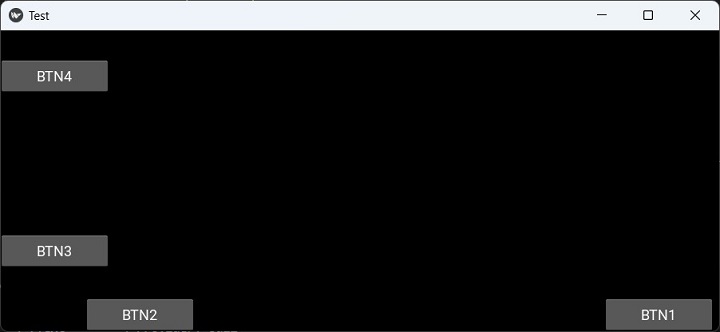
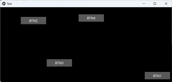
Kivy - Miscellaneous
Kivy - Exception Handling
在编程中,异常处理是指防止程序在遇到运行时错误时崩溃的机制。Kivy 提供了一个名为 ExceptionHandler 的类来管理 Kivy 或你自己的代码引发的异常。
ExceptionManager 类在“kivy.base”模块中定义。你需要从“kivy.base”导入它并访问处理 Kivy 异常的实例。可以使用此类为不同类型的异常添加自定义处理方法,或者当异常发生时覆盖 Kivy 的默认行为。例如,可以使用 handle_exception 方法记录异常、向用户显示消息或优雅地退出应用程序。
from kivy.base import ExceptionHandler, ExceptionManager
from logging import Logger
class handler(ExceptionHandler):
def handle_exception(self, inst):
Logger.exception('Exception caught by ExceptionHandler')
return ExceptionManager.PASS
ExceptionManager.add_handler(handler())一个以异常作为参数并返回以下某个值的处理函数 −
-
ExceptionManager.PASS − 异常应被忽略,因为它已由处理程序处理。
-
ExceptionManager.RAISE − 异常应被重新引发。
-
ExceptionManager.USER_HANDLED − 异常已由用户处理,不应记录。
还可以使用 handle_exception 方法通过已注册的处理程序来手动处理异常。
Kivy - Resources Management
“kivy.resources”模块包括跨路径列表搜索特定资源的功能,尤其是在应用程序处理多个路径和项目时。
当 Kivy 查找图像文件或“kv”文件等任何资源时,它会搜索一组预定的文件夹。可以使用 resource_add_path() 和 resource_remove_path() 函数修改此文件夹列表。
如果你想对默认的 style.kv 或 data/defaulttheme0.png 使用任何备选方案,可以通过 resource_add_path() 方法添加所偏好备选方案的路径。
以下函数定义在“kivy.resources”模块中 −
-
resource_add_path(path) − 添加要进行搜索的自定义路径。
-
resource_find(filename, use_cache=False) − 在路径列表中搜索资源。搜索结果会缓存 60 秒。可以使用 use_cache=False 禁用此功能。
-
resource_remove_path(path) − 移除搜索路径。