Bokeh 简明教程
Bokeh - Plots with Glyphs
任何图表通常由一个或多个几何形状组成,例如 line, circle, rectangle, 等。这些形状具有关于相应数据集的视觉信息。在 Bokeh 术语中,这些几何形状称为图形。使用 bokeh.plotting interface 构造的 Bokeh 图表使用一组默认工具和样式。但是,可以使用可用的绘图工具自定义样式。
Any plot is usually made up of one or many geometrical shapes such as line, circle, rectangle, etc. These shapes have visual information about the corresponding set of data. In Bokeh terminology, these geometrical shapes are called gylphs. Bokeh plots constructed using bokeh.plotting interface use a default set of tools and styles. However, it is possible to customize the styles using available plotting tools.
Types of Plots
使用图形创建的不同类型的图表如下所示 −
Different types of plots created using glyphs are as given below −
Line plot
此类型的图表对于以线条形式沿 x 轴和 y 轴可视化点的移动非常有用。它用于执行时间序列分析。
This type of plot is useful for visualizing the movements of points along the x-and y-axes in the form of a line. It is used to perform time series analytics.
Bar plot
这通常对于指示数据集中的特定列或字段的每个类别的计数非常有用。
This is typically useful for indicating the count of each category of a particular column or field in your dataset.
Patch plot
此图表指示特定阴影中某个区域中的点。此类图表用于区分同一数据集内的不同组。
This plot indicates a region of points in a particular shade of color. This type of plot is used to distinguish different groups within the same dataset.
Scatter plot
此类型的图表用于可视化两个变量之间的关系并指示它们之间的相关性强度。
This type of plot is used to visualize relationship between two variables and to indicate the strength of correlation between them.
通过调用 Figure 类 的适当方法,可以形成不同的图形图表。通过遵循构造函数获得 Figure 对象 −
Different glyph plots are formed by calling appropriate method of Figure class. The Figure object is obtained by following constructor −
from bokeh.plotting import figure
figure(**kwargs)
Figure 对象可以通过各种关键字参数进行自定义。
The Figure object can be customised by various keyword arguments.
Sr.No |
Title |
Set the title for the plot |
1 |
x_axis_label |
Set title of x axis |
2 |
y_axis_label |
Set title for y axis |
3 |
plot_width |
Set width of figure |
4 |
plot_height |
Set height of figure |
Line plot
Figure 对象的 line() method 将线形图形添加到 Bokeh 图形中。它需要 x 和 y 参数作为数据数组,以显示其线性关系。
The line() method of Figure object adds a line glyph to the Bokeh figure. It needs x and y parameters as data arrays for showing their linear relationship.
from bokeh.plotting import figure, show
fig = figure()
fig.line(x,y)
show(fig)
以下代码在两个值集中渲染了一条简单的折线图,形式为 Python 列表对象 −
Following code renders a simple line plot between two sets of values in the form Python list objects −
from bokeh.plotting import figure, output_file, show
x = [1,2,3,4,5]
y = [2,4,6,8,10]
output_file('line.html')
fig = figure(title = 'Line Plot example', x_axis_label = 'x', y_axis_label = 'y')
fig.line(x,y)
show(fig)
Bar plot
figure 对象具有两种不同的方法用于构建条形图
The figure object has two different methods for constructing bar plot
hbar()
条形图水平显示在绘图宽度上。 hbar() method 具有以下参数 −
The bars are shown horizontally across plot width. The hbar() method has the following parameters −
Sr.No |
y |
The y coordinates of the centers of the horizontal bars. |
1 |
height |
The heights of the vertical bars. |
2 |
right |
The x coordinates of the right edges. |
3 |
left |
The x coordinates of the left edges. |
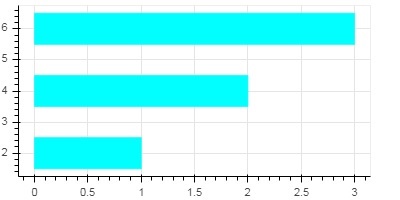
以下代码是使用 Bokeh 的 horizontal bar 的示例。
Following code is an example of horizontal bar using Bokeh.
from bokeh.plotting import figure, output_file, show
fig = figure(plot_width = 400, plot_height = 200)
fig.hbar(y = [2,4,6], height = 1, left = 0, right = [1,2,3], color = "Cyan")
output_file('bar.html')
show(fig)
Output
vbar()
条形图垂直显示在绘图高度上。 vbar() method 具有以下参数 −
The bars are shown vertically across plot height. The vbar() method has following parameters −
Sr.No |
x |
The x-coordinates of the centers of the vertical bars. |
1 |
width |
The widths of the vertical bars. |
2 |
top |
The y-coordinates of the top edges. |
3 |
bottom |
The y-coordinates of the bottom edges. |
以下代码显示 vertical bar plot −
Following code displays vertical bar plot −
from bokeh.plotting import figure, output_file, show
fig = figure(plot_width = 200, plot_height = 400)
fig.vbar(x = [1,2,3], width = 0.5, bottom = 0, top = [2,4,6], color = "Cyan")
output_file('bar.html')
show(fig)
Patch plot
在 Bokeh 中,将特定颜色的某个区域着色的图称为补丁图,用来显示区域或具有相似属性的组。Figure 对象具有 patch() 和 patches() 方法,可用于此目的。
A plot which shades a region of space in a specific color to show a region or a group having similar properties is termed as a patch plot in Bokeh. Figure object has patch() and patches() methods for this purpose.
patch()
此方法将补丁字形添加到给定的 figure。此方法具有以下参数 −
This method adds patch glyph to given figure. The method has the following arguments −
1 |
x |
The x-coordinates for the points of the patch. |
2 |
y |
The y-coordinates for the points of the patch. |
以下 Python 代码生成了一个简单的 patch plot −
A simple patch plot is obtained by the following Python code −
from bokeh.plotting import figure, output_file, show
p = figure(plot_width = 300, plot_height = 300)
p.patch(x = [1, 3,2,4], y = [2,3,5,7], color = "green")
output_file('patch.html')
show(p)
patches()
此方法用于绘制多个多边形块,它需要以下参数−
This method is used to draw multiple polygonal patches. It needs following arguments −
1 |
xs |
The x-coordinates for all the patches, given as a “list of lists”. |
2 |
ys |
The y-coordinates for all the patches, given as a “list of lists”. |
作为 patches() 方法的一个示例,运行以下代码 −
As an example of patches() method, run the following code −
from bokeh.plotting import figure, output_file, show
xs = [[5,3,4], [2,4,3], [2,3,5,4]]
ys = [[6,4,2], [3,6,7], [2,4,7,8]]
fig = figure()
fig.patches(xs, ys, fill_color = ['red', 'blue', 'black'], line_color = 'white')
output_file('patch_plot.html')
show(fig)
Scatter Markers
散点图通常用于确定两个变量之间的双变量关系。可以利用 Bokeh 向其中添加更强的交互性。可通过调用 Figure 对象的 scatter() 方法获得散点图。此方法使用以下参数−
Scatter plots are very commonly used to determine the bi-variate relationship between two variables. The enhanced interactivity is added to them using Bokeh. Scatter plot is obtained by calling scatter() method of Figure object. It uses the following parameters −
1 |
x |
values or field names of center x coordinates |
2 |
y |
values or field names of center y coordinates |
3 |
size |
values or field names of sizes in screen units |
4 |
marker |
values or field names of marker types |
5 |
color |
set fill and line color |
在 Bokeh 中定义了以下标记类型常量:−
Following marker type constants are defined in Bokeh: −
-
Asterisk
-
Circle
-
CircleCross
-
CircleX
-
Cross
-
Dash
-
Diamond
-
DiamondCross
-
Hex
-
InvertedTriangle
-
Square
-
SquareCross
-
SquareX
-
Triangle
-
X
以下 Python 代码会生成具有圆圈标记的散点图。
Following Python code generates scatter plot with circle marks.
from bokeh.plotting import figure, output_file, show
fig = figure()
fig.scatter([1, 4, 3, 2, 5], [6, 5, 2, 4, 7], marker = "circle", size = 20, fill_color = "grey")
output_file('scatter.html')
show(fig)