Excel Power Pivot 简明教程
Excel Power Pivot - Overview
Excel Power Pivot 是随 Excel 附带的强大高效工具。借助 Power Pivot,您可以从外部源加载数亿行数据,并使用其强大的 xVelocity 引擎以高度压缩的形式有效管理数据。这样一来,就可以执行计算、分析数据,然后汇总成报告,以得出结论并做出决策。因此,对于具有 Excel 实践经验的人来说,可以在几分钟内执行高端数据分析并做出决策。
Excel Power Pivot is an efficient, powerful tool that comes with Excel as an Add-in. With Power Pivot, you can load hundreds of millions of rows of data from external sources and manage the data effectively with its powerful xVelocity engine in a highly compressed form. This makes it possible to perform the calculations, analyze the data, and arrive at a report to draw conclusions and decisions. Thus, it would be possible for a person with hands-on experience with Excel, to perform the high-end data analysis and decision making in a matter of few minutes.
本教程将涵盖以下内容 -
This tutorial will cover the following −
Power Pivot Features
Power Pivot 作为出色工具的原因在于其功能集。您将在章节 - Power Pivot 功能中学习各种 Power Pivot 功能。
What makes Power Pivot a strong tool is the set of its features. You will learn the various Power Pivot features in the chapter − Power Pivot Features.
Power Pivot Data from Various Sources
Power Pivot 可以汇总来自各种数据源的数据以执行必要的计算。您将在章节 - 将数据加载到 Power Pivot 中学习如何将数据导入到 Power Pivot。
Power Pivot can collate data from various data sources to perform the required calculations. You will learn how to get data into Power Pivot, in the chapter − Loading Data into Power Pivot.
Power Pivot Data Model
Power Pivot 的强大之处在于其数据库 - 数据模型。数据以数据表的形式存储在数据模型中。您可以在数据表之间创建关系,以结合来自不同数据表的数据进行分析和报告。章节 - 了解数据模型(Power Pivot 数据库)提供了有关数据模型的详细信息。
The power of Power Pivot lies in its database- Data Model. The data is stored in the form of data tables in the Data Model. You can create relationships between the data tables to combine the data from different data tables for analysis and reporting. The chapter − Understanding Data Model (Power Pivot Database) gives you the details about the Data Model.
Managing Data Model and Relationships
您需要知道如何管理数据模型中的数据表及其之间的关系。您将在章节 - 管理 Power Pivot 数据模型中获取这些详细信息。
You need to know how you can manage the data tables in the Data Model and the relationships between them. You will get the details of these in the chapter − Managing Power Pivot Data Model.
Creating Power Pivot Tables and Power Pivot Charts
Power PivotTable 和 Power Pivot 图表为您提供一种方式来分析数据以得出结论和/或决策。
Power PivotTables and Power Pivot Charts provide you a way to analyze the data for arriving at conclusions and/or decisions.
您将在章节 - 创建 Power PivotTable 和扁平化 PivotTable 中学习如何创建 Power PivotTable。
You will learn how to create Power PivotTables in the chapters − Creating a Power PivotTable and Flattened PivotTables.
您将在章节 - Power PivotChart 中学习如何创建 Power PivotChart。
You will learn how to create Power PivotCharts in the chapter − Power PivotCharts.
DAX Basics
DAX 是 Power Pivot 中用于执行计算的语言。DAX 中的公式类似于 Excel 公式,有一点区别 - Excel 公式基于各个单元格,而 DAX 公式基于列(字段)。
DAX is the language used in Power Pivot to perform calculations. The formulas in DAX are similar to Excel formulas, with one difference − while the Excel formulas are based on individual cells, DAX formulas are based on columns (fields).
你将在本章——DAX 基础中了解 DAX 的基础知识。
You will understand the basics of DAX in the chapter − Basics of DAX.
Exploring and Reporting Power Pivot Data
你可以在数据透视表和数据透视图中探索 Power Pivot 数据。你将学习如何在此教程中探索和报告数据。
You can explore the Power Pivot Data that is in the Data Model with Power PivotTables and Power Pivot Charts. You will get to learn how you can explore and report data throughout this tutorial.
Hierarchies
你可以在数据表中定义数据层次结构,以便轻松地关联起来在 Power Pivot 数据透视表中处理相关数据字段。你将在此章节中了解层次结构的创建和用法——Power Pivot 中的层次结构。
You can define data hierarchies in a data table so that it would be easy to handle related data fields together in Power PivotTables. You will learn the details of the creation and usage of Hierarchies in the chapter − Hierarchies in Power Pivot.
Aesthetic Reports
你可以用 Power Pivot 图表和/或 Power Pivot 图表创建美观的数据分析报告。你可以利用各种格式化选项突出显示报告中的重要数据。报告本质上是交互式的,它使用户能够快速轻松地查看紧凑报告中的任何所需详细信息。
You can create aesthetic reports of your data analysis with Power Pivot Charts and/or Power Pivot Charts. You have several formatting options available to highlight the significant data in the reports. The reports are interactive in nature, enabling the person looking at the compact report to view any of the required details quickly and easily.
你将在本章——用 Power Pivot 数据制作美观报告中学习这些详细信息。
You will learn these details in the chapter − Aesthetic Reports with Power Pivot Data.
Excel Power Pivot - Installing
Excel 中的 Power Pivot 提供了一个数据模型,可以连接各种不同的数据源,基于这些数据源可以分析、可视化和探索数据。Power Pivot 提供的易于使用的界面使具有 Excel 实践经验的人员能够毫不费力地加载数据、管理数据(作为数据表)、创建数据表之间的关系并执行必要的计算以形成报告。
Power Pivot in Excel provides a Data Model connecting various different data sources based on which the data can be analyzed, visualized, and explored. The easy-to-use interface provided by Power Pivot enables a person with hands-on experience in Excel to effortlessly load data, manage the data as data tables, create relationships among the data tables, and perform the required calculations to arrive at a report.
在本章中,你将了解是什么使 Power Pivot 成为分析师和决策者不可或缺的强大工具。
In this chapter, you will learn, what makes Power Pivot a strong and sought after tool for analysts and decision makers.
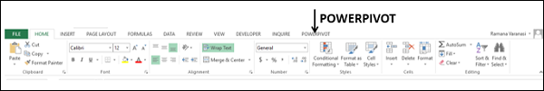
Power Pivot on the Ribbon
开始使用 Power Pivot 的第一步是确保功能区上显示 POWERPIVOT 选项卡。如果您使用的是 Excel 2013 或更高版本,则功能区上会显示 POWERPIVOT 选项卡。
The first step to proceed with Power Pivot is to ensure that the POWERPIVOT tab is available on the Ribbon. If you have Excel 2013 or later versions, the POWERPIVOT tab appears on the Ribbon.
如果您使用的是 Excel 2010,则 POWERPIVOT 选项卡可能不会显示在功能区上,只要您尚未启用 Power Pivot 加载项。
If you have Excel 2010, POWERPIVOT tab might not appear on the Ribbon if you have not already enabled the Power Pivot add-in.
Power Pivot Add-in
Power Pivot 加载项是一个 COM 加载项,需要启用它才能在 Excel 中获取 Power Pivot 的完整功能。即使功能区上显示了 POWERPIVOT 选项卡,您还需要确保启用该加载项才能访问 Power Pivot 的所有功能。
Power Pivot Add-in is a COM Add-in that needs to be enabled to get the complete features of Power Pivot in Excel. Even when POWERPIVOT tab appears on the ribbon, you need to ensure that the add-in is enabled to access all the features of Power Pivot.
Step 1 - 单击功能区上的文件选项卡。
Step 1 − Click the FILE tab on the Ribbon.
Step 2 - 单击下拉列表中的选项。此时会显示 Excel 选项对话框。
Step 2 − Click Options in the dropdown list. The Excel Options dialog box appears.
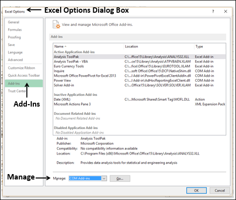
Step 3 - 按照以下说明进行操作。
Step 3 − Follow the instructions as follows.
-
Click Add-Ins.
-
In the Manage box, select COM Add-ins from the dropdown list.
-
Click the Go button. The COM Add-Ins dialog box appears.
-
Check Power Pivot and click OK.
What is Power Pivot?
Excel Power Pivot 是用于集成和处理大量数据的一个工具。使用 Power Pivot,您可以轻松地在包含数百万行的各种数据中加载、排序和筛选数据,以及执行所需的计算。您可以利用 Power Pivot 作为一种即席报告和分析解决方案。
Excel Power Pivot is a tool for integrating and manipulating large volumes of data. With Power Pivot, you can easily load, sort and filter data sets that contain millions of rows and perform the required calculations. You can utilize Power Pivot as an ad hoc reporting and analytics solution.
如下所示的 Power Pivot 功能区包含各种命令,从管理数据模型到创建报表。
The Power Pivot Ribbon as shown below has various commands, ranging from managing Data Model to creating reports.
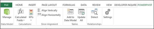
Power Pivot 窗口的特色功能区如下所示 -
The Power Pivot window will have the Ribbon as shown below −

Why is Power Pivot a Strong Tool?
调用 Power Pivot 时,Power Pivot 会创建数据定义和连接,并将其以压缩形式与您的 Excel 文件一起存储。当源中的数据更新时,它会在您的 Excel 文件中自动刷新。这就使得可以方便地使用在别处维护的数据,而只需不时地进行研究和决策制定即可。源数据可以采用任何形式 - 从文本文件或网页到不同的关系数据库。
When you invoke Power Pivot, Power Pivot creates data definitions and connections that get stored with your Excel file in a compressed form. When the data at the source is updated, it is refreshed automatically in your Excel file. This facilitates the usage of the data maintained elsewhere but is required for study time-to-time study and arriving at decisions. The source data can be in any form − ranging from a text file or a web page to the different relational databases.
PowerPivot 窗口中 Power Pivot 的用户友好界面使您无需了解任何数据库查询语言即可执行数据操作。然后,您可以在几秒钟内创建分析报告。报告通用、动态且交互性强,可让您进一步探查数据,以获得见解并得出结论/决策。
The user-friendly interface of Power Pivot in the PowerPivot window enables you to perform data operations without the knowledge of any database query language. You can then create a report of your analysis within few seconds. The reports are versatile, dynamic and interactive and enable you to further probe into the data to get the insights and arrive at the conclusions / decisions.
您在 Excel 中及 Power Pivot 窗口中处理的数据存储在 Excel 工作簿中一个分析数据库中,一个强大的本地引擎会加载、查询和更新该数据库中的数据。因为数据位于 Excel 中,所以会立即提供给数据透视表、数据透视图、Power View 以及 Excel 中您用来聚合数据和与数据交互的其他功能。由 Excel 提供数据演示和交互性,且数据和 Excel 演示对象包含在同一个工作簿文件中。Power Pivot 支持大小高达 2 GB 的文件,并且能让您在内存中处理高达 4 GB 的数据。
The data that you work on in Excel and in the Power Pivot window is stored in an analytical database inside the Excel workbook, and a powerful local engine loads, queries, and updates the data in that database. Since the data is in Excel, it is immediately available to PivotTables, PivotCharts, Power View, and other features in Excel that you use to aggregate and interact with the data. The data presentation and interactivity is provided by Excel and the data and Excel presentation objects are contained within the same workbook file. Power Pivot supports files up to 2GB in size and enables you to work with up to 4GB of data in memory.
Power Features to Excel with Power Pivot
Power Pivot 功能随 Excel 免费提供。Power Pivot 通过强大的功能增强了 Excel 性能,这些功能包括:
Power Pivot features are free with Excel. Power Pivot has enhanced the Excel performance with power features that include the following −
-
Ability to handle large data volumes, compressed into small files, with amazing speed.
-
Filter data and rename columns and tables while importing.
-
Organize tables into individual tabbed pages in the Power Pivot window as against the Excel tables distributed all over the workbook or multiple tables in the same worksheet.
-
Create relationships among the tables, so as to analyze the data in the tables collectively. Before Power Pivot, one had to rely on heavy usage of VLOOKUP function to combine the data into a single table before such analysis. This used to be laborious and error-prone.
-
Add power to the simple PivotTable with many added features.
-
Provide Data Analysis Expressions (DAX) language to write advanced formulas.
-
Add calculated fields and calculated columns to the data tables.
-
Create KPIs to use in PivotTables and Power View reports.
您將在下一章詳細了解 Power Pivot 功能。
You will understand the Power Pivot features in detail in the next chapter.
Uses of Power Pivot
您可以将 Power Pivot 用于以下用途−
You can use Power Pivot for the following −
-
To perform powerful data analysis and create sophisticated Data Models.
-
To mash-up large volumes of data from several different sources quickly.
-
To perform information analysis and share the insights interactively.
-
To write advanced formulas with the Data Analysis Expressions (DAX) language.
-
To create Key Performance Indicators (KPIs).
Data Modelling with Power Pivot
Power Pivot 提供 Excel 中的進階資料建模功能。Power Pivot 中的資料是由資料模型管理,資料模型也稱為 Power Pivot 資料庫。您可以使用 Power Pivot 協助您深入了解您的資料。
Power Pivot provides advanced data modeling features in Excel. The data in the Power Pivot is managed in the Data Model that is also referenced as Power Pivot database. You can use Power Pivot to help you gain new insights into your data.
您可以建立資料表之間的關聯,以便對資料表進行資料分析。透過 DAX,您可以撰寫進階公式。您可以在資料模型中資料表中建立計算欄位和計算欄。
You can create relationships between data tables so that you can perform data analysis on the tables collectively. With DAX, you can write advanced formulas. You can create calculated fields and calculated columns in the data tables in the Data Model.
您可以定義資料中要在工作簿各處使用的階層,包括 Power View。您可以建立 KPI,以便在樞紐分析表和 Power View 報告中使用,用以一目了然地顯示是否超過或低於一個或多個指標的效能目標。
You can define Hierarchies in the data to use everywhere in the workbook, including Power View. You can create KPIs to use in PivotTables and Power View reports to show at a glance whether performance is on or off target for one or more metrics.
Business Intelligence with Power Pivot
商業智慧 (BI) 基本上是一套工具和流程,人們用來收集資料、將資料轉換為有意義的資訊,然後做出更明智的決策。Excel 中 Power Pivot 的 BI 功能讓您能夠收集資料、視覺化資料,並與組織中的人員分享資訊,同時涵蓋多部裝置。
Business intelligence (BI) is essentially the set of tools and processes that people use to gather data, turn it into meaningful information, and then make better decisions. The BI capabilities of Power Pivot in Excel enable you to gather data, visualize data, and share information with people in your organization across multiple devices.
您可以將工作簿分享到已啟用 Excel 服務的 SharePoint 環境。在 SharePoint 伺服器上,Excel 服務會處理資料並將其呈現於瀏覽器視窗中,其他人在視窗中可以分析資料。
You can share your workbook to a SharePoint environment that has Excel Services enabled. On the SharePoint server, Excel Services processes and renders the data in a browser window where others can analyze the data.
Excel Power Pivot - Features
Power Pivot 最重要且功能最强大的功能是其数据库 - 数据模型。下一个重要功能是 xVelocity 内存分析引擎,该引擎能够在几分钟内对大型多数据库执行操作。PowerPivot 加载项还附带一些更重要的功能。
The most important and powerful feature of Power Pivot is its database − Data Model. The next significant feature is the xVelocity in-memory analytics engine that makes it possible to work on large multiple databases in a matter of few minutes. There are some more important features that come with the PowerPivot Add-in.
在本章中,您将简要了解 Power Pivot 的各项功能,这些功能将在后面进行详细说明。
In this chapter, you will get a brief overview of the features of Power Pivot, which are illustrated in detail later.
Loading Data from External Sources
您可以通过两种方式将数据从外部源加载到数据模型中 -
You can load data into Data Model from external sources in two ways −
-
Load data into Excel and then create a Power Pivot Data Model.
-
Load data directly into Power Pivot Data Model.
第二种方法的效率更高,因为 Power Pivot 会以一种高效的方式处理内存中的数据。
The second way is more efficient because of the efficient way Power Pivot handles the data in memory.
有关更多详细信息,请参阅章节 − 将数据加载到 Power Pivot。
For more details, refer to chapter − Loading Data into Power Pivot.
Excel Window and Power Pivot Window
当你开始使用 Power Pivot 时,会同时打开两个窗口 − Excel 窗口和 Power Pivot 窗口。可以通过 Power Pivot 窗口直接将数据加载到数据模型中,在数据视图和图表视图中查看数据、创建表之间的关系、管理关系以及创建 Power Pivot 表和/或 Power Pivot 图表报告。
When you start working with Power Pivot, two windows will open simultaneously − Excel window and Power Pivot window. It is through PowerPivot window that you can load data into Data Model directly, view the data in Data View and Diagram View, Create relationships between tables, manage the relationships, and create the Power PivotTable and/or PowerPivot Chart reports.
从外部来源导入数据时,你不必将数据存放在 Excel 表格中。如果你在工作簿中将数据作为 Excel 表格,则可以将它们添加到数据模型中,在数据模型中创建链接到 Excel 表格的数据表。
You need not have the data in Excel tables when you are importing data from external sources. If you have data as Excel tables in the workbook, you can add them to Data Model, creating data tables in Data Model that are linked to the Excel tables.
当你从 Power Pivot 窗口创建数据透视表或数据透视图表时,它们会在 Excel 窗口中创建。但是,数据仍然由数据模型管理。
When you create a PivotTable or PivotChart from Power Pivot window, they are created in the Excel window. However, the data is still managed from Data Model.
你随时可以在 Excel 窗口和 Power Pivot 窗口之间轻松切换。
You can always switch between the Excel window and Power Pivot window anytime, easily.
Data Model
数据模型是 Power Pivot 最强大的功能。从各种数据源获得的数据作为数据表保存在数据模型中。你可以在数据表之间创建关系,以便将表中的数据合并起来进行分析和报告。
The Data Model is the most powerful feature of Power Pivot. The data that is obtained from various data sources is maintained in Data Model as data tables. You can create relationships between the data tables so that you can combine the data in the tables for analysis and reporting.
你将在章节 − 了解数据模型(Power Pivot 数据库)中详细了解数据模型。
You will learn in detail about the Data Model in the chapter − Understanding Data Model (Power Pivot Database).
Memory Optimization
Power Pivot 数据模型使用 xVelocity 存储,当数据加载到内存中时会对该数据进行高度压缩,这使得可以在内存中存储数亿行数据。
Power Pivot Data Model uses xVelocity storage, which is highly compressed when data is loaded into memory that makes it possible to store hundreds of millions of rows in memory.
因此,如果你直接将数据加载到数据模型中,则会以高效的高度压缩形式执行此操作。
Thus, if you load data directly into Data Model, you will be doing it in the efficient highly compressed form.
Compact File Size
如果数据直接加载到数据模型中,则在保存 Excel 文件时,它在硬盘上占用的空间非常小。你可以比较 Excel 文件的大小,第一个是将数据加载到 Excel 中然后创建数据模型,第二个是跳过第一步直接将数据加载到数据模型中。第二个文件将比第一个小 10 倍。
If the data is loaded directly into Data Model, when you save the Excel file, it occupies very less space on the hard disk. You can compare the Excel file sizes, the first one with loading data into Excel and then creating the Data Model and the second with loading data directly into the Data Model skipping the first step. The second one will be up to 10 times smaller than the first one.
Power PivotTables
你可以从 Power Pivot 窗口创建 Power Pivot 表。这样创建的数据透视表基于数据模型中的数据表,使得可以将来自相关表的数据合并起来进行分析和报告。
You can create the Power PivotTables from Power Pivot window. The PivotTables so created are based on the data tables in the Data Model, making it possible to combine data from the related tables for analysis and reporting.
Power PivotCharts
你可以从 Power Pivot 窗口创建 Power Pivot 图表。这样创建的数据透视图表基于数据模型中的数据表,使得可以将来自相关表的数据合并起来进行分析和报告。Power Pivot 图表具有 Excel 数据透视图表的所有功能,还具有许多其他功能,例如字段按钮。
You can create the Power PivotCharts from Power Pivot window. The PivotCharts so created are based on the data tables in the Data Model, making it possible to combine data from the related tables for analysis and reporting. The Power PivotCharts have all the features of Excel PivotCharts and many more such as field buttons.
你还可以将 Power Pivot 表和 Power Pivot 图表进行组合。
You can also have combinations of Power PivotTable and Power PivotChart.
DAX Language
Power Pivot 的强大之处在于可以在数据模型上有效使用 DAX 语言,对数据表中的数据执行计算。你可以使用在 Power Pivot 表和 Power Pivot 图表中定义的 DAX 计算列和计算字段。
The strength of Power Pivot comes from the DAX Language that can be used effectively on the Data Model to perform calculations on the data in the data tables. You can have Calculated Columns and Calculated Fields defined by DAX that can be used in the Power PivotTables and Power PivotCharts.
Excel Power Pivot - Loading Data
在本章中,我们将学习如何将数据加载到 Power Pivot。
In this chapter, we will learn to load data into Power Pivot.
你可以使用两种方式将数据加载到 Power Pivot 中——
You can load data into Power Pivot in two ways −
-
Load data into Excel and add it to the Data Model
-
Load data into PowerPivot directly, populating the Data Model, which is the PowerPivot database.
如果你需要 Power Pivot 数据,无需通过 Excel 便可以使用第二种方法。这是因为,你只需要将数据加载一次,以高度压缩的格式。为了理解差异的程度,假设你通过先将数据添加到数据模型中并将数据加载到 Excel 中,文件大小可能是 10 MB。
If you want the data for Power Pivot, do it the second way, without Excel even knowing about it. This is because you will be loading the data only once, in highly compressed format. To understand the magnitude of difference, suppose you load data into Excel by first adding it to the Data Model, the file size is say 10 MB.
如果你直接将数据加载到 PowerPivot 中,便可以跳过 Excel 的额外步骤,进入数据模型,此时你的文件大小可能只有不到 1 MB。
If you load data into PowerPivot, and hence into Data Model skipping the extra step of Excel, your file size could be as less as 1 MB only.
Data Sources Supported by Power Pivot
你可以将数据从各种数据源导入到 Power Pivot 数据模型,也可以建立连接和/或使用现有连接。Power Pivot 支持以下数据源——
You can either import data into the Power Pivot Data Model from various data sources or establish connections and/or use the existing connections. Power Pivot supports the following data sources −
-
SQL Server relational database
-
Microsoft Access database
-
SQL Server Analysis Services
-
SQL Server Reporting Services (SQL 2008 R2)
-
ATOM data feeds
-
Text files
-
Microsoft SQL Azure
-
Oracle
-
Teradata
-
Sybase
-
Informix
-
IBM DB2
-
Object Linking and Embedding Database/Open Database Connectivity
-
(OLEDB/ODBC) sources
-
Microsoft Excel File
-
Text File
Loading Data Directly into PowerPivot
要直接将数据加载到 Power Pivot,请执行以下操作——
To load data directly into Power Pivot, perform the following −
-
Open a new workbook.
-
Click on the POWERPIVOT tab on the ribbon.
-
Click on Manage in the Data Model group.

将会打开 PowerPivot 窗口。现在你有两个窗口——Excel 工作簿窗口和连接到你的工作簿的 PowerPivot for Excel 窗口。
The PowerPivot window opens. Now you have two windows − the Excel workbook window and the PowerPivot for Excel window that is connected to your workbook.
-
Click the Home tab in the PowerPivot window.
-
Click From Database in the Get External Data group.
-
Select From Access.

表导入向导出现。
The Table Import Wizard appears.
-
Browse to the Access database file.
-
Provide Friendly connection name.
-
If the database is password protected, fill in those details also.

单击 Next → 按钮。表导入向导显示用于选择如何导入数据的选项。
Click the Next → button. The Table Import Wizard displays the options for choosing how to import data.

单击从表和视图的列表中选择以选择要导入的数据。
Click Select from a list of tables and views to choose the data to import.

单击 Next → 按钮。表导入向导显示您选择的 Access 数据库中的表和视图。
Click the Next → button. The Table Import Wizard displays the tables and views in the Access database that you have selected.
选中 Medals 复选框。
Check the box Medals.

您可能会注意到,您可以通过选中复选框来选择表、在添加到数据透视表之前预览和筛选表,或者选择相关表。
As you can observe, you can select the tables by checking the boxes, preview and filter the tables before adding to Pivot Table and/or select the related tables.
单击 Preview & Filter 按钮。
Click the Preview & Filter button.

您会注意到,您可以通过选中列标签中的复选框来选择特定的列、通过单击列标签中的下拉箭头来选择包含的值来筛选列。
As you can see, you can select specific columns by checking the boxes in the column labels, filter the columns by clicking the dropdown arrow in the column label to select the values to be included.
-
Click OK.
-
Click the Select Related Tables button.
-
Power Pivot checks what other tables are related to the selected Medals table, if a relation exists.

您会发现,Power Pivot 发现 Disciplines 表与 Medals 表相关并将其选中。单击完成。
You can see that Power Pivot found that the table Disciplines are related to the table Medals and selected it. Click Finish.
表导入向导显示 − Importing 并显示导入的状态。这将需要几分钟的时间,您可通过单击 Stop Import 按钮来停止导入。
Table Import Wizard displays − Importing and shows the status of the import. This will take a few minutes and you can stop the import by clicking the Stop Import button.

导入数据后,表导入向导显示 – Success 并显示导入的结果,如下面的截图所示。单击关闭。
Once the data is imported, the Table Import Wizard displays – Success and shows the results of the import as shown in the screenshot below. Click Close.

Power Pivot 在两个选项卡中显示两个导入的表。
Power Pivot displays the two imported tables in two tabs.

您可以使用选项卡下方的 Record 箭头滚动记录(表格的行)。
You can scroll through the records (rows of the table) using the Record arrows below the tabs.
Table Import Wizard
在上一个部分中,您已经了解了如何通过表导入向导从 Access 导入数据。
In the previous section, you have learnt how to import data from Access through the Table Import Wizard.
请注意,根据所选用于连接的数据源,表导入向导选项会发生更改。您可能想知道可以选择哪些数据源。
Note that the Table Import Wizard options change as per the data source that is selected to connect to. You might want to know what data sources you can choose from.
单击 Power Pivot 窗口中的 From Other Sources 。
Click From Other Sources in the Power Pivot window.

“表导入向导 − Connect to a Data Source ”出现。你可以创建一个到数据源的连接或使用已存在的连接。
The Table Import Wizard – Connect to a Data Source appears. You can either create a connection to a data source or you can use one that already exists.

可以在导入表向导中滚动浏览连接列表以了解与 Power Pivot 兼容的数据连接。
You can scroll through the list of connections in the Import Table Wizard to know the compatible data connections to Power Pivot.
-
Scroll down to the Text Files.
-
Select Excel File.

-
Click the Next → button. The Table Import Wizard displays – Connect to a Microsoft Excel File.
-
Browse to the Excel file in the Excel File Path box.
-
Check the box – Use first row as column headers.

-
Click the Next → button. The Table Import Wizard displays − Select Tables and Views.
-
Check the box Product Catalog$. Click the Finish button.

你将看到以下 Success 消息。单击“关闭”。
You will see the following Success message. Click Close.

你已导入一张表,并且还创建了连接至包含其他表的 Excel 文件的连接。
You have imported one table, and you have also, created a connection to the Excel file that contains several other tables.
Opening Existing Connections
建立与数据源的连接后,你可以在稍后打开它。
Once you have established a connection to a data source, you can open it later.
单击 Power Pivot 窗口中的“现有连接”。
Click Existing Connections in the PowerPivot window.

“现有连接”对话框出现。从列表中选择“Excel 销售数据”。
The Existing Connections dialog box appears. Select Excel Sales Data from the list.

单击“打开”按钮。表导入向导出现,显示表和视图。
Click the Open button. The Table Import Wizard appears displaying the tables and views.
选择要导入的表,然后单击 Finish 。
Select the tables that you want to import and click Finish.

选定的五张表将被导入。单击 Close 。
The selected five tables will be imported. Click Close.

你可以看到这五张表已添加到 Power Pivot 中,每张都在一个新选项卡中。
You can see that the five tables are added to the Power Pivot, each in a new tab.

Creating Linked Tables
链接表是 Excel 中表与数据模型中表之间的实时链接。对 Excel 中表的更新将自动更新模型中数据表中的数据。
Linked tables are a live link between the table in Excel and the table in the Data Model. Updates to the table in Excel automatically update the data in the data table in the model.
你可以按照以下几个步骤将 Excel 表格链接到 Power Pivot 中−
You can link the Excel table into Power Pivot in a few steps as follows −
-
Create an Excel table with the data.
-
Click the POWERPIVOT tab on the Ribbon.
-
Click Add to Data Model in the Tables group.

Excel 表格链接到 PowerPivot 中的对应数据表。
The Excel table is linked to the corresponding Data Table in PowerPivot.

你可以看到具有链接表格选项卡的表格工具已添加到 Power Pivot 窗口。如果你单击 Go to Excel Table ,你将切换到 Excel 工作表。如果你单击 Manage ,你将切换回 Power Pivot 窗口中的链接表格。
You can see that the Table Tools with the tab - Linked Table is added to the Power Pivot window. If you click Go to Excel Table, you will switch to the Excel worksheet. If you click Manage, you will switch back to the linked table in the Power Pivot window.
你可以自动或手动更新链接表格。
You can update the linked table either automatically or manually.
请注意,你只能在你与 Power Pivot 在工作簿中存在时链接 Excel 表格。如果你在一个单独的工作簿中有 Excel 表格,那么你必须按下一节中的解释加载它们。
Note that you can link an Excel table only if it is present in the workbook with the Power Pivot. If you have Excel tables in a separate workbook, then you have to load them as explained in the next section.
Loading from Excel Files
如果你想要从 Excel 工作簿加载数据,请记住以下内容−
If you want to load the data from Excel workbooks, keep the following in mind −
-
Power Pivot considers the other Excel workbook as a database and only worksheets are imported.
-
Power Pivot loads each worksheet as a table.
-
Power Pivot cannot recognize single tables. Hence, Power Pivot cannot recognize if there are multiple tables on a worksheet.
-
Power Pivot cannot recognize any additional information other than the table on a worksheet.
因此,请将每个表格保留在单独的工作表中。
Hence, keep each table in a separate worksheet.
准备好工作簿中的数据后,您可以按以下步骤导入数据-
Once your data in the workbook is ready, you can import the data as follows −
-
Click From Other Sources in the Get External Data group in the Power Pivot window.
-
Proceed as given in the section − Table Import Wizard.
以下是链接的 Excel 表格和导入的 Excel 表格之间的差异 −
The following are the differences between linked Excel tables and imported Excel tables −
-
Linked tables need to be in the same Excel workbook in which the Power Pivot database is stored. If the data already exists in other Excel workbooks, there is no point in using this feature.
-
The Excel import feature allows you to load data from different Excel workbooks.
-
Loading data from an Excel workbook does not create a link between the two files. Power Pivot creates only a copy of the data, while importing.
-
When the original Excel file is updated, data in the Power Pivot will not be refreshed. You need to either set the update mode to automatic or update the data manually, in the Linked Table tab of the Power Pivot window.
Loading from Text Files
一种流行的数据表示形式是逗号分隔值(csv)格式。每行数据/记录都由文本行表示,其中列/字段由逗号分隔。许多数据库都提供保存为 csv 格式文件的选择。
One of the popular data representation styles is with the format known as comma separated values (csv). Each data row /record is represented by a text line, wherein the columns /fields are separated by commas. Many databases provide the option of saving to a csv format file.
如果您想将 csv 文件加载到 Power Pivot 中,则必须使用“文本文件”选项。假设您有以下带 csv 格式的文本文件:
If you want to load a csv file into Power Pivot, you have to use the Text File option. Suppose you have the following text file with csv format −

-
Click the PowerPivot tab.
-
Click the Home tab in the PowerPivot window.
-
Click From Other Sources in the Get External Data group. The Table Import Wizard appears.
-
Scroll down to Text Files.

-
Click Text File.
-
Click the Next → button. Table Import Wizard appears with the display − Connect to Flat File.
-
Browse to the text file in the File Path box. The csv files usually have the first line representing column headers.
-
Check the box Use first row as column headers, if the first line has headers.
-
In the Column Separator box, default is Comma (,), but in case your text file has any other operator such as Tab, Semicolon, Space, Colon or Vertical Bar, then choose that operator.

您可以观察到,这里是对数据表的预览。单击“完成”。
As you can observe, there is a preview of your data table. Click Finish.
Power Pivot 在数据模型中创建数据表。
Power Pivot creates the data table in the Data Model.

Loading from the Clipboard
假设您有应用程序中的数据,而 Power Pivot 无法将其识别为数据源。要将这些数据加载到 Power Pivot 中,您有两个选择:
Suppose, you have data in an application that is not recognized by Power Pivot as a data source. To load this data into Power Pivot, you have two options −
-
Copy the data to an Excel file and use the Excel file as data source for Power Pivot.
-
Copy the data, so that it will be on the clipboard, and paste it into Power Pivot.
您已经在较早的部分学习了第一个选项。而且这比第二个选项更好,您将在本部分的末尾找到它。但是,您应该知道如何将数据从剪贴板复制到 Power Pivot 中。
You have already learnt the first option in an earlier section. And this is preferable to the second option, as you will find at the end of this section. However, you should know how to copy data from clipboard into Power Pivot.
假设您在 word 文档中按以下方式拥有数据:
Suppose you have data in a word document as follows −

Word 不是 Power Pivot 的数据源。所以,执行以下操作:
Word is not a data source for Power Pivot. Therefore, perform the following −
-
Select the table in the Word document.
-
Copy and Paste it in the PowerPivot window.

Paste Preview 对话框将出现。
The Paste Preview dialog box appears.
-
Give the name as Word-Employee table.
-
Check the box Use first row as column headers and click OK.

复制到剪贴板的数据将粘贴到 Power Pivot 中的新数据表中,标签为 − Word-Employee 表。
The data copied into the clipboard will be pasted into a new data table in Power Pivot, with the tab − Word-Employee table.

假设您想要用新内容替换此表。
Suppose, you want to replace this table with new content.
-
Copy the table from Word.
-
Click Paste Replace.

“粘贴预览”对话框将出现。验证您用来替换的内容。
The Paste Preview dialog box appears. Verify the contents that you are using for replace.

单击确定。
Click OK.

正如您所观察到的,Power Pivot 中数据表的内容将被剪贴板中的内容替换。
As you can observe, the contents of the data table in Power Pivot are replaced by the contents in the clipboard.
假设您想要向数据表添加两行新数据。在 Word 文档的表格中,您有两个新行。
Suppose you want to add two new rows of data to a data table. In the table in the Word document, you have the two news rows.

-
Select the two new rows.
-
Click Copy.
-
Click Paste Append in the Power Pivot window. The Paste Preview dialog box appears.
-
Verify the contents that you are using to append.

单击确定继续。
Click OK to proceed.

正如您所观察到的,Power Pivot 中数据表的内容将追加剪贴板中的内容。
As you can observe, the contents of the data table in Power Pivot are appended with the contents in the clipboard.
在本节的开头,我们已经说过将数据复制到 excel 文件并使用链接表比从剪贴板中复制更好。
In the beginning of this section, we have said that copying data to an excel file and using linked table is better than copying from clipboard.
这是由于以下原因:
This is because of the following reasons −
-
If you use linked table, you know the source of the data. On the other hand, you will not know the source of the data later or if it is used by a different person.
-
You have tracking information in the Word file, such as when the data is replaced and when the data is appended. However, there is no way of copying that information to Power Pivot. If you copy the data first to an excel file, you can preserve that information for later use.
-
While copying from clipboard, if you want to add some comments, you cannot do so. If you copy to Excel file first, you can insert comments in your Excel table that will be linked to the Power Pivot.
-
There is no way to refresh the data copied from clipboard. If the data is from a linked table, you can always ensure that the data is updated.
Refreshing Data in Power Pivot
您可以随时刷新从外部数据源导入的数据。
You can refresh the data imported from the external data sources at any point of time.
如果您只想刷新 Power Pivot 中的一个数据表,请执行以下操作:
If you want to refresh only one data table in the Power Pivot, do the following −
-
Click the tab of the data table.
-
Click Refresh.
-
Select Refresh from the dropdown list.

如果您想刷新 Power Pivot 中的所有数据表,请执行以下操作:
If you want to refresh all the data tables in the Power Pivot, do the following −
-
Click the Refresh button.
-
Select Refresh All from the dropdown list.
Excel Power Pivot - Data Model
数据模型是 Excel 2013 中引入的一种新方法,用于集成来自多个表的数据,有效地在 Excel 工作簿中构建关系数据源。在 Excel 中,数据模型以透明的方式使用,可提供用于数据透视表和数据透视图形的数据。在 Excel 中,您可以通过包含表名称和相应字段的数据透视表/数据透视图形字段列表访问表及其相应的值。
A Data Model is a new approach introduced in Excel 2013 for integrating data from multiple tables, effectively building a relational data source inside an Excel workbook. Within Excel, Data Model is used transparently, providing tabular data used in PivotTables and PivotCharts. In Excel, you can access the tables and their corresponding values through the PivotTable / PivotChart Field lists that contain the table names and corresponding fields.
数据模型在 Excel 中的主要用途是 Power Pivot 使用它。数据模型可以看作是 Power Pivot 数据库,并且 Power Pivot 的所有强大功能都是通过数据模型进行管理的。Power Pivot 的所有数据操作本质上都是显式的,并且可以在数据模型中视化。
The main use of Data Model in Excel is its usage by Power Pivot. Data Model can be considered as the Power Pivot database, and all the power features of Power Pivot are managed with the Data Model. All data operations with Power Pivot are explicit in nature and can be visualized in the Data Model.
在本章中,您将详细了解数据模型。
In this chapter, you will understand the Data Model in detail.
Excel and Data Model
Excel 工作簿中只有一个数据模型。当您使用 Excel 时,数据模型使用是隐式的。您不能直接访问数据模型。您只能在数据透视表或数据透视图形的“字段”列表中查看“数据模型”中的多个表并使用它们。创建数据模型和添加数据也是在 Excel 中隐式完成的,此时将外部数据获取到 Excel 中。
There will be only one Data Model in an Excel workbook. When you work with Excel, Data Model usage is implicit. You cannot directly access the Data Model. You can only see the multiple tables in the Data Model in the Fields list of PivotTable or PivotChart and use them. Creating the Data Model and adding data is also done implicitly in Excel, while you are getting external data into Excel.
如果你要查看数据模型,你可以按以下步骤进行…
If you want to look at the Data Model, you can do so as follows −
-
Click the POWERPIVOT tab on the Ribbon.
-
Click Manage.
如果工作簿中存在数据模型,它将显示为表格,每个表格都有一个选项卡。
Data Model, if exists in the workbook, will be displayed as tables, each one with a tab.
Note − 如果你将 Excel 表添加到数据模型,你不会将 Excel 表转化为数据表。Excel 表的副本将作为数据表添加到数据模型中,并在两者之间创建一个链接。因此,如果在 Excel 表中进行了更改,数据表也会更新。但是,从存储的角度来看,有两个表。
Note − If you add an Excel table to Data Model, you will not transform the Excel table into a data table. A copy of the Excel table is added as a data table in the Data Model and a link is created between the two. Hence, if changes are done in the Excel table, the data table also is updated. However, from the storage point of view, there are two tables.
Power Pivot and Data Model
数据模型本质上是 Power Pivot 的数据库。即使你从 Excel 创建数据模型,它也只构建 Power Pivot 数据库。创建数据模型和/或添加数据是在 Power Pivot 中明确完成的。
Data Model is inherently the database for Power Pivot. Even when you create the Data Model from Excel, it builds the Power Pivot database only. Creating the Data Model and/or adding data is done explicitly in Power Pivot.
事实上,你可以从 Power Pivot 窗口管理数据模型。你可以向数据模型添加数据,从不同的数据源导入数据,查看数据模型,在表之间创建关系,创建计算字段和计算列,等等。
In fact, you can manage the Data Model from Power Pivot window. You can add data to Data Model, import data from different data sources, view the Data Model, create relationships between the tables, create calculated fields and calculated columns, etc.
Creating a Data Model
你既可以从 Excel 添加表到数据模型,也可以直接将数据导入 Power Pivot,从而创建 Power Pivot 数据模型表。你可以在 Power Pivot 窗口中单击“管理”来查看数据模型。
You can either add tables to the Data Model from Excel or you can directly import data into Power Pivot, thus creating the Power Pivot Data Model tables. You can view the Data Model by clicking Manage in the Power Pivot window.
你将在“通过 Excel 加载数据”一章中了解如何从 Excel 向数据模型添加表。你将在“将数据加载到 Power Pivot”一章中了解如何将数据加载到数据模型中。
You will understand how to add tables from Excel to the Data Model in the chapter – Loading Data through Excel. You will understand how to load data into Data Model in the chapter – Loading Data into Power Pivot.
Tables in Data Model
数据模型中的表可以定义为一组跨不同表持有关系的表。这些关系使人们能够出于分析和报告目的将来自不同表的相关数据进行组合。
Tables in Data Model can be defined as a set of tables holding relationships across them. The relationships enable combining related data from different tables for analysis and reporting purposes.
数据模型中的表称为数据表。
The tables in the Data Model are called Data Tables.
数据模型中的表被认为是一组记录(记录是一行),由字段(字段是一列)组成。你不能编辑数据表中的各个项目。但是,你可以向数据表中追加行或添加计算列。
A table in the Data Model is considered as a set of records (a record is a row) made up of fields (a field is a column). You cannot edit individual items in a data table. However, you can append rows or add calculated columns to the data table.
Excel Tables and Data Tables
Excel 表仅仅是单独表的集合。一个工作表上可以有多个表。每个表可以单独访问,但不可能同时访问来自多个 Excel 表的数据。这就是当您创建数据透视表时,它仅基于一个表的原因。如果您需要同时使用来自两个 Excel 表的数据,您需要首先将它们合并到一个 Excel 表中。
Excel tables are just a collection of separate tables. There can be multiple tables on a worksheet. Each table can be accessed separately, but it is not possible to access data from more than one Excel table at the same time. This is the reason that when you create a PivotTable, it is based on only one table. If you need to use the data from two Excel tables collectively, you need to first merge them into a single Excel table.
另一方面,数据表与其他有关系的数据表共存,有助于组合多表中的数据。将数据导入 Power Pivot 中时,将创建数据表。在创建数据透视表时,您还可以将 Excel 表添加到数据模型,以获取外部数据或从多表中获取数据。
A data table on the other hand coexists with other data tables with relationships, facilitating the combination of data from multiple tables. Data tables get created when you import data into Power Pivot. You can also add Excel tables to the Data Model while you are creating a Pivot Table getting external data or from multiple tables.
数据模型中的数据表可以通过两种方式查看 −
The data tables in the Data Model can be viewed in two ways −
-
Data View.
-
Diagram View.
Data View of Data Model
在数据模型的数据视图中,每个数据表都存在于一个单独的选项卡中。数据表行是记录,列表示字段。选项卡包含表名称,列标题是该表中的字段。您可以在数据视图中使用数据分析表达式 (DAX) 语言进行计算。
In the data view of the Data Model, each data table exists on a separate tab. The data table rows are the records and columns represent the fields. The tabs contain the table names and the column headers are the fields in that table. You can do calculations in the data view using the Data Analysis Expressions (DAX) language.
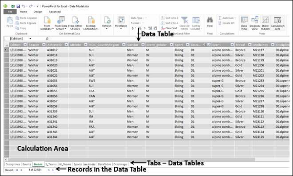
Diagram View of Data Model
在数据模型的图表视图中,所有数据表都由包含表名称的框表示,并包含表中的字段。您只需拖动即可安排图表视图中的表。您可以调整数据表的大小,以便显示表中的所有字段。
In the diagram view of the Data Model, all the data tables are represented by boxes with the table names and contain the fields in the table. You can arrange the tables in the diagram view by just dragging them. You can adjust the size of a data table so that all the fields in the table are displayed.
Relationships in Data Model
您可以在图表视图中查看关系。如果两表之间已定义关系,则会显示连接源表和目标表的箭头。如果您想知道关系中使用了哪些字段,只需双击箭头。箭头和两表中的两个字段将被突出显示。
You can view the relationships in the diagram view. If two tables have a relationship defined between them, an arrow connecting the source table to the target table appears. If you want to know which fields are used in the relationship, just double click the arrow. The arrow and the two fields in the two tables are highlighted.
如果您导入具有主键和外键关系的相关表,表关系会自动创建。Excel 可以使用导入的表关系信息作为数据模型中表关系的基础。
Table relationships will be created automatically if you import related tables that have primary and foreign key relationships. Excel can use the imported relationship information as the basis for table relationships in the Data Model.
您还可以在两种视图中的任何一种中显式创建关系 −
You can also explicitly create relationships in either of the two views −
-
Data View − Using Create Relationship dialog box.
-
Diagram View − By clicking and dragging to connect the two tables.
Create Relationship Dialog Box
Create Relationship Dialog Box
在一个关系中,涉及四个实体 −
In a relationship, four entities are involved −
-
Table − The data table from which the relationship starts.
-
Column − The field in the Table that is also present in the related table.
-
Related Table − The data table where the relationship ends.
-
Related Column − The field in the related table that is same as the field represented by Column in Table. Note that the values of Related Column should be unique.
在图表视图中,可以通过单击表中的字段并将鼠标拖动到相关表来创建关系。
In the diagram view, you can create the relationship by clicking on the field in the table and dragging to the related table.
您将在本章中了解有关关系的更多信息 - 使用 Power Pivot 管理数据表和关系。
You will learn more about relationships in the chapter - Managing Data Tables and Relationships with Power Pivot.
Excel Power Pivot - Managing Data Model
Power Pivot 的主要用途是管理数据表及其之间的关系,以便于分析来自多张表的数据。在创建数据透视表或直接从 PowerPivot 功能区时,可以将 Excel 表添加到数据模型中。
The major use of Power Pivot is its ability to manage the data tables and the relationships among them, to facilitate analysis of the data from several tables. You can add an excel table to the Data Model while you are creating a PivotTable or directly from the PowerPivot Ribbon.
仅当它们之间存在关系时,您才能分析来自多个表的数据。使用 Power Pivot,您可以从“数据视图”或“图表视图”创建关系。此外,如果您已选择将表添加到 Power Pivot,您还需要添加关系。
You can analyze data from across multiple tables only when relationships exist among them. With Power Pivot, you can create relationships from the Data View or Diagram View. Moreover, if you had chosen to add a table to the Power Pivot, you need to add a relationship as well.
Adding Excel Tables to Data Model with PivotTable
当您在 Excel 中创建数据透视表时,它只基于单个表/范围。如果您想向数据透视表添加更多表,可以使用数据模型来实现。
When you create a PivotTable in Excel, it is based only on a single table / range. In case you want to add more tables to the PivotTable, you can do so with the Data Model.
假设您的工作簿中有两个工作表:
Suppose you have two worksheets in your workbook −
-
One containing the data of salespersons and the regions they represent, in a table- Salesperson.
-
Another containing the data of sales, region and month wise, in a table – Sales.

您可以按业务员总结销售,如下所示。
You can summarize the sales – salesperson-wise as given below.
-
Click the table – Sales.
-
Click the INSERT tab on the Ribbon.
-
Select PivotTable in the Tables group.
将创建一个包含销售表字段(地区、月份和订单金额)的空数据透视表。正如你所观测到的,在数据透视表字段列表下面有一个 MORE TABLES 命令。
An empty PivotTable with the fields from the Sales table – Region, Month and Order Amount will be created. As you can observe, there is a MORE TABLES command below the PivotTable Fields list.
-
Click on MORE TABLES.
出现 Create a New PivotTable 消息框。显示的消息是 - 为在分析中使用多张报表,需要使用数据模型创建一个新的数据透视表。单击 是
The Create a New PivotTable message box appears. The message displayed is- To use multiple tables in your analysis, a new PivotTable needs to be created using the Data Model. Click Yes

将创建一个如下所示的新数据透视表 -
A New PivotTable will be created as shown below −

在数据透视表字段下方,你可以看到有两个选项卡 - ACTIVE 和 ALL 。
Under PivotTable Fields, you can observe that there are two tabs – ACTIVE and ALL.
-
Click the ALL tab.
-
Two tables- Sales and Salesperson, with the corresponding fields appear in the PivotTable Fields list.
-
Click the field Salesperson in the Salesperson table and drag it to ROWS area.
-
Click the field Month in the Sales table and drag it to ROWS area.
-
Click the field Order Amount in the Sales table and drag it to ∑ VALUES area.

数据透视表已创建。在数据透视表字段中出现一条消息 - Relationships between tables may be needed 。
The PivotTable is created. A message appears in the PivotTable Fields – Relationships between tables may be needed.
单击消息旁边的 创建 按钮。出现 Create Relationship 对话框。
Click the CREATE button next to the message. The Create Relationship dialog box appears.

-
Under Table, select Sales.
-
Under Column (Foreign) box, select Region.
-
Under Related Table, select Salesperson.
-
Under Related Column (Primary) box, select Region.
-
Click OK.

你从两张工作表中的两张表的 PivotTable 已准备就绪。
Your PivotTable from the two tables on two worksheets is ready.

此外,正如 Excel 在将第二张表添加到数据透视表时所述,数据透视表已使用数据模型创建。要进行验证,请执行以下操作:
Further, as Excel stated while adding the second table to the PivotTable, the PivotTable got created with Data Model. To verify, do the following −
-
Click the POWERPIVOT tab on the Ribbon.
-
Click Manage in the Data Model group. The Data View of the Power Pivot appears.

你可以看到,你在创建数据透视表时所使用的两张 Excel 表已转换为数据模型中的数据表。
You can observe that the two Excel tables that you used in creating the PivotTable are converted to data tables in the Data Model.
Adding Excel Tables from a Different Workbook to Data Model
假设两张表 - 销售人员和销售位于两个不同的工作簿中。
Suppose the two tables – Salesperson and Sales are in two different workbooks.

你可以将其他工作簿中的 Excel 表格添加到数据模型中 ,如下所示 −
You can add the Excel table from a different workbook to the Data Model as follows −
-
Click the Sales table.
-
Click the INSERT tab.
-
Click PivotTable in the Tables group. The Create PivotTable dialog box appears.

-
In the Table/Range box, type Sales.
-
Click on New Worksheet.
-
Check the box Add this data to the Data Model.
-
Click OK.
你将获得一个新工作表上的空枢纽分析表,其中仅包含与“销售额”表相对应的字段。
You will get an empty PivotTable on a new worksheet with only the fields corresponding to the Sales table.
你已将销售额表数据添加到数据模型中。接下来,你还必须按照以下步骤将销售人员表数据获取到数据模型中 −
You have added the Sales table data to the Data Model. Next, you have to get the Salesperson table data also into Data Model as follows −
-
Click on the worksheet containing Sales table.
-
Click the DATA tab on the Ribbon.
-
Click Existing Connections in the Get External Data group. The Existing Connections dialog box appears.
-
Click on the Tables tab.
在 This Workbook Data Model, 1 table 下显示(这是先前添加的销售额表)。你还将找到两个在其中显示表格的工作簿。
Under This Workbook Data Model, 1 table is displayed (This is the Sales table that you added earlier). You also find the two workbooks displaying the tables in them.
-
Click Salesperson under Salesperson.xlsx.
-
Click Open. The Import Data dialog box appears.
-
Click on PivotTable Report.
-
Click on New worksheet.

你可以看到 — Add this data to the Data Model 框已选中且处于非活动状态。单击“确定”。
You can see that the box – Add this data to the Data Model is checked and inactive. Click OK.

将创建枢纽分析表。
The PivotTable will be created.

正如你所观察到的,两个表格都在数据模型中。你可能需要在两个表之间创建关系,如前一部分所示。
As you can observe the two tables are in the Data Model. You might have to create a relationship between the two tables as in the previous section.
Adding Excel Tables to Data Model from the PowerPivot Ribbon
将 Excel 表格添加到数据模型的另一种方法是执行 so from the PowerPivot Ribbon 。
Another way of adding Excel tables to Data Model is doing so from the PowerPivot Ribbon.
假设您的工作簿中有两个工作表:
Suppose you have two worksheets in your workbook −
-
One containing the data of salespersons and the regions they represent, in a table – Salesperson.
-
Another containing the data of sales, region and month wise, in a table – Sales.

可以在进行任何分析之前,首先将这些 Excel 表格添加到数据模型中。
You can add these Excel tables to the Data Model first, before doing any analysis.
-
Click on the Excel table - Sales.
-
Click the POWERPIVOT tab on the Ribbon.
-
Click Add to Data Model in the Tables group.

Power Pivot 窗口会出现,其中添加了数据表“销售人员”。在 Power Pivot 窗口的 Ribbon 中会出现一个选项卡 — 链接的表格。
Power Pivot window appears, with the data table Salesperson added to it. Further a tab – Linked Table appears on the Ribbon in the Power Pivot window.
-
Click on the Linked Table tab on the Ribbon.
-
Click on Excel Table: Salesperson.

你会发现工作簿中显示了两个表的名字,其中“销售人员”已经被选中。这意味着数据表“销售人员”已经链接到 Excel 表“销售人员”。
You can find that the names of the two tables present in your workbook are displayed and the name Salesperson is ticked. This means the data table Salesperson is linked to the Excel table Salesperson.
单击 Go to Excel Table 。
Click Go to Excel Table.

出现包含“销售人员”表格的工作表的 Excel 窗口。
Excel window with worksheet containing Salesperson table appears.
-
Click the Sales worksheet tab.
-
Click the Sales table.
-
Click Add to Data Model in the Tables group on the Ribbon.

Excel 表格“销售”也会被添加到数据模型中。
The Excel table Sales is also added to the Data Model.

如果你希望基于这两个表格进行分析,正如你所了解的那样,你需要创建两个数据表格之间的关系。在 Power Pivot 中,可以通过两种方式进行操作 −
If you want to do analysis based on these two tables, as you are aware, you need to create a relationship between the two data tables. In Power Pivot, you can do this in two ways −
-
From Data View
-
From Diagram View
Creating Relationships from Data View
正如你所了解的那样,在数据视图中,你可以查看作为行和记录、作为列的字段中的数据表。
As you know that in Data View, you can view the data tables with records as rows and fields as columns.
-
Click on the Design tab in the Power Pivot window.
-
Click on Create Relationship in the Relationships group. The Create Relationship dialog box appears.

-
Click on Sales in the Table box. This is the table from where the relationship starts. As you are aware, Column should be the field that is present in the related table Salesperson that contains unique values.
-
Click on Region in the Column box.
-
Click on Salesperson in the Related Linked Table box.
相关链接列会自动填入“区域”。
The Related Linked Column gets automatically populated with Region.

单击“创建”按钮。关系就会创建。
Click the Create button. The relationship is created.
Creating Relationships from Diagram View
从图表视图中创建关系会相对更容易。按照给定的步骤进行操作。
Creating Relationships from Diagram View is relatively easier. Follow the given steps.
-
Click the Home tab in the Power Pivot window.
-
Click Diagram View in the View group.

数据模型的图表视图出现在 Power Pivot 窗口中。
The Diagram View of the Data Model appears in the Power Pivot window.

-
Click on Region in Sales table. Region in Sales table is highlighted.
-
Drag to Region in Salesperson table. Region in Salesperson table is also highlighted. A line appears in the direction you dragged.
-
A line appears from the table Sales to the table Salesperson indicating the relationship.

正如您所见,一条线从销售表显示到销售人员表,表示关系和方向。
As you can see, a line appears from the Sales table to the Salesperson table, indicating the relationship and the direction.

如果您想知道是关系的一部分哪个字段,请单击关系线。关系线和两个表中的字段都会高亮显示。
If you want to know the field that is a part of a relationship, click on the relationship line. The line and the field in both the tables are highlighted.

Managing Relationships
您可以编辑或删除数据模型中的现有关系。
You can edit or delete an existing relationship in Data Model.
-
Click the Design tab in the Power Pivot window.
-
Click Manage Relationships in the Relationships group. The Manage Relationships dialog box appears.

将显示数据模型中存在的所有关系。
All the relationships that exist in the Data Model are displayed.

Refreshing Power Pivot Data
假设您修改了 Excel 表中的数据。您可以在 Excel 表中添加/更改/删除数据。
Suppose you modify the data in the Excel table. You can add / change / delete the data in the Excel table.
若要刷新 PowerPivot 数据,请执行以下操作:
To refresh the PowerPivot data, do the following −
-
Click the Linked Table tab in the Power Pivot window.
-
Click Update All.
数据表将更新为 Excel 表中所做的修改。
The data table is updated with the modifications made in the Excel table.
正如您所观察到的,您不能直接修改数据表中的数据。因此,当您将数据添加到数据模型时,最好将数据保存在链接到数据表中的 Excel 表中。这样可以在您更新 Excel 表中的数据时更新数据表中的数据。
As you can observe, you cannot modify data in the data tables directly. Hence, it is better to maintain your data in Excel tables that are linked to the data tables when you add them to the Data Model. This facilitates updating the data in data tables as and when you update the data in Excel tables.
Excel Power PivotTable - Creation
Power 透视表基于 Power 透视表数据库,该数据库被称为数据模型。你已经学习了数据模型的强大功能。Power 透视表的力量在于其在 Power 透视表中汇总数据模型数据的的能力。正如你所知道的,数据模型可以处理数百万行的数据,而且这些数据来自不同的输入。这让 Power 透视表可以在几分钟内汇总来自任何地方的数据。
Power PivotTable is based on the Power Pivot database, which is called the Data Model. You have already learnt the powerful features of the Data Model. The power of Power Pivot is in its ability to summarize data from the Data Model in the Power PivotTable. As you are aware, the Data Model can handle huge data spanning millions of rows and coming from diverse inputs. This enables Power PivotTable to summarize the data from anywhere in a matter of few minutes.
Power 透视表在布局上类似于透视表,具有以下不同之处−
Power PivotTable resembles PivotTable in its layout, with the following differences −
-
PivotTable is based on Excel tables, whereas Power PivotTable is based on data tables that are part of Data Model.
-
PivotTable is based on a single Excel table or data range, whereas Power PivotTable can be based on multiple data tables, provided they are added to Data Model.
-
PivotTable is created from Excel window, whereas Power PivotTable is created from PowerPivot window.
Creating a Power PivotTable
假设你在数据模型中有两个数据表 − Salesperson 和 Sales。要从这两个数据表创建 Power 透视表,请执行以下操作 −
Suppose you have two data tables − Salesperson and Sales in the Data Model. To create a PowerPivot Table from these two data tables, proceed as follows −
-
Click the Home tab on the Ribbon in PowerPivot window.
-
Click PivotTable on the Ribbon.
-
Select PivotTable from the dropdown list.

创建透视表对话框出现。正如你所观察到的,这是一个简单的对话框,没有任何关于数据的查询。这是因为 Power 透视表总是基于数据模型,即定义了它们之间关系的数据表。
Create PivotTable dialog box appears. As you can observe, this is a simple dialog box, without any queries on data. This is because, Power PivotTable is always based on Data Model, i.e. the data tables with the relationships defined among them.
选择新建工作表并单击确定。
Select New Worksheet and click OK.

在 Excel 窗口中创建一个新工作表并会出现一个空透视表。
A new worksheet is created in Excel window and an empty PivotTable appears.

正如你所观察到的,Power 透视表的布局类似于透视表。 PIVOTTABLE TOOLS 出现于功能区,其中 ANALYZE 和 DESIGN 选项卡与透视表相同。
As you can observe, the layout of the Power PivotTable is similar to that of PivotTable. The PIVOTTABLE TOOLS appear on the Ribbon, with ANALYZE and DESIGN tabs, identical to PivotTable.
透视表字段列表出现在工作表的右侧。在这里,你会发现与透视表的一些不同之处。
The PivotTable Fields List appears on the right side of the worksheet. Here, you will find some differences from PivotTable.
Power PivotTable Fields
透视表字段列表有两个选项卡 − 标题下方和字段列表上方出现的活动状态和全部状态。 ALL 选项卡被高亮显示。
The PivotTable Fields list has two tabs − ACTIVE and ALL that appear below the title and above the fields list. The ALL tab is highlighted.

请注意, ALL 标签显示“数据模型”中的所有数据表,而 ACTIVE 标签显示所有为所选 Power PivotTable 选择的数据表。由于 Power PivotTable 为空,这意味着尚未选择任何数据表;因此,默认情况下会选择 ALL 标签,并显示数据模型中当前存在的两个表。此时,如果您单击 ACTIVE 标签,则“字段”列表将为空。
Note that the ALL tab displays all the data tables in the Data Model and ACTIVE tab displays all the data tables that are chosen for the Power PivotTable at hand. As the Power PivotTable is empty, it means that no data table is selected yet; hence by default, ALL tab is selected and the two tables that are currently in the Data Model are displayed. At this point, if you click the ACTIVE tab, the Fields list would be empty.
-
Click on the table names in the PivotTable Fields list under ALL. The corresponding fields with check boxes will appear.
-
Each table name will have the symbol on the left side.
-
If you place the cursor on this symbol, the Data Source and the Model Table Name of that data table will be displayed.

-
Drag Salesperson from Salesperson table to the ROWS area.
-
Click the ACTIVE tab.

正如您所观察到的,“销售人员”字段如期显示在 PivotTable 中,“销售人员”表显示在 ACTIVE 标签下。
As you can observe, the field Salesperson appears in the PivotTable and the table Salesperson appears under the ACTIVE tab as expected.
-
Click the ALL tab.
-
Click on Month and Order Amount in the Sales table.

再次单击 ACTIVE 标签。两张表 - “销售额”和“销售人员”显示在 ACTIVE 标签下。
Again, click the ACTIVE tab. Both the tables − Sales and Salesperson appear under the ACTIVE tab.

-
Drag Month to COLUMNS area.
-
Drag Region to FILTERS area.

-
Click the arrow next to ALL in the Region filter box.
-
Click Select Multiple Items.
-
Select North and South and click OK.

以升序对列标签进行排序。
Sort the column labels in the ascending order.

Power PivotTable 可以动态修改,以浏览和报告数据。
Power PivotTable can be modified dynamically explore and report data.
Excel Power Pivot - Basics of DAX
DAX (Data Analysis eXpression) 语言是 Power Pivot 的语言。DAX 由 Power Pivot 用于数据建模,它方便你用于自助 BI。DAX 是基于数据表和数据表中的列。请注意它不是基于表中的各个单元格,Excel 中的公式和函数就是这种情况。
DAX (Data Analysis eXpression) language is the language of Power Pivot. DAX is used by Power Pivot for data modeling and it is convenient for you to use for self-service BI. DAX is based on data tables and columns in data tables. Note that it is not based on individual cells in the table as is the case with the formulas and functions in Excel.
你将学习数据模型中存在的两个简单计算 − 本章中的度量值列和度量值字段。
You will learn the two simple calculations that exist in Data Model − Calculated Column and Calculated Field in this chapter.
Calculated Column
度量值列是数据模型中的一列,由计算定义并扩展数据表的内容。它可视化为由公式定义的 Excel 表中的新列。
Calculated column is a column in the Data Model that is defined by a calculation and that extends the content of a data table. It can be visualized as a new column in an Excel table defined by a formula.
Extending the Data Model using Calculated Columns
假设你具有区域明智的产品销售数据以及数据模型中的产品目录。
Suppose you have sales data of products region-wise in data tables and also a Product Catalog in the Data Model.

使用此数据创建 Power PivotTable。
Create a Power PivotTable with this data.

正如你所看到的,Power PivotTable 已汇总了所有区域的销售数据。假设你要知道每种产品获得的总利润。你了解每种产品的价格、销售成本和已售出单位数。
As you can observe, the Power PivotTable has summarized the sales data from all the regions. Suppose you want to know the gross profit made on each of the products. You know the price of each product, the cost at which it is sold and the number of units sold.

但是,如果你需要计算总利润,则需要在每个区域的数据表中再有两列 − 总产品价格和总利润。这是因为,数据透视图需要数据表中的列来汇总结果。
However, if you need to calculate the gross profit, you need to have two more columns in each of the data tables of the regions − Total Product Price and Gross Profit. This is because, PivotTable requires columns in data tables to summarize the results.
如你所知,总产品价格是产品价格 * 单位数,总利润是总金额 − 总产品价格。
As you know, Total Product Price is Product Price * No. of Units and Gross Profit is Total Amount − Total Product Price.
你需要使用 DAX 表达式来添加度量值列,如下所示 −
You need to use DAX Expressions to add the Calculated Columns as follows −
-
Click the East_Sales tab in Data View of the Power Pivot window to view the East_Sales Data Table.
-
Click the Design tab on the Ribbon.
-
Click Add.

突出显示标题为 − 添加列的右侧列。
The column on the right side with the header − Add Column is highlighted.

在公式栏中键入 = [Product Price] * [No. of Units] 并按 Enter 。
Type = [Product Price] * [No. of Units] in the formula bar and press Enter.

将插入一个标题为 CalculatedColumn1 的新列,其中包含由你输入的公式计算的值。
A new column with header CalculatedColumn1 is inserted with the values calculated by the formula you entered.

-
Double click the header of the new calculated column.
-
Rename the header as TotalProductPrice.

为总利润再添加一列度量值列,如下所示 −
Add one more calculated column for Gross Profit as follows −
-
Click the Design tab on the Ribbon.
-
Click Add.
-
The column on the right side with the header − Add Column is highlighted.
-
Type = [TotalSalesAmount] − [TotaProductPrice] in the formula bar.
-
Press Enter.
将插入一个标题为 CalculatedColumn1 的新列,其中包含由你输入的公式计算的值。
A new column with header CalculatedColumn1 is inserted with the values calculated by the formula you entered.

-
Double click the header of the new calculated column.
-
Rename the header as Gross Profit.

以同样的方式添加 North_Sales 数据表中的计算列。合并所有步骤,像如下进行-
Add the Calculated Columns in the North_Sales data table in a similar way. Consolidating all the steps, proceed as follows −
-
Click the Design tab on the Ribbon.
-
Click Add. The column on the right side with the header − Add Column is highlighted.
-
Type = [Product Price] * [No. of Units] in the formula bar and press Enter.
-
A new column with header CalculatedColumn1 gets inserted with the values calculated by the formula you entered.
-
Double click the header of the new calculated column.
-
Rename the header as TotalProductPrice.
-
Click the Design tab on the Ribbon.
-
Click Add. The column on the right side with the header - Add Column is highlighted.
-
Type = [TotalSalesAmount] − [TotaProductPrice] in the formula bar and press Enter. A new column with header CalculatedColumn1 gets inserted with the values calculated by the formula you entered.
-
Double click the header of the new calculated column.
-
Rename the header as Gross Profit.
针对 South Sales 数据表和 West Sales 数据表重复上面给出的步骤。
Repeat the above given steps for the South Sales data table and West Sales data table.

你有必要的部分来汇总毛利。现在,创建动力透视表。
You have the necessary columns to summarize the Gross Profit. Now, create the Power PivotTable.

因为动力透视表中的计算列,你可以汇总 Gross Profit 且所有操作都可以在几个无差错步骤中完成。
You are able to summarize the Gross Profit that became possible with the calculated columns in the Power Pivot and it all can be done just in a few steps that are error-free.
你也可以按以下区域为产品进行汇总-
You can summarize it region wise for the products as given below also −

Calculated Field
假设你想要按产品和地区计算利润百分比。你可以通过向数据表添加计算字段来执行此操作。
Suppose you want to calculate the percentage of profit made by each region product-wise. You can do so by adding a calculated field to the Data Table.
-
Click below the column Gross Profit in the East_Sales table in Power Pivot window.
-
Type EastProfit: = SUM ([Gross Profit]) / sum ([TotalSalesAmount]) in the formula bar.
-
Press Enter.

计算字段EastProfit被插入到毛利列的下方。
The calculated field EastProfit is inserted below the Gross Profit column.
-
Right click the calculated field − EastProfit.
-
Select Format from the dropdown list.

格式设置对话框会出现。
The Formatting dialog box appears.
-
Select Number under Category.
-
In the Format box, select Percentage and click OK.

计算出的字段 EastProfit 被格式化为百分比。
The calculated field EastProfit is formatted to percentage.

重复这些步骤来插入以下计算出的字段 −
Repeat the steps to insert the following calculated fields −
-
NorthProfit in North_Sales data table.
-
SouthProfit in South_Sales data table.
-
WestProfit in West_Sales data table.
Note − 你不能为一个给定的名称定义多个计算出的字段。
Note − You cannot define more than one calculated field with a given name.
单击 Power 透视表。你可以看到计算出的字段出现在表中。
Click on the Power PivotTable. You can see that the calculated fields appear in the tables.

-
Select the fields − EastProfit, NorthProfit, SouthProfit and WestProfit from the tables in the PivotTable Fields list.
-
Arrange the fields such that the Gross Profit and Percentage Profit appear together. The Power PivotTable looks as follows −

Note − 在 Excel 较早版本中, Calculate Fields 被称为 Measures 。
Note − The Calculate Fields were called Measures in earlier versions of Excel.
Excel Power Pivot - Exploring Data
在上一章中,您学习了如何从一组普通数据表中创建 Power Pivot 表。在本章中,您将学习当数据表包含数千行时,如何使用 Power Pivot 表来探索数据。
In the previous chapter, you have learnt how to create a Power PivotTable from a normal set of data tables. In this chapter, you will learn how you can explore data with Power PivotTable, when the data tables contain thousands of rows.
为了更好地理解,我们将从一个访问数据库导入数据,该数据库是一个关系数据库。
For a better understanding, we will import the data from an access database, which you know is a relational database.
Loading Data from Access Database
要从 Access 数据库加载数据,请按照给定的步骤操作 -
To load data from the Access database, follow the given steps −
-
Open a new blank workbook in Excel.
-
Click Manage in the Data Model group.
-
Click the POWERPIVOT tab on the Ribbon.

“透视表”窗口会出现。
The Power Pivot window appears.
-
Click the Home tab in the Power Pivot window.
-
Click From Database in the Get External Data group.
-
Select From Access from the dropdown list.

表导入向导出现。
The Table Import Wizard appears.
-
Provide Friendly connection name.
-
Browse to the Access database file, Events.accdb, the Events database file.
-
Click on the Next > button.

Table Import 向导会显示用于选择如何导入数据的选项。
The Table Import wizard displays options for choosing how to import data.
单击 Select from a list of tables and views to choose the data to import ,然后单击 Next 。
Click Select from a list of tables and views to choose the data to import and click Next.

Table Import 向导会显示您已选取的 Access 数据库中的所有表格。选中所有的方框以选中所有的表格,然后单击“完成”。
The Table Import Wizard displays all the tables in the Access database that you have selected. Check all the boxes to select all the tables and click Finish.

Table Import 向导会显示 - Importing ,并呈现导入的状态。这可能需要几分钟的时间,您也可以单击 Stop Import 按钮来停止导入。
The Table Import Wizard displays – Importing and shows the status of the import. This may take a few minutes and you can stop the import by clicking the Stop Import button.
一旦数据导入完成,“导入表格向导”就会显示 - Success ,并显示导入的结果。单击 Close 。
Once the data import is complete, Table Import Wizard displays – Success and shows the results of the import. Click Close.

透视表在数据视图的不同标签中显示所有的导入表格。
Power Pivot displays all the imported tables in different tabs in Data View.

单击图表视图。
Click on the Diagram View.

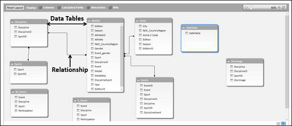
您可以观察到表格之间存在关系 - Disciplines and Medals 。这是因为当您从关系数据库(例如 Access)导入数据时,数据库中存在的相关性也导入到了透视表中的数据模型中。
You can observe that a relationship exists between the tables – Disciplines and Medals. This is because, when you import data from a relational database such as Access, the relationships that exist in the database also are imported to the Data Model in Power Pivot.
Creating a PivotTable from the Data Model
使用先前导入的表格创建一个数据透视表,如下:
Create a PivotTable with the tables that you have imported in the previous section as follows −
-
Click PivotTable on the Ribbon.
-
Select PivotTable from the drop down list.
-
Select New Worksheet in the Create PivotTable dialog box that appears and click OK.

在 Excel 窗口的新工作表中创建了一个空数据透视表。
An empty PivotTable is created in a new worksheet in the Excel window.

在 Power 透视数据模型中列入的所导入表格将显示在数据透视表字段列表中。
All the imported tables that are a part of Power Pivot Data Model appear in the PivotTable Fields list.
-
Drag the NOC_CountryRegion field in the Medals table to the COLUMNS area.
-
Drag Discipline from the Disciplines table to the ROWS area.
-
Filter Discipline to display only five sports: Archery, Diving, Fencing, Figure Skating, and Speed Skating. This can be done either in PivotTable Fields area, or from the Row Labels filter in the PivotTable itself.
-
Drag Medal from the Medals table to the VALUES area.
-
Select Medal from the Medals table again and drag it into the FILTERS area.
数据透视表将填充选定区域的添加字段和布局。
The PivotTable is populated with the added fields and in the chosen layout from the areas.

Exploring Data with PivotTable
你可能只想显示奖牌数 > 80 的值。要执行此操作,请按照以下步骤操作:
You might want to display only those values with Medal Count > 80. To perform this, follow the given steps −
-
Click the arrow to the right of Column Labels.
-
Select Value Filters from the dropdown list.
-
Select Greater Than…. from the second dropdown list.
-
Click OK.

将会出现 Value Filter 对话框。在最靠右的框中输入 80,然后单击“确定”。
The Value Filter dialog box appears. Type 80 in the right-most box and click OK.

数据透视表只会显示奖牌总数高于 80 的地区。
The PivotTable displays only those regions with total number of medals more than 80.

你只需按照几个步骤,就可以用不同的表格生成你想要的特定报表。由于 Access 数据库中的表之间存在预先的关系,因此才能够实现这一点。由于你同时从数据库中导入了所有表格,因此 Power 透视会在其数据模型中重新创建关系。
You could arrive at the specific report that you wanted from the different tables in just few steps. This became possible because of the pre-existing relationships among the tables in the Access database. As you imported all the tables from the database together at the same time, Power Pivot recreated the relationships in its Data Model.
Summarizing Data from Different Sources in Power Pivot
如果你从不同来源获取数据表,或者没有同时从数据库中导入表格,或者如果你在工作簿中创建了新的 Excel 表格并将它们添加到数据模型中,则必须创建希望用于在数据透视表中进行分析和汇总的表格之间的关系。
If you get the data tables from different sources or if you do not import the tables from a database at the same time, or if you create new Excel tables in your workbook and add them to the Data Model, you have to create the relationships among the tables that you want to use for your analysis and summarization in the PivotTable.
-
Create a new worksheet in the workbook.
-
Create an Excel table – Sports.

将“体育”表格添加到数据模型中。
Add Sports table to Data Model.

使用字段 SportID 在表格 Disciplines and Sports 之间创建关系。
Create a relationship between the tables Disciplines and Sports with the field SportID.

将字段 Sport 添加到数据透视表中。
Add the field Sport to the PivotTable.

整理字段 - Discipline and Sport 在行区域。
Shuffle the fields - Discipline and Sport in the ROWS area.

Extending Data Exploration
您还可以进一步探索 Events 表中的数据。
You can get the table Events also into further data exploration.
创建 Events 和 Medals 表格之间的关系,字段为 DisciplineEvent 。
Create a relationship between the tables- Events and Medals with the field DisciplineEvent.

将表格 Hosts 添加到工作簿和数据模型中。
Add a table Hosts to the workbook and Data Model.

Extending the Data Model using Calculated Columns
为了将主机表格连接到任何其他表格,它应该具有一个字段,该字段的值唯一标识主机表格中的每一行。由于主机表格中不存在这样的字段,因此您可以在主机表格中创建计算列,以便其中包含唯一值。
To connect Hosts table to any of the other tables, it should have a field with values that uniquely identify each row in the Hosts table. As no such field exists in the Host table, you can create a calculated column in the Hosts table so that it contains unique values.
-
Go to the Hosts table in Data View of the PowerPivot window.
-
Click the Design tab on the Ribbon.
-
Click Add.
最右边的名为添加列的列被高亮显示。
The right-most column with the header Add Column is highlighted.

-
Type the following DAX formula in the formula bar = CONCATENATE ([Edition], [Season])
-
Press Enter.
使用上述 DAX 公式生成的值创建了一个新列,标题为 CalculatedColumn1 ,并且该列已填满。
A new column is created with the header CalculatedColumn1 and the column is filled by the values resulting from the above DAX formula.

右键单击新列,然后从下拉列表中选择重命名列。
Right-click on the new column and select Rename Column from the dropdown list.

在新列的标题中键入 EditionID 。
Type EditionID in the header of the new column.

如您所见,列 EditionID 在 Hosts 表格中有唯一值。
As you can see, the column EditionID has unique values in the Hosts table.
Creating a Relationship Using Calculated Columns
如果您必须在 Hosts 表格和 Medals 表格之间创建关系,则列 EditionID 还应存在于 Medals 表格中。按照以下步骤在 Medals 表格中创建计算列-
If you have to create a relationship between the Hosts table and the Medals table, the column EditionID should exist in the Medals table also. Create a calculated column in Medals table as follows −
-
Click on the Medals table in the Data View of Power Pivot.
-
Click the Design tab on the Ribbon.
-
Click Add.
在公式栏中键入 DAX 公式 = YEAR ([EDITION]) ,然后按 Enter。
Type the DAX formula in the formula bar = YEAR ([EDITION]) and press Enter.
将创建的新列重命名为 Year,然后单击 Add 。
Rename the new column that is created as Year and click Add.

-
Type the following DAX formula in the formula bar = CONCATENATE ([Year], [Season])
-
Rename the new column that is created as EditionID.

正如您所观察到的,Medals 表格中的 EditionID 列与 Hosts 表格中的 EditionID 列具有相同的值。因此,您可以使用 EditionID 字段在表格之间(Medals 和 Sports)创建关系。
As you can observe, the EditionID column in the Medals table has identical values as the EditionID column in the Hosts table. Therefore, you can create a relationship between the tables – Medals and Sports with the EditionID field.
-
Switch to the diagram view in PowerPivot window.
-
Create a relationship between the tables- Medals and Hosts with the field that is obtained from the calculated column i.e. EditionID.

现在可以将主办方表中的字段添加到 Power 透视表中。
Now you can add fields from Hosts table to Power PivotTable.
Excel Power Pivot - Flattened
当数据具有很多级别时,有时阅读数据透视表报表会变得很麻烦。
When the data has many levels, sometimes it becomes cumbersome to read the PivotTable report.
例如,考虑以下数据模型。
For example, consider the following Data Model.

我们将创建 Power PivotTable 和 Power Flattened PivotTable 以了解布局。
We will create a Power PivotTable and a Power Flattened PivotTable to get an understanding of the layouts.
Creating a PivotTable
您可以按以下方式创建 Power PivotTable −
You can create a Power PivotTable as follows −
-
Click the Home tab on the Ribbon in the PowerPivot window.
-
Click PivotTable.
-
Select PivotTable from the dropdown list.

将创建一个空的数据透视表。
An empty PivotTable will be created.
-
Drag the fields − Salesperson, Region and Product from the PivotTable Fields list to the ROWS area.
-
Drag the field − TotalSalesAmount from the Tables − East, North, South and West to the ∑ VALUES area.

如您所见,阅读此类报告有点麻烦。如果条目数量增多,难度会更大。
As you can see, it is a bit cumbersome read such a report. If the number of entries becomes more, the more difficult it will be.
Power Pivot 提供了一个使用扁平数据透视表更好地表示数据的解决方案。
Power Pivot provides a solution for a better representation of data with Flattened PivotTable.
Creating a Flattened PivotTable
您可以按照以下步骤创建 Power 扁平数据透视表 −
You can create a Power Flattened PivotTable as follows −
-
Click the Home tab on the Ribbon in the PowerPivot window.
-
Click PivotTable.
-
Select Flattened PivotTable from the dropdown list.

将出现 Create Flattened PivotTable 对话框。选择新建工作表,然后单击确定。
Create Flattened PivotTable dialog box appears. Select New Worksheet and click OK.

您可以观察到数据在此数据透视表中已展开。
As you can observe the data is flattened out in this PivotTable.

Note − 在本例中,销售员、区域和产品仅在 ROWS 区域中,如前例所示。然而,在数据透视表布局中,这三个字段显示为三列。
Note − In this case Salesperson, Region and Product are in ROWS area only as in the previous case. However, in the PivotTable layout, these three fields are appearing as three columns.
Exploring Data in Flattened PivotTable
假设你要汇总产品空调的销售数据。您可以使用扁平数据透视表以下述方式简单地完成此操作 −
Suppose you want to summarize the sales data for the product − Air Conditioner. You can do it in a simple way with the Flattened PivotTable as follows −
-
Click the arrow next to the column header − Product.
-
Check the box Air Conditioner and uncheck the other boxes. Click OK.

扁平数据透视表已筛选为空调销售数据。
The Flattened PivotTable is filtered to the Air Conditioner sales data.
您可以通过从 COLUMNS 区域将 ∑ VALUES 拖到 ROWS 区域来使它看起来更扁平。
You can make it look more flattened by dragging ∑ VALUES to ROWS area from the COLUMNS area.
在 ∑ VALUES 区域中重命名求和值的自定义名称,使其更具意义,如下所示 −
Rename the custom names of the summation values in the ∑ VALUES area to make them more meaningful as follows −
-
Click on a summation value, say, Sum of TotalSalesAmount for East.
-
Select Value Field Settings from the dropdown list.
-
Change the Custom Name to East TotalSalesAmount.
-
Repeat the steps for the other three summation values.

您还可以总结已销售的单位数。
You can also summarize the number of units sold.
-
Drag No. of Units to the ∑ VALUES area from each of the tables − East_Sales, North_Sales, South_Sales and West_Sales.
-
Rename the values to East Total No. of Units, North Total No. of Units, South Total No. of Units and West Total No. of Units respectively.

如您所见,上述两个表格中都有包含空值的行,因为每位销售人员代表一个地区,而每个地区也仅由一位销售人员代表。
As you can observe, in both of the above tables, there are rows with empty values, as each salesperson represents a single region and each region is represented only by a single salesperson.
-
Select the rows with empty values.
-
Right click and click on Hide in the dropdown list.
所有包含空值的行都将隐藏。
All the rows with empty values will be hidden.

如您所见,虽然包含空值的行没有显示,但销售人员的信息也隐藏了。
As you can observe, though the rows with empty values are not displayed, the information on the Salesperson also got hidden.
-
Click on the column header − Salesperson.
-
Click the ANALYZE tab on the Ribbon.
-
Click Field Settings. The Field Settings dialog box appears.
-
Click the Layout & Print tab.
-
Check the box - Repeat Item Labels.
-
Click OK.

如您所见,销售人员信息已显示且包含空值的行已隐藏。此外,报表中的区域列是多余的,因为值列中的值具有自解释性。
As you can observe, the Salesperson information is displayed and the rows with empty values are hidden. Further, the column Region in the report is redundant, as the values in the Values column are self-explanatory.

将区域字段拖出区域。
Drag the field Regions out of Area.

反转 ROWS 区域中销售人员和产品字段的顺序。
Reverse the order of the fields − Salesperson and Product in the ROWS area.

您已在一个简洁的报表中合并源自 Power Pivot 中六个表格的数据。
You have arrived at a concise report combining data from six tables in the Power Pivot.
Excel Power Pivot Charts - Creation
基于数据模型并从 Power 透视窗口创建的透视图表是一个 Power 透视图表。虽然它拥有与 Excel 透视图表类似的一些功能,但还有其他一些功能使其更加强大。
A PivotChart based on Data Model and created from the Power Pivot window is a Power PivotChart. Though it has some features similar to Excel PivotChart, there are other features that make it more powerful.
在本章中,你将学习有关 Power 透视图表的内容。从今以后,我们将称其为透视图表以示简单。
In this chapter, you will learn about Power PivotCharts. Henceforth we refer to them as PivotCharts, for simplicity.
Creating a PivotChart
假设你希望基于以下数据模型创建透视图表。
Suppose you want to create a PivotChart based on the following Data Model.

-
Click the Home tab on the Ribbon in Power Pivot window.
-
Click PivotTable.
-
Select PivotChart from the dropdown list.

出现 Create PivotChart 对话框。选择新建工作表,然后单击确定。
The Create PivotChart dialog box appears. Select New Worksheet and click OK.

在 Excel 窗口的新工作表上创建了一个空透视图表。
An empty PivotChart is created on a new worksheet in the Excel window.

如你所见,数据模型中的所有表格会显示在“透视表字段”列表中。
As you can observe, all the tables in the data model are displayed in the PivotChart Fields list.
-
Click on the Salesperson table in the PivotChart Fields list.
-
Drag the fields − Salesperson and Region to AXIS area.
透视表中将出现两个轴字段按钮,分别对应于两个选定字段。这些是轴字段按钮。字段按钮用于筛选透视表中显示的数据。
Two field buttons for the two selected fields appear on the PivotChart. These are the Axis field buttons. The use of field buttons is to filter data that is displayed on the PivotChart.

将 TotalSalesAmount 从四张表(East_Sales、North_Sales、South_Sales 和 West_Sales)中的每张表拖动到 ∑ VALUES 区域。
Drag TotalSalesAmount from each of the four tables– East_Sales, North_Sales, South_Sales and West_Sales to ∑ VALUES area.

工作表上会出现以下内容 −
The following appear on the worksheet −
-
In the PivotChart, column chart is displayed by default.
-
In the LEGEND area, ∑ VALUES are added.
-
The Values appear in the Legend in the PivotChart, with title Values.
-
The Value Field Buttons appear on the PivotChart. You can remove the legend and the value field buttons for a tidier look of the PivotChart.
-
Click on the button at the top right corner of the PivotChart. The Chart Elements dropdown list appears.

取消选中图表元素列表中的图例复选框。图例将从透视图表中删除。
Uncheck the box Legend in the Chart Elements list. The Legend is removed from the PivotChart.

-
Right click on the value field buttons.
-
Select Hide Value Field Buttons on Chart from the dropdown list.

图表上的值字段按钮被删除。
The value field buttons on the chart are removed.
Note − 字段按钮和/或图例的显示取决于透视图表的上下文。你需要决定需要显示哪些内容。
Note − The display of field buttons and/or legend depends on the context of the PivotChart. You need to decide what is required to be displayed.

PivotChart Fields List
与 Power 透视表一样,Power 透视图表字段列表也包含两个选项卡 - ACTIVE 和 ALL。在 ALL 选项卡下,显示数据模型中的所有数据表。在 ACTIVE 选项卡下,显示已将字段添加到透视图表的那些表。
As in the case of Power PivotTable, Power PivotChart Fields list also contains two tabs – ACTIVE and ALL. Under the ALL tab, all the data tables in the Power Pivot Data Model are displayed. Under the ACTIVE tab, the tables from which the fields are added to PivotChart are displayed.

同样,这些区域与 Excel 透视图表中的区域相同。有四个区域:
Likewise, the areas are as in the case of Excel PivotChart. There four areas are −
-
AXIS (Categories)
-
LEGEND (Series)
-
∑ VALUES
-
FILTERS
正如你在上一个章节中看到的,图例中填充了∑值。此外,已将字段按钮添加到数据透视表中,以便于过滤所显示的数据。
As you have seen in the previous section, Legend is populated with ∑ Values. Further, field buttons are added to the PivotChart for the ease of filtering the data that is being displayed.
Filters in PivotChart
你可以在图表上使用轴字段按钮来过滤所显示的数据。单击轴字段按钮的箭头 - 区域。
You can use the Axis field buttons on the chart to filter the data being displayed. Click on the arrow on the Axis field button – Region.

出现的下拉列表如下所示 −
The dropdown list that appears looks as follows −

你可以选择你想要显示的值。或者,你可以将该字段放在过滤器区域中以过滤值。
You can select the values that you want to display. Alternatively, you can place the field in FILTERS area for filtering the values.
将区域字段拖放到过滤器区域。透视报表筛选器按钮 - 区域出现在数据透视表上。
Drag the field Region to FILTERS area. The Report Filter button - Region appears on the PivotChart.

单击报表筛选器按钮的箭头 - 区域。出现的下拉列表如下所示 −
Click on the arrow on the Report Filter button − Region. The dropdown list that appears looks as follows −

你可以选择你想要显示的值。
You can select the values that you want to display.
Slicers in PivotChart
使用切片器是另一个在 Power PivotChart 中过滤数据的方法。
Using Slicers is another option to filter data in the Power PivotChart.
-
Click the ANALYZE tab under PIVOTCHART tools on the Ribbon.
-
Click Insert Slicer in the Filter group. The Insert Slicer dialog box appears.

所有表格和相应的字段都出现在插入切片器对话框中。
All the tables and the corresponding fields appear in the Insert Slicer dialog box.
在插入切片器对话框中单击业务员表格中的区域字段。
Click the field Region in Salesperson table in the Insert Slicer dialog box.

区域字段的切片器出现在工作表上。
Slicer for the field Region appears on the worksheet.

如你所见,区域字段仍然作为轴字段存在。你可以通过单击切片器按钮来选择想要显示的值。
As you can observe, the Region field still exists as an Axis field. You can select the values that you want to display by clicking on the Slicer buttons.
记住你可以在几分钟内完成所有这些操作,并且由于 Power Pivot 数据模型和定义的关系,这些操作都是动态的。
Remember that you are able to do all these in a few minutes and also dynamically because of the Power Pivot Data Model and defined relationships.
PivotChart Tools
在 Power PivotChart 中,PIVOTCHART 工具在功能区上有三个选项卡,而不是 Excel 数据透视表中的两个选项卡 −
In Power PivotChart, the PIVOTCHART TOOLS has three tabs on the Ribbon as against two tabs in Excel PivotChart −
-
ANALYZE
-
DESIGN
-
FORMAT
第三个选项卡 − 格式化是 Power PivotChart 中的附加选项卡。
The third tab − FORMAT is the additional tab in Power PivotChart.

单击功能区上的格式化选项卡。
Click the FORMAT tab on the Ribbon.

格式化选项卡下的功能区选项都用以增强你的数据透视表的精彩程度。你可以明智地使用这些选项,避免过分枯燥。
The options on the Ribbon under FORMAT tab are all for adding splendor to your PivotChart. You can use these options judiciously, without getting over bored.
Table and Chart Combinations
Power Pivot 为您提供各种 Power 透视表和 Power 透视图表组合,以用于数据探索、可视化和报告。您已在前面的章节中学习了数据透视表和数据透视图表。
Power Pivot provides you with different combinations of Power PivotTable and Power PivotChart for data exploration, visualization, and reporting. You have learnt the PivotTables and PivotCharts in the previous chapters.
在本章节中,您将了解如何从 Power 透视窗口中创建表格和图表组合。
In this chapter, you will learn how to create the Table and Chart combinations from within the Power Pivot window.
考虑我们在动态数据透视图中用于图示的以下数据模型:
Consider the following Data Model in Power Pivot that we will use for illustrations −
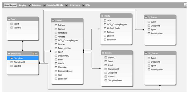
Chart and Table (Horizontal)
利用这个选项,您可以在同一张工作表中创建一个 Power 透视图表和一个 Power 透视表,它们以水平方式彼此相邻。
With this option, you can create a Power PivotChart and a Power PivotTable, one next another horizontally in the same worksheet.
-
Click the Home tab in Power Pivot window.
-
Click PivotTable.
-
Select Chart and Table (Horizontal) from the dropdown list.
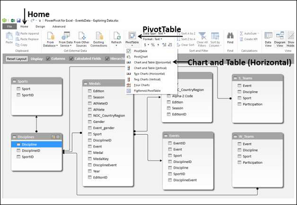
将出现“创建数据透视表和数据透视表(水平)”对话框。选择“新建工作表”,然后单击“确定”。
Create PivotChart and PivotTable (Horizontal) dialog box appears. Select New Worksheet and click OK.

空白的数据透视图表和空白的数据透视表将显示在新的工作表中。
An empty PivotChart and an empty PivotTable appear on a new worksheet.
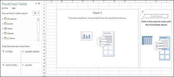
-
Click on the PivotChart.
-
Drag NOC_CountryRegion from Medals table to the AXIS area.
-
Drag Medal from Medals table to the ∑ VALUES area.
-
Right click on the Chart and select Change Chart Type from the dropdown list.
-
Select Area Chart.
-
Change the Chart Title to Total No. of Medals − Country Wise.

正如您所见,美国拥有奖牌数量最多(>4500 枚)。
As you can see, USA has the highest number of Medals (> 4500).
-
Click on the PivotTable.
-
Drag Sport from the Sports table to the ROWS area.
-
Drag Medal from the Medals table to the ∑ VALUES area.
-
Drag NOC_CountryRegion from Medals table to FILTERS area.
-
Filter the NOC_CountryRegion field to the value USA.
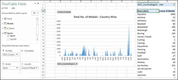
将 PivotTable Report 布局更改为 Outline 表单。
Change the PivotTable Report Layout to Outline Form.
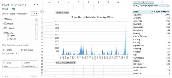
-
Deselect Sport from the Sports table.
-
Drag Gender from the Medals table to the ROWS area.
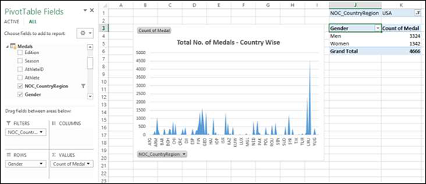
Chart and Table (Vertical)
使用此选项,您可以在同一工作表的垂直下方创建 Power PivotChart 和 Power PivotTable。
With this option, you can create a Power PivotChart and a Power PivotTable, one below another vertically in the same worksheet.
-
Click the Home tab in Power Pivot window.
-
Click PivotTable.
-
Select Chart and Table (Vertical) from the dropdown list.
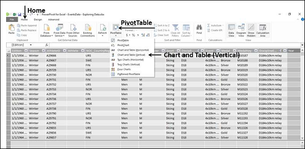
将会显示 Create PivotChart and PivotTable (Vertical) 对话框。选择新建工作表,然后单击确定。
The Create PivotChart and PivotTable (Vertical) dialog box appears. Select New Worksheet and click OK.
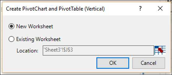
空 PivotChart 和空 PivotTable 将垂直显示在新的工作表上。
An empty PivotChart and an empty PivotTable appear vertically on a new worksheet.
-
Click on the PivotChart.
-
Drag Year from the Medals table to AXIS area.
-
Drag Medal from the Medals table to ∑ VALUES area.
-
Right click on the Chart and select Change Chart Type from the dropdown list.
-
Select Line Chart.
-
Check the box Data Labels in the Chart Elements.
-
Change the Chart Title to Total No. of Medals – Year Wise.

正如您所见,2008 年拥有奖牌数量最多(2450 枚)。
As you can observe, year 2008 has the highest number of Medals (2450).
-
Click on the PivotTable.
-
Drag Sport from the Sports table to the ROWS area.
-
Drag Gender from the Medals table to the ROWS area.
-
Drag Medal from the Medals table to the ∑ VALUES area.
-
Drag Year from the Medals table to the FILTERS area.
-
Filter the Year field to the value 2008.
-
Change the Report Layout of PivotTable to Outline Form.
-
Filter the field Sport with Value Filters to Greater than or equal to 80.

Excel Power Pivot - Hierarchies
数据模型中的层次结构是数据表中嵌套列的列表,在 Power PivotTable 中使用时被视为单一项目。例如,如果数据表中具有国家/地区、州、城市这些列,则可以定义一个层次结构,将这三列组合成一个字段。
A hierarchy in Data Model is a list of nested columns in a data table that are considered as a single item when used in a Power PivotTable. For example, if you have the columns − Country, State, City in a data table, a hierarchy can be defined to combine the three columns into one field.
在 Power PivotTable 字段列表中,层次结构显示为一个字段。因此,您可以只向数据透视表添加一个字段,而不是层次结构中的三个字段。此外,它使您可以以一种有意义的方式在嵌套级别中向上或向下移动。
In the Power PivotTable Fields list, the hierarchy appears as one field. So, you can add just one field to the PivotTable, instead of the three fields in the hierarchy. Further, it enables you to move up or down the nested levels in a meaningful way.
考虑此章节中插图的以下数据模型。
Consider the following Data Model for illustrations in this chapter.

Creating a Hierarchy
您可以在数据模型的图表视图中创建层次结构。请注意,您只能根据单个数据表创建层次结构。
You can create Hierarchies in the diagram view of the Data Model. Note that you can create a hierarchy based on a single data table only.
-
Click on the columns − Sport, DisciplineID and Event in the data table Medal in that order. Remember that the order is important to create a meaningful hierarchy.
-
Right-click on the selection.
-
Select Create Hierarchy from the dropdown list.

将使用三个选定字段作为子级的层次结构字段创建。
The hierarchy field with the three selected fields as the child levels gets created.

Renaming a Hierarchy
若要重命名层次结构字段,请执行以下操作 −
To rename the hierarchy field, do the following −
-
Right click on Hierarchy1.
-
Select Rename from the dropdown list.

键入 EventHierarchy 。
Type EventHierarchy.

Creating a PivotTable with a Hierarchy in Data Model
可以使用在数据模型中创建的层次结构创建 Power PivotTable。
You can create a Power PivotTable using the hierarchy that you created in the Data Model.
-
Click the PivotTable tab on the Ribbon in the Power Pivot window.
-
Click PivotTable on the Ribbon.

显示 Create PivotTable 对话框。选择“New Worksheet”,然后单击“OK”。
The Create PivotTable dialog box appears. Select New Worksheet and click OK.

在新的工作表中创建空的透视表。
An empty PivotTable is created in a new worksheet.

在“透视表字段”列表中, EventHierarchy 显示为“Medals”表中的一个字段。Medals 表中的其他字段已折叠并显示为“More Fields”。
In the PivotTable Fields list, EventHierarchy appears as a field in Medals table. The other fields in the Medals table are collapsed and shown as More Fields.
-
Click on the arrow in front of EventHierarchy.
-
Click on the arrow in front of More Fields.
将显示 EventHierarchy 下的字段。Medal 表中的所有字段将显示在“更多字段”下。
The fields under EventHierarchy will be displayed. All the fields in the Medals table will be displayed under More Fields.

正如您所看到的,您添加到层次结构中的三个字段也会出现在 More Fields 下方,并带有复选框。如果您不希望它们出现在 More Fields 下方的“透视表字段”列表中,则必须隐藏 Power Pivot 窗口的数据视图中 Medals 数据表中的列。您可以随时取消隐藏它们。
As you can observe, the three fields that you added to the hierarchy also appear under More Fields with check boxes. If you do not want them to appear in the PivotTable Fields list under More Fields, you have to hide the columns in the data table – Medals in data view in Power Pivot Window. You can always unhide them whenever you want.
按如下方式将字段添加到透视表 −
Add fields to the PivotTable as follows −
-
Drag EventHierarchy to ROWS area.
-
Drag Medal to ∑ VALUES area.

“Sport”字段的值以正号 (+) 开头显示在透视表中。每项运动的奖牌数显示在后面。
The values of Sport field appear in the PivotTable with a + sign in front of them. The medal count for each sport is displayed.
-
Click on the + sign before Aquatics. The DisciplineID field values under Aquatics will be displayed.
-
Click on the child D22 that appears. The Event field values under D22 will be displayed.

正如您所看到的,奖牌数给出了按父级 − DisciplineID 汇总的赛事,按父级 − “Sport” 进一步汇总的赛事。
As you can observe, medal count is given for the Events, that get summed up at the parent level − DisciplineID, that get further summed up at the parent level − Sport.
Creating a Hierarchy based on Multiple Tables
假设您要在透视表中显示学科而不是学科 ID,以使其成为更易于阅读和理解的汇总。为此,您需要在 Medals 表中包含 Discipline 字段,而您知道它并不存在。Discipline 字段位于 Disciplines 数据表中,但您无法用来自多个表的字段创建层次结构。不过,有一种方法可以从其他表中获取所需的字段。
Suppose you want to display the Disciplines in the PivotTable rather than DisciplineIDs to make it a more readable and understandable summarization. In order to do this, you need to have the field Discipline in Medals table that as you know is not. Discipline field is in Disciplines data table, but you cannot create a hierarchy with fields from more than one table. But, there is a way to obtain the required field from the other table.
您知道 Medals 表和 Disciplines 表是相关的。您可以通过使用 DAX 与关系创建列,将 Disciplines 表中的 Discipline 字段添加到 Medals 表中。
As you are aware, the tables − Medals and Disciplines are related. You can add the field Discipline from Disciplines table to the Medals table, by creating a column using the relationship with DAX.
-
Click data view in Power Pivot window.
-
Click the Design tab on the Ribbon.
-
Click Add.
表右侧的列 – 添加列被高亮显示。
The column − Add Column on the right side of the table is highlighted.
在公式栏中输入 = RELATED (Disciplines [Discipline]) 。新列 − CalculatedColumn1 创建,值与 Disciplines 表中的 Discipline 字段值相同。
Type = RELATED (Disciplines [Discipline]) in the formula bar. A new column − CalculatedColumn1 is created with the values as Discipline field values in the Disciplines table.

将 Medals 表中如此获取的新列重命名为 Discipline。接下来,你必须从层次结构中移除 DisciplineID,并添加 Discipline(这将在后续章节中学习)。
Rename the new column thus obtained in the Medals table as Discipline. Next, you have to remove DisciplineID from the Hierarchy and add Discipline, which you will learn in the following sections.
Removing a Child Level from a Hierarchy
你可以观察到,层次结构仅在图表视图中可见,在数据视图中不可见。因此,你仅能在图表视图中编辑层次结构。
As you can observe, the hierarchy is visible in the diagram view only, and not in the data view. Hence, you can edit a hierarchy in the diagram view only.
-
Click on the diagram view in the Power Pivot window.
-
Right click DisciplineID in EventHierarchy.
-
Select Remove from Hierarchy from the dropdown list.

确认对话框出现。单击 Remove from Hierarchy 。
The Confirm dialog box appears. Click Remove from Hierarchy.

DisciplineID 字段从层次结构中删除。请记住,你已从层次结构中移除该字段,但源字段仍存在于数据表中。
The field DisciplineID gets deleted from the hierarchy. Remember that you have removed the field from hierarchy, but the source field still exists in the data table.
接下来,你需要将 Discipline 字段添加到 EventHierarchy。
Next, you need to add Discipline field to EventHierarchy.
Adding a Child Level to a Hierarchy
你可以向现有层次结构 - EventHierarchy 添加 Discipline 字段,如下所示 −
You can add the field Discipline to the existing hierarchy - EventHierarchy as follows −
-
Click on the field in Medals table.
-
Drag it to the Events field below in the EventHierarchy.

Discipline 字段会添加到 EventHierarchy。
The Discipline field gets added to EventHierarchy.

你可以看到,EventHierarchy 中的字段顺序为运动 – 项目 – 学科。但是,你应知道其顺序应为运动 – 学科 – 项目。因此,你需要更改字段顺序。
As you can observe, the order of the fields in EventHierarchy is Sport–Event–Discipline. But, as you are aware it has to be Sport–Discipline-Event. Hence, you need to change the order of the fields.
Changing the Order of a Child Level in a Hierarchy
要将字段 Discipline 移到字段 Sport 之后的位置,请执行以下操作 −
To move the field Discipline to the position after the field Sport, do the following −
-
Right click on the field Discipline in EventHierarchy.
-
Select Move Up from the dropdown list.

字段顺序将更改为运动 – 学科 – 项目。
The order of the fields changes to Sport-Discipline-Event.

PivotTable with Changes in Hierarchy
若要查看你在事件层级中对数据透视表所做的更改,你不需要新建数据透视表。你可以在现有的数据透视表上查看它们。
To view the changes that you made in EventHierarchy in the PivotTable, you need not create a new PivotTable. You can view them in the existing PivotTable itself.
单击 Excel 窗口中的包含数据透视表的工作表。
Click on the worksheet with the PivotTable in Excel window.

正如你观察到的,在数据透视表字段列表中,事件层级中的子级别反映了你在数据模型中层级中所做的更改。同样的更改也会相应地反映在数据透视表中。
As you can observe, in the PivotTable Fields list, the child levels in the EventHierarchy reflect the changes you made in the Hierarchy in Data Model. The same changes also get reflected in the PivotTable accordingly.
单击数据透视表中水上运动前的加号。子级别将作为学科字段的值显示。
Click the + sign in front of Aquatics in the PivotTable. The child levels appear as values of the field Discipline.

Hiding and Showing Hierarchies
你可以选择隐藏这些层级,并在需要时显示它们。
You can choose to hide the Hierarchies and show them whenever you want.
-
Uncheck the box Hierarchies in the top menu of diagram view to hide the hierarchies.
-
Check the box Hierarchies to show the hierarchies.

Creating a Hierarchy in Other Ways
除了在前面的部分中创建层级的方式外,你还可以另外两种方式创建层级。
In addition to the way you created hierarchy in the previous sections, you can create a hierarchy in another two ways.
-
Click the Create Hierarchy button on the top right corner of the Medals data table in diagram view.

将在表格中创建新的层级,其中没有任何字段。
A new hierarchy gets created in the table without any fields in it.

按该顺序将字段年份和赛季拖到新层级。层级会显示子级别。
Drag the fields Year and Season, in that order to the new hierarchy. The hierarchy shows the child levels.

-
Another way of creating the same hierarchy is as follows −[style="arabic"]
-
Right click on the field Year in the Medals data table in diagram view.
-
Select Create Hierarchy from the dropdown list.
-

会在表中创建一个新的层级,其中年份是子字段。
A new hierarchy is created in table with Year as a child field.

将字段赛季拖到层级。层级会显示子级别。
Drag the field season to the hierarchy. The hierarchy shows the child levels.

Deleting a Hierarchy
你可以通过以下方式从数据模型中删除层级−
You can delete a hierarchy from the Data Model as follows −
-
Right click on the hierarchy.
-
Select Delete from the dropdown list.

将显示 Confirm 对话框。单击 Delete from Model 。
The Confirm dialog box appears. Click Delete from Model.

分层结构已被删除。
The hierarchy gets deleted.

Calculations Using Hierarchy
您可以通过分层结构创建计算。在 EventsHierarchy 中,您可以按以下方式将子级别奖牌数显示为其父级别奖牌数的百分比 −
You can create calculations using a hierarchy. In the EventsHierarchy, you can display the number of medals at a child level as a percentage of the number of medals at its parent level as follows −
-
Right click on a Count of Medal value of an Event.
-
Select Value Field Settings from the dropdown list.

将出现Value Field Settings对话框。
Value Field Settings dialog box appears.
-
Click the Show Values As tab.
-
Select % of Parent Row Total from the list and click OK.

子级别显示为父总计的百分比。您可以通过对父项的子级别的百分比值求和来验证这一点。总和应为 100%。
The child levels are displayed as the percentage of the Parent Totals. You can verify this by summing up the percentage values of the child level of a parent. The sum would be 100%.

Drilling Up and Drilling Down a Hierarchy
您可以使用快速浏览工具快速查看分层结构的各级别。
You can quickly drill up and drill down across the levels in a hierarchy using Quick Explore tool.
-
Click on a value of Event field in the PivotTable.
-
Click the Quick Explore tool - that appears at the bottom right corner of the cell containing the selected value.

出现了 Explore box with Drill Up 选项。这是因为从 Event 中您只能向上钻取,因为其下方没有子级别。
The Explore box with Drill Up option appears. This is because from Event you can only drill up as there are no child levels under it.
单击 Drill Up 。
Click Drill Up.

数据透视表数据向上钻取至 Disciplin 。
PivotTable data is drilled up to Discipline.

单击Quick Explore tool-出现于包含值的单元格的右下角。
Click on the Quick Explore tool - that appears at the bottom right corner of the cell containing a value.
会出现一个包含“向上钻取”和“向下钻取”选项的浏览框。这是因为从 Discipline 中您可以向上钻取至 Sport 或向下钻取至 Event。
Explore box appears with Drill Up and Drill Down options displayed. This is because from Discipline you can drill up to Sport or drill down to Event.

通过这种方式,您可以快速浏览分层结构。
This way you can quickly move up and down the hierarchy.
Excel Power Pivot - Aesthetic Reports
您可以利用資料模型中的 Power Pivot 資料建立美觀的資料分析報告。
You can create aesthetic reports of your data analysis with Power Pivot Data that is in Data Model.
其重要特性有 −
The important features are −
-
You can use PivotCharts to produce visual reports of your data. You can use Report Layouts to structure your PivotTables to make them easily readable.
-
You can insert Slicers for filtering data in the report.
-
You can use a common Slicer for both the PivotChart and the PivotTable that are in the same report.
-
Once your final report is ready, you can choose to hide the Slicers form the display.
在本章節中,您將會了解如何取得 Power Pivot 中可用的選項所產生的報告。
You will learn how to get reports with the options that are available in Power Pivot in this chapter.
考虑此章节中插图的以下数据模型。
Consider the following Data Model for illustrations in this chapter.

Reports based on Power PivotChart
建立 Power Pivot 圖表,如下所示−
Create a Power PivotChart as follows −
-
Click the Home tab on the Ribbon in PowerPivot window.
-
Click PivotTable.
-
Select PivotChart from the dropdown list.
-
Click New Worksheet in the Create PivotChart dialog box.
将在 Excel 窗口中的新工作表中创建一个空的数据透视表。
An empty PivotChart is created in a new worksheet in Excel window.
-
Drag Sport from Medals table to Axis area.
-
Drag Medal from Medals Table to ∑ VALUES area.

-
Click the ANALYZE tab in PIVOTTABLE TOOLS on the Ribbon.
-
Click Insert Slicer in the Filter Group. The Inset Slicers dialog box appears.
-
Click the field NOC_CountryRegion in the Medals table.
-
Click OK.

切片器 NOC_CountryRegion 出现。
The Slicer NOC_CountryRegion appears.
-
Select USA.
-
Drag Gender from Medals table to GENDER area.

-
Right click on the PivotChart.
-
Select Change Chart Type from the dropdown list.

将出现“更改图表类型”对话框。
The Change Chart Type dialog box appears.
单击“堆积柱形图”。
Click on Stacked Column.

-
Insert Slicer for Sport field.
-
Drag Discipline from Disciplines table to AXIS area.
-
Remove the field Sport from AXIS area.
-
Select Aquatics in the Slicer – Sport.

Report Layout
创建数据透视表如下 −
Create PivotTable as follows −
-
Click on Home tab on the Ribbon in PowerPivot window.
-
Click on PivotTable.
-
Click on PivotTable in the dropdown list. The Create PivotTable dialog box appears.
-
Click on New Worksheet and click Ok. An empty PivotTable gets created in a new worksheet.
-
Drag NOC_CountryRegion from Medals table to AXIS area.
-
Drag Sport from Medals table to COLUMNS area.
-
Drag Discipline from Disciplines table to COLUMNS area.
-
Drag Medal to ∑ VALUES area.

单击“列标签”旁边的箭头按钮,然后选择“水生运动”。
Click on the arrow button next to Column Labels and select Aquatics.

-
Click on the arrow button next to Row Labels.
-
Select Value Filters from the dropdown list.
-
Select Greater Than Or Equal To from the second dropdown list.

在“值筛选器”对话框中“奖牌计数大于或等于”旁边的框中键入 80。
Type 80 in the box next to Count of Medal is greater than or equal to in the Value Filter dialog box.

-
Click the DESIGN tab in PIVOTTABLE TOOLS on the Ribbon.
-
Click on Subtotals.
-
Select Do Not Show Subtotals fromn the dropdown list.

小计列(水生运动合计)移除。
The Subtotals column – Aquatics Total gets removed.

单击“报表布局”,然后从下拉列表中选择“ Show in Outline Form ”。
Click Report Layout and select Show in Outline Form from the dropdown list.

选中“条带行”框。
Check the box Banded Rows.

字段名称显示的行标签和列标签位置,并且报表清晰明了。
The field names appear in place of Row Labels and Column Labels and the report looks self-explanatory.

Using a Common Slicer
创建数据透视图和数据透视表,彼此相邻。
Create a PivotChart and PivotTable next to each other.
-
Click the Home tab on the Ribbon in PowerPivot tab.
-
Click PivotTable.
-
Select Chart and Table (Horizontal) from the dropdown list.

创建数据透视表和数据透视图 (水平) 对话框将显示。
The Create PivotChart and PivotTable (Horizontal) dialog box appears.
选择新建工作表,然后单击确定。在新建工作表中,空数据透视图和空数据透视表将并排显示。
Select New Worksheet and click OK. An Empty PivotChart and an empty PivotTable appear next to each other in a new worksheet.

-
Click PivotChart.
-
Drag Discipline from Disciplines table to AXIS area.
-
Drag Medal from Medals table to ∑ VALUES area.
-
Click PivotTable.
-
Drag Discipline from Disciplines table to ROWS area.
-
Drag Medal from Medals table to ∑ VALUES area.

-
Click the ANALYZE tab in PIVOTTABLE TOOLS on the Ribbon.
-
Click Insert Slicer. The Insert Slicers dialog box appears.
-
Click on NOC_CountryRegion and Sport in Medals table.
-
Click OK.

将显示两个筛选器 - NOC_CountryRegion 和 Sport。排列并调整其大小使其与数据透视表正确对齐。
Two Slicers – NOC_CountryRegion and Sport appear. Arrange and size them to align properly next to the PivotTable.

-
Select USA in the NOC_CountryRegion Slicer.
-
Select Aquatics in the Sport Slicer. The PivotTable is filtered to the selected values.

如您所见,数据透视图未进行筛选。要使用相同筛选器筛选数据透视图,您不需要为数据透视图重新插入筛选器。您可以使用为数据透视表使用的相同筛选器。
As you can observe, the PivotChart is not filtered. To filter PivotChart with the same filters, you need not insert Slicers again for PivotChart. You can use the same Slicers that you have used for the PivotTable.
-
Click on NOC_CountryRegion Slicer.
-
Click the OPTIONS tab in SLICER TOOLS on the Ribbon.
-
Click Report Connections in the Slicer group. The Report Connections dialog box appears for the NOC_CountryRegion Slicer.

您会看到对话框中列出了工作簿中的所有数据透视表和数据透视图。
You can see that all the PivotTables and PivotCharts in the workbook are listed in the dialog box.
-
Click on the PivotChart that is in the same worksheet as the selected PivotTable and click OK.
-
Repeat for Sport Slicer.

数据透视图也将根据在两个筛选器中所选的值进行筛选。
The PivotChart is also filtered to the values selected in the two Slicers.

接下来,您可以在数据透视图和数据透视表中添加详细信息。
Next, you can add details to the PivotChart and PivotTable.
-
Click the PivotChart.
-
Drag Gender to LEGEND area.
-
Right click on the PivotChart.
-
Select Change Chart Type.
-
Select Stacked Column in the Change Chart Type dialog box.
-
Click on the PivotTable.
-
Drag Event to ROWS area.
-
Click the DESIGN tab in PIVOTTABLE TOOLS on the Ribbon.
-
Click Report Layout.
-
Select Outline Form from the dropdown list.

Selecting Objects for Display in the Report
可以选择在最终报表中不显示筛选器。
You can choose not to display the Slicers on the final Report.
-
Click the OPTIONS tab in SLICER TOOLS on the Ribbon.
-
Click Selection Pane in Arrange group. The Selection Pane appears on the right side of the window.

如您所见,符号 将显示在选择窗格中的对象旁边。这意味着这些对象是可见的。
As you can observe, the symbol appears next to the objects in the Selection Pane. This means those objects are visible.
-
Click on symbol next to NOC_CountryRegion.
-
Click on symbol next to Sport. The symbol is changed to for both. This means the visibility for the two Slicers is off.

关闭选择窗格。
Close the Selection Pane.

你可以看到报表中看不到两个切片器。
You can see that the two Slicers are not visible in the Report.