Plotly 简明教程
Plotly - Polar Chart and Radar Chart
在本章中,我们将学习如何在 Plotly 的帮助下制作极坐标图和雷达图。
In this chapter, we will learn how Polar Chart and Radar Chart can be made with the help Plotly.
首先,让我们研究一下极坐标图。
First of all, let us study about polar chart.
Polar Chart
极坐标图是圆形图的常见变体。当数据点之间的关系最容易通过半径和角度可视化时,它非常有用。
Polar Chart is a common variation of circular graphs. It is useful when relationships between data points can be visualized most easily in terms of radiuses and angles.
在极坐标图中,一个序列由一个闭合曲线表示,该曲线连接了极坐标系中的点。每个数据点由到极点的距离(径向坐标)和到固定方向的角度(角坐标)确定。
In Polar Charts, a series is represented by a closed curve that connect points in the polar coordinate system. Each data point is determined by the distance from the pole (the radial coordinate) and the angle from the fixed direction (the angular coordinate).
极坐标图沿着径向轴和角轴表示数据。径向坐标和角坐标使用 go.Scatterpolar() 函数的 r 和 theta 参数给出。theta 数据可以是分类的,但数值数据也是可能的并且是最常用的。
A polar chart represents data along radial and angular axes. The radial and angular coordinates are given with the r and theta arguments for go.Scatterpolar() function. The theta data can be categorical, but, numerical data are possible too and is the most commonly used.
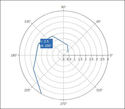
以下代码生成一个基本的极坐标图。除了 r 和 theta 参数外,我们还将模式设置为 lines (它可以设置为标记,在这种情况下只显示数据点)。
Following code produces a basic polar chart. In addition to r and theta arguments, we set mode to lines (it can be set to markers well in which case only the data points will be displayed).
import numpy as np
r1 = [0,6,12,18,24,30,36,42,48,54,60]
t1 = [1,0.995,0.978,0.951,0.914,0.866,0.809,0.743,0.669,0.588,0.5]
trace = go.Scatterpolar(
   r = [0.5,1,2,2.5,3,4],
   theta = [35,70,120,155,205,240],
   mode = 'lines',
)
data = [trace]
fig = go.Figure(data = data)
iplot(fig)
输出如下 −
The output is given below −
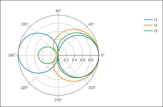
在以下示例中,来自 comma-separated values (CSV) file 的数据用于生成极坐标图。 polar.csv 的前几行如下 -
In the following example data from a comma-separated values (CSV) file is used to generate polar chart. First few rows of polar.csv are as follows −
y,x1,x2,x3,x4,x5,
0,1,1,1,1,1,
6,0.995,0.997,0.996,0.998,0.997,
12,0.978,0.989,0.984,0.993,0.986,
18,0.951,0.976,0.963,0.985,0.969,
24,0.914,0.957,0.935,0.974,0.946,
30,0.866,0.933,0.9,0.96,0.916,
36,0.809,0.905,0.857,0.943,0.88,
42,0.743,0.872,0.807,0.923,0.838,
48,0.669,0.835,0.752,0.901,0.792,
54,0.588,0.794,0.691,0.876,0.74,
60,0.5,0.75,0.625,0.85,0.685,
在笔记本的输入单元中输入以下脚本以生成如下图所示的极坐标图 -
Enter the following script in notebook’s input cell to generate polar chart as below −
import pandas as pd
df = pd.read_csv("polar.csv")
t1 = go.Scatterpolar(
   r = df['x1'], theta = df['y'], mode = 'lines', name = 't1'
)
t2 = go.Scatterpolar(
   r = df['x2'], theta = df['y'], mode = 'lines', name = 't2'
)
t3 = go.Scatterpolar(
   r = df['x3'], theta = df['y'], mode = 'lines', name = 't3'
)
data = [t1,t2,t3]
fig = go.Figure(data = data)
iplot(fig)
以下为上述代码的输出 -
Given below is the output of the above mentioned code −
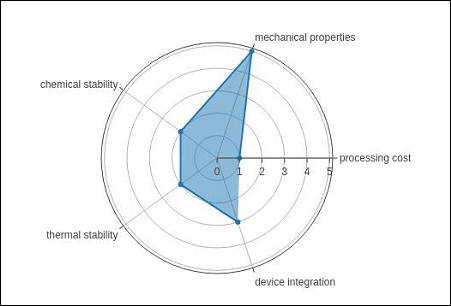
Radar chart
雷达图(也称为 spider plot 或 star plot ),以从中心向外发散的轴上表示的定量变量二维图的形式显示多变量数据。这些轴的相对位置和角度通常没有信息量。
A Radar Chart (also known as a spider plot or star plot) displays multivariate data in the form of a two-dimensional chart of quantitative variables represented on axes originating from the center. The relative position and angle of the axes is typically uninformative.
对于雷达图,在一般情况下,使用具有 go.Scatterpolar() 函数中类别角变量的极坐标图。
For a Radar Chart, use a polar chart with categorical angular variables in go.Scatterpolar() function in the general case.
以下代码可呈现具有 Scatterpolar() function 的基本雷达图 -
Following code renders a basic radar chart with Scatterpolar() function −
radar = go.Scatterpolar(
   r = [1, 5, 2, 2, 3],
   theta = [
      'processing cost',
      'mechanical properties',
      'chemical stability',
      'thermal stability',
      'device integration'
   ],
   fill = 'toself'
)
data = [radar]
fig = go.Figure(data = data)
iplot(fig)
下面提到的输出是给定代码的结果 -
The below mentioned output is a result of the above given code −