Wpf 简明教程
WPF - Styles
The .NET framework provides several strategies to personalize and customize the appearance of an application. Styles provide us the flexibility to set some properties of an object and reuse these specific settings across multiple objects for a consistent look.
-
In styles, you can set only the existing properties of an object such as Height, Width, Font size, etc.
-
Only default behavior of a control can be specified.
-
Multiple properties can be added into a single style.
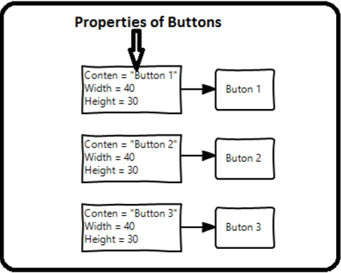
样式用于为一组控件提供统一的外观。隐式样式用于对给定类型的控件的所有控件应用外观,并简化应用程序。设想有三个按钮,它们都必须看起来相同,宽度和高度相同,字体大小相同,前景色相同,等等。我们可以在按钮元素上设置所有这些属性,并且对于所有按钮来说,这仍然完全是可以的。查看以下图表。
Styles are used to give a uniform look or appearance to a set of controls. Implicit styles are used to apply an appearance to all the controls of a given type and simplify the application. Imagine three buttons, all of them have to look the same, same width and height, same font size, same foreground color, etc. We can set all those properties on the button elements themselves and that’s still quite okay for all of the buttons. Take a look at the following diagram.

但在实际应用程序中,你通常会有更多需要看起来完全相同的控件。当然不只是按钮,你通常会希望你的文本块、文本框和组合框等在整个应用程序中看起来相同。当然,一定有更好的方法来实现这一点,被称为 styling 。可以将样式视为将一组属性值应用到多个元素的便捷方式。查看以下图表。
But in a real-life applications, you’ll typically have a lot more of these that need to look exactly the same. And not only buttons of course, you’ll typically want your text blocks, text boxes, and combo boxes etc. to look the same across your application. Surely, there must be a better way to achieve this and it is known as styling. You can think of a style as a convenient way to apply a set of property values to more than one element. Take a look at the following diagram.

Example
我们通过一个简单的示例来了解这个概念。首先创建一个新的 WPF 项目。
Let’s take a simple example to understand this concept. Start by creating a new WPF project.
-
Drag three buttons from the toolbox to the design window.
-
The following XAML code creates three buttons and initializes them with some properties.
<Window x:Class = "WPFStyle.MainWindow"
   xmlns = "http://schemas.microsoft.com/winfx/2006/xaml/presentation"
   xmlns:x = "http://schemas.microsoft.com/winfx/2006/xaml"
   xmlns:d = "http://schemas.microsoft.com/expression/blend/2008"
   xmlns:mc = "http://schemas.openxmlformats.org/markup-compatibility/2006"
   xmlns:local = "clr-namespace: WPFStyle"
   mc:Ignorable = "d" Title = "MainWindow" Height = "350" Width = "604">

   <StackPanel>
      <Button Content = "Button1" Height = "30" Width = "80"
         Foreground = "Blue" FontSize = "12" Margin = "10"/>
      <Button Content = "Button2" Height = "30" Width = "80"
         Foreground = "Blue" FontSize = "12" Margin = "10"/>
      <Button Content = "Button3" Height = "30" Width = "80"
         Foreground = "Blue" FontSize = "12" Margin = "10"/>
   </StackPanel>

</Window>
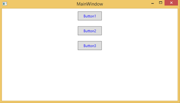
当您查看上面的代码时,您会看到所有按钮的高度、宽度、前景色、字体大小和边距属性均相同。现在,编译并执行上述代码后,将显示以下窗口。
When you look at the above code, you will see that for all the buttons height, width, foreground color, font size and margin properties are same. Now when the above code is compiled and executed the following window will be displayed.

现在,我们来看同一个示例,但这一次,我们将使用 style 。
Now let’s have a look at the same example, but this time, we will be using style.
<Window x:Class = "XAMLStyle.MainWindow"
   xmlns = "http://schemas.microsoft.com/winfx/2006/xaml/presentation"
   xmlns:x = "http://schemas.microsoft.com/winfx/2006/xaml"
   xmlns:d = "http://schemas.microsoft.com/expression/blend/2008"
   xmlns:mc = "http://schemas.openxmlformats.org/markup-compatibility/2006"
   xmlns:local = "clr-namespace:XAMLStyle"
   mc:Ignorable = "d" Title = "MainWindow" Height = "350" Width = "604">

   <Window.Resources>
      <Style x:Key = "myButtonStyle" TargetType = "Button">
         <Setter Property = "Height" Value = "30" />
         <Setter Property = "Width" Value = "80" />
         <Setter Property = "Foreground" Value = "Blue" />
         <Setter Property = "FontSize" Value = "12" />
         <Setter Property = "Margin" Value = "10" />
      </Style>
   </Window.Resources>

   <StackPanel>
      <Button Content = "Button1" Style = "{StaticResource myButtonStyle}" />
      <Button Content = "Button2" Style = "{StaticResource myButtonStyle}" />
      <Button Content = "Button3" Style="{StaticResource myButtonStyle}" />
   </StackPanel>

</Window>
样式在资源字典中定义,每个样式都有一个唯一的键标识符和一个目标类型。在 <style> 内部,您可以看到为将在样式中包含的每个属性定义了多个 setter 标记。
Styles are defined in the resource dictionary and each style has a unique key identifier and a target type. Inside <style> you can see that multiple setter tags are defined for each property which will be included in the style.
在上例中,每个按钮的所有公共属性现在都在样式中定义,然后通过 StaticResource 标记扩展设置样式属性,将样式分配给具有唯一键的每个按钮。
In the above example, all of the common properties of each button are now defined in style and then the style are assigned to each button with a unique key by setting the style property through the StaticResource markup extension.
当您编译并执行上述代码时,它将显示以下窗口(相同的输出)。
When you compile and execute the above code, it will display the following window (the same output).

这样做的好处显而易见,我们可以在其作用域内的任何地方重用该样式;如果需要更改它,我们只需在样式定义中更改它一次,而不是在每个元素上更改。
The advantage of doing it like this is immediately obvious, we can reuse that style anywhere in its scope; and if we need to change it, we simply change it once in the style definition instead of on each element.
样式定义的级别会立即限制该样式的作用域。因此,作用域(即您可以在其中使用样式的位置)取决于您定义样式的位置。样式可以在以下级别上定义:
In what level a style is defined instantaneously limits the scope of that style. So the scope, i.e. where you can use the style, depends on where you’ve defined it. Styles can be defined on the following levels −
Sr.No |
Levels & Description |
1 |
Control LevelDefining a style on control level can only be applied to that particular control. Given below is an example of a control level where the button and TextBlock have their own style. |
2 |
Layout LevelDefining a style on any layout level will make it accessible by that layout and its child elements only. |
3 |
Window LevelDefining a style on a window level can make it accessible by all the elements on that window. |
4 |
Application LevelDefining a style on app level can make it accessible throughout the entire application. Let’s take the same example, but here, we will put the styles in app.xaml file to make it accessible throughout application. |