Dev UI for extension developers
|
Dev UI v2
本指南涵盖 Dev UI v2,这是 Quarkus 3 及更高版本中的默认设置。 This guide covers the Dev UI v2, which is the default from Quarkus 3 onwards. |
本指南涵盖 extension authors的 Quarkus Dev UI。
This guide covers the Quarkus Dev UI for extension authors.
Quarkus 随附一个开发人员 UI,在 dev 模式下可用(在使用 `mvn quarkus:dev`启动 quarkus 时),默认情况下位于 /q/dev-ui。它将显示类似这样的内容:
Quarkus ships with a Developer UI, which is available in dev mode (when you start
quarkus with mvn quarkus:dev) at /q/dev-ui by default. It will show you something like
this:
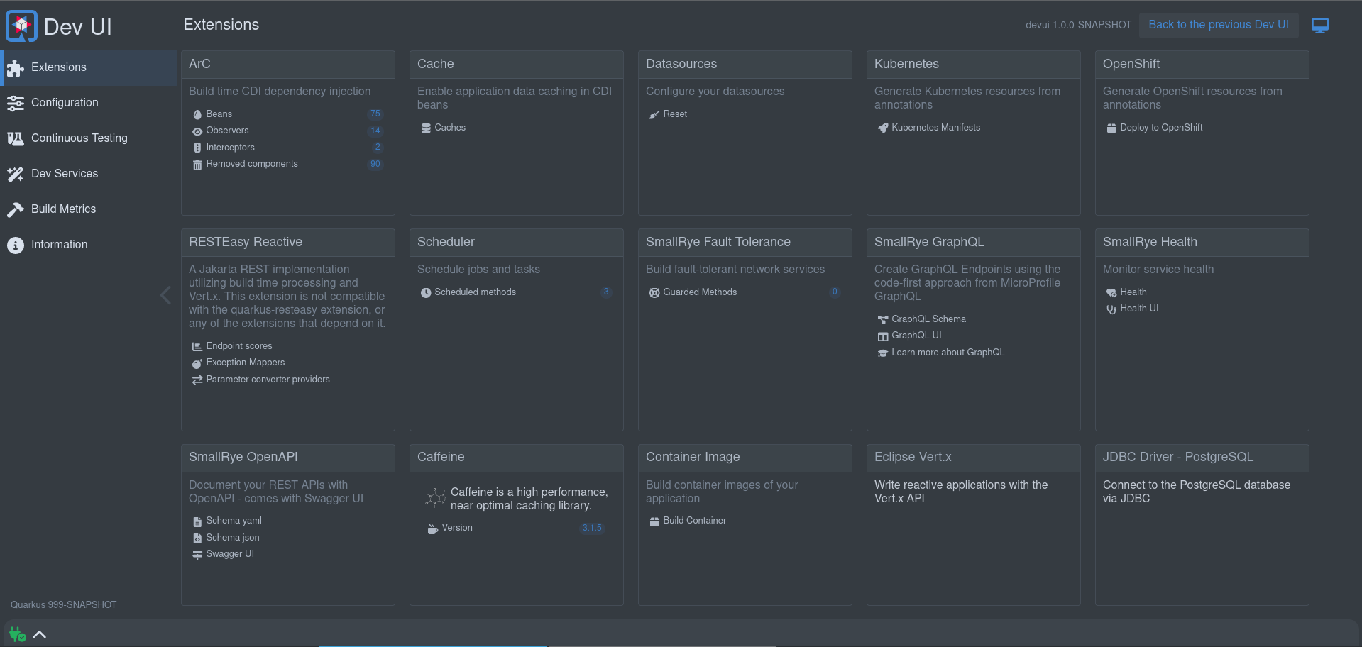
它允许你:
It allows you to:
-
quickly visualize all the extensions currently loaded
-
view extension statuses and go directly to extension documentation
-
view and change
Configuration -
manage and visualize
Continuous Testing -
view
Dev Servicesinformation -
view the Build information
-
view and stream various logs
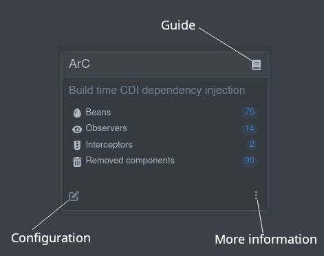
将列出应用程序中使用的每个扩展。在那里,你可以找到指南、其他信息以及每个扩展的适用配置:
Each extension used in the application will be listed. There, you can find the guides, additional information, and the applicable configuration for each extension:
Make my extension extend the Dev UI
要使扩展在 Dev UI 中列出,你无需执行任何操作!
To make your extension listed in the Dev UI, you don’t need to do anything!
所以你可以随时从这里开始 :)
So you can always start with that :)
扩展可以:
Extensions can:
Add links to an extension card
External links
这些是引用其他(Dev UI 之外的)数据的链接。此数据可以是 HTML 页面、文本或其他数据。
These are links that reference other (external from Dev UI) data. This data can be HTML pages, text, or other data.
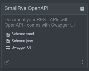
一个小例子是 SmallRye OpenAPI 扩展,它包含指向以 JSON 和 YAML 格式生成的 OpenAPI 架构以及指向 Swagger UI 的链接:
A good example of this is the SmallRye OpenAPI extension that contains links to the generated OpenAPI schema in both JSON and YAML format, and a link to Swagger UI:
在构建时便已知与这些外部引用的链接。因此,要在卡片上添加这样的链接,请在你的扩展中添加以下构建步骤:
The links to these external references are known at build time. So to get links like this on your card, you add the following Build Step in your extension:
@BuildStep(onlyIf = IsDevelopment.class)(1)
public CardPageBuildItem pages(NonApplicationRootPathBuildItem nonApplicationRootPathBuildItem) {

    CardPageBuildItem cardPageBuildItem = new CardPageBuildItem(); (2)

    cardPageBuildItem.addPage(Page.externalPageBuilder("Schema yaml") (3)
            .url(nonApplicationRootPathBuildItem.resolvePath("openapi")) (4)
            .isYamlContent() (5)
            .icon("font-awesome-solid:file-lines")); (6)

    cardPageBuildItem.addPage(Page.externalPageBuilder("Schema json")
            .url(nonApplicationRootPathBuildItem.resolvePath("openapi") + "?format=json")
            .isJsonContent()
            .icon("font-awesome-solid:file-code"));

    cardPageBuildItem.addPage(Page.externalPageBuilder("Swagger UI")
            .url(nonApplicationRootPathBuildItem.resolvePath("swagger-ui"))
            .isHtmlContent()
            .icon("font-awesome-solid:signs-post"));

    return cardPageBuildItem;
}| 1 | Always make sure that this build step is only run when in dev mode |
| 2 | To add anything on the card, you must return/produce a CardPageBuildItem. |
| 3 | To add a link, you can use the addPage method, as all links go to a "page". Page has some builders to assist with building a page. For external links, use the externalPageBuilder. |
| 4 | Adding the url of the external link (in this case, we use NonApplicationRootPathBuildItem to create this link, as this link is under the configurable non-application path, default /q). Always use NonApplicationRootPathBuildItem if your link is available under /q. |
| 5 | You can (optionally) hint the content type of the content you are navigating to. If there is no hint, a header call will be made to determine the MediaType; |
| 6 | You can add an icon. All free font-awesome icons are available. |
|
Note about icons
如果您在 Font awesome处找到您的图标,您可以按如下方式映射:例如 |
|
Note about icons
If you find your icon at Font awesome, you can map as follow: Example |
Embedding external content
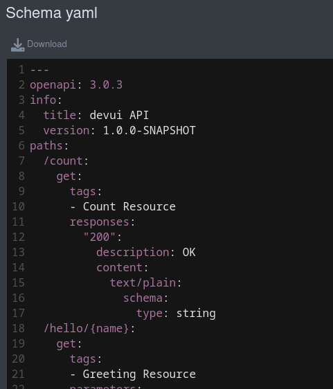
默认情况下,即使是外部链接也会在开发者界面中呈现(嵌入)。对于 HTML,页面将被呈现,并且任何其他内容都将使用 code-mirror显示,用以标记媒体类型。例如,YAML 格式的 OpenAPI 架构文档:
By default, even external links will render inside (embedded) in Dev UI. In the case of HTML, the page will be rendered, and any other content will be shown using code-mirror to markup the media type. For example, the OpenAPI schema document in YAML format:
如果您不想嵌入内容,可以在页面构建器上使用 .doNotEmbed(),然后这将会在一个新标签页中打开链接。
If you do not want to embed the content, you can use the .doNotEmbed() on the Page Builder, this will then open the link in a new tab.
Runtime external links
上面的示例假设您在构建时知道要使用的链接。在某些情况下,您可能只在运行时才知道。在那种情况下,可以使用返回要添加的链接的 Communicating to the backend方法,并在创建链接时使用它。不要在页面构建器上使用 .url`方法,而要使用 `.dynamicUrlJsonRPCMethodName("yourJsonRPCMethodName").
The example above assumes you know the link to use at build time. There might be cases where you only know this at runtime. In that case, you can use a Communicating to the backend Method that returns the link to add, and use that when creating the link. Rather than using the .url method on the page builder, use the .dynamicUrlJsonRPCMethodName("yourJsonRPCMethodName").
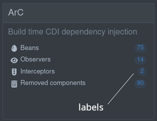
Adding labels
您可以使用页面构建器上的其中一个构建器方法向卡片中的链接添加一个选项标签。这些标签可以是
You can add an option label to the link in the card using one of the builder methods on the page builder. These labels can be
-
static (known at build time)
.staticLabel("staticLabelValue") -
dynamic (loaded at runtime)
.dynamicLabelJsonRPCMethodName("yourJsonRPCMethodName") -
streaming (continuously streaming updated values at runtime)
.streamingLabelJsonRPCMethodName("yourJsonRPCMethodName")
对于动态和流动的标签,请参见 Communicating to the backend小节。
For dynamic and streaming labels, see the Communicating to the backend Section.
Add full pages
您还可以链接到“内部”页面(与上述“外部”页面相对应)。这意味着您可以构建页面并添加数据和操作以便在开发者界面中呈现。
You can also link to an "internal" page (as opposed to the above "external" page). This means that you can build the page and add data and actions for rendering in Dev UI.
Build time data
要使构建时数据可以在您的整页中使用,您可以使用一个键和一个值将任何数据添加到 `CardPageBuildItem`中:
To make build time data available on your full page, you can add any data to your CardPageBuildItem with a key and a value:
CardPageBuildItem pageBuildItem = new CardPageBuildItem();
pageBuildItem.addBuildTimeData("someKey", getSomeValueObject());
您可以为页面上在构建时需要知道的所有数据添加多个这样的键值对。
You can add multiple of these key-value pairs for all the data you know at build time that you need on the page.
在开发者界面中添加整页内容有几种选项。从最基本的(良好开端)开始到完全成熟的 Web 组件(首选)。
There are a few options to add full page content in Dev UI. Starting from the most basic (good start) to a full blown web-component (preferred).
Display some build time data on a screen (without having to do frontend coding):
如果您有一些在构建时已知并希望显示的数据,则可以在 `Page`中使用以下某个构建器:
If you have some data that is known at build time that you want to display, you can use one of the following builders in Page:
Raw data
这会显示您数据中原始的(已序列化的)JSON 值:
This will display your data in its raw (serialised) JSON value:
cardPageBuildItem.addPage(Page.rawDataPageBuilder("Raw data") (1)
                .icon("font-awesome-brands:js")
.buildTimeDataKey("someKey")); (2)| 1 | Use the rawDataPageBuilder. |
| 2 | Link back to the key used when you added the build time data in addBuildTimeData on the Page BuildItem. |
这会创建一个链接到将原始数据呈现为 JSON 格式的页面:
That will create a link to a page that renders the raw data in JSON:
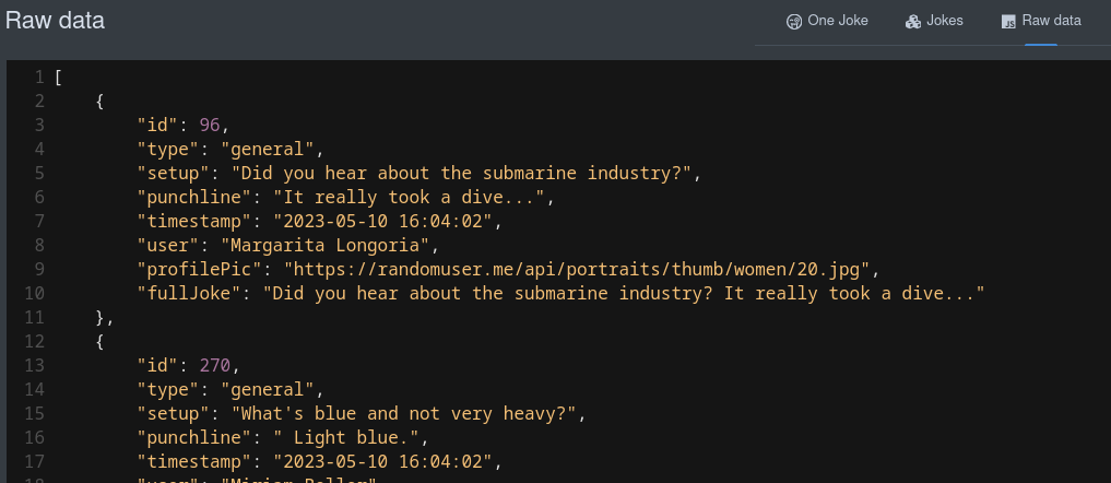
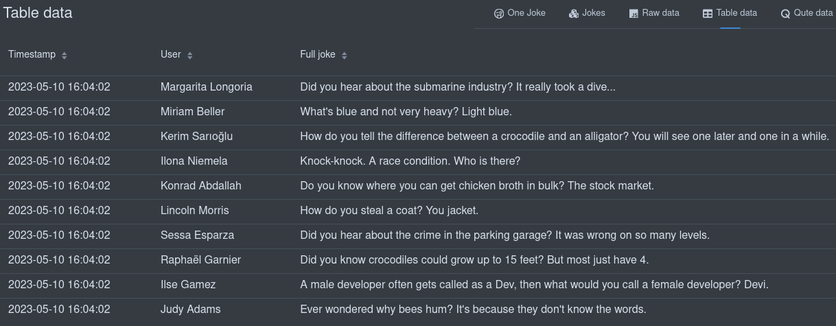
Table data
如果结构允许,您还可以将构建时数据显示在表中:
You can also display your Build time data in a table if the structure allows it:
cardPageBuildItem.addPage(Page.tableDataPageBuilder("Table data") (1)
                .icon("font-awesome-solid:table")
                .showColumn("timestamp") (2)
                .showColumn("user") (2)
                .showColumn("fullJoke") (2)
.buildTimeDataKey("someKey")); (3)| 1 | Use the tableDataPageBuilder. |
| 2 | Optionally only show certain fields. |
| 3 | Link back to the key used when you added the build time data in addBuildTimeData on the Page BuildItem. |
这会创建一个链接到将数据呈现为表格的页面:
That will create a link to a page that renders the data in a table:
Qute data
您还可以使用 Qute 模板显示构建时数据。模板中可以使用所有构建时数据键:
You can also display your build time data using a qute template. All build time data keys are available to use in the template:
cardPageBuildItem.addPage(Page.quteDataPageBuilder("Qute data") (1)
                .icon("font-awesome-solid:q")
.templateLink("qute-jokes-template.html")); (2)| 1 | Use the quteDataPageBuilder. |
| 2 | Link to the Qute template in /deployment/src/main/resources/dev-ui/. |
使用任何 Qute 模板来显示数据,例如 qute-jokes-template.html:
Use any Qute template to display the data, for example, qute-jokes-template.html:
<table>
    <thead>
        <tr>
            <th>Timestamp</th>
            <th>User</th>
            <th>Joke</th>
        </tr>
    </thead>
    <tbody>
        {#for joke in jokes} (1)
        <tr>
            <td>{joke.timestamp}</td>
            <td><span><img src="{joke.profilePic}" height="30px"></img> {joke.user}</span></td>
            <td>{joke.fullJoke}</td>
        </tr>
        {/for}
    </tbody>
</table>| 1 | jokes added as a build time data key on the Page Build Item. |
Web component page
如需使用操作和运行时(或构建时)数据构建交互页面,您必须使用 Web 组件页面:
To build an interactive page with actions and runtime (or build time) data, you must use the web component page:
cardPageBuildItem.addPage(Page.webComponentPageBuilder() (1)
                    .icon("font-awesome-solid:egg")
                    .componentLink("qwc-arc-beans.js") (2)
.staticLabel(String.valueOf(beans.size())));| 1 | Use the webComponentPageBuilder. |
| 2 | Link to the Web Component in /deployment/src/main/resources/dev-ui/. The title can also be defined (using .title("My title") in the builder), but if not, the title will be assumed from the componentLink, which should always have the format qwc (stands for Quarkus Web Component) dash extensionName (example, arc in this case ) dash page title ("Beans" in this case) |
Dev UI 使用 Lit简化了构建这些 Web 组件的过程。您可以在此处详细了解 Web 组件和 Lit:
Dev UI uses Lit to make building these web components easier. You can read more about Web Components and Lit:
Basic structure of a Web component page
Web 组件页面只是一个会创建一个新 HTML 元素的 JavaScript 类:
A Web component page is just a JavaScript Class that creates a new HTML Element:
import { LitElement, html, css} from 'lit'; (1)
import { beans } from 'build-time-data'; (2)

/**
 * This component shows the Arc Beans
 */
export class QwcArcBeans extends LitElement { (3)

    static styles = css` (4)
        .annotation {
          color: var(--lumo-contrast-50pct); (5)
        }

        .producer {
          color: var(--lumo-primary-text-color);
        }
        `;

    static properties = {
        _beans: {state: true}, (6)
    };

    constructor() { (7)
        super();
        this._beans = beans;
    }

    render() { (8)
        if (this._beans) {
            return html`<ul>
                ${this._beans.map((bean) => (9)
                    html`<li>${bean.providerType.name}</li>`
                )}</ul>`;
        } else {
            return html`No beans found`;
        }
    }
}
customElements.define('qwc-arc-beans', QwcArcBeans); (10)| 1 | You can import Classes and/or functions from other libraries.
In this case, we use the LitElement class and html & css functions from Lit |
| 2 | Build time data as defined in the Build step and can be imported using the key and always from build-time-data. All keys added in your Build step will be available. |
| 3 | The component should be named in the following format: Qwc (stands for Quarkus Web Component), then Extension Name, then Page Title, all concatenated with Camel Case. This will also match the file name format as described earlier. The component should also extend LitComponent. |
| 4 | CSS styles can be added using the css function, and these styles only apply to your component. |
| 5 | Styles can reference globally defined CSS variables to make sure your page renders correctly, especially when switching between light and dark mode. You can find all CSS variables in the Vaadin documentation (Color, Sizing and Spacing, etc.) |
| 6 | Properties can be added. Use _ in front of a property if that property is private. Properties are usually injected in the HTML template, and can be defined as having state, meaning that if that property changes, the component should re-render. In this case, the beans are Build time data and only change on hot-reload, which will be covered later. |
| 7 | Constructors (optional) should always call super first and then set the default values for the properties. |
| 8 | The render method (from LitElement) will be called to render the page. In this method, you return the markup of the page you want. You can use the html function from Lit, which gives you a template language to output the HTML you want. Once the template is created, you must only set or change the properties to re-render the page content. Read more about Lit html |
| 9 | You can use the built-in template functions to do conditional, list, etc. Read more about Lit Templates |
| 10 | You must always register your Web component as a custom element, with a unique tag. Here, the tag will follow the same format as the filename (qwc dash extension name dash page title ); |
Using Vaadin UI components for rendering
Dev UI 广泛使用\ Vaadin web components作为 UI 构建模块。
Dev UI makes extensive usage of Vaadin web components as UI Building blocks.
例如,弧 Bean 使用\ Vaadin Grid渲染:
As an example, the Arc Beans are rendered using a Vaadin Grid:
import { LitElement, html, css} from 'lit';
import { beans } from 'build-time-data';
import '@vaadin/grid'; (1)
import { columnBodyRenderer } from '@vaadin/grid/lit.js'; (2)
import '@vaadin/vertical-layout';
import '@qomponent/qui-badge'; (3)

/**
 * This component shows the Arc Beans
 */
export class QwcArcBeans extends LitElement {

    static styles = css`
        .arctable {
          height: 100%;
          padding-bottom: 10px;
        }

        code {
          font-size: 85%;
        }

        .annotation {
          color: var(--lumo-contrast-50pct);
        }

        .producer {
          color: var(--lumo-primary-text-color);
        }
        `;

    static properties = {
        _beans: {state: true},
    };

    constructor() {
        super();
        this._beans = beans;
    }

    render() {
        if (this._beans) {

            return html`
                <vaadin-grid .items="${this._beans}" class="arctable" theme="no-border">
                    <vaadin-grid-column auto-width
                        header="Bean"
                        ${columnBodyRenderer(this._beanRenderer, [])}
                        resizable>
                    </vaadin-grid-column>

                    <vaadin-grid-column auto-width
                        header="Kind"
                        ${columnBodyRenderer(this._kindRenderer, [])}
                        resizable>
                    </vaadin-grid-column>

                    <vaadin-grid-column auto-width
                        header="Associated Interceptors"
                        ${columnBodyRenderer(this._interceptorsRenderer, [])}
                        resizable>
                    </vaadin-grid-column>
                </vaadin-grid>`;

        } else {
            return html`No beans found`;
        }
    }

    _beanRenderer(bean) {
        return html`<vaadin-vertical-layout>
      <code class="annotation">@${bean.scope.simpleName}</code>
      ${bean.nonDefaultQualifiers.map(qualifier =>
            html`${this._qualifierRenderer(qualifier)}`
        )}
      <code>${bean.providerType.name}</code>
      </vaadin-vertical-layout>`;
    }

    _kindRenderer(bean) {
      return html`
        <vaadin-vertical-layout>
          ${this._kindBadgeRenderer(bean)}
          ${this._kindClassRenderer(bean)}
        </vaadin-vertical-layout>
    `;
    }

    _kindBadgeRenderer(bean){
      let kind = this._camelize(bean.kind);
      let level = null;

      if(bean.kind.toLowerCase() === "field"){
        kind = "Producer field";
        level = "success";
      }else if(bean.kind.toLowerCase() === "method"){
          kind = "Producer method";
          level = "success";
      }else if(bean.kind.toLowerCase() === "synthetic"){
        level = "contrast";
      }

      return html`
        ${level
          ? html`<qui-badge level='${level}' small><span>${kind}</span></qui-badge>`
          : html`<qui-badge small><span>${kind}</span></qui-badge>`
        }`;
    }

    _kindClassRenderer(bean){
      return html`
          ${bean.declaringClass
            ? html`<code class="producer">${bean.declaringClass.simpleName}.${bean.memberName}()</code>`
            : html`<code class="producer">${bean.memberName}</code>`
          }
      `;
    }

    _interceptorsRenderer(bean) {
        if (bean.interceptors && bean.interceptors.length > 0) {
            return html`<vaadin-vertical-layout>
                          ${bean.interceptorInfos.map(interceptor =>
                              html`<div>
                                    <code>${interceptor.interceptorClass.name}</code>
                                    <qui-badge class="${bean.kind.toLowerCase()}" small pill><span>${interceptor.priority}</span></qui-badge>
                                  </div>`
                          )}
                        </vaadin-vertical-layout>`;
        }
    }

    _qualifierRenderer(qualifier) {
        return html`<code class="annotation">${qualifier.simpleName}</code>`;
    }

    _camelize(str) {
        return str.replace(/(?:^\w|[A-Z]|\b\w|\s+)/g, function (match, index) {
            if (+match === 0)
                return "";
            return index === 0 ? match.toUpperCase() : match.toLowerCase();
        });
    }
}
customElements.define('qwc-arc-beans', QwcArcBeans);| 1 | Import the Vaadin component you want to use |
| 2 | You can also import other functions if needed |
| 3 | You can also use any component in the Qomponent library, described below |
Qomponent
我们还包括 [Qomponent]([role="bare"] \[role="bare"]https://github.com/qomponent)库中的所有组件
We also include all components from the [Qomponent]([role="bare"]https://github.com/qomponent) library
-
[Card]([role="bare"]https://www.npmjs.com/package/@qomponent/qui-card)
-
[Badge]([role="bare"]https://www.npmjs.com/package/@qomponent/qui-badge)
-
[Alert]([role="bare"]https://www.npmjs.com/package/@qomponent/qui-alert)
-
[Code block]([role="bare"]https://www.npmjs.com/package/@qomponent/qui-code-block)
Card
卡片组件以在卡片中显示内容
Card component to display contents in a card
import '@qomponent/qui-card'; <qui-card header="Small">
<div slot="content">
<div class="cardcontents">
<span>Hello</span>
</div>
</div>
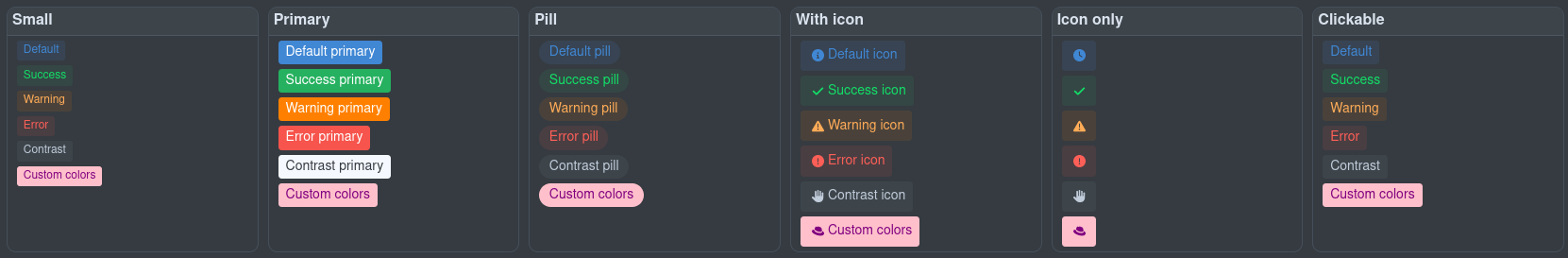
</qui-card>Badge
徽章 UI 组件基于\ vaadin themed徽章
Badge UI Component based on the vaadin themed badge
import '@qomponent/qui-badge';您可以使用小、主要、药丸的任意组合,带有图标和带任意级别的可点击性(`default`、`success`、`warning`、`error`、`contrast`),或设置您自己的颜色。
You can use any combination of small, primary, pill, with icon and clickable with any level of default, success, warning, error, contrast, or set your own colors.
<div class="cards">
    <h3>Tiny</h3>
    <div class="card">
        <qui-badge tiny><span>Default</span></qui-badge>
        <qui-badge level="success" tiny><span>Success</span></qui-badge>
        <qui-badge level="warning" tiny><span>Warning</span></qui-badge>
        <qui-badge level="error" tiny><span>Error</span></qui-badge>
        <qui-badge level="contrast" tiny><span>Contrast</span></qui-badge>
        <qui-badge background="pink" color="purple" tiny><span>Custom colors</span></qui-badge>
    </div>

    <h3>Small</h3>
    <div class="card">
        <qui-badge small><span>Default</span></qui-badge>
        <qui-badge level="success" small><span>Success</span></qui-badge>
        <qui-badge level="warning" small><span>Warning</span></qui-badge>
        <qui-badge level="error" small><span>Error</span></qui-badge>
        <qui-badge level="contrast" small><span>Contrast</span></qui-badge>
        <qui-badge background="pink" color="purple" small><span>Custom colors</span></qui-badge>
    </div>

    <h3>Primary</h3>
    <div class="card">
        <qui-badge primary><span>Default primary</span></qui-badge>
        <qui-badge level="success" primary><span>Success primary</span></qui-badge>
        <qui-badge level="warning" primary><span>Warning primary</span></qui-badge>
        <qui-badge level="error" primary><span>Error primary</span></qui-badge>
        <qui-badge level="contrast" primary><span>Contrast primary</span></qui-badge>
        <qui-badge background="pink" color="purple" primary><span>Custom colors</span></qui-badge>
    </div>

    <h3>Pill</h3>
    <div class="card">
        <qui-badge pill><span>Default pill</span></qui-badge>
        <qui-badge level="success" pill><span>Success pill</span></qui-badge>
        <qui-badge level="warning" pill><span>Warning pill</span></qui-badge>
        <qui-badge level="error" pill><span>Error pill</span></qui-badge>
        <qui-badge level="contrast" pill><span>Contrast pill</span></qui-badge>
        <qui-badge background="pink" color="purple" pill><span>Custom colors</span></qui-badge>
    </div>

    <h3>With Icon</h3>
    <div class="card">
        <qui-badge text="Default" icon="circle-info">
            <span>Default icon</span>
        </qui-badge>
        <qui-badge text="Success" level="success" icon="circle-check">
            <span>Success icon</span>
        </qui-badge>
        <qui-badge text="Warning" level="warning" icon="warning">
            <span>Warning icon</span>
        </qui-badge>
        <qui-badge text="Error" level="error" icon="circle-exclamation">
            <span>Error icon</span>
        </qui-badge>
        <qui-badge text="Contrast" level="contrast" icon="adjust">
            <span>Contrast icon</span>
        </qui-badge>
        <qui-badge text="Custom" background="pink" color="purple" icon="flag-checkered">
            <span>Custom colors</span>
        </qui-badge>
    </div>

    <h3>Icon only</h3>
    <div class="card">
        <qui-badge icon="circle-info"></qui-badge>
        <qui-badge level="success" icon="circle-check"></qui-badge>
        <qui-badge level="warning" icon="warning"></qui-badge>
        <qui-badge level="error" icon="circle-exclamation"></qui-badge>
        <qui-badge level="contrast" icon="adjust"></qui-badge>
        <qui-badge level="contrast" background="pink" color="purple" icon="flag-checkered"></qui-badge>
    </div>

    <h3>Clickable</h3>
    <div class="card">
        <qui-badge clickable><span>Default</span></qui-badge>
        <qui-badge clickable level="success"><span>Success</span></qui-badge>
        <qui-badge clickable level="warning"><span>Warning</span></qui-badge>
        <qui-badge clickable level="error"><span>Error</span></qui-badge>
        <qui-badge clickable level="contrast"><span>Contrast</span></qui-badge>
        <qui-badge clickable background="pink" color="purple"><span>Custom colors</span></qui-badge>
    </div>

</div>
Alert
警报围绕 Bootstrap 警报进行建模。点击\ here了解更多信息。
Alerts are modeled around the Bootstrap alerts. Click here for more info.
此外,请查看下面的通知控制器作为一种替代方案。
Also, see the Notification controller below as an alternative.
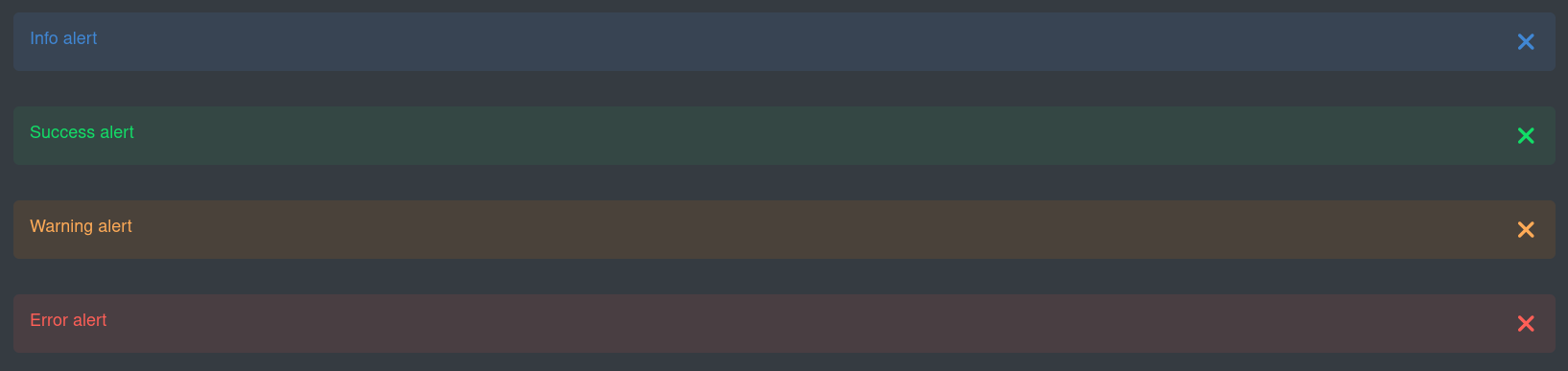
import '@qomponent/qui-alert';<qui-alert><span>Info alert</span></qui-alert>
<qui-alert level="success"><span>Success alert</span></qui-alert>
<qui-alert level="warning"><span>Warning alert</span></qui-alert>
<qui-alert level="error"><span>Error alert</span></qui-alert>
<qui-alert permanent><span>Permanent Info alert</span></qui-alert>
<qui-alert level="success" permanent><span>Permanent Success alert</span></qui-alert>
<qui-alert level="warning" permanent><span>Permanent Warning alert</span></qui-alert>
<qui-alert level="error" permanent><span>Permanent Error alert</span></qui-alert>
<qui-alert center><span>Center Info alert</span></qui-alert>
<qui-alert level="success" center><span>Center Success alert</span></qui-alert>
<qui-alert level="warning" center><span>Center Warning alert</span></qui-alert>
<qui-alert level="error" center><span>Center Error alert</span></qui-alert>
<qui-alert showIcon><span>Info alert with icon</span></qui-alert>
<qui-alert level="success" showIcon><span>Success alert with icon</span></qui-alert>
<qui-alert level="warning" showIcon><span>Warning alert with icon</span></qui-alert>
<qui-alert level="error" showIcon><span>Error alert with icon</span></qui-alert>
<qui-alert icon="vaadin:flag-checkered"><span>Info alert with custom icon</span></qui-alert>
<qui-alert level="success" icon="vaadin:flag-checkered"><span>Success alert with custom icon</span></qui-alert>
<qui-alert level="warning" icon="vaadin:flag-checkered"><span>Warning alert with custom icon</span></qui-alert>
<qui-alert level="error" icon="vaadin:flag-checkered"><span>Error alert with custom icon</span></qui-alert>
<qui-alert size="small" showIcon><span>Small Info alert with icon</span></qui-alert>
<qui-alert level="success" size="small" showIcon><span>Small Success alert with icon</span></qui-alert>
<qui-alert level="warning" size="small" showIcon><span>Small Warning alert with icon</span></qui-alert>
<qui-alert level="error" size="small" showIcon><span>Small Error alert with icon</span></qui-alert>
<qui-alert showIcon><span>Info <code>alert</code> with markup <br><a href="https://quarkus.io/" target="_blank">quarkus.io</a></span></qui-alert>
<qui-alert level="success" showIcon><span>Success <code>alert</code> with markup <br><a href="https://quarkus.io/" target="_blank">quarkus.io</a></span></qui-alert>
<qui-alert level="warning" showIcon><span>Warning <code>alert</code> with markup <br><a href="https://quarkus.io/" target="_blank">quarkus.io</a></span></qui-alert>
<qui-alert level="error" showIcon><span>Error <code>alert</code> with markup <br><a href="https://quarkus.io/" target="_blank">quarkus.io</a></span></qui-alert>
<qui-alert showIcon primary><span>Primary Info alert with icon</span></qui-alert>
<qui-alert level="success" showIcon primary><span>Primary Success alert with icon</span></qui-alert>
<qui-alert level="warning" showIcon primary><span>Primary Warning alert with icon</span></qui-alert>
<qui-alert level="error" showIcon primary><span>Primary Error alert with icon</span></qui-alert>
<qui-alert title="Information"><span>Info alert with title</span></qui-alert>
<qui-alert title="Well done" level="success"><span>Success alert with title</span></qui-alert>
<qui-alert title="Beware" level="warning"><span>Warning alert with title</span></qui-alert>
<qui-alert title="Ka-boom" level="error"><span>Error alert with title</span></qui-alert>
<qui-alert title="Information" showIcon><span>Info alert with title and icon</span></qui-alert>
<qui-alert title="Well done" level="success" showIcon><span>Success alert with title and icon</span></qui-alert>
<qui-alert title="Beware" level="warning" showIcon><span>Warning alert with title and icon</span></qui-alert>
<qui-alert title="Ka-boom" level="error" showIcon><span>Error alert with title and icon</span></qui-alert>Code block
显示代码块。此组件了解主题并将使用正确的 codemirror 主题来匹配浅色/深色模式。
Display a code block. This component is aware of the theme and will use the correct codemirror theme to match the light/dark mode.
import '@qomponent/qui-code-block';<qui-code-block mode="properties">
<slot>
foo = bar
</slot>
</qui-code-block>或从 URL 获取内容:
Or fetching the contents from a URL:
<div class="codeBlock">
    <qui-code-block
        mode='${this._mode}'
        src='${this._externalUrl}'>
    </qui-code-block>
</div>
为了确保代码块采用正确的 code-mirror 主题(基于 Dev UI 中当前的主题),你可以执行以下操作:
To make sure that the code block adopt the correct code-mirror theme (based on the current one in Dev UI), you can do the following:
import { observeState } from 'lit-element-state';
import { themeState } from 'theme-state';
然后将 extends 更改为观察状态:
Then change the extends to observe state:
extends observeState(LitElement) {现在你可以获取当前主题,因此将 theme 属性添加到代码块,例如:
Now you can get the current theme, so add the theme property to your code block, example:
<div class="codeBlock">
    <qui-code-block
        mode='${this._mode}'
        src='${this._externalUrl}'
        theme='${themeState.theme.name}'>
    </qui-code-block>
</div>
模式:- 属性 - js - java - xml - json - yaml - sql - html - css - sass - markdown
Modes: - properties - js - java - xml - json - yaml - sql - html - css - sass - markdown
Internal components
IDE link
创建一个指向可以在用户 IDE 中打开的资源(如 Java 源文件)的链接(如果我们可以检测到 IDE)。
Creates a link to a resource (like a Java source file) that can be opened in the user’s IDE (if we could detect the IDE).
import 'qui-ide-link';<qui-ide-link title='Source full class name'
class='text-source'
fileName='${sourceClassNameFull}'
lineNumber=${sourceLineNumber}>[${sourceClassNameFull}]</qui-ide-link>;Using internal controllers
一些 internal controllers 可用于让某些事情变得更容易:
Some internal controllers are available to make certain things easier:
-
Notifier
-
Storage
-
Log
-
Router
Notifier
这是显示土司消息的简单方法。土司可以放置在屏幕上(默认左下角),并且可以具有一定等级(信息、成功、警告、错误)。任何等级都可以是主要的,从而创建一个更突出的土司消息。
This is an easy way to show a toast message. The toast can be placed on the screen (default left bottom) and can have a level (Info, Success, Warning, Error). Any of the levels can also be primary, which will create a more prominent toast message.
查看此控制器的源: here。
See the source of this controller here.
示例用法:
Example usage:

import { notifier } from 'notifier';<a @click=${() => this._info()}>Info</a>;_info(position = null){
notifier.showInfoMessage("This is an information message", position);
}你可以在 here 找到所有有效位置。
You can find all the valid positions here.
Storage
以安全方式访问本地存储的简单方法。这将值存储在本地存储中,该存储适用于你的扩展程序。这样,你就不必担心与另一个扩展程序发生冲突了。
An easy way to access the local storage in a safe way. This will store values in the local storage, which is scoped for your extension. This way, you do not have to worry that you might clash with another extension.
本地存储对于记住用户偏好或状态很有用。例如,页脚会记住状态(打开/关闭)和底部抽屉打开时的尺寸。
Local storage is useful to remember user preferences or state. For example, the footer remembers the state (open/close) and the size when open of the bottom drawer.
import { StorageController } from 'storage-controller';

// ...

storageControl = new StorageController(this); // Passing in this will scope the storage to your extension

// ...

const storedHeight = this.storageControl.get("height"); // Get some value

// ...

this.storageControl.set('height', 123); // Set some valLog
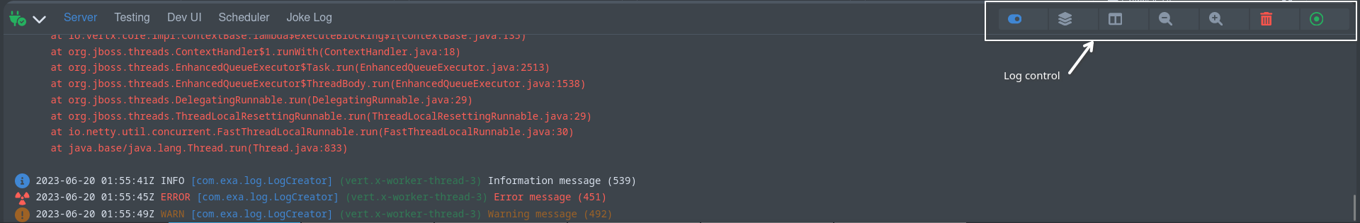
日志控制器用于向 (页脚) 日志添加控制按钮。请参阅 Add a log file。
The log controller is used to add control buttons to a (footer) log. See Add a log file.
import { LogController } from 'log-controller';

// ...

logControl = new LogController(this); // Passing in this will scope the control to your extension

// ...
this.logControl
                .addToggle("On/off switch", true, (e) => {
                    this._toggleOnOffClicked(e);
                }).addItem("Log levels", "font-awesome-solid:layer-group", "var(--lumo-tertiary-text-color)", (e) => {
                    this._logLevels();
                }).addItem("Columns", "font-awesome-solid:table-columns", "var(--lumo-tertiary-text-color)", (e) => {
                    this._columns();
                }).addItem("Zoom out", "font-awesome-solid:magnifying-glass-minus", "var(--lumo-tertiary-text-color)", (e) => {
                    this._zoomOut();
                }).addItem("Zoom in", "font-awesome-solid:magnifying-glass-plus", "var(--lumo-tertiary-text-color)", (e) => {
                    this._zoomIn();
                }).addItem("Clear", "font-awesome-solid:trash-can", "var(--lumo-error-color)", (e) => {
                    this._clearLog();
                }).addFollow("Follow log", true , (e) => {
                    this._toggleFollowLog(e);
}).done();Router
路由器主要在内部使用。这使用 Vaadin Router 在幕后将 URL 路由到 SPA 中正确的页面/部分。它将更新导航并允许历史记录(返回按钮)。这也创建了在具有多个页面的扩展程序上可用的子菜单。
The router is mostly used internally. This uses Vaadin Router under the covers to route URLs to the correct page/section within the SPA. It will update the navigation and allow history (back button). This also creates the sub-menu available on extensions that have multiple pages.
请参阅 controller 以获取一些可能有用的方法。
See the controller for some methods that might be useful.
Communicating to the backend
JsonRPC against the Runtime classpath
您可以获取或流式处理运行时数据(而非前面讨论的 Build time data),或针对运行时类路径(而非部署类路径)执行方法。在运行时获取数据分为两部分。运行时模块中的 Java 端,然后是 Web 组件中的用法。
You can fetch or stream runtime data (rather than Build time data discussed earlier) or execute methods against the runtime classpath (as opposed to deployment classpath). There are two parts to getting data during runtime. The Java side in the runtime module, and then the usage in the web component.
Java part
此代码负责提供数据以在 UI 上显示。
This code is responsible for making data available to display on the UI.
您必须在部署模块中 Processor 中注册 JsonPRCService:
You must register the JsonPRCService in your processor in the deployment module:
@BuildStep(onlyIf = IsDevelopment.class)(1)
JsonRPCProvidersBuildItem createJsonRPCServiceForCache() {(2)
    return new JsonRPCProvidersBuildItem(CacheJsonRPCService.class);(3)
}| 1 | Always only do this in Dev Mode |
| 2 | Produce or return a JsonRPCProvidersBuildItem |
| 3 | Define the class in your runtime module that will contain methods that make data available in the UI |
现在,在您的运行时模块中,创建 JsonRPC 服务。此类将默认为一个应用程序范围的 Bean,除非您明确指定 Bean 的范围。返回某些内容的所有 public 方法均可供 Web 组件 Javascript 调用。
Now, in your Runtime module, create the JsonRPC Service. This class will default to an application-scoped bean, except if you explicitly scope the bean. All public methods that return something will be made available to call from the Web component Javascript.
这些方法中的返回对象可以是:
The return object in these methods can be:
-
primitives or
String, -
io.vertx.core.json.JsonArray -
io.vertx.core.json.JsonObject -
any other POJO that can be serializable to JSON
以上所有内容都可以是阻塞(POJO)或非阻塞(@NonBlocking`或 `Uni)。另外,可以使用 `Multi`流式传输数据。
All of the above can be blocking (POJO) or nonblocking (@NonBlocking or Uni). Alternatively, data can be streamed using Multi.
@NonBlocking (1)
public JsonArray getAll() { (2)
    Collection<String> names = manager.getCacheNames();
    List<CaffeineCache> allCaches = new ArrayList<>(names.size());
    for (String name : names) {
        Optional<Cache> cache = manager.getCache(name);
        if (cache.isPresent() && cache.get() instanceof CaffeineCache) {
            allCaches.add((CaffeineCache) cache.get());
        }
    }
    allCaches.sort(Comparator.comparing(CaffeineCache::getName));

    var array = new JsonArray();
    for (CaffeineCache cc : allCaches) {
        array.add(getJsonRepresentationForCache(cc));
    }
    return array;
}| 1 | This example runs nonblocking. We could also return Uni<JsonArray> |
| 2 | The method name getAll will be available in the Javascript |
Webcomponent (Javascript) part
现在您可以使用 JsonRPC 控制器访问 `getAll`方法(以及 JsonRPC 服务中的任何其他方法)
Now you can use the JsonRPC controller to access the getAll method (and any other methods in your JsonRPC Service)
import { JsonRpc } from 'jsonrpc';

// ...

jsonRpc = new JsonRpc(this); // Passing in this will scope the RPC calls to your extension

// ...

/**
  * Called when displayed
  */
connectedCallback() {
    super.connectedCallback();
    this.jsonRpc.getAll().then(jsonRpcResponse => { (1)
        this._caches = new Map();
        jsonRpcResponse.result.forEach(c => { (2)
            this._caches.set(c.name, c);
        });
    });
}| 1 | Note the method getAll corresponds to the method in your Java Service. This method returns a Promise with the JsonRPC result. |
| 2 | In this case, the result is an array, so we can loop over it. |
JsonArray(或任意 Java 集合)都将返回一个数组;否则,将返回一个 JsonObject。
JsonArray (or any Java collection), either blocking or nonblocking, will return an array; otherwise, a JsonObject will be returned.
你也可以在被调用的方法中传递参数,例如:(在 Runtime Java 代码中)
You can also pass in parameters in the method being called, for example: (In the Runtime Java code)
public Uni<JsonObject> clear(String name) { (1)
    Optional<Cache> cache = manager.getCache(name);
    if (cache.isPresent()) {
        return cache.get().invalidateAll().map((t) -> getJsonRepresentationForCache(cache.get()));
    } else {
        return Uni.createFrom().item(new JsonObject().put("name", name).put("size", -1));
    }
}| 1 | The clear method takes one parameter called name |
在 Webcomponent(Javascript)中:
In the Webcomponent (Javascript):
_clear(name) {
    this.jsonRpc.clear({name: name}).then(jsonRpcResponse => { (1)
        this._updateCache(jsonRpcResponse.result)
    });
}| 1 | The name parameter is passed in. |
Streaming data
你可以通过持续向屏幕流送数据,保持 UI 屏幕更新为最新数据。这可以通过 Multi (Java 端) 和 Observer (Javascript 端) 来实现
You can keep a UI screen updated with the latest data by continuously streaming data to the screen. This can be done with Multi (Java side) and Observer (Javascript side)
流式传输数据的 Java 端:
Java side of streaming data:
public class JokesJsonRPCService {

    private final BroadcastProcessor<Joke> jokeStream = BroadcastProcessor.create();

    @PostConstruct
    void init() {
        Multi.createFrom().ticks().every(Duration.ofHours(4)).subscribe().with((item) -> {
            jokeStream.onNext(getJoke());
        });
    }

    public Multi<Joke> streamJokes() { (1)
        return jokeStream;
    }

    // ...
}| 1 | Return the Multi that will stream jokes |
流式传输数据的 Javascript 端:
Javascript side of streaming data:
this._observer = this.jsonRpc.streamJokes().onNext(jsonRpcResponse => { (1)
    this._addToJokes(jsonRpcResponse.result);
    this._numberOfJokes = this._numberOfJokes++;
});

// ...

this._observer.cancel(); (2)| 1 | You can call the method (optionally passing in parameters) and then provide the code that will be called on the next event. |
| 2 | Make sure to keep an instance of the observer to cancel later if needed. |
JsonRpc against the deployment classpath
在某些情况下,你可能需要针对部署类路径执行方法和/或获取数据。这也会通过 JsonRPC 通信发生,但在这种情况下,你无需在 runtime 模块中创建 JsonRPC 服务,你可以直接在部署模块中的供应商中提供要运行的代码。要做到这一点,你需要生成一个 BuildTimeActionBuildItem,例如:
In certain cases you might need to execute methods and/or get data against the deployment classpath. This also happens over JsonRPC communication, but in this case you do not create a JsonRPC Service in the runtime module,
you can just supply the code to be run in a supplier in the deployment module. To do this you will produce a BuildTimeActionBuildItem, example:
    @BuildStep(onlyIf = IsDevelopment.class)
    BuildTimeActionBuildItem createBuildTimeActions() { (1)
        BuildTimeActionBuildItem generateManifestActions = new BuildTimeActionBuildItem();(2)
        generateManifestActions.addAction("generateManifests", ignored -> { (3)
            try {
                List<Manifest> manifests = holder.getManifests();
                // Avoid relying on databind.
                Map<String, String> map = new LinkedHashMap<>();
                for (Manifest manifest : manifests) {
                    map.put(manifest.getName(), manifest.getContent());
                }
                return map;
            } catch (Exception e) {
                throw new RuntimeException(e);
            }
        });

        return generateManifestActions;
}| 1 | Return or use a BuildProducer to create a BuildTimeActionBuildItem |
| 2 | BuildTimeActionBuildItem is automatically scoped with your extension namespace |
| 3 | Here we add an action, that is the same as a request-response method. The method name (that can be called from js in the same way as any json-rpc service) is generateManifests. |
你还可以将 CompletableFuture/CompletionStage 返回为一个动作,如果你想流送数据,你需要使用 addSubscription (而不是 addAction)并返回一个 Flow.Publisher。
You can also return a CompletableFuture/CompletionStage as an action, and if you want to stream data you need to use addSubscription (rather than addAction) and return a Flow.Publisher.
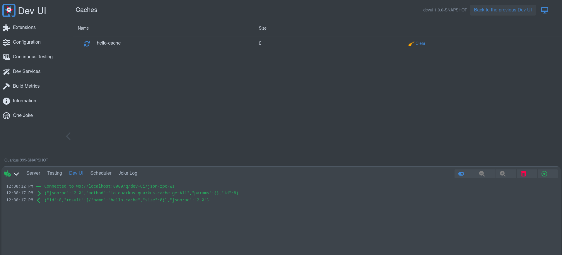
Dev UI Log
当使用 999-SNAPSHOT 版本运行本地应用程序时,开发人员界面将在页脚中显示一个 Dev UI 日志。这对于调试浏览器和 Quarkus 应用程序之间流动的所有 JSON RPC 消息很有用。
When running a local application using the 999-SNAPSHOT version, the Dev UI will show a Dev UI Log in the footer. This is useful for debugging all JSON RPC messages flowing between the browser and the Quarkus app.
Hot reload
当热重载发生时,可以自动更新屏幕。为此,用 QwcHotReloadElement 替换 Webcomponent 扩展的 LitElement。
You can update a screen automatically when a hot reload happens. To do this, replace the LitElement that your Webcomponent extends with QwcHotReloadElement.
QwcHotReloadElement 扩展 LitElement,所以组件仍然是 Lit 元素。
QwcHotReloadElement extends LitElement, so your component is still a Lit Element.
当扩展 QwcHotReloadElement 时,必须使用 hotReload 方法。(还必须仍然提供 Lit 的 render 方法)
When extending a QwcHotReloadElement, you have to use the hotReload method. (You must also still provide the render method from Lit)
import { QwcHotReloadElement, html, css} from 'qwc-hot-reload-element';

// ...

export class QwcMyExtensionPage extends QwcHotReloadElement {

    render(){
        // ...
    }

    hotReload(){
        // ..
    }

}
Custom cards
如果不想使用默认内置卡片,可以自定义在扩展页面上显示的卡片。
You can customize the card that is being displayed on the extension page if you do not want to use the default built-in card.
为此,必须提供一个将加载到所提供卡片位置中的 Webcomponent,并在 Java 处理器中注册此卡片:
To do this, you must provide a Webcomponent that will be loaded in the place of the provided card and register this in the Java Processor:
cardPageBuildItem.setCustomCard("qwc-mycustom-card.js");在 JavaScript 端,可以访问所有页面(在想要创建链接时)
On the Javascript side, you have access to all the pages (in case you want to create links)
import { pages } from 'build-time-data';并将传入以下属性:
And the following properties will be passed in:
-
extensionName
-
description
-
guide
-
namespace
static properties = {
    extensionName: {type: String},
    description: {type: String},
    guide: {type: String},
    namespace: {type: String}
}
State (advance)
State 允许属性包含状态并且可以在全局范围内重复使用。状态属性的一个示例是主题、连接状态(如果已连接到后端)等。
State allows properties to contain state and can be reused globally. An example of state properties is the theme, the connection state (if we are connected to the backend), etc.
请参见 current built-in 状态对象。
See the current built-in state objects.
Dev UI 中的状态使用 LitState。可以在其 documentation 中详细了解它。
The state in Dev UI uses LitState. You can read more about it in their documentation.
Add a log file
除了添加卡片和页面之外,扩展还可以将日志添加到页脚中。这对于记录持续发生的事件很有用。离开某个页面时,页面将丢失与后端的连接,而页脚中的日志将永久连接。
Apart from adding a card and a page, extensions can add a log to the footer. This is useful for logging things that are happening continuously. A page will lose connection to the backend when navigating away from that page, and a log in the footer will be permanently connected.
将某些内容添加到页脚的工作方式与添加卡片完全相同,除了使用 FooterPageBuildItem 而不是 CardPageBuildItem。
Adding something to the footer works exactly like adding a Card, except you use a FooterPageBuildItem rather than a CardPageBuildItem.
FooterPageBuildItem footerPageBuildItem = new FooterPageBuildItem();

footerPageBuildItem.addPage(Page.webComponentPageBuilder()
        .icon("font-awesome-regular:face-grin-tongue-wink")
        .title("Joke Log")
        .componentLink("qwc-jokes-log.js"));

footerProducer.produce(footerPageBuildItem);然后可以在 Webcomponent 中将日志流传输到界面:
In your Webcomponent, you can then stream the log to the UI:
export class QwcJokesLog extends LitElement {
    jsonRpc = new JsonRpc(this);
    logControl = new LogController(this);

    // ....
}Add a section menu
这允许扩展在菜单部分中直接链接到页面。
This allows an extension to link a page directly in the section Menu.
将某些内容添加到部分菜单的工作方式与添加卡片完全相同,除了使用 MenuPageBuildItem 而不是 CardPageBuildItem。
Adding something to the section menu works exactly like adding a Card, except you use a MenuPageBuildItem rather than a CardPageBuildItem.
MenuPageBuildItem menuPageBuildItem = new MenuPageBuildItem();

menuPageBuildItem.addPage(Page.webComponentPageBuilder()
        .icon("font-awesome-regular:face-grin-tongue-wink")
        .title("One Joke")
        .componentLink("qwc-jokes-menu.js"));

menuProducer.produce(menuPageBuildItem);您的页面可以是任何类似于卡片的页面。
Your page can be any Page similar to Cards.
Testing
您可以在扩展中添加用来测试的测试:
You can add tests to your extension that test:
-
Build time data
-
Runtime data via JsonRPC
您必须将其添加到您的 pom:
You must add this to your pom:
<dependency>
    <groupId>io.quarkus</groupId>
    <artifactId>quarkus-vertx-http-dev-ui-tests</artifactId>
    <scope>test</scope>
</dependency>
这会让您访问两个基本类以创建这些测试。
This will give you access to two base classes for creating these tests.
Testing Build time data
如果您添加了构建时间数据,例如:
If you added Build time data, for example:
cardPageBuildItem.addBuildTimeData("somekey", somevalue);如果您要测试您的构建时间数据是否正确生成,您可以添加一个扩展 `DevUIBuildTimeDataTest`的测试。
To test that your build time data is generated correctly, you can add a test that extends DevUIBuildTimeDataTest.
public class SomeTest extends DevUIBuildTimeDataTest {

    @RegisterExtension
    static final QuarkusDevModeTest config = new QuarkusDevModeTest().withEmptyApplication();

    public SomeTest() {
        super("io.quarkus.my-extension");
    }

    @Test
    public void testSomekey() throws Exception {
        JsonNode somekeyResponse = super.getBuildTimeData("somekey");
        Assertions.assertNotNull(somekeyResponse);

        // Check more values on somekeyResponse
    }

}
Testing Runtime data
如果您添加了一个带运行时数据响应的 JsonRPC 服务,例如:
If you added a JsonRPC Service with runtime data responses, for example:
public boolean updateProperties(String content, String type) {
    // ...
}
如果您要测试 `updateProperties`是否通过 JsonRPC 正确执行,您可以添加一个扩展 `DevUIJsonRPCTest`的测试。
To test that updateProperties executes correctly via JsonRPC, you can add a test that extends DevUIJsonRPCTest.
public class SomeTest extends DevUIJsonRPCTest {

    @RegisterExtension
    static final QuarkusDevModeTest config = new QuarkusDevModeTest().withEmptyApplication();

    public SomeTest() {
        super("io.quarkus.my-extension");
    }

    @Test
    public void testUpdateProperties() throws Exception {

        JsonNode updatePropertyResponse = super.executeJsonRPCMethod("updateProperty",
                Map.of(
                        "name", "quarkus.application.name",
                        "value", "changedByTest"));
        Assertions.assertTrue(updatePropertyResponse.asBoolean());

        // Get the properties to make sure it is changed
        JsonNode allPropertiesResponse = super.executeJsonRPCMethod("getAllValues");
        String applicationName = allPropertiesResponse.get("quarkus.application.name").asText();
        Assertions.assertEquals("changedByTest", applicationName);
    }
}