Advanced Excel Charts 简明教程
Advanced Excel - Box and Whisker Chart
盒须图(也称为箱形图)通常用于统计分析。例如,您可以使用盒须图对比实验结果或竞争性考试成绩。
Box and Whisker charts, also referred to as Box Plots are commonly used in statistical analysis. For example, you can use a Box and Whisker chart to compare experimental results or competitive exam results.
What is a Box and Whisker Chart?
在盒须图中,数值数据将按四分位数划分,并在第一四分位数和第三四分位数之间绘制一个矩形,并沿着第二四分位数绘制一条附加的线以标记中位数。第一四分位数和第三四分位数之外的最小值和最大值将以称作“须”的线表示。须表示高于或低于上下四分位数的变化幅度,且须之外的任何点都将被视为异常值。
In a Box and Whisker chart, numerical data is divided into quartiles and a box is drawn between the first and third quartiles, with an additional line drawn along the second quartile to mark the median. The minimums and maximums outside the first and third quartiles are depicted with lines, which are called whiskers. Whiskers indicate variability outside the upper and lower quartiles, and any point outside the whiskers is considered as an outlier.
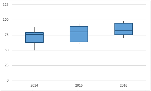
盒须图如下所示。
A Box and Whisker chart looks as shown below.
Advantages of Box and Whisker Charts
无论您在哪里,只要需要了解数据分布,就可以使用盒须图。并且数据可以是多样化的,数据可从任何领域获取以进行统计分析。示例包括以下内容-
You can use Box and Whisker chart wherever to understand the distribution of data. And the data can be diverse that is drawn from any field for statistical analysis. Examples include the following −
-
Survey responses on a particular product or service to understand the user’s preferences.
-
Examination results to identify which students need more attention in a particular subject.
-
Question-Answer patterns for a competitive examination to finalize the combination of categories.
-
Laboratory results to draw conclusions on a new drug that is invented.
-
Traffic patterns on a particular route to streamline the signals that are enroute. The outliers also help in identifying the reasons for the data to get outcast.
Preparation of Data
假设您获得了以下数据-
Suppose you are given the following data −
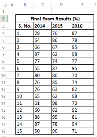
根据以上数据创建第二张表,如下所示-
Create a second table from the above table as follows −
Step 1 - 使用 Excel 函数 MIN、QUARTILE 和 MAX 计算 2014、2015 和 2016 年的每个系列的以下内容。
Step 1 − Compute the following for each of the series – 2014, 2015 and 2016 using Excel Functions MIN, QUARTILE and MAX.
-
Minimum Value.
-
First Quartile.
-
Median Value.
-
Third Quartile.
-
Maximum Value.
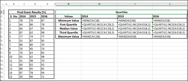
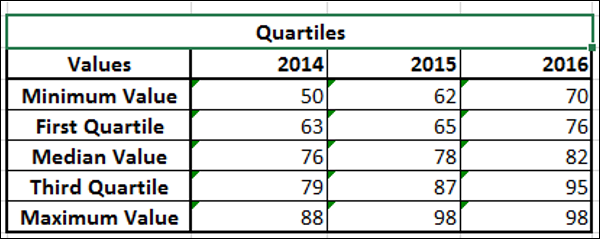
生成的第二张表将如下所示。
The resulting second table will be as given below.
Step 2 - 根据第二张表计算差值的第三张表-
Step 2 − Create a third table from the second table, computing the differences −
-
Retain the first row – Minimum Value as it is.
-
In the second row – compute values as First Quartile - Minimum Value.
-
In the third row – compute values as Median Value - First Quartile.
-
In the fourth row – compute values as Third Quartile - Median Value.
-
In the fifth row – compute values as Maximum Value - Third Quartile.
您将得到如以下所示的第三个表格。
You will get the third table as shown below.
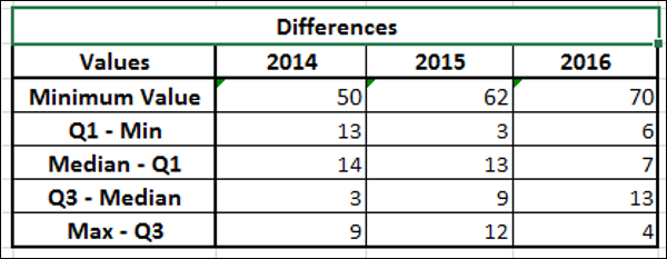
您将使用这些数据用于箱线图。
You will use this data for the Box and Whisker chart.
Creating a Box and Whisker Chart
以下是创建箱线图的步骤。
Following are the steps to create a Box and Whisker chart.
Step 1 - 选择在上节中获取的第三个表格中的数据。
Step 1 − Select the data obtained as the third table in the previous section.
Step 2 - 插入一个堆积柱形图。
Step 2 − Insert a Stacked Column chart.
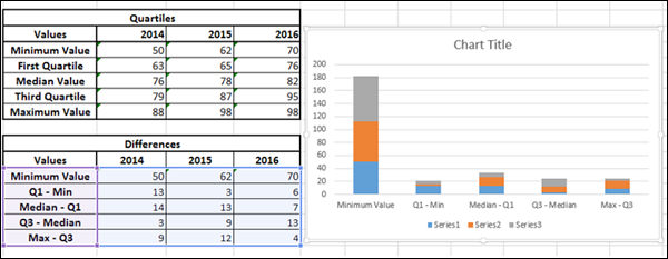
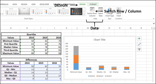
Step 3 - 单击功能区上的设计选项卡。
Step 3 − Click the DESIGN tab on the Ribbon.
Step 4 - 在数据组中单击切换行/列按钮。
Step 4 − Click Switch Row / Column button in the Data group.
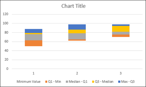
您的图表将如下图所示。
Your chart will be as shown below.
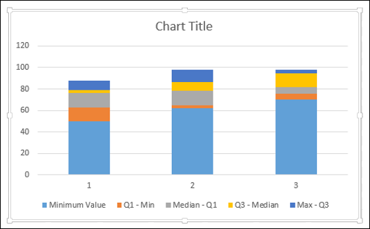
Step 5 - 右键单击底部数据系列。单击填充并选择无填充。
Step 5 − Right click on the bottom Data Series. Click Fill and select No Fill.
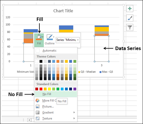
底部的 Data 系列将变得不可见。
The bottom Data series becomes invisible.
Step 6 - 在图表元素中取消选择图表标题和图例。
Step 6 − Deselect Chart Title and Legend in Chart Elements.
Step 7 - 将水平轴标签更改为 2014、2015 和 2016。
Step 7 − Change the Horizontal Axis Labels to 2014, 2015 and 2016.
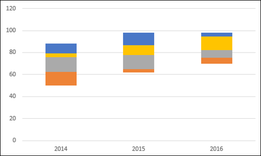
Step 8 - 现在,您的盒子已准备就绪。接下来,您需要创建线须。
Step 8 − Now, your Boxes are ready. Next, you have to create the Whiskers.
-
Right click on the Top Data Series.
-
Change Fill to No Fill.
-
Click the DESIGN tab on the Ribbon.
-
Click Add Chart Element in the Chart layouts group.
-
Click Error Bars in the dropdown list and select Standard Deviation.
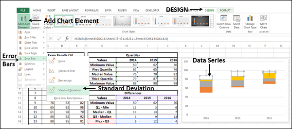
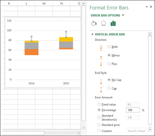
Step 9 − 创建了顶部线须。接下来,按照如下所示格式化线须(错误线)−
Step 9 − You got the top Whiskers. Next, format Whiskers (Error Bars) as follows −
-
Right click on the Error Bars.
-
Select Format Error Bars.
-
Select the following under ERROR BAR OPTIONS in the Format Error Bars pane. Select Minus under Direction. Select No Cap under End Style. Select Percentage under Error Amount and type 100.
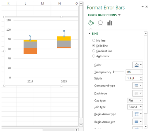
Step 10 − 在“格式错误线”窗格中的“错误线选项”下,单击“填充和线条”选项卡。
Step 10 − Click the Fill & Line tab under ERROR BAR OPTIONS in the Format Error Bars pane.
-
Select Solid line under LINE.
-
Select the color as dark blue.
-
Type 1.5 in the Width box.
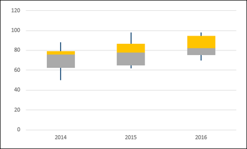
Step 11 − 为第二根较低的底部系列重复上述步骤。
Step 11 − Repeat the above given steps for the second lower bottom Series.
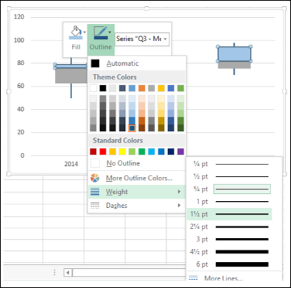
Step 12 − 接下来,按照如下所示格式化框。
Step 12 − Next, format the boxes as follows.
-
Right click on one of the Box series.
-
Click Fill.
-
Choose color as light blue.
-
Click Outline.
-
Choose the color as dark blue.
-
Click Weight.
-
Select 1½ pt.
Step 13 − 为其他框系列重复上述步骤。
Step 13 − Repeat the steps given above for the other Box series.

您的箱线图就制作好了。
Your Box and Whisker chart is ready.