Advanced Excel Charts 简明教程
Advanced Excel - Waterfall Chart
瀑布图是小企业和大企业中最流行的可视化工具之一,尤其是在金融领域。瀑布图非常适合显示您如何得出净值(例如净收入),方法是分解积极贡献和消极贡献的累积效应。
Waterfall chart is one of the most popular visualization tools used in small and large businesses, especially in Finance. Waterfall charts are ideal for showing how you have arrived at a net value such as net income, by breaking down the cumulative effect of positive and negative contributions.
What is a Waterfall Chart?
瀑布图是一种数据可视化形式,有助于了解按顺序引入的正值或负值所产生的累积效应。典型的瀑布图用于显示初始值如何随着一系列中间值而增加或减少,最终得出最终值。
A Waterfall chart is a form of data visualization that helps in understanding the cumulative effect of sequentially introduced positive or negative values. A typical Waterfall chart is used to show how an initial value is increased and decreased by a series of intermediate values, leading to a final value.
在瀑布图中,各列使用颜色编码,以便您可以快速区分正数和负数。初始值和最终值列从水平轴开始,而中间值是浮动列。
In a Waterfall chart, the columns are color coded so that you can quickly tell positive from negative numbers. The initial and the final value columns start on the horizontal axis, while the intermediate values are floating columns.
由于这种外观,瀑布图也被称为桥图、飞砖图或级联图。
Because of this look, Waterfall charts are also called Bridge charts, Flying Bricks charts or Cascade charts.
Advantages of Waterfall Charts
瀑布图具有以下优点 -
A Waterfall chart has the following advantages −
-
Analytical purposes − Used especially for understanding or explaining, the gradual transition in the quantitative value of an entity, which is subjected to increment or decrement.
-
Quantitative analysis − Used in quantitative analysis ranging from inventory analysis to performance analysis.
-
Tracking contracts − Starting with the number of contracts at hand at the beginning of the year, taking into account − The new contracts that are added The contracts that got cancelled The contracts that are finished, and Finally ending with the number of contracts at hand at the end of the year.
-
Tracking performance of company over a given number of years.
通常,如果存在一个初始值,并且一段时间内该值发生变化(正值和负值),则瀑布图就可用于描绘初始值、按发生顺序排列的正值和负值变化以及最终值。
In general, if you have an initial value, and changes (positive and negative) occur to that value over a period of time, then Waterfall chart can be used to depict the initial value, positive and negative changes in their order of occurrence and the final value.
Preparation of Data
您需要从给定输入数据中准备数据,以便可以将其描绘成瀑布图。
You need to prepare the data from the given input data, so that it can be portrayed as a Waterfall chart.
考虑以下数据 -
Consider the following data −
按照以下步骤准备瀑布图数据 -
Prepare the data for the Waterfall chart as follows −
-
Ensure the column Net Cash Flow is to the left of the Months Column (This is because you will not include Net Cash Flow column while creating the chart).
-
Add two columns − Increase and Decrease for positive and negative cash flows respectively.
-
Add a column Start − the first column in the chart with the start value in the Net Cash Flow.
-
Add a column End − the last column in the chart with the end value in the Net Cash Flow.
-
Add a column Float − that supports the intermediate columns.
-
Insert formulas to compute the values in these columns as given in the table below.
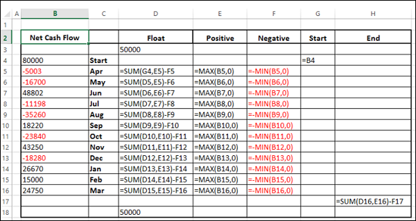
在浮动列中,在开头和末尾插入一行。放一个任意的值 50000。这只是为了在图表左侧和右侧留一些空间。
In the Float column, insert a row in the beginning and at the end. Place an arbitrary value 50000. This is just to have some space to the left and right sides of the chart.
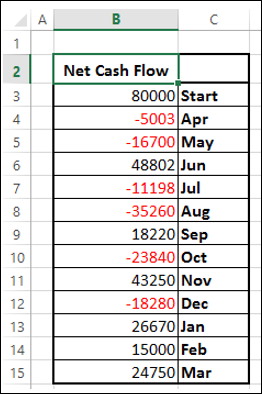
数据将显示在下表中给出 -
The data will look as given in the following table −
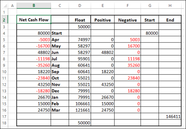
该数据已准备好创建瀑布图。
The data is ready to create a Waterfall chart.
Creating a Waterfall Chart
您可以通过自定义堆积柱形图来创建一个瀑布图,如下所示 -
You can create a Waterfall chart customizing Stacked Column chart as follows −
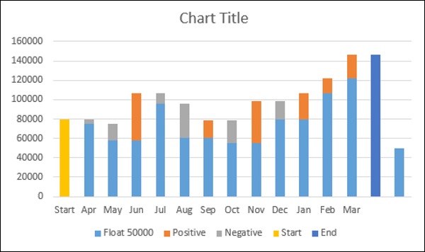
Step 1 − 选择单元格 C2:H18(即不包括现金净流量列)。
Step 1 − Select the cells C2:H18 (i.e. excluding the Net Cash Flow column).
Step 2 − 插入堆积柱形图。
Step 2 − Insert Stacked Column chart.
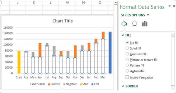
Step 3 − 右键单击浮动序列。
Step 3 − Right click on the Float series.
Step 4 − 在下拉列表中单击格式化数据系列。
Step 4 − Click Format Data Series in the dropdown list.
Step 5 − 在格式化数据系列窗格中的序列选项中选择无填充为填充。
Step 5 − Select No fill for FILL in the SERIES OPTIONS in the Format Data Series pane.
Step 6 − 右键单击负序列。
Step 6 − Right click on the Negative series.
Step 7 − 选择填充颜色为红色。
Step 7 − Select Fill color as red.

Step 8 − 右键单击正序列。
Step 8 − Right click on the Positive series.
Step 9 − 选择填充颜色为绿色。
Step 9 − Select Fill color as green.

Step 10 − 右键单击开始序列。
Step 10 − Right click on the Start series.
Step 11 − 选择填充颜色为灰色。
Step 11 − Select Fill color as gray.
Step 12 − 右键单击结束序列。
Step 12 − Right click on the End series.
Step 13 − 选择填充颜色为灰色。
Step 13 − Select Fill color as gray.

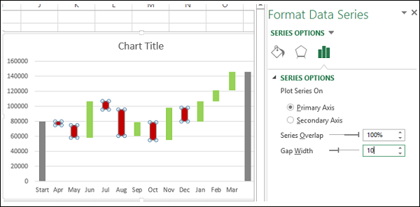
Step 14 − 右键单击任意序列。
Step 14 − Right click on any of the series.
Step 15 − 在格式化数据系列窗格中的序列选项下选择 10% 的间隙宽度。
Step 15 − Select Gap Width as 10% under SERIES OPTIONS in the Format Data Series pane.
Step 16 − 为图表命名。
Step 16 − Give a name to the chart.
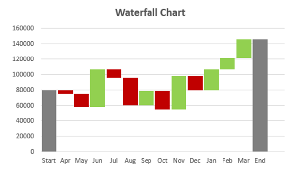
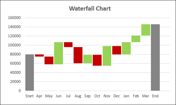
瀑布图已完成。
Your Waterfall chart is ready.