Advanced Excel Charts 简明教程
Advanced Excel Charts - Histogram
直方图是数值数据分布的图形表示。它广泛应用于统计分析。Karl Pearson 引入了直方图。
A Histogram is a graphical representation of the distribution of numerical data. It is widely used in Statistical Analysis. Karl Pearson introduced histogram.
在 Excel 中,您可以从作为 Excel 附加项提供的分析工具包创建直方图。但是,在这种情况下,当数据更新时,除非再次通过分析工具包修改直方图,否则直方图将不会反映更改后的数据。
In Excel, you can create a Histogram from the Analysis ToolPak that comes as an add-in with Excel. However, in such a case, when the data is updated, Histogram will not reflect the changed data unless it is modified through Analysis ToolPak again.
在本章中,您将学习如何从柱形图创建直方图。在这种情况下,当源数据更新时,图表也会刷新。
In this chapter, you will learn how to create a Histogram from a Column chart. In this case, when the source data is updated the chart also gets refreshed.
What is a Histogram?
直方图由一系列矩形表示,这些矩形的长度与连续数值区间中变量出现次数对应。数值区间称为“bin”,而出现次数称为频率。
A Histogram is represented by rectangles with lengths corresponding to the number of occurrences of a variable in successive numerical intervals. The numerical intervals are called bins and the number of occurrences is called frequency.
Bin 通常被指定为连续、不相交的变量区间。Bin 必须是相邻的,并且具有相等的大小。位于 Bin 上的矩形的高度与 Bin 的频率成比例,它表示该 Bin 中案例的数量。因此,水平轴表示 Bin,而垂直轴表示频率。矩形被着色或阴影化。
The bins are usually specified as consecutive, non-overlapping intervals of the variable. The bins must be adjacent and are of equal size. A rectangle over a bin with height proportional to the frequency of the bin depicts the number of cases in that bin. Thus, the horizontal axis represents the bins whereas the vertical axis represents the frequency. The rectangles are colored or shaded.
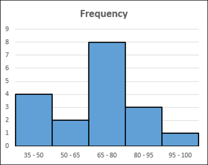
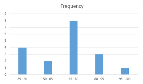
直方图将如下图所示。
A Histogram will be as shown below.
Advantages of Histograms
直方图用于检查数据的潜在分布、异常值、偏度等。例如,直方图可在统计分析中用于以下场景:
Histogram is used to inspect the data for its underlying distribution, outliers, skewness, etc. For example, Histogram can be used in statistical analysis in the following scenarios −
-
A census of a country to obtain the people of various age groups.
-
A survey focused on the demography of a country to obtain the literacy levels.
-
A study on the effect of tropical diseases during a season across different regions in a state.
Preparation of Data
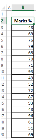
考虑以下给定的数据。
Consider the data given below.
根据以上数据创建 Bin 并计算每个 Bin 中的值的数目,如下所示:
Create bins and calculate the number of values in each bin from the above data as shown below −
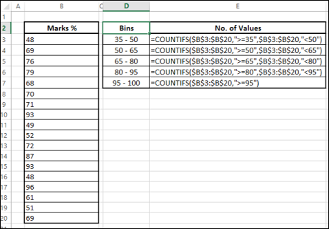
Bin 中值的数目称为该 Bin 的频率。
The number of values in a bin is referred to as the frequency of that bin.
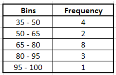
此表称为“频率表”,我们将使用它来创建直方图。
This table is called a Frequency table and we will use it to create the Histogram.
Creating a Histogram
以下是创建直方图的步骤。
Following are the steps to create a Histogram.
Step 1 - 选择频率表中的数据。
Step 1 − Select the data in the Frequency table.
Step 2 - 插入一个簇状柱形图。
Step 2 − Insert a Clustered Column chart.
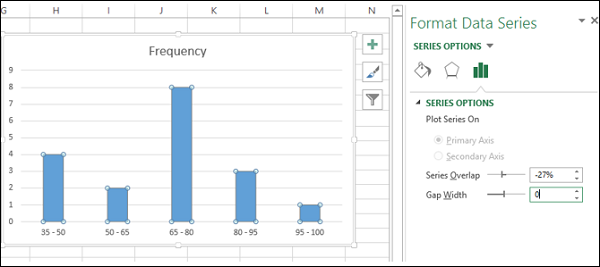
Step 3 - 右键单击列,然后从下拉列表中选择“格式化数据系列”。
Step 3 − Right click on the Columns and select Format Data Series from the dropdown list.
Step 4 - 单击“系列选项”,然后在“系列选项”下将间隙宽度更改为 0。
Step 4 − Click SERIES OPTIONS and change the Gap Width to 0 under SERIES OPTIONS.
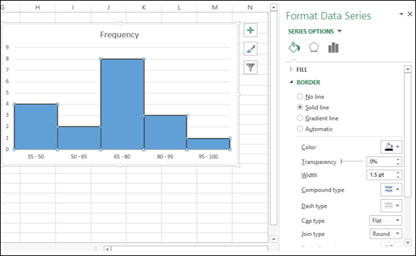
Step 5 - 如下所示格式化图表。
Step 5 − Format the chart as follows.
-
Click on Fill & Line.
-
Click on Solid Line under Border.
-
Select black for color.
-
Type 1.5 for Width.
Step 6 - 调整图表大小。
Step 6 − Adjust the size of the chart.
您的直方图已完成。您会注意到,每列的长度都对应于特定 Bin 的频率。
Your Histogram is ready. As you can observe, the length of each column corresponds to the frequency of that particular bin.