Advanced Excel Charts 简明教程
Advanced Excel - Step Chart
如果您必须以不规则时间间隔显示数据,并且在变更之间保持恒定,那么步长图将很有用。例如,步长图可用于显示商品价格变更、税率变更、利率变更等。
Step chart is useful if you have to display the data that changes at irregular intervals and remains constant between the changes. For example, Step chart can be used to show the price changes of commodities, changes in tax rates, changes in interest rates, etc.
What is a Step Chart?
步长图是一种不使用最短距离连接两个数据点的折线图。相反,它使用垂直和水平线条以系列形式连接数据点,形成阶梯状进行。步长图的垂直部分表示数据及其大小的变化。步长图的水平部分表示数据的恒定。
A Step chart is a Line chart that does not use the shortest distance to connect two data points. Instead, it uses vertical and horizontal lines to connect the data points in a series forming a step-like progression. The vertical parts of a Step chart denote changes in the data and their magnitude. The horizontal parts of a Step chart denote the constancy of the data.
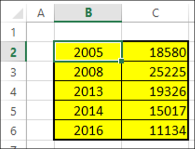
考虑以下数据 -
Consider the following data −
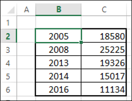
正如您所看到的,数据变动发生在不规则的时间间隔内。
As you can observe, the data changes are occurring at irregular intervals.
步长图如下所示。
A Step chart looks as shown below.
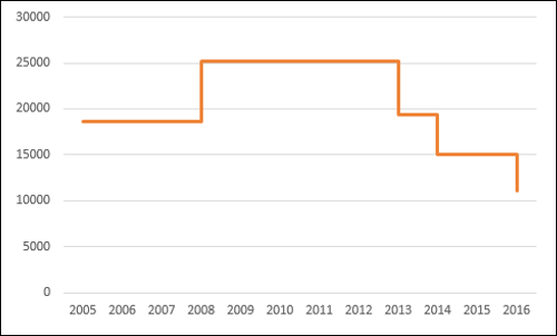
正如您所看到的,数据变动发生在不规则的时间间隔内。当数据保持恒定时,它会以水平线显示,直到发生变动为止。发生变化时,其大小由垂直线表示。
As you can see, the data changes are occurring at irregular intervals. When the data remains constant, it is depicted by a horizontal Line, till a change occurs. When a change occurs, its magnitude is depicted by a vertical Line.
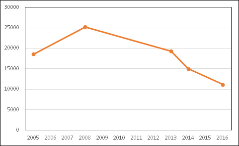
如果您使用折线图显示相同的数据,它将如下图所示。
If you had displayed the same data with a Line chart, it would be like as shown below.
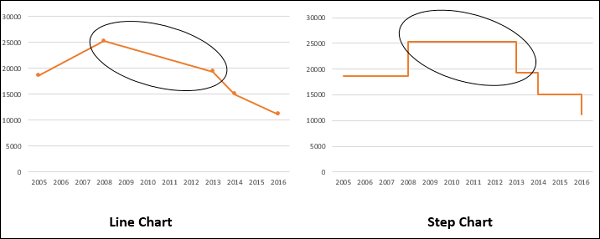
Differences between Line Charts and Step Charts
您可以识别同一数据中的折线图和步长图之间的以下差异 −
You can identify the following differences between a Line chart and a Step chart for the same data −
-
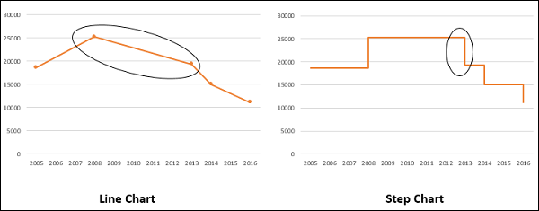
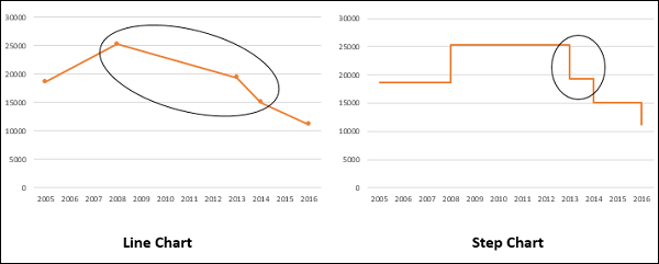
The focus of the Line chart is on the trend of the data points and not the exact time of the change. A Step chart shows the exact time of the change in the data along with the trend.
-
A Line chart cannot depict the magnitude of the change but a Step chart visually depicts the magnitude of the change.
-
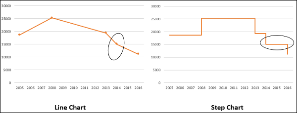
Line chart cannot show the duration for which there is no change in a data value. A Step chart can clearly show the duration for which there is no change in a data value.
-
A Line chart can sometimes be deceptive in displaying the trend between two data values. For example, Line chart can show a change between two values, while it is not the case. On the other hand, a step chart can clearly display the steadiness when there are no changes.
-
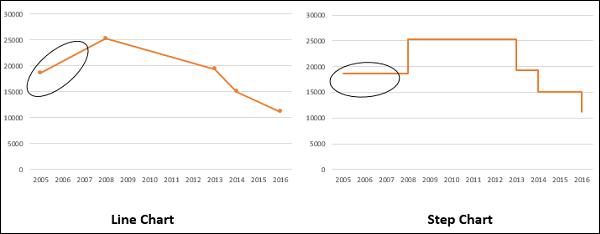
A Line chart can display a sudden increase/decrease, though the changes occur only on two occasions. A Step chart can display only the two occurred changes and when the changes actually happened.
Advantages of Step Charts
步长图可用于描绘数据在不规则的时间间隔内具有数据变化的固有特性的任何类型的数据。示例包括以下内容 −
Step charts are useful to portray any type of data that has an innate nature of data changes at irregular intervals of time. Examples include the following −
-
Interest rates vs. time.
-
Tax rates vs. income.
-
Electricity charges slabs based on the Units utilized.
Preparation of Data
考虑以下数据 -
Consider the following data −
Step 1 − 选择数据。将数据复制并粘贴到最后一行的下方。
Step 1 − Select the data. Copy and paste the data below the last row of the data.
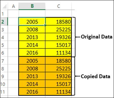
Step 2 − 复制并粘贴右侧的所有数据。数据如下所示。
Step 2 − Copy and paste the entire data on the right side of the data. The data looks as given below.
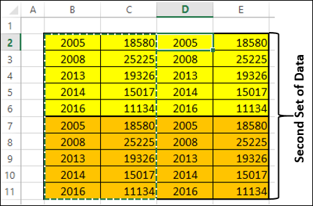
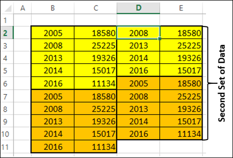
Step 3 − 删除下表中所示的第二组数据表中以红色高亮显示的单元格。
Step 3 − Delete the cells highlighted in red that are depicted in the table of second set of data given below.
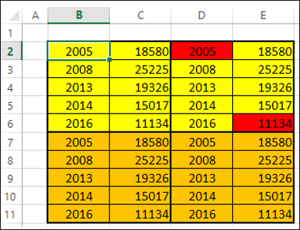
Step 4 − 在删除时向上移动单元格。第二组数据如下所示。
Step 4 − Shift the cells up while deleting. The second set of data looks as given below.
Step 5 − 复制第二组数据并将它们粘贴到右侧以获得第三组数据。
Step 5 − Copy the second set of data and paste it to the right side of it to get the third set of data.
Step 6 − 选择第三组数据。将其从小到大的值进行排序。
Step 6 − Select the third set of data. Sort it from the smallest to the largest values.
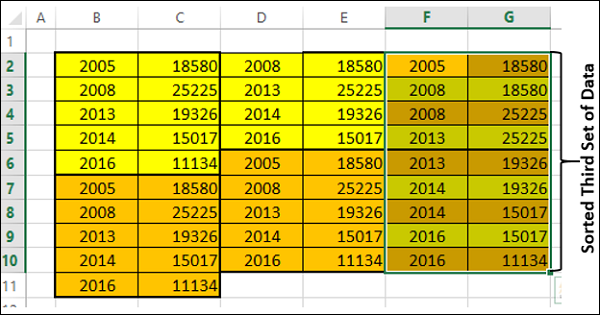
你需要使用这种已排序的第三组数据来创建阶梯图。
You need to use this sorted third set of data to create the Step chart.
Creating a Step Chart
按照以下步骤创建阶梯图 −
Follow the steps given below to create a step chart −
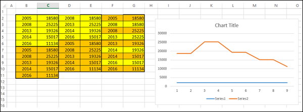
Step 1 − 选择第三组数据并插入折线图。
Step 1 − Select the third set of data and insert a Line chart.
Step 2 − 如下格式化图表-
Step 2 − Format the chart as follows −
-
Click on the chart.
-
Click the DESIGN tab on the Ribbon.
-
Click Select Data in the Data group. The Select Data Source dialog box appears.
-
Select Series1 under Legend Entries (Series).
-
Click the Remove button.
-
Click the Edit button under Horizontal (Category) Axis Labels. Click OK.
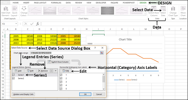
“轴标签”对话框将出现。
The Axis Labels dialog box appears.
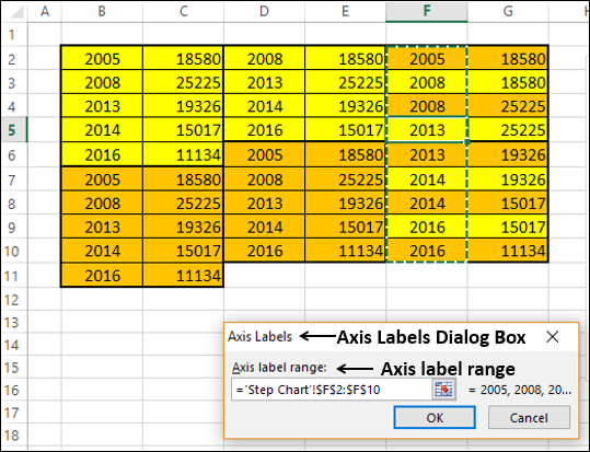
Step 3 − 在“轴标签范围”下选择单元格 F2:F10,然后单击“确定”。
Step 3 − Select the cells F2:F10 under the Axis labels range and click OK.
Step 4 − 在“选择数据源”对话框中单击“确定”。你的图表将如下所示。
Step 4 − Click OK in the Select Data Source dialog box. Your chart will look as shown below.
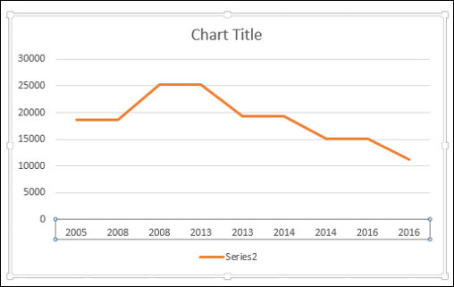
Step 5 − 您会看到,水平(类别)轴中缺少一些值(年份)。要插入值,请按照以下步骤操作。
Step 5 − As you can observe, some values (Years) in the Horizontal (Category) Axis are missing. To insert the values, follow the steps given below.
-
Right click on the Horizontal Axis.
-
Select Format Axis.
-
Click AXIS OPTIONS in the Format Axis pane.
-
Select Date Axis under Axis Type in AXIS OPTIONS.
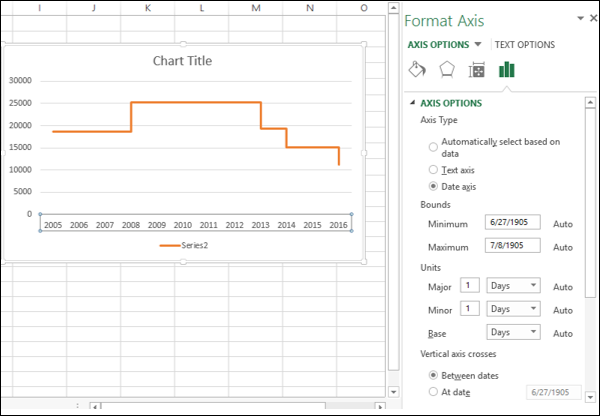
如你所见,水平(类别)轴现在还包含类别值中缺失的年份。此外,在发生更改之前,该线是水平的。当有更改时,其大小由垂直线的高度表示。
As you can see, the Horizontal (Category) Axis now contains even the missing Years in the Category values. Further, until a change occurs, the line is horizontal. When there is a change, its magnitude is depicted by the height of the vertical line.
Step 6 - 在图表元素中取消选择图表标题和图例。
Step 6 − Deselect the Chart Title and Legend in Chart Elements.
你的步骤图已准备就绪。
Your Step chart is ready.