Advanced Excel Charts 简明教程
Advanced Excel - Funnel Chart
漏斗图用于可视化在数据从一个阶段传递到另一个阶段时渐进的减少。这些阶段中的每个阶段的数据均表示为 100%(整体)的不同部分。与饼图类似,漏斗图也不使用任何坐标轴。
Funnel chart is used to visualize the progressive reduction of data as it passes from one phase to another. Data in each of these phases is represented as different portions of 100% (the whole). Like the Pie chart, the Funnel chart does not use any axes either.
例如,在销售渠道中,将有如下所示的阶段。
For example, in a sales pipeline, there will be stages as shown below.
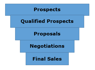
潜在客户 → 合格潜在客户 → 提议 → 谈判 → 最终销售。
Prospects → Qualified Prospects → Proposals → Negotiations → Final Sales.
通常,这些值将逐渐降低。许多潜在客户被识别出来,但其中一部分被验证,甚至更少的一部分获得了提案资格。来谈判的数字更少,最终只有为数不多的交易获胜。这将使这些条形图类似于漏斗。
Typically, the values decrease gradually. Many prospects are identified, but a part of them are validated and even lesser qualify for Proposals. A still lesser number come for negotiations and in the end, there is only a handful of deals that are won. This will make the bars resemble a funnel.
What is a Funnel Chart?
漏斗图显示了一个从初始状态开始、以最终状态结束的过程,在该过程中可以明显看出流失发生在哪些阶段以及流失的规模如何。如果该图表还与研究数据相结合,即对在销售或订单履行过程的每个步骤中丢失了多少项目的量化测量,那么漏斗图将说明流程中最大的瓶颈在哪里。
The Funnel chart shows a process that starts at the initial state and ends with a final state, where it is noticeable in what stages the fall out happens and by what magnitude. If the chart is also combined with research data, meaning quantified measurements of just how many items are lost at each step of the sales or order fulfillment process, then the Funnel chart illustrates where the biggest bottlenecks are in the process.
与真正的漏斗不同,并不是所有从顶部倒入的东西都会流向底部。该名称仅指图表形状,其目的是为了说明。
Unlike a real funnel, not everything that is poured in at the top flows through to the bottom. The name only refers to the shape of the chart, the purpose of which is illustrative.
漏斗图的另一种变体是以 100%(整体)的不同部分表示每个阶段的数据,以显示变化沿着漏斗发生的速率。
Another variant of Funnel chart is where the data in each of these phases is represented as different portions of 100% (the whole), to show at what rate the changes occur along the Funnel.
与饼图类似,漏斗图也不使用任何坐标轴。
Like the Pie chart, the Funnel chart does not use any axes either.
Advantages of Funnel Charts
漏斗图可用于各种场景,包括以下场景 −
Funnel chart can be used in various scenarios, including the following −
-
To allow executives to see how effective the sales team is in turning a sales lead into a closed deal.
-
A Funnel chart can be used to display Web site visitor trends. It can display visitor page hits to the home page at the top, and the other areas, for e.g. the web site downloads or the people interested in buying the product will be proportionally smaller.
-
Order fulfillment funnel chart with the initiated orders on top and down to the bottom the orders delivered to satisfied customers. It shows how many there are still in the process and the percentage cancelled and returned.
-
Another use of Funnel chart is to display sales by each salesperson.
-
Funnel chart can also be used to evaluate Recruitment process.
-
Funnel chart can also be used to analyze the order fulfillment process.
Preparation of Data
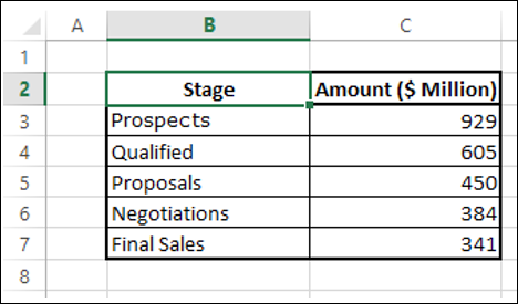
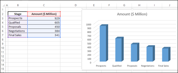
将数据值放在表格中。
Place the data values in a table.
Step 1 − 如下所示在表格中插入一列。
Step 1 − Insert a column in the table as shown below.
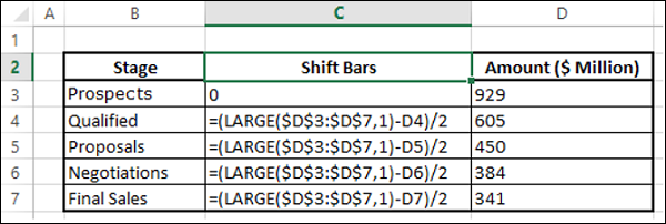
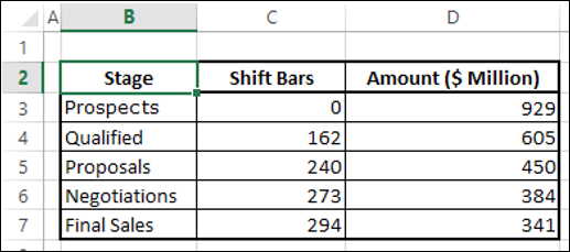
你会得到以下数据。你将使用此表格创建漏斗图。
You will get the following data. You will use this table to create the Funnel chart.
Creating a Funnel Chart
以下是如何创建漏斗图的步骤:
Following are the steps to create the Funnel chart −
Step 1 - 选择数据,插入堆叠柱状图。
Step 1 − Select the data and insert a Stacked Bar chart.
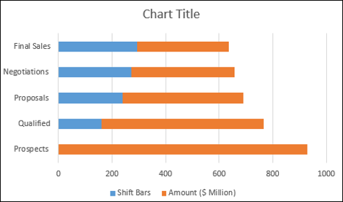
Step 2 - 右键单击移位柱状条(上图中的蓝色),然后将填充色更改为不填充。
Step 2 − Right click on the Shift Bars (blue color in the above chart) and change Fill color to No Fill.

该图表如下所示。
The chart looks as shown below.
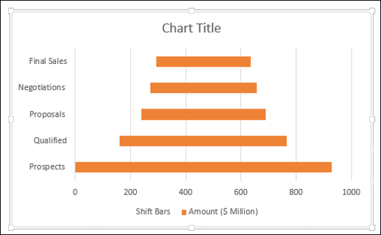
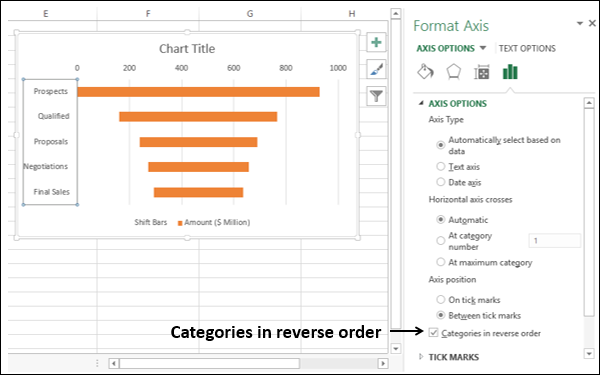
Step 3 - 如下所示设计图表。
Step 3 − Design the chart as follows.
-
Right click on the Vertical Axis.
-
Select Format Axis from the dropdown list.
-
Click AXIS OPTIONS in the Format Axis pane.
-
Check the box – Categories in reverse order.
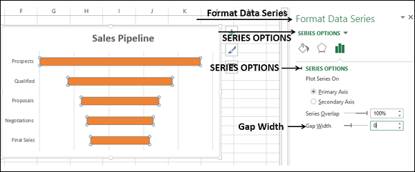
Step 4 - 如下所示微调图表。
Step 4 − Fine tune the chart as follows.
-
Deselect Legend in Chart Elements.
-
Change the Chart Title.
-
Right click on the orange Bars.
-
Select Format Data Series.
-
Change the Gap Width to 0% in the SERIES OPTIONS.
Step 5 - 选择图表元素中的数据标签。
Step 5 − Select Data Labels in Chart Elements.
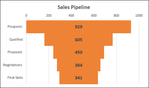
销售渠道漏斗图已完成。
Your Sales Pipeline Funnel chart is ready.
Formatting a Funnel Chart
Step 6 - 如下所示,使图表更具吸引力:
Step 6 − Make the chart more appealing as follows
-
Click on the Chart Elements.
-
Deselect Horizontal Axis.
-
Deselect Gridlines.
-
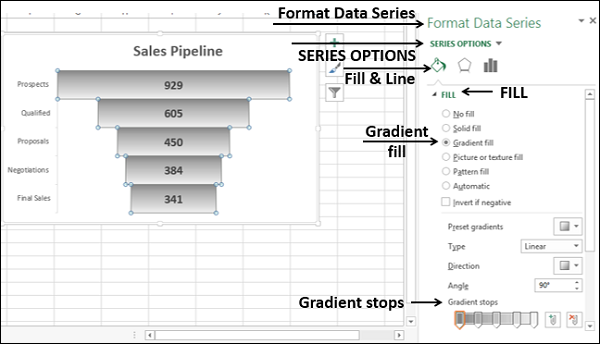
Right click on the Bars.
-
Select Format Data Series from the dropdown list.
-
Click on Fill & Line under SERIES OPTIONS in the Format Data Series pane.
-
Click on Gradient fill under the Fill option.
-
Set Gradient stops.
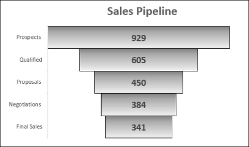
Step 7 − 在边框下点击实线。选择黑色。
Step 7 − Click on Solid line under BORDER. Select Color as black.

你的格式化漏斗图已经完成。
Your formatted Funnel chart is ready.
Aesthetic Funnel Chart
现在你已经理解了漏斗图的基础知识,可以继续创建以下实际上看起来像漏斗的美观漏斗图−
Now that you understood the fundamentals of Funnel chart, you can proceed to create an aesthetic Funnel chart that actually looks like a Funnel as follows −
Step 1 − 从原始数据表开始。
Step 1 − Start with the original table of data.

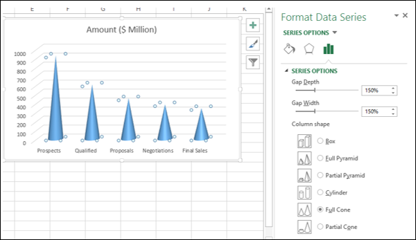
Step 2 − 选择数据并插入 3-D 堆积柱形图。
Step 2 − Select the data and insert a 3-D Stacked Column chart.
Step 3 - 如下所示设计图表。
Step 3 − Design the chart as follows.
-
Right click on the Columns.
-
Select Format Data Series.
-
Click on SERIES OPTIONS in the Format Data Series pane.
-
Select Full Cone under Column shape.
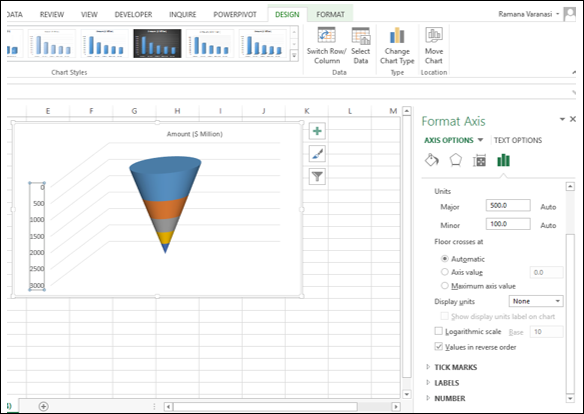
Step 4 - 如下所示微调图表。
Step 4 − Fine tune the chart as follows.
-
Click the Design tab on the Ribbon.
-
Click Switch Row / Column.
-
Right click on the Vertical Axis and select Format Axis from the dropdown list.
-
Click AXIS OPTIONS in the Format Axis pane.
-
Check the box – Values in reverse order.
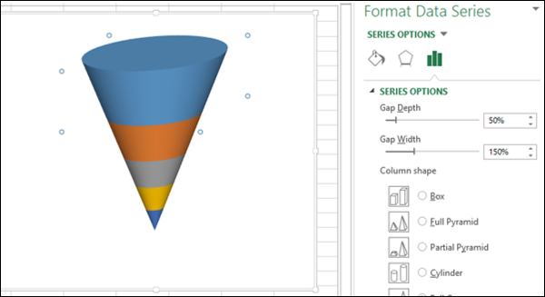
Step 5 − 取消选择所有图表元素
Step 5 − Deselect all the Chart Elements
Step 6 − 在长条形上右击,然后在下拉列表中选择“格式数据系列”。
Step 6 − Right click on the Bars and select Format Data Series from the dropdown list.
Step 7 − 在“系列选项”窗格中点击“系列选项”,并在“系列选项”下为“间隙深度”键入 50%。
Step 7 − Click on SERIES OPTIONS in the Format Data Series pane and type 50% for Gap Depth under SERIES OPTIONS.
Step 8 − 使用以下详细信息对图表进行格式化。
Step 8 − Format your chart with details as follows.
-
Select Data Labels in Chart Elements.
-
Place them and format them.
-
You can choose Call Out option for the Data Label of the bottom part.
-
Give a Chart Title.
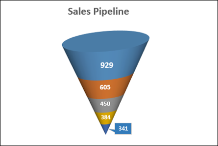
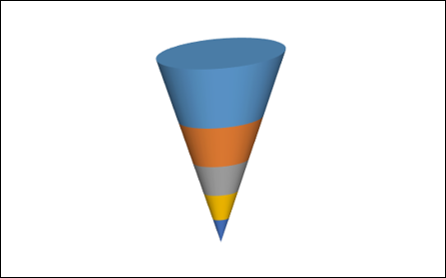
漏斗形图表已就绪。
Your Funnel chart is ready.