Advanced Excel Charts 简明教程
Advanced Excel - Waffle Chart
如果您希望将工作进度显示为完成百分比、实际完成目标等,饼状图可以增加您数据可视化的美感。它快速直观地显示了您想要表达的内容。
Waffle chart adds beauty to your data visualization, if you want to display work progress as percentage of completion, goal achieved vs Target, etc. It gives a quick visual cue of what you want to portray.
饼状图也被称为方形饼图或矩阵图。
Waffle chart is also known as Square Pie chart or Matrix chart.
What is a Waffle Chart?
饼状图是一个 10 × 10 单元格网格,单元格根据条件格式着色。网格表示 1% - 100% 范围内的值,并且单元格将以应用于它们包含的 % 值的条件格式突出显示。例如,如果工作的完成百分比为 85%,则通过将所有包含值 ⇐ 85% 的单元格格式化为特定颜色(如绿色)来表示。
Waffle chart is a 10 × 10 cell grid with the cells colored as per conditional formatting. The grid represents values in the range 1% - 100% and the cells will be highlighted with the conditional formatting applied to the % values they contain. For example, if the percentage of completion of work is 85%, it is portrayed by formatting all the cells that contain values ⇐ 85% with a specific color, say green.
饼状图如下图所示。
Waffle chart looks as shown below.
Advantages of Waffle Chart
华夫饼图具有以下优点:
Waffle chart has the following advantages −
-
It is visually interesting.
-
It is very readable.
-
It is discoverable.
-
It does not distort the data.
-
It provides visual communication beyond simple data visualization.
Uses of Waffle Chart
华夫饼图用于和为 100% 的完全平坦数据。将变量的百分比加亮显示,通过突出显示的单元格数量给出描述。它可用于各种用途,包括以下用途:
The Waffle chart is used for completely flat data that adds up to 100%. The percentage of a variable is highlighted to give the depiction by the number of cells that are highlighted. It can be used for various purposes, including the following −
-
To display the percentage of work that is complete.
-
To display the percentage of progress that is made.
-
To depict the expenses incurred as against the budget.
-
To display Profit %.
-
To portray the actual value achieved as against the set target, say in sales.
-
To visualize the company progress as against the goals that are set.
-
To display the pass percentage in an exam in a college / city/ state.
Creating a Waffle Chart Grid
对于华夫饼图,您需要先创建一个 10 × 10 平方单元格网格,以便网格本身为正方形。
For the Waffle Chart, you need to first create the 10 × 10 Grid of square cells such that the Grid itself will be a square.
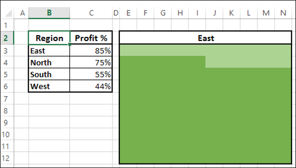
Step 1 − 通过调整单元格宽度在 Excel 表上创建一个 10 × 10 方形网格。
Step 1 − Create a 10 × 10 square grid on an Excel sheet by adjusting the cell widths.
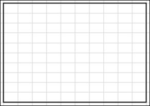
Step 2 − 使用 % 值填充单元格,从左下角单元格的 1% 开始,在右上角单元格以 100% 结束。
Step 2 − Fill the cells with % values, starting with 1% in the left-bottom cell and ending with 100% in the right-top cell.
Step 3 − 减小字体大小,以便所有值可见,但不要更改网格的形状。
Step 3 − Decrease the font size such that all the values are visible but do not change the shape of the grid.
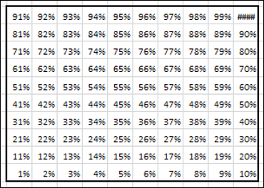
这是您将用于华夫饼图的网格。
This is the grid that you will use for the Waffle chart.
Creating a Waffle Chart
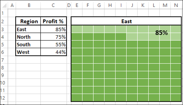
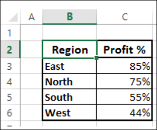
假设您具有以下数据:
Suppose you have the following data −
Step 1 − 通过对您创建的网格应用条件格式,创建一个华夫饼图,其中显示东区利润率,如下所示:
Step 1 − Create a Waffle chart that displays the Profit% for the Region East by applying Conditional Formatting to the Grid you have created as follows −
-
Select the Grid.
-
Click Conditional Formatting on the Ribbon.
-
Select New Rule from the drop down list.
-
Define the Rule to format values ⇐ 85 % (give the cell reference of the Profit %) with fill color and font color as dark green.

Step 2 – 定义另一个规则,用浅绿色填充和字体颜色来设置高于 85%(给出利润百分比的单元格引用)的值格式。
Step 2 − Define another rule to format values > 85 % (give the cell reference of the Profit %) with fill color and font color as light green.

Step 3 – 给图表标题,引用单元格 B3。
Step 3 − Give the Chart Title by giving reference to the cell B3.
如你所见,同时为填充和字体选择相同的颜色使你能够不显示百分比值。
As you can see, choosing the same color for both Fill and Font enable you not to display the %values.
Step 4 – 给图表添加如下标签。
Step 4 − Give a Label to the chart as follows.
-
Insert a Text box in the chart.
-
Give the reference to the cell C3 in the Text box.
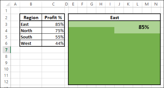
Step 5 – 将单元格边框着色为白色。
Step 5 − Color the cell borders white.

你的区域东部的华夫饼图表已经就绪。
Your Waffle chart for the Region East is ready.
为如下区域(即北方、南方和西方)创建华夫饼图表:
Create Waffle charts for the Regions, i.e. North, South and West as follows −
-
Create the Grids for North, South and West as given in the previous section.
-
For each Grid, apply conditional formatting as given above based on the corresponding Profit % value.
你还可以通过为条件化设置选择不同的颜色,明确地为不同区域创建华夫饼图表。
You can also make Waffle charts for different regions distinctly, by choosing a variation in the colors for Conditional Formatting.
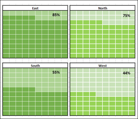
如你所见,右边的华夫饼图表的颜色选择不同于左边的华夫饼图表。
As you can see, the colors chosen for the Waffle charts on the right are varying from the colors chosen for the Waffle charts on the left.