Advanced Excel Charts 简明教程
Advanced Excel Charts - Heat Map
热图通常用于引用于二维阵列中区域的彩色区分,每种颜色都与每个区域共享的不同特征相关。
Heat Map is normally used to refer to the colored distinction of areas in a two dimensional array, with each color associated with a different characteristic shared by each area.
在 Excel 中,热图可以基于单元格包含的值应用于一系列单元格,方法是使用单元格颜色和/或字体颜色。Excel 条件格式适用于此目的。
In Excel, Heat Map can be applied to a range of cells based on the values that they contain by using cell colors and/or font colors. Excel Conditional Formatting comes handy for this purpose.
What is a Heat Map?
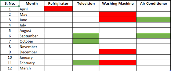
热图是在表格中可视化表示数据,以突出显着的 data points。例如,如果你在过去一年中按月份统计了产品销售数据的,则可以预测哪些月份的产品销售高或低。
A Heat Map is a visual representation of data in a table to highlight the data points of significance. For example, if you have month wise data on sale of products over the last one year, you can project in which months a product has high or low sales.
热图如下所示。
A Heat Map looks as shown below.
Advantages of Heat Maps
热图可用于以不同的颜色直观显示不同范围的数据。当你拥有大型数据集并且想要快速可视化数据中的某些特征时,这非常有用。
Heat Map can be used to visually display the different ranges of data with distinct colors. This is very useful when you have large data sets and you want to quickly visualize certain traits in the data.
使用热图旨在 −
Heat maps are used to −
-
Highlight the top few and the bottom few of a range of values.
-
Portray a trend in the values by using color shades.
-
Identify blank cells – say in an answer sheet or a questionnaire.
-
Highlight the quality ranges of the products.
-
Highlight the numbers in supply chain.
-
Highlight negative values.
-
Highlight zero values.
-
Highlight outliers defined by thresholds.
Preparation of Data
将数据安排在表格中。
Arrange the data in a table.
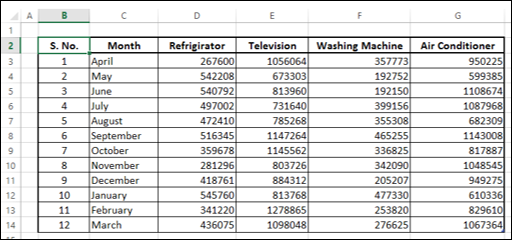
正如您所看到的,这些数据是每个产品逐月从 4 月到 3 月的财政年度数据。您可以创建一个热图来快速识别在哪些月份的销售额较高或较低。
As you can see, the data is for a fiscal year, April – March, month-wise for each product. You can create a Heat Map to quickly identify during what months the sales were high or low.
Creating a Heat Map
以下是创建热图的步骤 −
Following are the steps to create a Heat Map −
Step 1 − 选择数据。
Step 1 − Select the data.
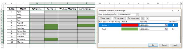
Step 2 − 在功能区上单击条件格式。单击管理规则并添加规则,如下所示。
Step 2 − Click Conditional Formatting on the Ribbon. Click Manage Rules and add rules as shown below.
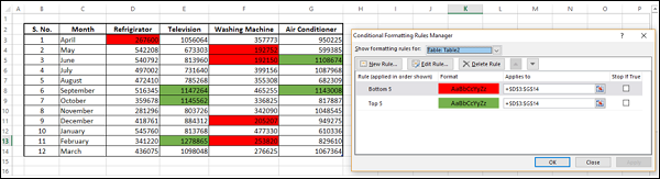
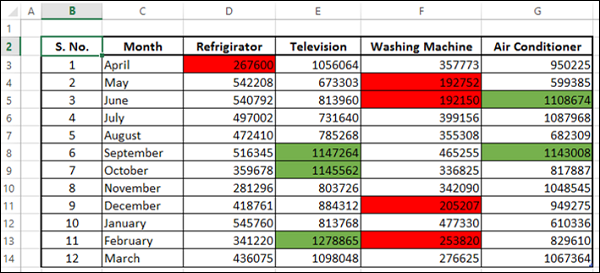
前五个值用绿色(填充)着色,后五个值用红色(填充)着色。
The top five values are colored with green (fill) and the bottom five values are colored with red (fill).
Creating Heat Map without Displaying Values
有时,查看者可能只需要信息,而数字可能并不重要。在这种情况下,您可以进行一些格式化,如下所示 −
At times, the viewers might be just be interested in the information and the numbers might not be necessary. In such a case, you can do a bit of formatting as follows −
Step 1 − 选择数据并将字体颜色选择为白色。
Step 1 − Select the data and select the font color as white.

正如您所看到的,数字不可见。接下来,您需要突出显示前五个和后五个值,而不显示数字。
As you can see, the numbers are not visible. Next, you need to highlight the top five and bottom five values without displaying the numbers.
Step 2 − 选择数据(当然,是不可见的)。
Step 2 − Select the data (which is not visible, of course).
Step 3 − 应用条件格式,以便前五个值用绿色(填充和字体)着色,而后五个值用红色(填充和字体)着色。
Step 3 − Apply Conditional Formatting such that the top five values are colored with green (both fill and font) and the bottom five values are colored with red (both fill and font).
Step 4 − 单击应用按钮。
Step 4 − Click the Apply button.
这种做法可以快速直观地显示全年及所有产品的高销量和低销量。由于您为填充和字体选用了相同的颜色,因此无法查看值。
This gives a quick visualization of high and low sales across the year and across the products. As you have chosen the same color for both fill and font, the values are not visible.